

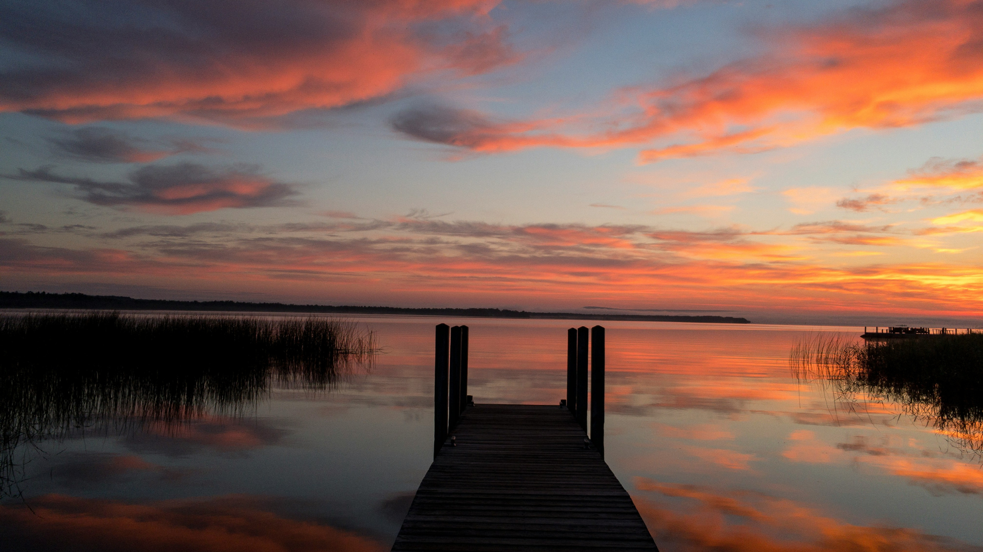
From Dusk to Dream is a color palette inspired by lakeside sunsets and that beautiful in-between moment when day becomes night.
It’s drawn from real memories — soft light reflecting off still water, warm skies, and that first deep breath after a long day. These seven hues hold space for both rest and renewal, designed to support creative expression, soulful decorating, and seasonal reflection.
Whether you’re here to find color inspiration for a project, explore calming tones for your space, or bring fresh energy into your creative practice — this palette invites you in.

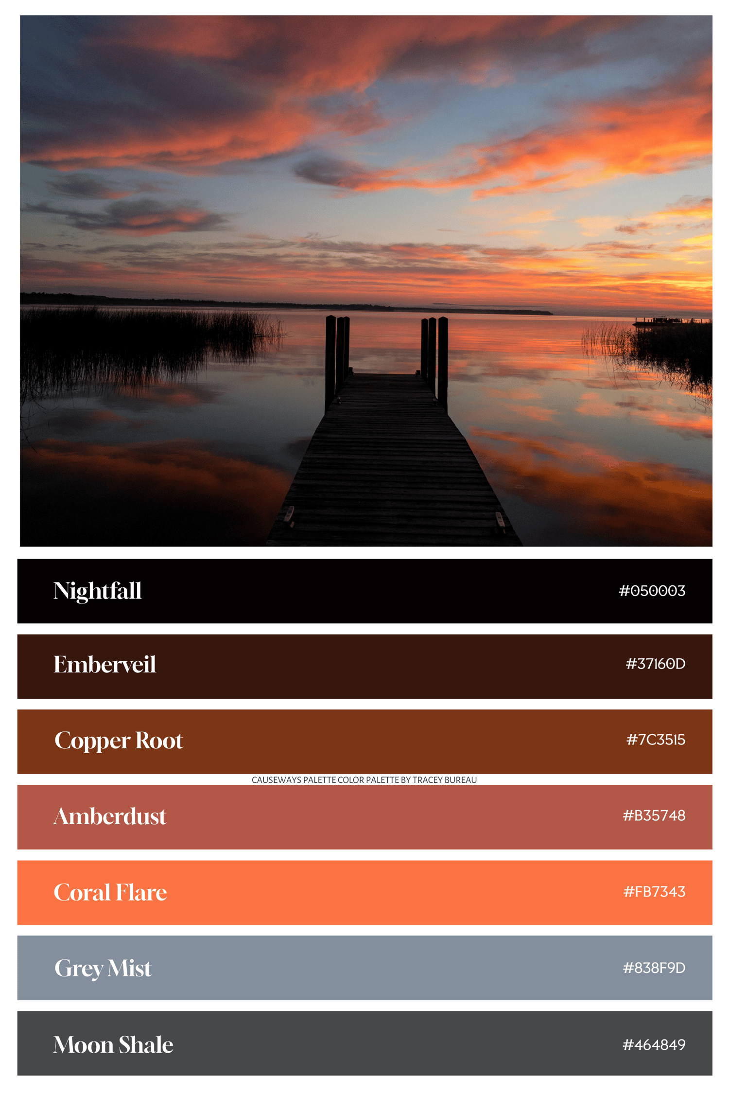
NIGHTFALL
Hex: #050003
Mood: Still, grounding, reflective
Nightfall is the deep hush after sunset — a velvety near-black that invites quiet and calm. It feels like closing your eyes in meditation or watching the stars begin to appear.
Use it when:
- You want a deep, grounding backdrop
- You’re designing for rest, reflection, or focus
- You need contrast or balance in a palette
Learn more about Nightfall and its coordinating solid color love printable wall art print, here.

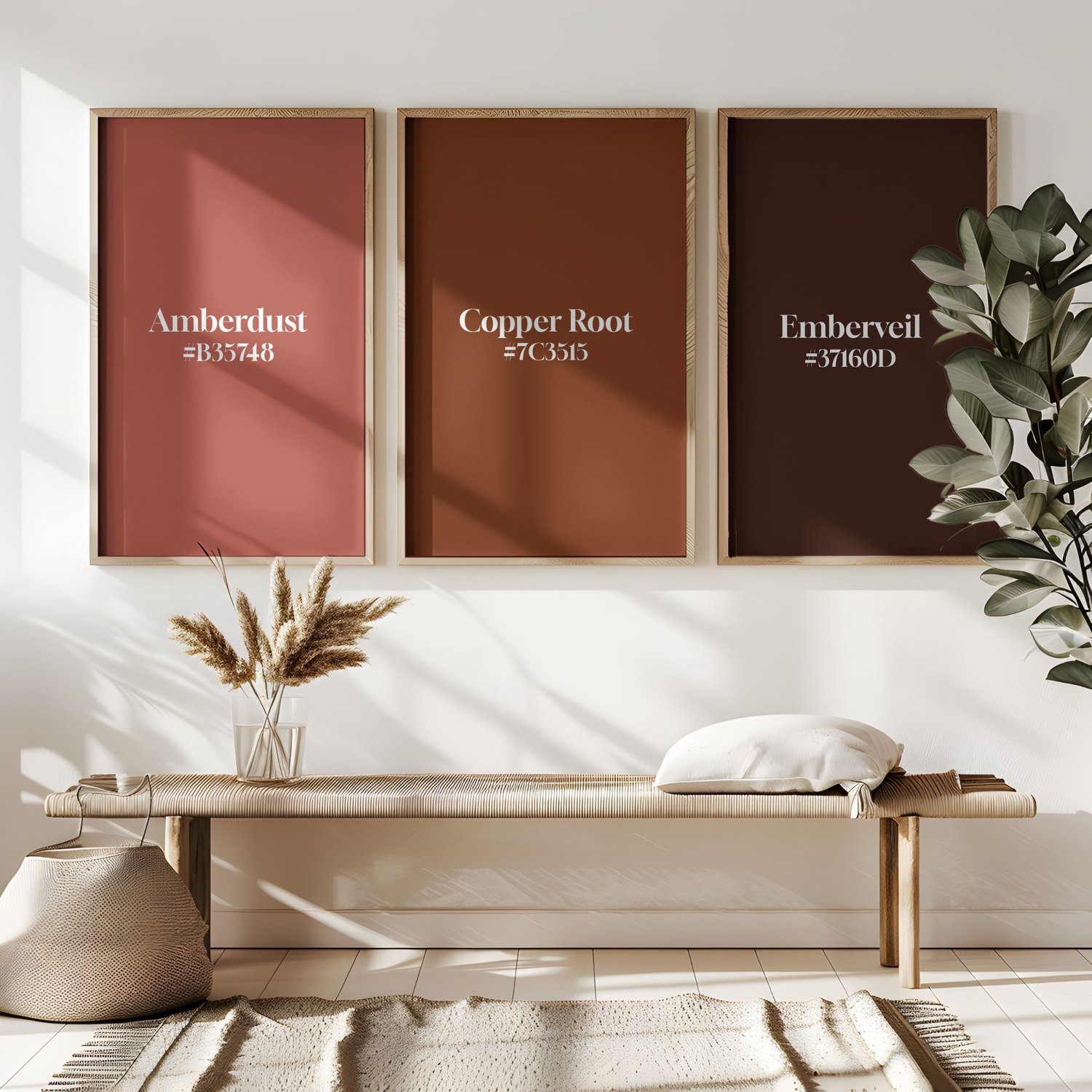
EMBERVEIL
Hex: #37160D
Mood: Protective, warm, grounding
Emberveil is a deep brown with hints of red — like the glow left behind after a flame fades. It’s earthy, rich, and gently powerful.
Use it when:
- You’re creating a cozy, rooted atmosphere
- You want to evoke warmth without brightness
- You’re working with themes of memory, rest, or reflection
Learn more about Emberveil and its coordinating solid color love printable wall art print, here.
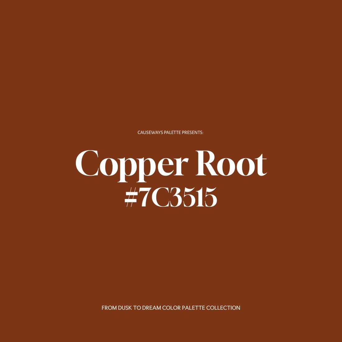
COPPER ROOT
Hex: #7C3515
Mood: Grounded, earthy, creative
Copper Root is a terracotta tone that feels handmade and alive — like clay warmed by hands or soil after rain. It brings depth and presence to any space or design.
Use it when:
- You’re working with natural materials or textures
- You want to evoke warmth and connection
- You’re honoring craft, ritual, or heritage
Learn more about Copper Root and its coordinating solid color love printable wall art print, here.

AMBERDUST
Hex: #B35748
Mood: Nostalgic, warm, soft
Amberdust carries the feeling of a golden memory — glowing, emotional, and slightly bittersweet. It adds tenderness and warmth to your palette.
Use it when:
- You want to soften or warm up your color story
- You’re working with themes of memory or love
- You want to create a cozy, emotionally resonant atmosphere
Learn more about Amberdust and its coordinating solid color love printable wall art print, here.

CORAL FLARE
Hex: #FB7343
Mood: Bold, creative, uplifting
Coral Flare is bright and expressive — the color of energy returning. It brings a playful spark and invites bold, joyful creation.
Use it when:
- You need a burst of creative energy
- You want a strong visual focal point
- You’re celebrating expression, confidence, or joy
Learn more about Coral Flare and its coordinating solid color love printable wall art print, here.

GREY MIST
Hex: #838F9D
Mood: Soft, cooling, neutral
Grey Mist is gentle and spacious — like moonlight on water or early morning mist. It creates room to breathe and reflect.
Use it when:
- You need visual calm or emotional ease
- You're designing something spacious or introspective
- You want a neutral that still feels soft and soulful
Learn more about Grey Mist and its coordinating solid color love printable wall art print, here.
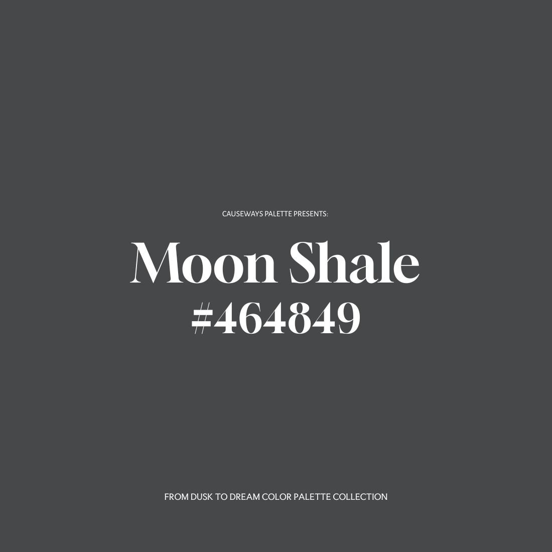
MOON SHALE
Hex: #464849
Mood: Grounded, balanced, steady
Moon Shale is a deep slate-gray with hints of blue — like cool stone at night. It’s solid, honest, and stabilizing.
Use it when:
- You want to feel emotionally steady or clear
- You’re starting something new and need grounding
- You’re balancing more expressive colors with something neutral
Learn more about Emberveil and its coordinating solid color love printable wall art print, here.
Bringing the Palette Into Form
Whether you’re decorating a room, curating your wardrobe, or designing digital work, the From Dusk to Dream palette can support you in many ways.
Here are a few ideas:
In the Home
- Copper Root adds earthy warmth — perfect for accent furniture, pottery, or cozy rooms
- Grey Mist soothes — ideal for bedrooms, bathrooms, and quiet corners
- Coral Flare brings energy — use in art, pillows, or statement pieces
- Nightfall and Moon Shale ground — great for trim, cabinetry, or creative studios
In Your Wardrobe
- Amberdust adds nostalgic warmth — scarves, knits, or natural textures
- Grey Mist + Moon Shale are versatile neutrals — great for layering or grounding your look
- Coral Flare pops with creative joy — nails, jewelry, or anything playful
In Creative Practice
- Use the hex codes in your digital work or branding
- Try them in coloring rituals, especially for transitions or clarity
- Let them guide journal entries, tarot spreads, or seasonal themes
Reflection prompts to explore with this palette:
- What am I releasing with the day?
- What is quietly blooming in the dark?
- Where is my creativity being reborn?


Art & Color Guide Section
Want to bring these colors into your space or creative world?
Click here to be taken to the From Dusk to Dream Collection, where the curated color palette guide resides as well as the printable abstract artwork, solid color wall prints OR you can grab the bundle if you just want to dive in and grab it all!
From Dusk to Dream is more than a color story — it’s a pause between breaths. A palette designed for the edges of day and the openings of becoming.
Let it meet you where you are. Let it soften what’s hard. Let it glow quietly into your world.
With color and quiet wonder,
Tracey
Comments ()