


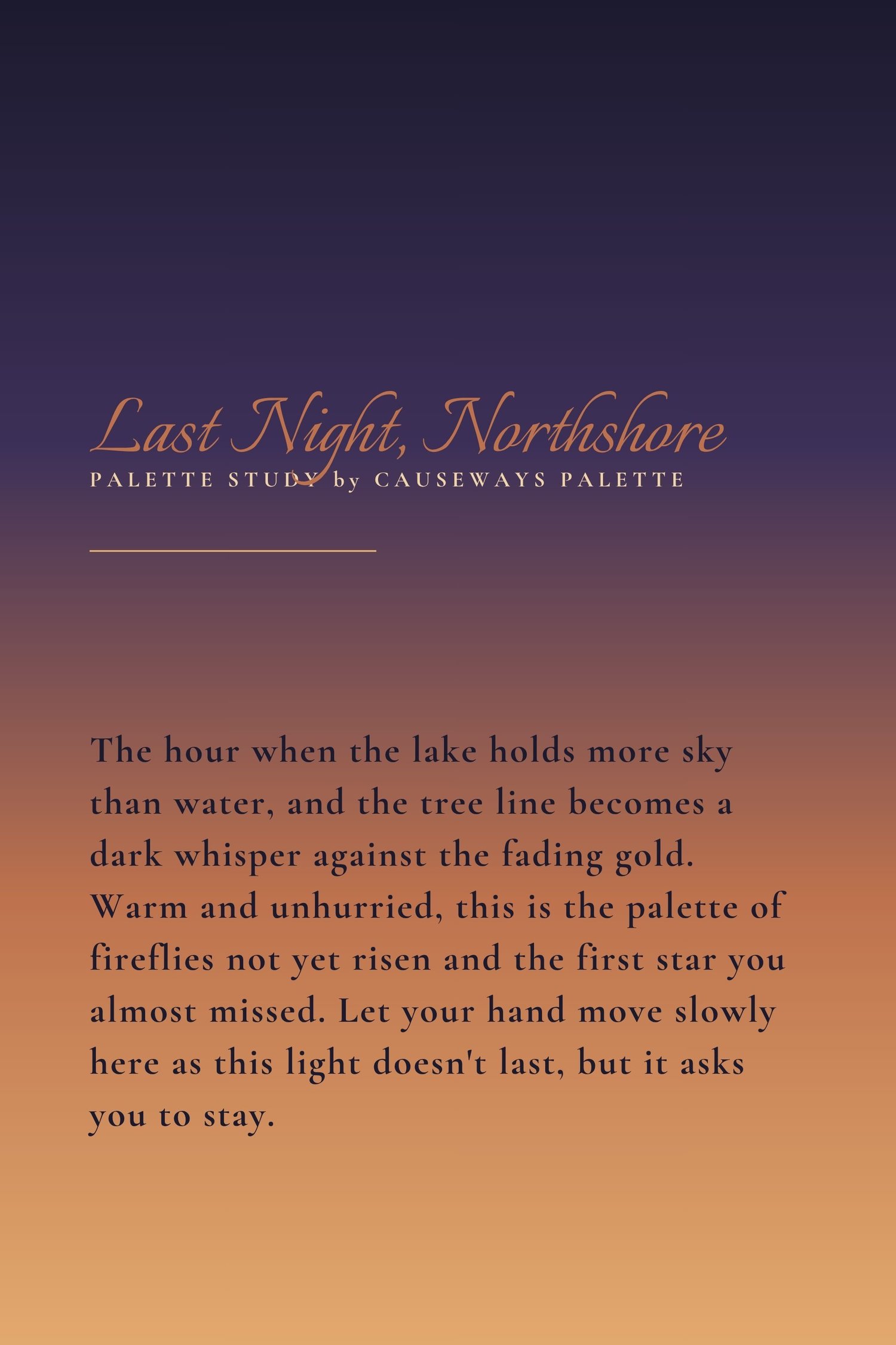
There is a particular hour at the water's edge that doesn't last long enough. The sun has already committed to leaving, but the sky hasn't decided what to do next. Gold lingers over the surface. The tree line darkens into silhouette. And for a few minutes, everything — the water, the air, the light itself — holds completely still.
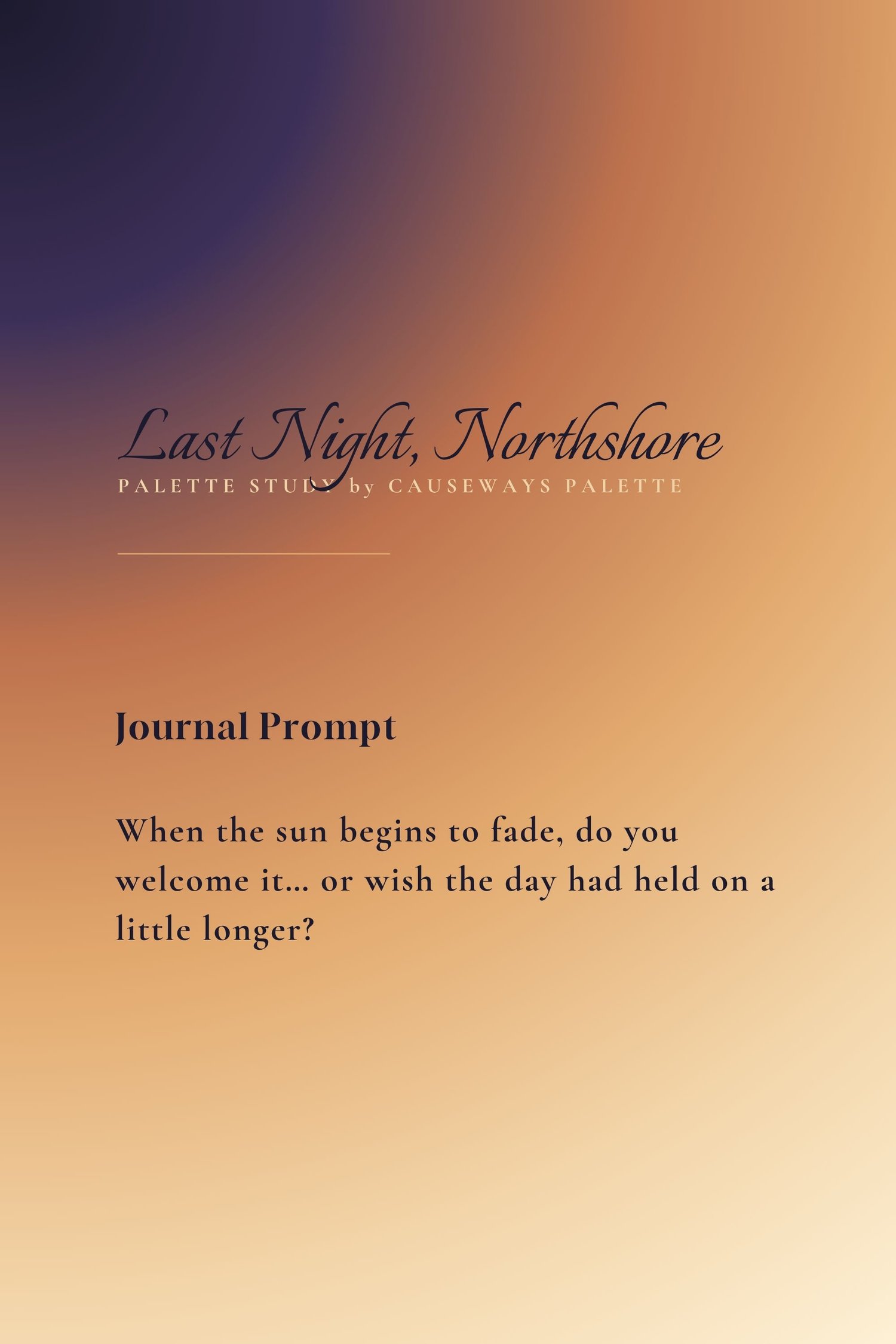
Last Night, Northshore was pulled from that hour. From the way deep midnight and soft plum can hold an entire sky while warm amber and terracotta carry the last of the light below them. These are not colors that fight for attention. They settle. They lean into each other. And that is exactly what makes them work.
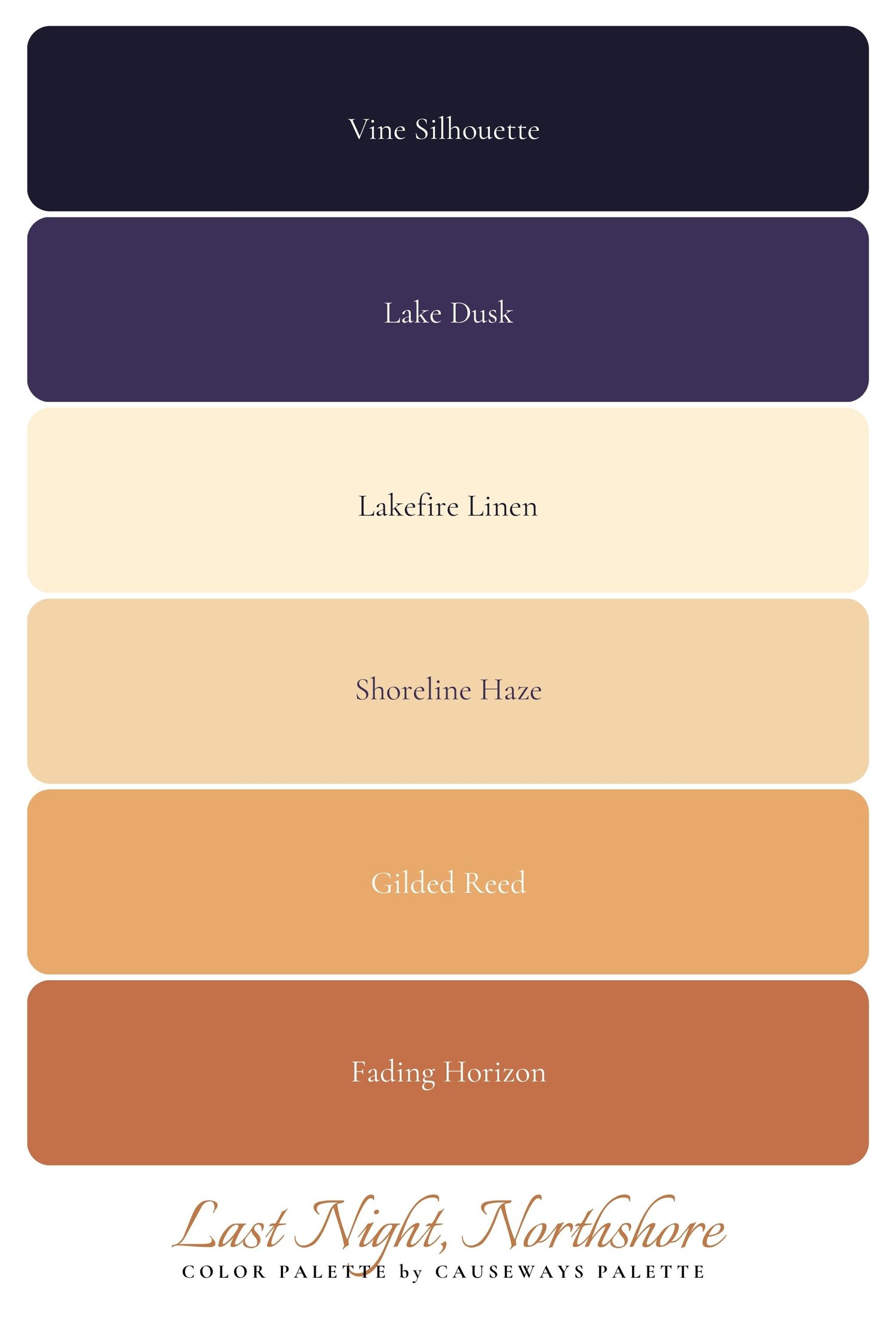
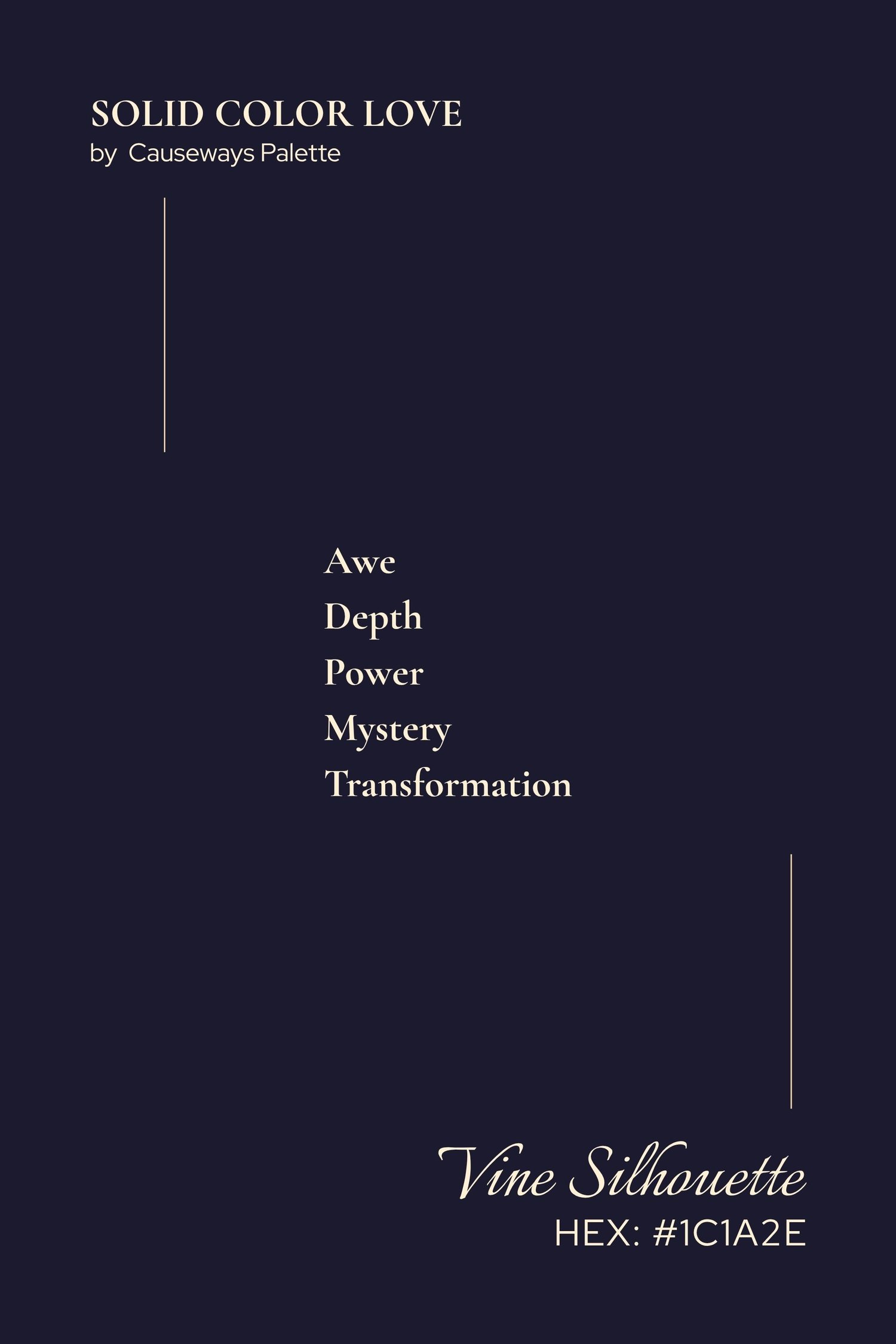
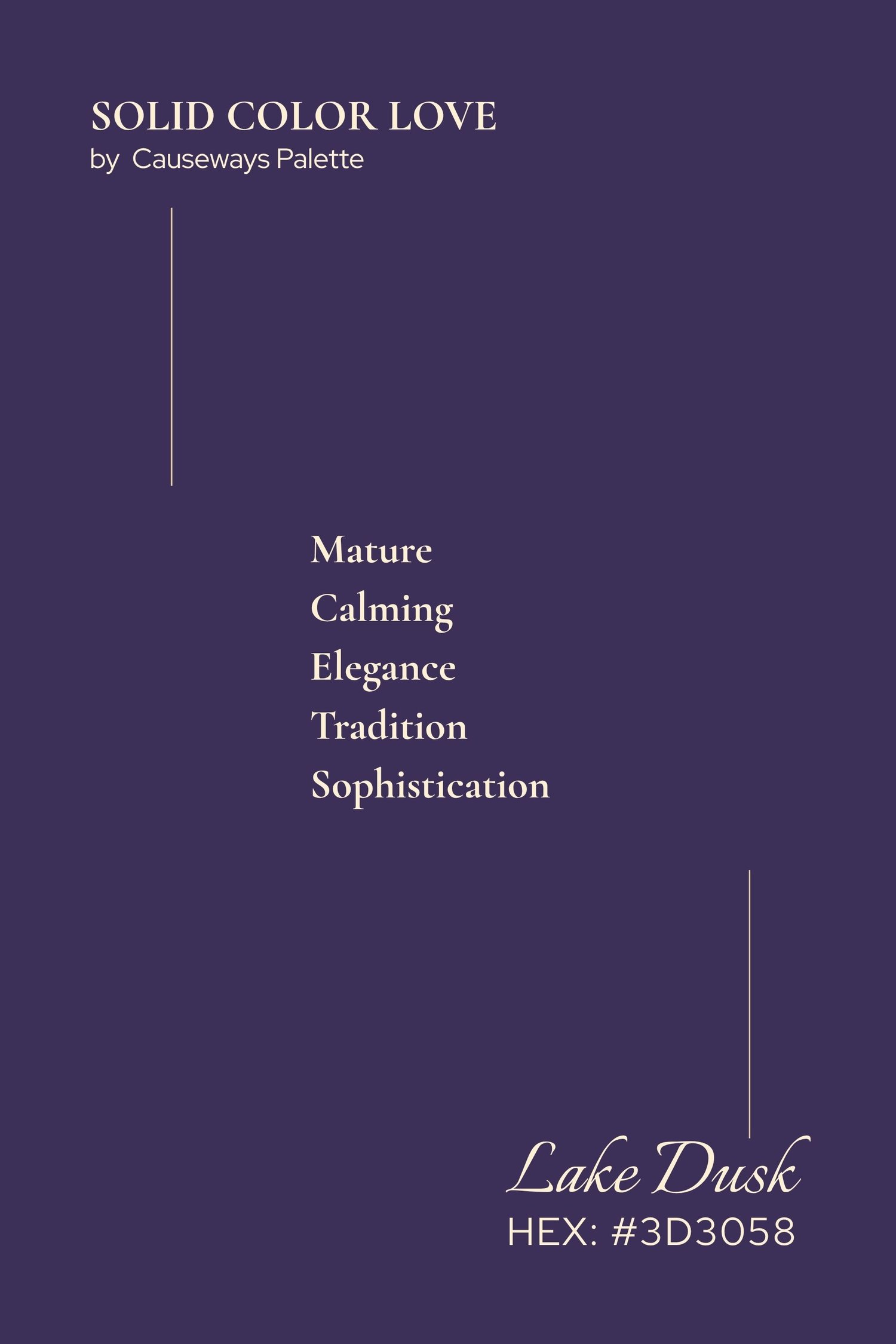
This is a palette built on contrast and quiet. The deepest tones — Vine Silhouette and Lake Dusk — do the anchoring work. They are the sky going dark, the tree line disappearing, the moment just before stars. Without them, the warmth in the lighter tones would have nowhere to land.
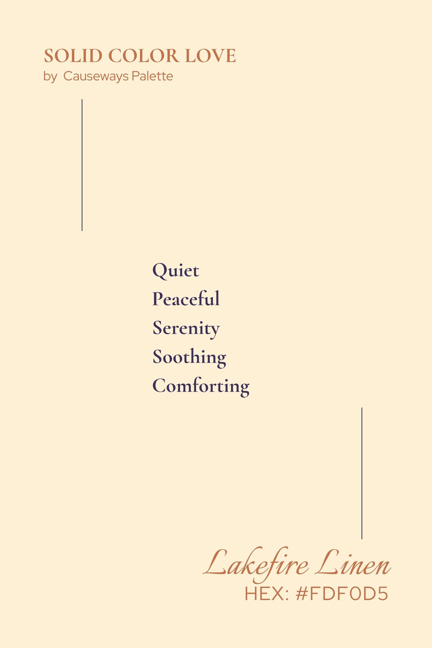
Lakefire Linen sits at the center and does something important — it gives the eye a place to rest. In a room, it becomes a wall color that makes everything around it feel considered. In a design, it becomes the breath between the darks and the golds. In a coloring page, it is the light source you build everything else around.
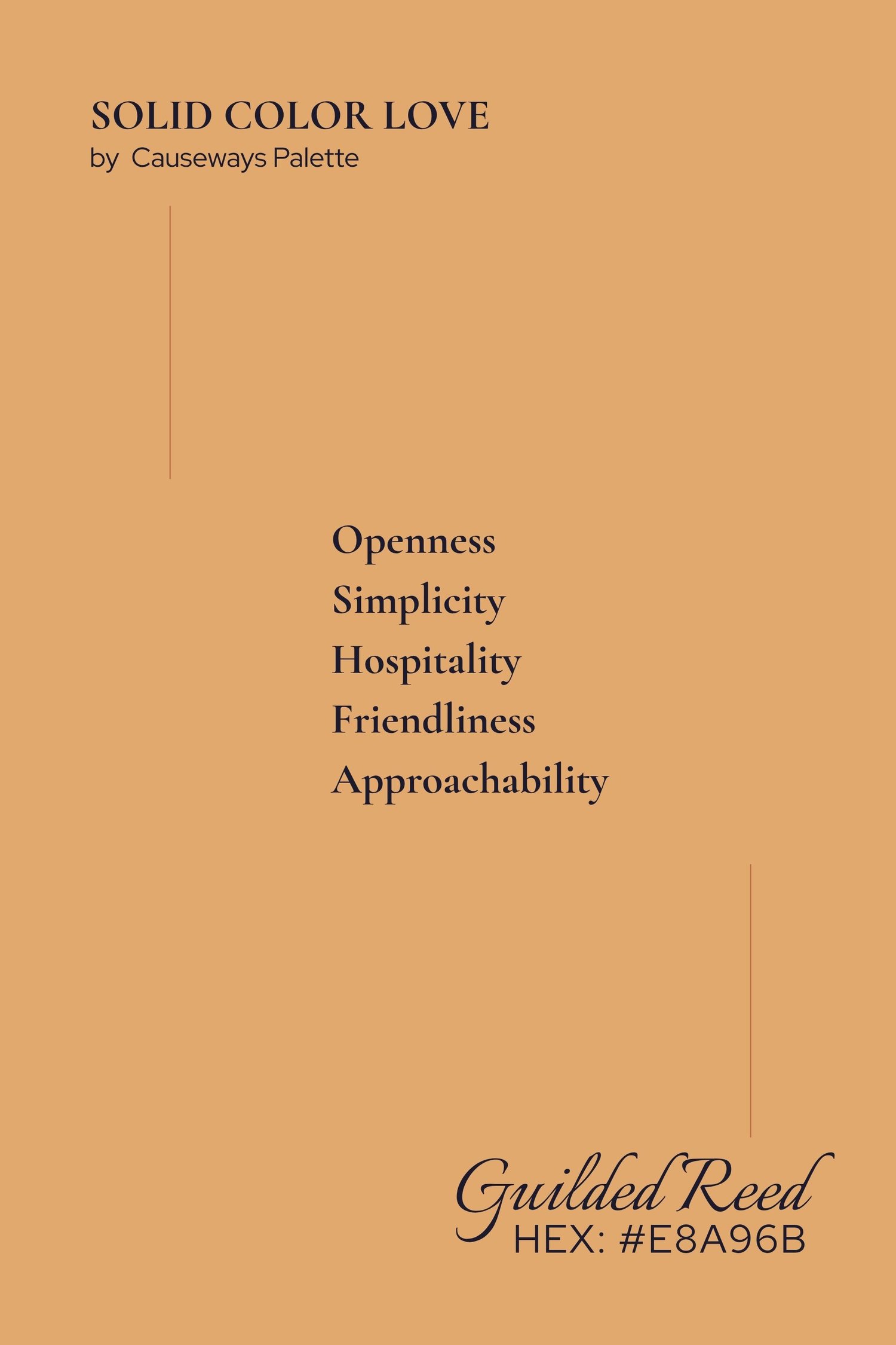
Shoreline Haze and Gilded Reed are the middle warmth — the colors of the water itself in that last hour, shifting from pale gold to something deeper and more amber. They move well together and work equally well apart.
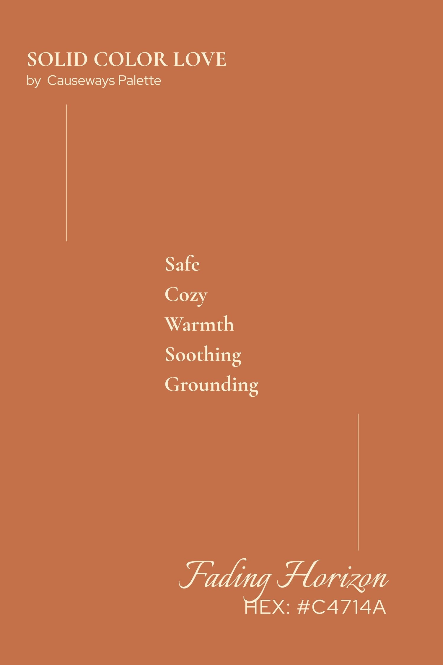
Fading Horizon closes the palette at its warmest point. It is the color that pulls the whole study toward the earth, toward the shore, toward something grounded. Used as an accent, it brings the entire palette alive.
This palette is for the people who noticed that hour.
Who looked up from whatever they were doing and felt something shift. Who didn't reach for their phone fast enough, or did — and found that the photograph never quite captured it anyway.
Color does what photographs sometimes can't. It carries the feeling without trying to replicate the image. Last Night, Northshore is not a picture of a sunset. It is the emotional truth of one — distilled into six colors that you can live in, design with, color through, or simply keep.
Use the deep tones as your foundation. Let the creams and golds breathe. Bring in Fading Horizon when something needs to feel grounded and warm. And trust that when these colors are together, they already know what they're doing.
Where water lives, color flows.
Last Night, Northshore is part of the Causeways Palette Study collection — water-sourced color systems designed to be used, lived in, and trusted.
Comments ()