
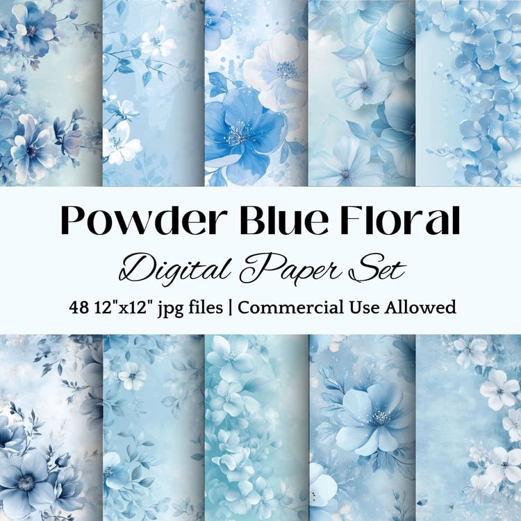
Your brand colors speak volumes before your customers read a single word. And in 2025, powder blue is having more than just a moment – it's creating a movement in the digital space, especially among spiritual and metaphysical businesses.
Why Powder Blue Is Trending Now
Powder blue brings together everything modern conscious consumers are looking for: calm, trust, and authenticity. This soft, serene shade sits at the perfect intersection of professional and approachable, making it ideal for spiritual businesses and wellness brands.
Want some examples? (Of course you do!)
Walk into any high-end spa or modern meditation studio and you'll likely spot powder blue accents. It's no coincidence – this soft, airy shade is a go-to choice for spaces designed to help people unwind. While everyone responds to colors differently, powder blue's connection to clear skies and calm waters makes it a natural fit for creating tranquil environments.
Take a scroll through your apps or a walk down any business district. Notice how many established companies incorporate blue in their branding? From Facebook to LinkedIn, Chase to American Express – blue dominates the professional landscape. Why? It taps into something deeply familiar. We see blue in nature's most constant elements: the sky above us and the oceans that shape our world.
Looking to create a productive space? While no color is a magic solution for concentration, powder blue offers a gentle presence that doesn't overwhelm the senses. It's like having a clear sky overhead – present but not demanding attention.
The Bottom Line: While personal color preferences vary wildly (and that's totally okay!), powder blue offers a versatile option that can work across industries and spaces. Whether you're rebranding your business or redesigning your home office, this timeless shade might be worth considering.
Remember: The best color choice is one that resonates with your authentic brand identity and makes both you and your audience feel at home.
How to Use Powder Blue in Your Digital Business
Website Design
The key to using powder blue effectively is balance. Use it as an accent color in your:
- Headers and subheaders
- Call-to-action buttons
- Newsletter signup forms
- Social media icons
- Background gradients for important sections
Digital Products
Powder blue works beautifully in:
- Ebook covers
- Course materials
- Meditation app interfaces
- Digital planners
- Crystal healing guides
- Workshop presentations
Social Media
Create a cohesive brand presence by incorporating powder blue into your:
- Instagram post templates
- Pinterest pins
- Facebook cover images
- YouTube thumbnails
- Story highlights
Practical Tips for Implementation
Start Small Begin by adding powder blue accents to your existing brand materials. This could be as simple as changing your newsletter subscribe button or adding a subtle powder blue overlay to your featured images.
Create Balance Pair powder blue with complementary colors like:
- Soft whites for a clean, airy feel
- Deep navy for grounding
- Rose quartz pink for spiritual alignment
- Sage green for natural harmony
Consider Your Message Powder blue communicates different meanings depending on its use:
- Lighter shades for spiritual and ethereal themes
- Medium tones for trust and reliability
- Deeper shades for wisdom and depth
When to Use Powder Blue (And When Not To)
Perfect For:
- Meditation and mindfulness content
- Crystal healing guides
- Digital planners and journals
- Spiritual course materials
- Wellness apps and interfaces
Less Suitable For:
- High-energy content
- Time-sensitive call-to-actions
- Warning messages
- Emergency notifications
Ready to Incorporate Powder Blue?
Your digital presence should evolve with current trends while staying true to your brand's spiritual essence. Powder blue offers the perfect balance of contemporary appeal and timeless wisdom.
Need help getting started? Our collection of powder blue digital templates, planners, and social media kits makes it easy to elevate your brand. Each piece is crafted with intention, combining modern design with spiritual alignment.
Remember: The most powerful branding comes from authentic alignment with your message. Powder blue isn't just a trend – it's a tool for creating deeper connections with your audience.
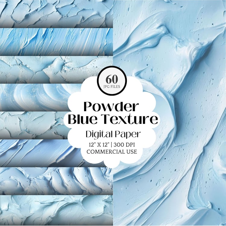
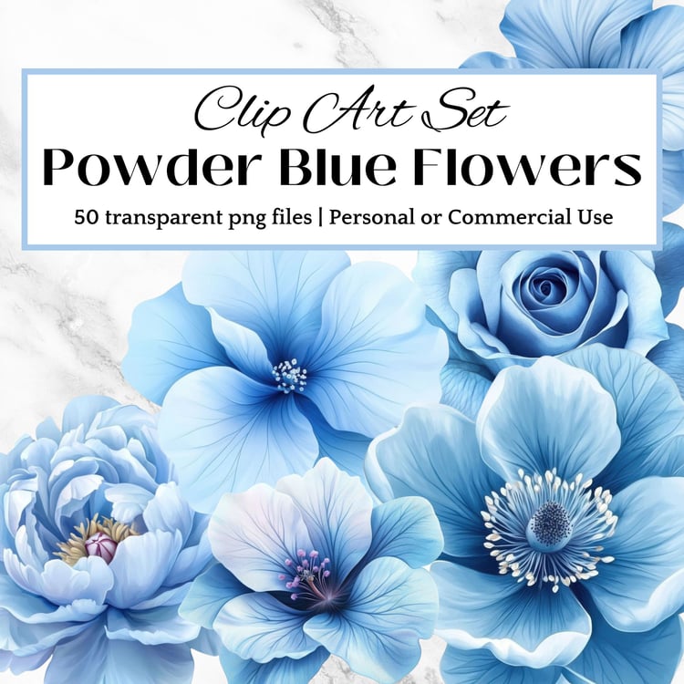
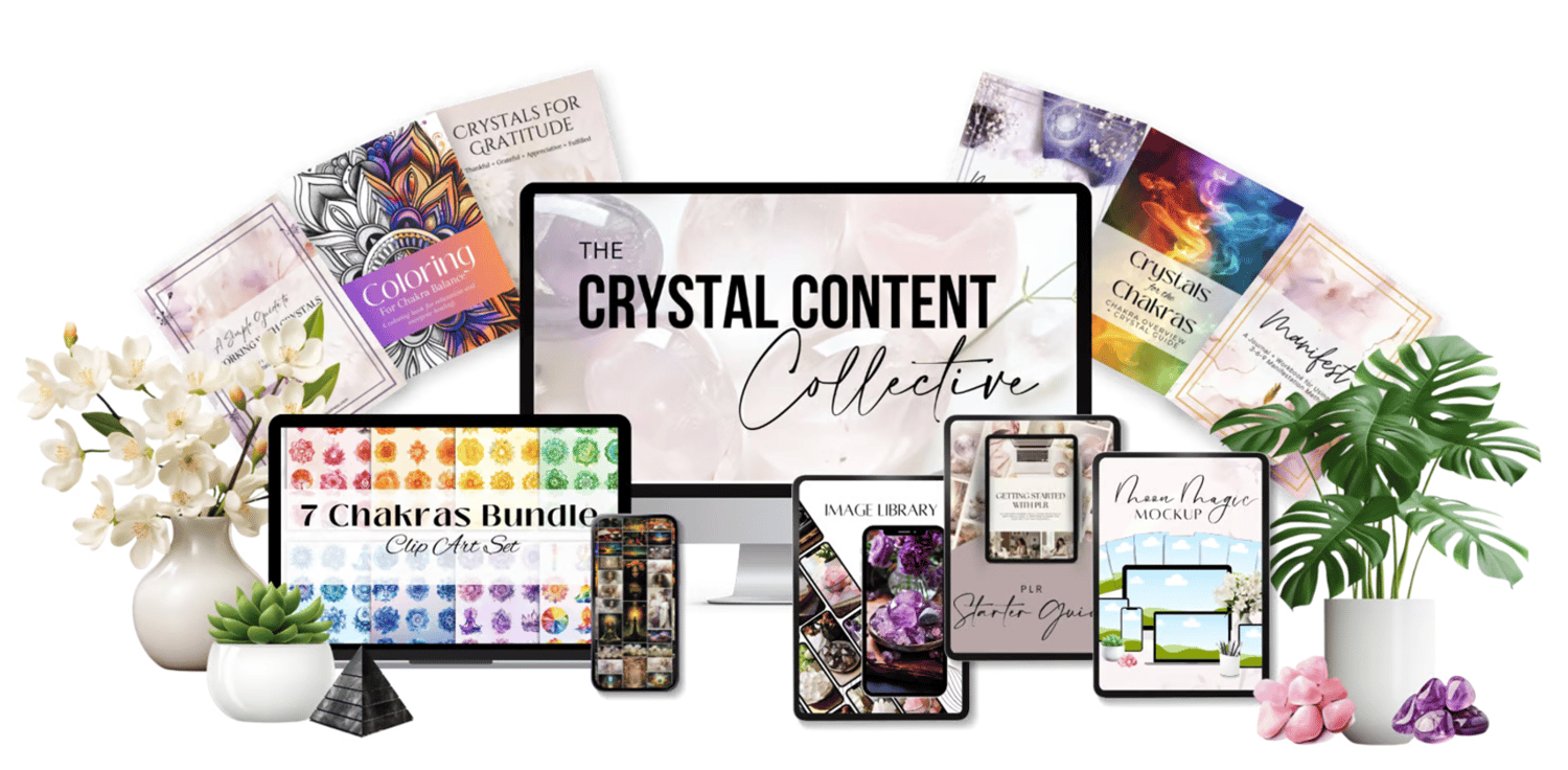
Want ALL of These Digital Paper Sets - and MORE?
Get unlimited access to all of the resources above AND so much more - including an image library with thousands of stock images - for one low price!
>> Learn More + Join The Crystal Content Collective <<
>> Learn More + Join The Crystal Content Collective <<
Comments ()