

Introduction
When I walk into a room, I usually spend a few moments looking before I set down the tripod.
I look at the ceiling lines, the direction of the flooring, the placement of the windows, and the way the furniture divides the space. I also pay attention to the adjoining rooms. A doorway may offer a useful layer of depth, or it may introduce a bright distraction that pulls attention away from the main subject.
Once the tripod is in place, moving it twelve inches can change nearly every relationship in the frame. A cabinet edge that overlapped a doorway may separate cleanly. A dining chair may stop merging with an island. The fireplace may settle into the center of the composition, or the room may gain enough asymmetry to feel more natural.
These adjustments are small on the floor and significant in the photograph.
Architectural composition develops through decisions about camera position, height, focal length, perspective, visual hierarchy, and timing. The photographer needs to understand what the room was designed to do, identify which features deserve attention, and organize those features within a two-dimensional frame.
This chapter provides a practical method for making those decisions consistently.
Continue Reading First
This chapter builds on several topics within the REPT Knowledge Base:
- Complete Guide to Real Estate Photography
- How to Photograph Interior Spaces Like a Professional
- How to Photograph Bathrooms and Difficult Spaces
- Best Lenses for Real Estate Photography
- How to Photograph Luxury Homes
- Drone Photography for Real Estate
- Twilight and Dusk Real Estate Photography
- HDR Photography Explained
- Flambient Photography Explained
- Real Estate Photography Editing Checklist
Browse the complete library:
Explore the REPT Knowledge Base
For the full capture and editing workflow:
Real Estate Photography Training Course
Table of Contents
- Composition Begins With the Purpose of the Image
- Read the Architecture Before Placing the Camera
- Choose the Camera Position
- Establish a Consistent Camera Height
- Select the Focal Length Carefully
- Control Perspective and Vertical Lines
- One-Point and Two-Point Compositions
- Create a Clear Visual Hierarchy
- Use Symmetry, Balance, and Negative Space
- Build Depth Through Layers
- Photograph Connections Between Rooms
- Refine the Edges of the Frame
- Compose Common Interior Spaces
- Compose Residential Exteriors
- Build a Coherent Property Gallery
- Use Editing to Support the Composition
- Common Composition Mistakes
- Frequently Asked Questions
Composition Begins With the Purpose of the Image
Every photograph in a real estate gallery should contribute useful information.
Some images establish the size and layout of a room. Others draw attention to craftsmanship, show the relationship between spaces, introduce the property, or create an emotional high point in the gallery.
Before choosing an angle, decide what the image needs to communicate.
A kitchen photograph might emphasize:
- The size and shape of the island
- The connection to the living room
- Custom cabinetry
- A range wall or hood
- The relationship between the kitchen and an outdoor view
Trying to communicate every feature in one frame usually creates a weak composition. The photographer backs farther into a corner, selects a wider focal length, and fills the frame with competing information.
A more deliberate gallery may use one wide image to explain the kitchen, a second angle to show its connection to the living space, and one or two detail photographs to document craftsmanship.
Each image receives a clear assignment.
Professional Tip
Before releasing the shutter, complete this sentence: “This photograph is here to show ______.” When the answer contains three or four unrelated ideas, the frame probably needs to be simplified.
Read the Architecture Before Placing the Camera
Architecture contains visual directions.
Flooring leads through the room. Beams divide the ceiling. Cabinet lines establish rhythm. Doors and windows create frames. Furniture defines circulation paths. Changes in ceiling height often indicate where one functional area ends and another begins.
Take a quick walk through the property before beginning the main sequence. Identify the spaces that carry the visual identity of the home and notice how a visitor naturally moves between them.
During this walkthrough, I look for:
- The primary axis of each room
- Strong architectural features
- Useful views into adjoining spaces
- Windows that may affect exposure
- Furniture that blocks important lines
- Reflections in glass, mirrors, and appliances
- Repeated materials or design elements
- Exterior views that contribute to the room
This survey helps establish the order of the shoot and reduces unnecessary experimentation once the tripod is set.
Identify the Main Architectural Feature
Most rooms have one feature that should receive priority.
In a living room, it may be a fireplace, a wall of windows, built-in cabinetry, or the connection to an outdoor space. In a kitchen, it may be the island, range wall, or arrangement of cabinetry. In a primary bathroom, the central feature may be a freestanding tub, shower, vanity wall, or exterior view.
The main feature does not always need to sit in the center. It does need enough visual separation and space to remain easy to understand.

Choose the Camera Position
Camera position has a greater influence on the composition than most equipment decisions.
Moving left or right changes how objects overlap. Moving forward or backward changes their relative scale. Raising or lowering the camera changes the balance between floors, furniture, walls, countertops, and ceilings.
The first position that fits the entire room is rarely the strongest one.
Start Near the Natural Viewing Position
A useful starting point is the location where a person would naturally pause and experience the room. This may be near the entrance, along a circulation path, or at the transition between two living areas.
From there, make controlled adjustments.
Move laterally and watch:
- Whether furniture begins to overlap
- Whether doorways gain or lose separation
- Whether the main feature becomes more visible
- Whether the room feels balanced
- Whether one wall grows disproportionately large
- Whether a distracting object enters the frame
Many compositions improve through a lateral movement of less than two feet.
Avoid Defaulting to the Corner
Corners provide room to place the tripod, but they can produce predictable images with exaggerated foreground walls and distant features that feel too small.
A corner composition works well when it reveals two important walls, establishes depth, or shows the relationship between several areas. It becomes less useful when the nearest wall occupies a large portion of the frame without adding information.
Try stepping away from the corner and allowing the camera to relate more directly to the room’s main axis.
Doorways Require Careful Placement
Photographing through a doorway can create a natural frame and sense of arrival. The doorway can also narrow the image, introduce large dark areas, and make the room feel distant.
When using a doorway:
- Keep the visible frame intentional.
- Check that both sides have a useful relationship.
- Avoid cutting through important furniture.
- Watch for hinges, switches, and door hardware.
- Confirm that the door itself will remain still during brackets.
A narrow strip of door frame often looks accidental. A clearly defined architectural frame feels purposeful.
Professional Tip
Move the tripod while watching the edges and overlaps rather than staring only at the center of the frame. Many composition problems develop where two objects almost touch.
Establish a Consistent Camera Height
Camera height influences the way a viewer experiences the property.
A lower camera gives more visual weight to furniture and flooring. A higher camera reveals countertops and horizontal surfaces while reducing the amount of ceiling in the frame. The appropriate height depends on the room and its features.
For many residential interiors, a camera height between approximately 40 and 50 inches provides a dependable starting range. I adjust from there according to the architecture.
Living Rooms
In a living room, place the camera near the seated or natural standing experience of the space. A position around light-switch height often provides a balanced relationship between the floor, furniture, walls, and ceiling.
Lower the camera slightly when the furniture is low or when a tall ceiling already dominates the room. Raise it when the backs of sofas block important features.
Kitchens
Kitchens often benefit from a slightly higher position because countertop surfaces and the shape of the island carry important information.
Raise the camera enough to reveal the countertop without looking sharply downward. The camera should still preserve the elevation of the cabinetry and the overall volume of the room.
Bathrooms
Vanities, tubs, and countertops may require a moderate increase in height. Mirrors introduce another concern: the camera and tripod must remain outside the reflection.
A small adjustment in height can move the camera behind a faucet, light fixture, or other architectural element.
Bedrooms
Bedrooms usually benefit from a lower position than kitchens. A camera placed too high can make the bed appear flat and reduce the sense of comfort.
Use the height to keep the mattress, headboard, windows, and ceiling in balanced proportions.
Maintain Consistency Across the Gallery
A property gallery feels more cohesive when camera height changes have an architectural reason. Frequent arbitrary changes make adjoining rooms appear disconnected.
Set a dependable default height and vary it only when a specific obstacle or feature calls for an adjustment.
Select the Focal Length Carefully
Wide-angle lenses are necessary for many interiors, especially small rooms. They also change spatial relationships near the edges of the frame.
Objects close to the camera can appear disproportionately large. Furniture near the corners may stretch. A room may seem wider while its focal feature recedes into the distance.
Use the Longest Focal Length the Space Supports
Whenever possible, move the camera back and use a slightly longer focal length. The result usually feels calmer and closer to the way the room is experienced in person.
This approach works especially well for:
- Large living rooms
- Kitchens
- Primary bedrooms
- Luxury interiors
- Builder portfolio photographs
- Architectural details
A wider focal length remains useful when physical space is limited or when the image needs to explain the relationship between several areas.
The choice should follow the purpose of the frame.
Watch the Edges
Wide lenses demand careful edge control.
Look for:
- Stretched chairs
- Elongated islands
- Oversized lamps
- Distorted doorways
- Curved cabinet lines
- Furniture entering at an awkward angle
When the edges feel unstable, move the camera, narrow the composition, or use an additional frame rather than forcing the entire room into one photograph.
Give Yourself Room for Correction
Perspective and geometry corrections may remove part of the image during editing. Adobe’s current Lightroom guidance recommends applying lens-profile corrections before Upright adjustments, and its Geometry tools may crop the visible edges as vertical and horizontal lines are corrected.
Leave modest breathing room around important features, especially near the sides and top of the frame.
Common Mistake
Selecting the widest available focal length before evaluating the room often leads to stretched furniture, oversized foreground objects, and more empty space than the composition needs.
Control Perspective and Vertical Lines
Residential architecture contains vertical references everywhere: doors, windows, cabinets, corners, columns, and wall edges.
When the camera remains level, those verticals stay parallel. Tilting upward or downward introduces convergence. The effect becomes more noticeable as the tilt increases.
Perspective-control lenses allow architectural photographers to shift the optical view while keeping the camera level. With conventional lenses, careful camera placement and moderate software correction provide a practical workflow for most real estate assignments.
Level the Tripod First
Begin with the tripod legs stable and the camera level on both axes. Use the camera’s electronic level when available, then confirm the result against several reliable architectural lines.
A house may contain walls, cabinets, or trim that are slightly out of square. Avoid using one questionable line as the only reference.
Adjust Height Before Tilting
When the frame contains too much floor, raise the camera. When it contains too much ceiling, lower it.
This adjustment preserves parallel verticals more effectively than tilting the camera.
There will be rooms where a slight tilt is unavoidable. Capture enough space around the subject to accommodate correction during editing.
Correct With Restraint
Lightroom’s Guided Upright and manual Geometry controls can straighten selected vertical and horizontal lines. Adobe also notes that perspective correction can alter aspect and crop the image, which is why the corrected photograph should be judged visually rather than by the numerical value of a slider.
Strong correction can make a room appear unnaturally tall, narrow, or stretched. Use the Aspect control or manual transformation tools when the corrected proportions no longer feel believable.
One-Point and Two-Point Compositions
Most interior photographs fall somewhere between one-point and two-point perspective.
Understanding the difference helps you choose an angle deliberately.
One-Point Perspective
A one-point composition places the camera square to a wall or architectural plane. Horizontal lines run across the frame, verticals remain upright, and depth lines move toward a central vanishing point.
This approach works well for:
- Symmetrical kitchens
- Fireplace walls
- Vanity walls
- Built-in cabinetry
- Formal dining rooms
- Balanced bedroom compositions
- Strong entry elevations
One-point compositions feel ordered and direct. Small alignment errors become more visible, so the camera needs to be placed carefully.
Check:
- Whether the camera is centered on the architectural feature
- Whether equal elements have equal spacing
- Whether the lens axis is square to the wall
- Whether furniture disrupts the symmetry
- Whether the center is architectural or merely geometric
The geometric center of a room may differ from the visual center of the composition.
Two-Point Perspective
A two-point composition views the room or feature from an angle. Horizontal lines move toward vanishing points on either side, while verticals remain upright.
This approach provides depth and often reveals the relationship between two walls or adjoining spaces.
It works well for:
- Open living areas
- Kitchens with islands
- Corner fireplaces
- Primary suites
- Outdoor living spaces
- Exterior three-quarter views
Two-point compositions tend to feel more natural and dimensional. They require careful control of near and far elements so that the foreground does not overwhelm the subject.
Create a Clear Visual Hierarchy
A viewer should be able to understand the subject of the photograph quickly.
Visual hierarchy directs attention by using size, position, brightness, contrast, color, and separation.
Establish the Primary Subject
Choose the feature that deserves the first look.
Examples include:
- A fireplace
- A kitchen island
- A freestanding tub
- A wall of windows
- A custom staircase
- A pool
- A dramatic entry
Give that subject enough space and contrast to remain clear.
Support It With Secondary Information
The rest of the frame should explain or support the primary subject.
A kitchen island may lead toward the range wall. A sofa may establish the use of the living room while leaving the fireplace visible. A doorway may reveal the dining room without competing with the kitchen.
Secondary features provide context. Their placement should avoid pulling equal attention in several directions.
Control Bright Areas
The eye tends to move toward brightness and contrast.
A small exposed window in an adjoining room can become more noticeable than an expensive architectural feature. A bright doorway at the edge of the frame may pull attention away from the center.
Use camera position, exposure blending, curtains, doors, and selective editing to control these areas.
Pay Attention to Color
A saturated object can dominate an otherwise neutral room.
This may be intentional when the object is part of the design. It may become a distraction when a brightly colored cleaning bottle, toy, towel, television screen, or exterior object enters the frame.
Review the room through the camera. Objects that feel minor in person can become visually strong inside a carefully organized composition.
Use Symmetry, Balance, and Negative Space
Symmetry is one compositional tool among many.
Some homes are designed around clear central axes. Others use asymmetry to create movement and variety. The photograph should respond to the architecture that exists.
Symmetry
Use symmetry when the room or feature has a strong center:
- Matching cabinets
- Double vanities
- Fireplace elevations
- Formal entries
- Balanced windows
- Matching nightstands
- Centered range hoods
Small errors become obvious in symmetrical frames. Confirm that the camera is square, level, and centered on the architectural feature.
Visual Balance
A balanced image can contain different elements on each side.
A large dark cabinet may balance several smaller bright windows. A fireplace on one side may be balanced by a seating group or doorway on the other.
Balance depends on visual weight rather than equal dimensions.
Negative Space
Areas of plain wall, ceiling, flooring, or sky can give the composition room to settle.
Negative space becomes useful when it separates objects, supports text placement, or reinforces the scale of the architecture.
It becomes wasteful when it occupies a large portion of the frame without supporting the subject.
Professional Tip
When a composition feels unsettled, identify the heaviest visual element in the frame. Then examine what balances it on the opposite side. The adjustment may require moving the camera rather than moving furniture.
Build Depth Through Layers
A photograph gains depth when the viewer can distinguish foreground, middle ground, and background.
Architectural photography offers natural layers through furniture, doorways, columns, counters, lighting fixtures, landscaping, and adjoining rooms.
Foreground
A foreground element can establish scale and invite the viewer into the room.
Useful foreground elements include:
- The corner of an island
- A chair or sofa edge
- A doorway
- A countertop
- Landscaping
- A porch column
The foreground should remain controlled. Large objects close to a wide lens can dominate the entire composition.
Middle Ground
The middle ground usually contains the main subject. Keep it clear enough that the viewer understands where to look.
Background
The background provides context and depth. It may include an adjoining room, exterior view, hallway, or architectural feature.
Check the background for bright distractions, clutter, open doors, visible bathrooms, reflections, and objects that merge with the subject.
Use Frames Within the Frame
Doorways, arches, beams, columns, and windows can create internal frames.
These elements work best when their edges feel intentional. A nearly symmetrical doorway or a partial arch often looks accidental. Adjust the camera until the framing relationship becomes clear.
Photograph Connections Between Rooms
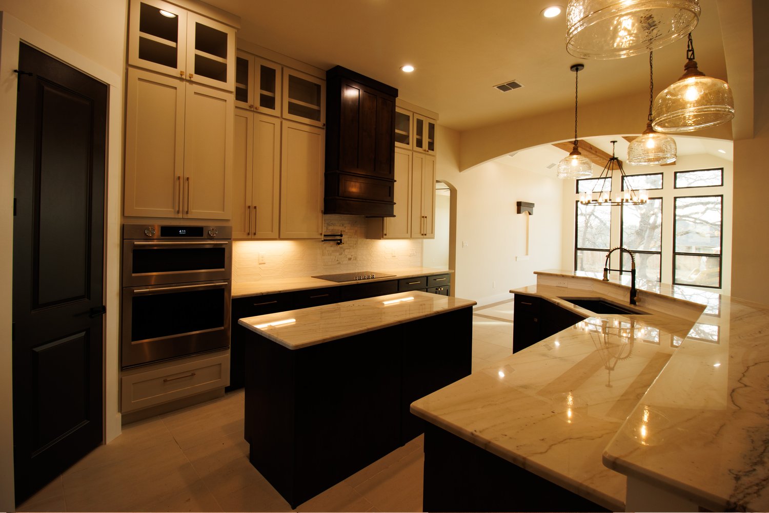
Open-plan homes require images that explain how spaces relate to one another.
A living room, kitchen, and dining area may function as one volume, but each area still needs visual identity.
Use Overlapping Views Carefully
One image can introduce the relationship between two rooms. Separate photographs can then give each room its own coverage.
For example:
- A wide view establishes the living room and kitchen.
- A kitchen-focused view explains the island and cabinetry.
- A reverse angle shows the living room and exterior connection.
- A dining view completes the shared space.
This sequence gives the viewer orientation without repeating the same frame.
Keep Transitional Areas Understandable
Doorways and hallways should lead somewhere useful. A view into another room works well when it reveals a meaningful feature or explains circulation.
A doorway showing a small section of blank wall usually adds visual noise.
Use Repeated Features
Repeated materials can tie several spaces together.
A beam, flooring pattern, stone finish, cabinet color, or ceiling detail may appear in several photographs. Include these connections when they help the gallery feel coherent.
Refine the Edges of the Frame
The center of an image receives most of the attention during capture. The edges often determine whether the composition feels finished.
Before taking the final bracket, inspect every side.
Look for:
- Partial lamps
- Cut chair legs
- Thin strips of wall
- Door handles entering the frame
- Plants touching the border
- Furniture merging with doorways
- Bright windows near a corner
- Slivers of adjoining rooms
- Reflections of the photographer
- Cabinet lines that almost meet the edge
Avoid Tangencies
A tangency occurs when two unrelated edges touch or nearly touch.
Examples include:
- A lamp aligned with a window frame
- A chair back touching the island
- A faucet merging with a cabinet handle
- A roofline touching a distant tree line
- A pendant overlapping a doorway edge
Tangencies flatten the image and make objects difficult to separate.
A small lateral movement usually solves the problem.
Decide Where to Crop Furniture
Furniture may need to enter or leave the frame.
When an object is partially shown, choose a crop that feels deliberate. Cutting through a thin part, such as a chair leg or lamp stem, tends to look awkward.
Crop through a substantial area or include the object with enough room to understand its form.
Common Mistake
A composition may appear strong at first glance while small edge conflicts make the finished photograph feel crowded. A slow border check before each final exposure prevents much of this cleanup.
Compose Common Interior Spaces
Every home is different, but several room types present recurring compositional decisions.
Living Rooms
Begin by identifying the focal feature and the main circulation path.
A living-room gallery often benefits from:
- One view that establishes the room
- One composition centered on the primary feature
- One reverse angle showing the connection to another space
- Detail photographs when craftsmanship deserves attention
Keep seating groups readable. Avoid placing sofa backs directly across important features unless the height makes the relationship clear.
Ceiling fans can interrupt otherwise clean compositions. Rotate the blades when possible so they relate more evenly to the frame.
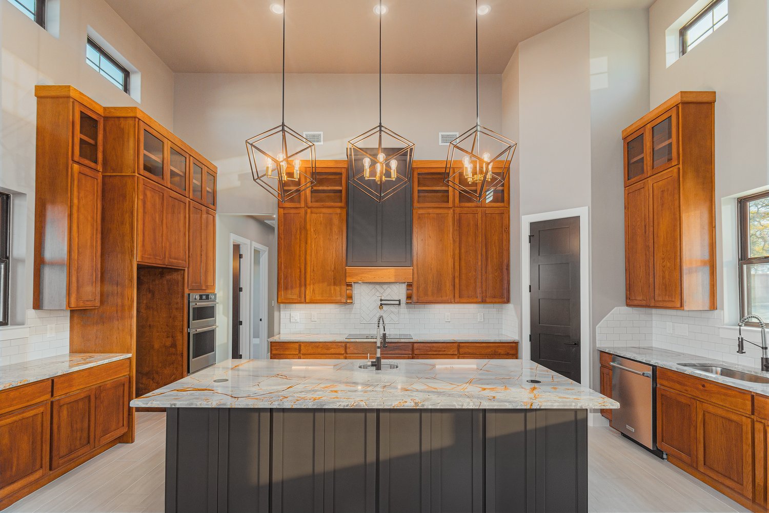
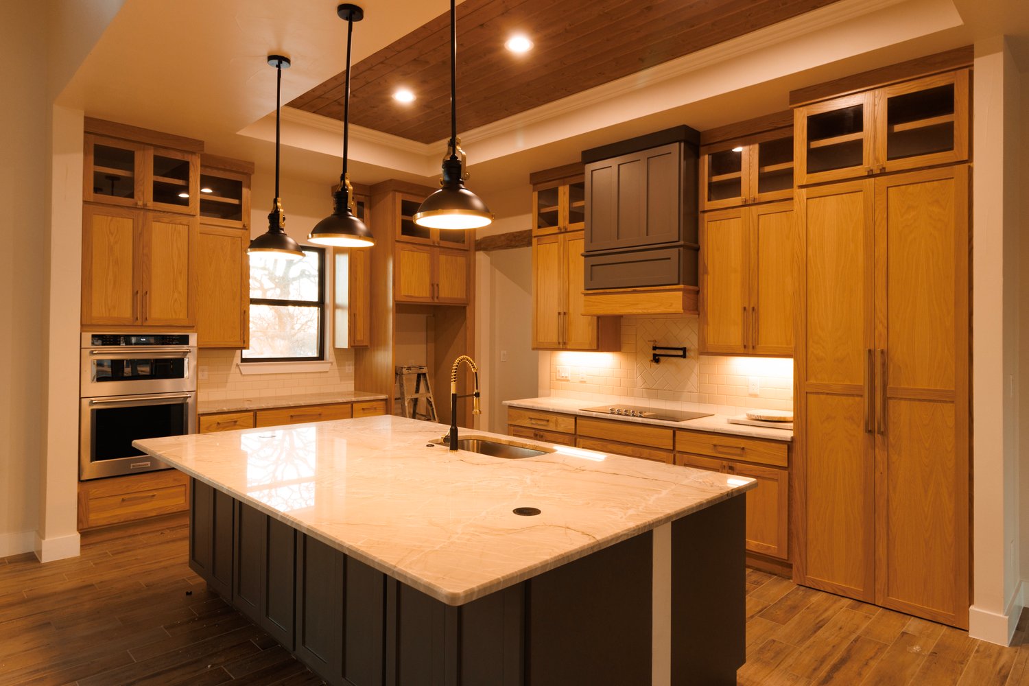
Kitchens
Kitchen compositions depend heavily on the island, cabinetry, and appliance walls.
Check that the island does not block the lower cabinets or range. Move laterally until cabinet runs remain visible and major appliances separate cleanly.
Pendant lights should fall in a deliberate rhythm. Watch for fixtures that overlap cabinet edges, doorways, and one another.
A kitchen usually needs fewer angles than photographers expect. Choose views that reveal genuinely different information.
Dining Rooms
Dining rooms often appear simple and become visually cluttered through chair legs, chandeliers, windows, and doorways.
Align the chandelier with the table rather than automatically centering it in the frame. The architectural center and furniture center may differ.
Straighten chairs and check spacing before photographing.
Bedrooms
The bed usually carries the greatest visual weight.
Position the camera so the headboard, nightstands, windows, and doorways form a stable arrangement. A square view works well for symmetrical suites. An angled view can show the relationship between the bed, sitting area, bathroom, or exterior view.
Avoid very wide focal lengths close to the foot of the bed. They can make the mattress feel unusually long and the headboard too distant.
Bathrooms
Bathrooms require close attention to reflections and overlapping fixtures.
The strongest composition may come from a doorway, shower opening, or narrow position between fixtures. Raise or lower the camera to hide its reflection behind a faucet, light fixture, or wall.
Keep toilet lids closed, align towels, remove personal items, and confirm that glass and mirrors are clean.
For more detailed coverage, link this section to How to Photograph Bathrooms and Difficult Spaces.
Hallways and Staircases
Hallways can explain circulation, but they rarely need several photographs.
Use a central axis when the architecture supports it. An offset position may work better when artwork, lighting, or a staircase creates movement.
Staircases often benefit from two views: one that shows the overall form and one that emphasizes craftsmanship or the relationship between levels.
Compose Residential Exteriors
Exterior composition follows many of the same principles as interior photography, with additional attention to landscape, sun direction, neighboring properties, and the approach to the home.
Begin With the Primary Elevation
Most residential galleries need a clear front-elevation photograph.
Walk the street or driveway before placing the tripod. Look for:
- A centered elevation
- A three-quarter view
- Landscaping that frames the house
- Driveways or walkways that create leading lines
- Trees that hide or reveal architecture
- Vehicles and neighboring homes
- The direction of the light
A frontal composition works well for symmetrical architecture. A three-quarter view adds depth and may show the entry more clearly.
Use Landscaping as Structure
Trees, shrubs, paths, and walls can frame the home and guide attention.
Avoid allowing branches to cut through rooflines or cover important windows. Moving several feet may clean up the relationship.
Control the Foreground
A large area of empty street or driveway can weaken the frame. Lowering the camera, moving forward, or adjusting the crop may improve the balance.
On acreage or luxury properties, a wider foreground can contribute to the sense of arrival when it includes meaningful landscaping, a drive, gates, or architectural walls.
Watch Neighboring Properties
Move laterally to reduce the visibility of nearby homes, vehicles, utility equipment, and trash containers.
The objective is to present the subject property clearly while maintaining an accurate representation of its setting.
Create a Daylight and Twilight Pair
When twilight coverage is included, capture a daylight view from the same or a closely related position.
The pair gives clients flexible marketing options and creates a strong sequence in the gallery.
For advanced exterior coverage, link this section to Twilight and Dusk Real Estate Photography and Drone Photography for Real Estate.
Professional Tip
The strongest exterior position is often found by walking across the property while looking back at the home. Starting with the camera already on the tripod can encourage you to settle too quickly.
Build a Coherent Property Gallery
A collection of individually strong photographs can still feel disorganized when the sequence lacks direction.
The gallery should help the viewer understand the property in a natural order.
Begin With Arrival
A practical sequence often starts with:
- Primary exterior
- Entry or secondary exterior
- Foyer
- Main living spaces
- Kitchen and dining
- Primary suite
- Secondary rooms
- Outdoor living
- Aerials
- Twilight hero images
The exact sequence will vary according to the home.
Avoid Repetition
Two photographs may use different camera positions while communicating the same information.
Compare each frame with the photographs before and after it. Remove images that do not add a new room, feature, relationship, or visual experience.
Alternate Wide and Focused Views
A sequence of only wide photographs can feel repetitive.
Use occasional medium compositions and details to slow the pace and draw attention to craftsmanship.
For luxury homes and builders, details may include:
- Cabinet joinery
- Stonework
- Hardware
- Lighting
- Tile
- Ceiling treatments
- Custom millwork
Maintain Visual Consistency
Keep camera height, white balance, perspective, contrast, and brightness coherent across adjoining spaces.
A gallery should feel like one property photographed through one visual system.
A Practical On-Site Composition Workflow
A repeatable method reduces indecision and improves consistency.
For each room:
1. Identify the primary feature
Decide what the room is designed around.
2. Determine the room’s main axis
Look for strong architectural alignment and circulation.
3. Choose one-point or two-point perspective
Select the approach that best explains the space.
4. Establish camera height
Begin at your default height and adjust for furniture, counters, reflections, or ceiling proportions.
5. Select the focal length
Use enough width to explain the room while preserving believable proportions.
6. Refine overlaps
Move left, right, forward, or backward until major objects separate cleanly.
7. Check the background
Close distracting doors, remove clutter, and control bright openings.
8. Check every edge
Look for accidental crops, slivers, reflections, and tangencies.
9. Capture the bracket or flash sequence
Keep the tripod stable throughout the exposure set.
10. Review at full size
Confirm focus, sharpness, exposure, and alignment before leaving the room.
This process becomes faster with repetition. The steps begin to happen almost automatically, while the architectural reasoning remains specific to each home.
Use Editing to Support the Composition
Editing can refine a composition, although the strongest results begin with careful camera placement.
Apply Lens Corrections First
Use the appropriate lens profile before making major perspective adjustments. Adobe recommends this order because lens-profile corrections improve the analysis used by Lightroom’s Upright tools.
Correct Vertical and Horizontal Alignment
Use reliable architectural lines as guides. Confirm the image visually after correction.
Some homes contain walls, cabinetry, or trim that are slightly out of square. A correction based on one imperfect line can make the rest of the room feel tilted.
Refine the Crop
Cropping can remove distractions, improve balance, and strengthen the visual hierarchy.
Preserve enough space around doors, windows, furniture, and architectural features. Tight crops can make a room feel constrained and limit how clients use the image.
Control Brightness and Contrast
Use local adjustments to prevent windows, doorways, screens, and light fixtures from pulling unnecessary attention.
Keep the primary subject easy to find.
Remove Minor Distractions Carefully
Temporary objects such as cords, small cleaning items, sensor spots, and isolated floor marks may be appropriate to remove.
Permanent architectural conditions and material features should be represented accurately. Discuss any substantial alteration with the client.
Review the Gallery Together
Compare adjoining rooms and repeated features.
Check:
- Perspective
- Camera height
- Color
- Window treatment
- Brightness
- Crop
- Export dimensions
The final review should consider the sequence rather than evaluating every image in isolation.
For the complete post-production process, continue with Real Estate Photography Editing Checklist, HDR Photography Explained, and Flambient Photography Explained.
Common Mistake
Heavy perspective correction can solve converging lines while creating unnatural room proportions. Leave enough space during capture and judge the corrected architecture by eye.
Common Composition Mistakes
Photographing From the First Available Position
The first angle may explain the room, but a small movement often produces cleaner separation and better balance.
Using the Widest Lens for Every Interior
Excessive width stretches edge objects and reduces the visual importance of features farther from the camera.
Showing Too Much
A frame containing several rooms, large areas of ceiling, and every piece of furniture can become difficult to read.
Treating Every Room the Same
Kitchens, bedrooms, bathrooms, living areas, and staircases require different camera heights and visual priorities.
Ignoring the Edges
Partial objects, bright openings, reflections, and near-tangencies make otherwise strong compositions feel unfinished.
Centering Without a Reason
Some architecture supports symmetry. Other rooms become static or awkward when forced into a centered composition.
Leaving Vertical Correction Entirely to Editing
Severe tilt reduces usable image area and can alter the apparent proportions of the room.
Repeating Similar Angles
Small changes in position do not always create a useful additional photograph.
Photographing Furniture Instead of Architecture
Furniture supports the scale and use of the room. Architectural features and spatial relationships should remain clear.
Forgetting the Gallery Sequence
Each photograph needs to contribute to the viewer’s understanding of the complete property.
Frequently Asked Questions
What camera height should I use for real estate photography?
A height between approximately 40 and 50 inches provides a useful starting point for many residential interiors. Kitchens may require a slightly higher position to reveal countertops, while bedrooms and low furniture may benefit from a lower camera. Adjust according to the architecture and maintain consistency throughout the gallery.
Should vertical lines always be perfectly straight?
Verticals should generally appear parallel in professional residential and architectural photography. Minor exceptions may occur when a deliberate viewpoint or physical limitation requires a slight tilt. Strong software correction should still preserve believable proportions.
Should I photograph from the corner of every room?
Corners are useful when they reveal important relationships and provide enough working distance. Offset and square-on positions often create cleaner, more specific compositions.
What focal length is best for interiors?
The best focal length depends on room size, camera format, and the purpose of the image. Use the longest focal length that allows you to communicate the space clearly. Very wide focal lengths should be used carefully around furniture and architectural features near the edges.
How many angles should I photograph in each room?
Most rooms need one or two strong views. Large kitchens, open living areas, luxury primary suites, and architecturally significant rooms may need more. Each additional image should communicate new information.
Is symmetry better than an angled composition?
Symmetry works well when the architecture has a clear central axis. Angled compositions provide depth and are useful for showing relationships between adjoining spaces. Choose the approach that responds naturally to the room.
How do I make a small room feel larger?
Use a clear camera position, remove visual clutter, select an appropriate wide focal length, and avoid oversized foreground objects. Showing a useful doorway or adjoining space can add depth. Preserve realistic proportions.
How do I avoid stretched furniture near the edges?
Move farther back when possible, use a longer focal length, and keep important furniture away from the extreme corners. Correct lens distortion with the appropriate profile during editing.
Should I move furniture for composition?
Small adjustments are often appropriate. Straighten chairs, align stools, refine pillows, open curtains consistently, and remove small distractions. Significant rearrangement should be coordinated with the homeowner, agent, builder, or stylist.
How can I improve composition quickly on location?
Slow down before setting the tripod. Identify the purpose of the photograph, main feature, room axis, camera height, and major overlaps. A repeatable pre-exposure check produces faster improvement than capturing many uncertain angles.
Recommended Course Lessons
The following REPT course lessons support the techniques in this chapter.
Episode 2 — Equipment and Software
Review tripod setup, wide-angle lens selection, file formats, and the equipment used to maintain consistent capture.
Episode 3 — Exterior Photography Workflow
Apply camera-position, sun-direction, elevation, and architectural-framing principles to front elevations, three-quarter views, landscaping, and exterior sequences.
Episode 4 — Interior Photography Workflow
Study room coverage, tripod placement, camera height, focal length, interior preparation, and the relationships between adjoining spaces.
Episodes 5–8 — Editing Workflow
Use the Camera Raw, HDR, Photoshop, blending, perspective-correction, color, and final-refinement workflows to complete the compositions captured on location.
Access the full course:
Real Estate Photography Training Course
Continue Your Training
Explore the REPT Knowledge Base
Continue through the connected equipment, capture, editing, business, and premium-service chapters:
Visit Real Estate Photography Training
Explore training information, educational resources, and future course updates:
Real Estate Photography Training
Complete the Course
Learn the full capture and editing process from equipment setup through final delivery:
Real Estate Photography Training Course
Follow Malachi on Instagram
View completed properties, composition examples, editing work, and behind-the-scenes content:
Instagram — @malachikg_rephoto
Related Articles
- Complete Guide to Real Estate Photography
- How to Photograph Interior Spaces Like a Professional
- How to Photograph Bathrooms and Difficult Spaces
- Best Lenses for Real Estate Photography
- HDR Photography Explained
- Flambient Photography Explained
- Real Estate Photography Editing Checklist
- How to Photograph Luxury Homes
- Twilight and Dusk Real Estate Photography
- Drone Photography for Real Estate
- Building a Real Estate Photography Portfolio That Gets Clients
Comments ()