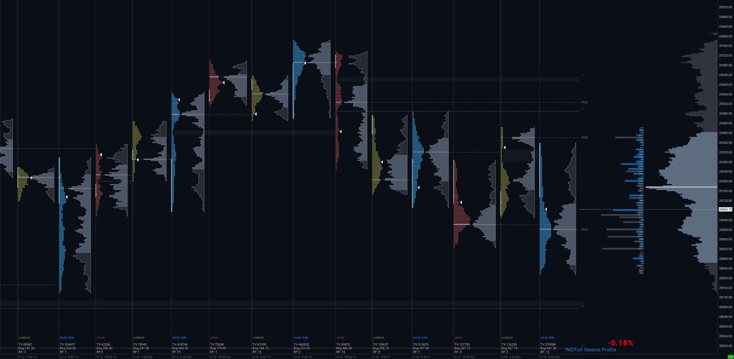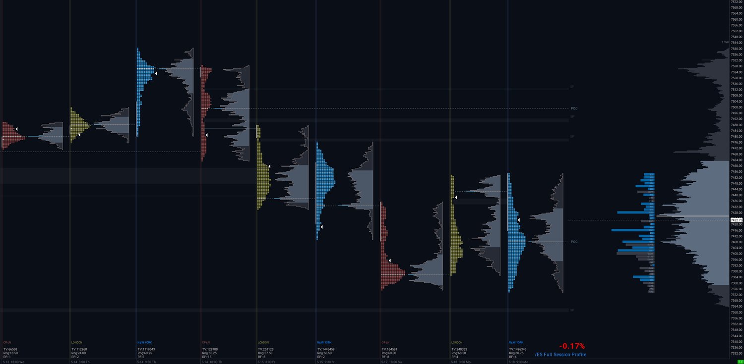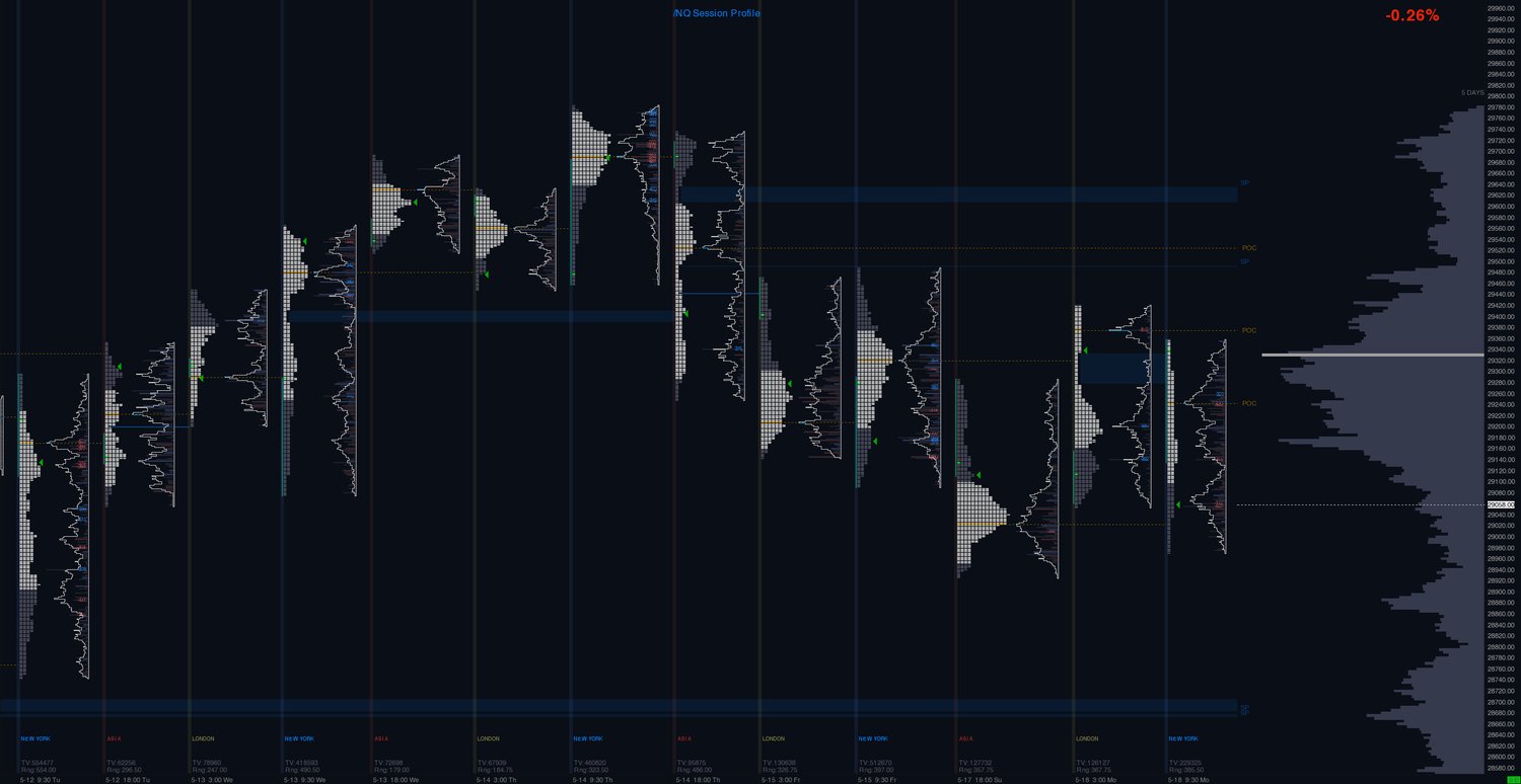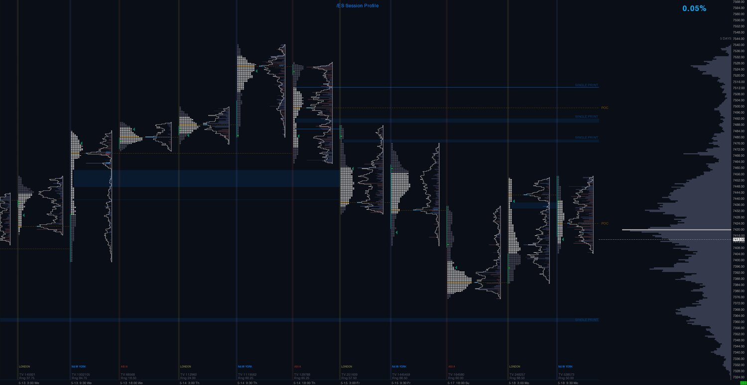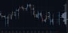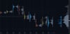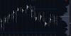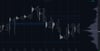
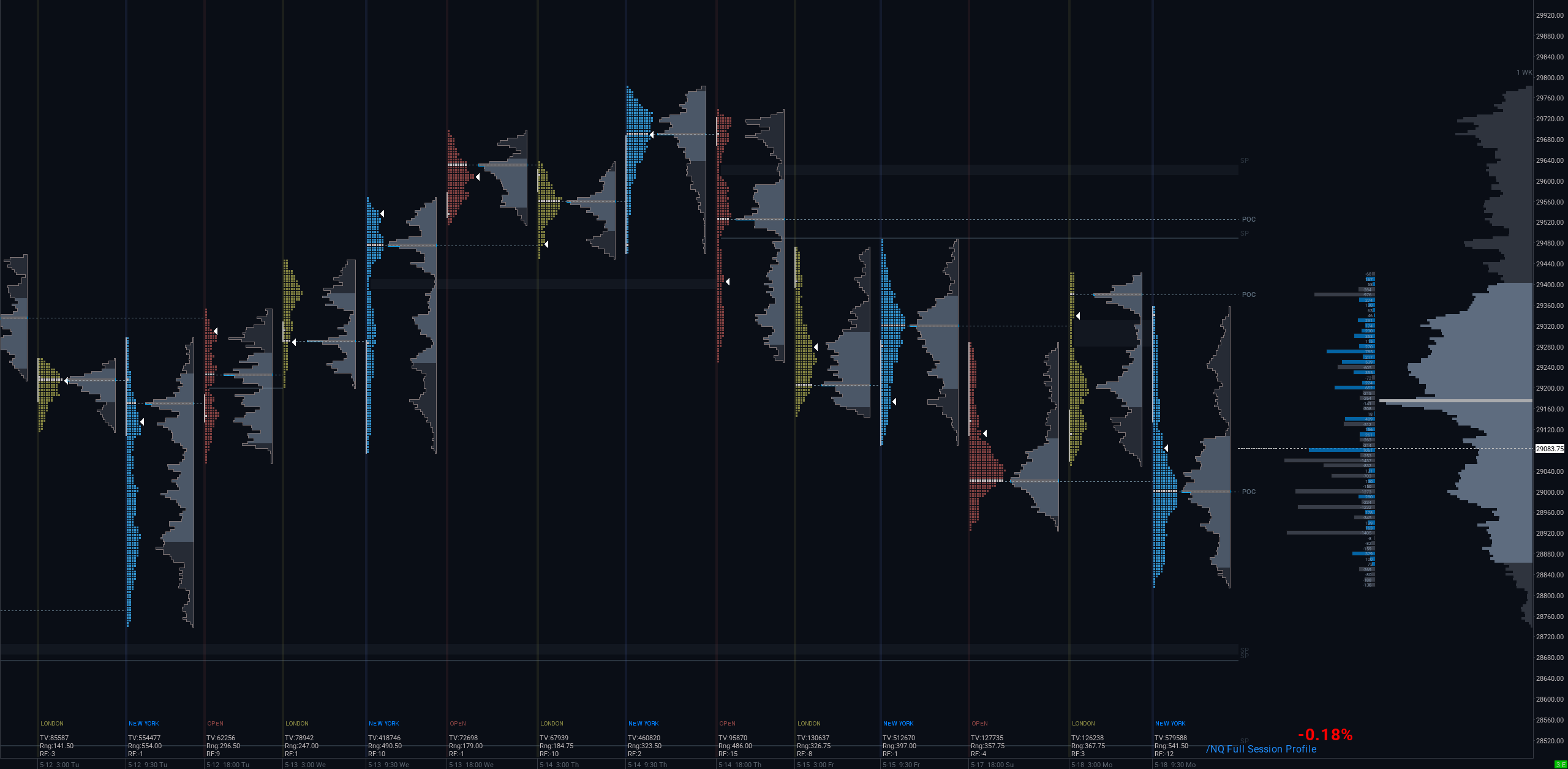
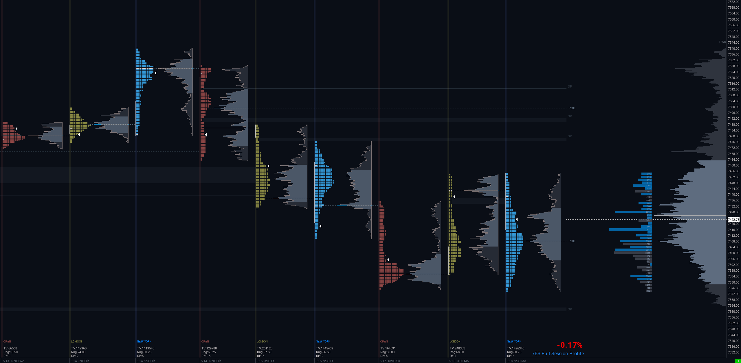
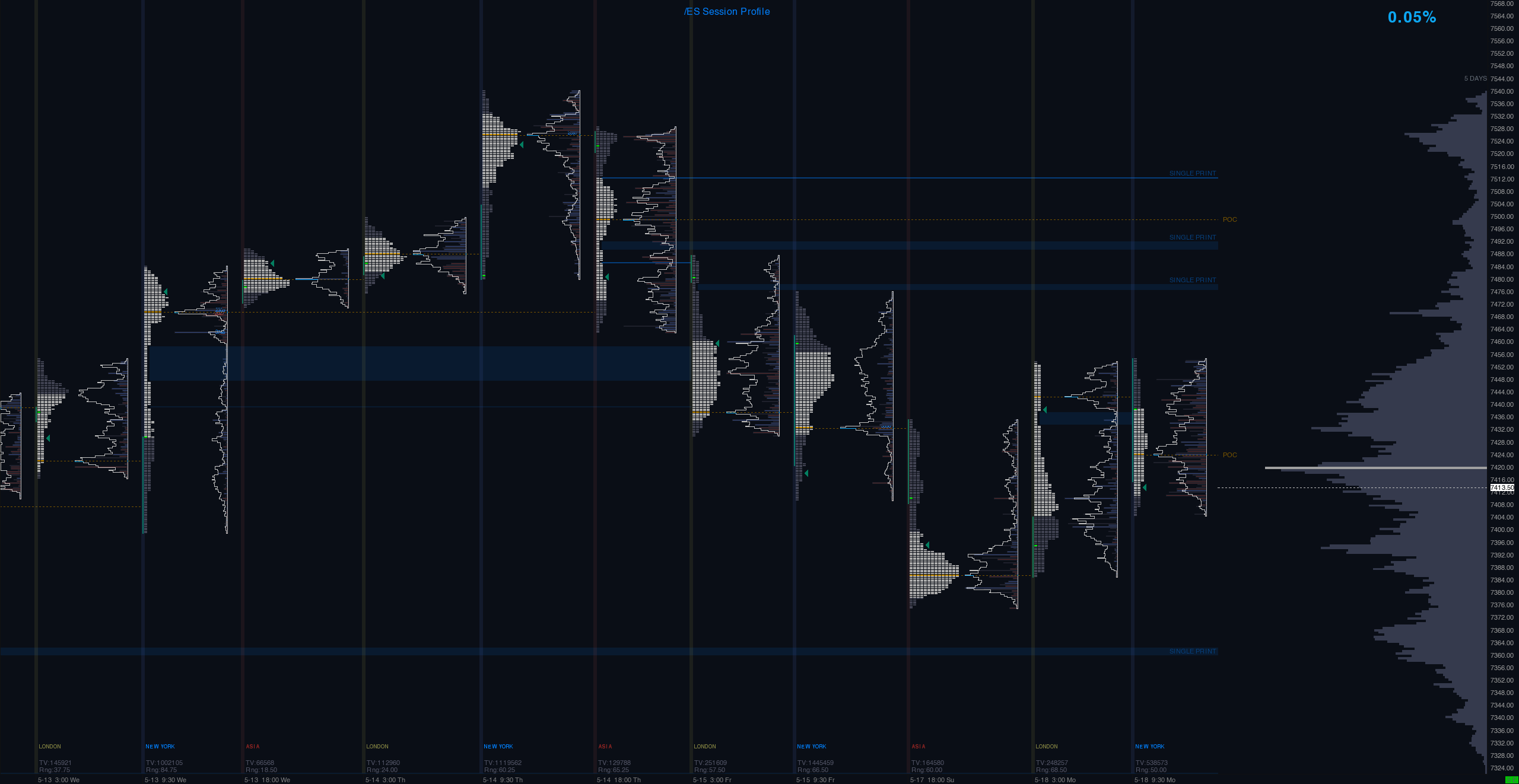
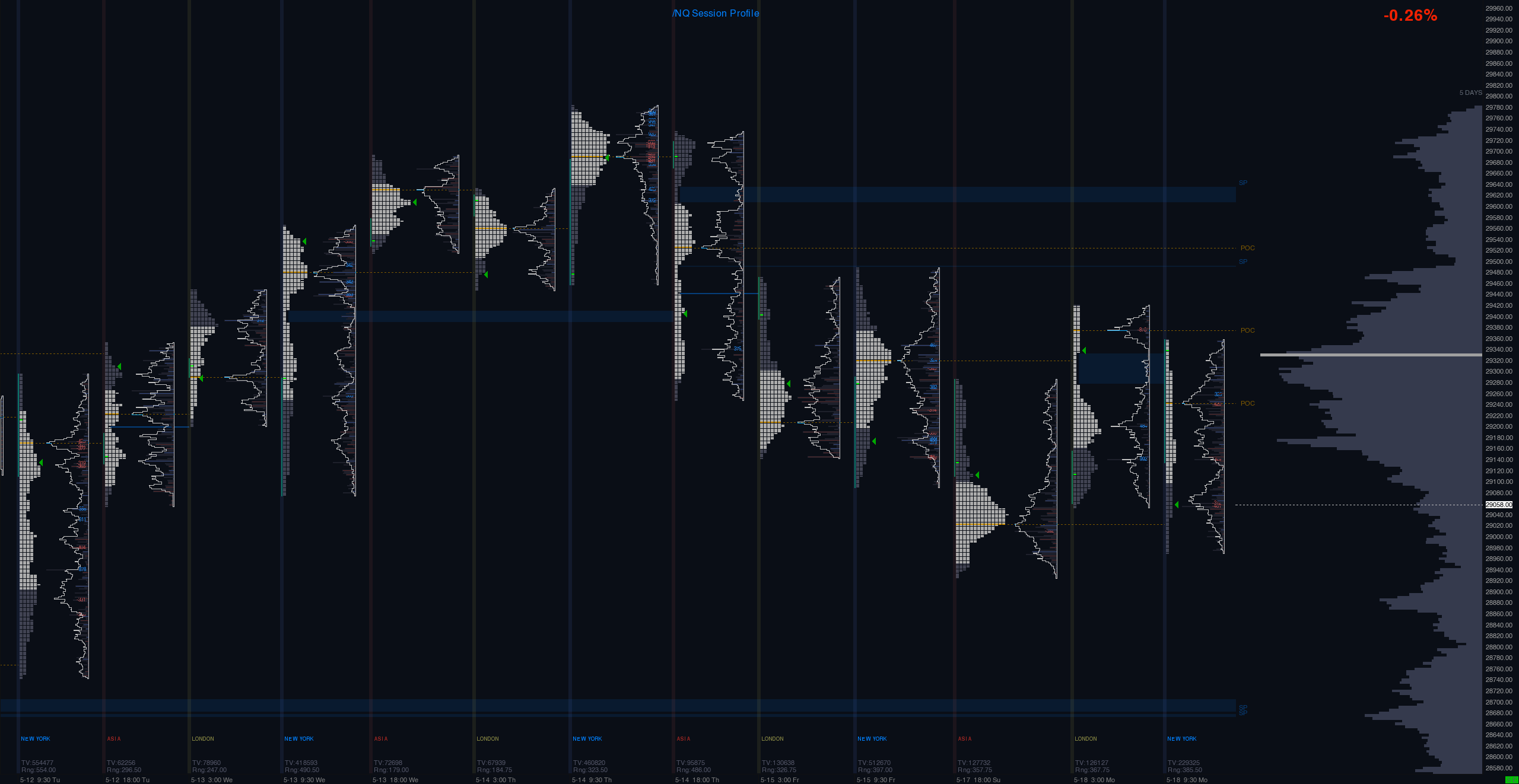

See the Market Like a Pro with Session TPO Chart.
This chart clearly marks all the key levels for you:
Session Profiles: You get a separate sessions for the Asia, London, and New York. This shows you how the market's plan changed during the day.
Point of Control (POC): This is the longest line in each session. It's the single most popular price that was traded, showing you where the market found the most "fair" value.
Value Area (VA): These areas show you the "comfort zone" where about 70% of all trading happened. This helps you avoid low-action areas.
Single Prints: These are "gaps" where the price moved very fast. Traders watch these spots closely because the price often comes back to test them.
Large Volume Profile: The big grey chart on the right adds up all the sessions. It gives you the "big picture" of the most and least traded prices overall.
*2 VERSIONS - updated the first one.