

Introduction
Color is a powerful tool in design, capable of evoking emotions, shaping perceptions, and influencing behavior. Understanding the principles of color psychology can greatly enhance your design choices and help you create impactful visuals that resonate with your audience. In this blog post, we will delve into the fascinating world of color psychology and explore how different colors evoke specific emotions. By learning how to strategically choose colors, you can elevate your designs and effectively communicate your brand's message.
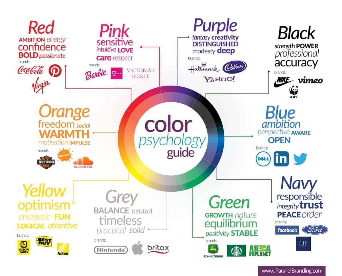
1. The Basics of Color Psychology
Color psychology is the study of how colors affect human emotions and behaviors. Different colors have unique psychological associations and can evoke specific feelings and responses. For example, warm colors like red and orange tend to create a sense of energy and excitement, while cool colors like blue and green are often associated with calmness and serenity.
Understanding these basic associations is essential for leveraging color in your designs.
2. Cultural and Contextual Influences
It's important to consider cultural and contextual influences when working with color. Colors can have different meanings and associations across cultures. For instance, in Western cultures, white is often associated with purity and weddings, while in some Eastern cultures, it symbolizes mourning. Additionally, cultural context and personal experiences can shape individual perceptions of color. Consider your target audience and the cultural context in which your design will be seen to ensure your color choices are appropriate and effective.
3. Creating Emotional Connections
Colors have the power to evoke specific emotions and create emotional connections with your audience. For example, blue can convey trust, reliability, and professionalism, making it suitable for financial institutions or healthcare brands. On the other hand, vibrant and energetic colors like yellow and orange can be used to grab attention and create a sense of excitement. Consider the emotions you want to evoke and choose colors that align with your brand's personality and message.
4. Color Harmonies and Combinations
In design, color harmonies and combinations play a vital role in creating visual appeal and conveying specific moods. Color harmonies refer to combinations of colors that work well together, such as complementary colors (opposite on the color wheel) or analogous colors(adjacent on the color wheel). Experiment with different harmonies to achieve the desired visual impact and ensure a cohesive design.
5. Contrast and Hierarchy
Contrast is essential for creating visual interest and guiding the viewer's attention. By using contrasting colors, you can highlight important elements and create a sense of hierarchy within your design. Consider using contrasting colors for headlines, calls to action, or key information to make them stand out and draw the viewer's focus.
6. Branding and Color Associations
Color plays a critical role in branding and brand recognition. Many successful brands have leveraged color psychology to establish strong associations with their products or services. For example, the vibrant red of Coca-Cola or the iconic yellow of McDonald's evoke instant recognition and create a sense of familiarity. When designing your brand's visual identity, consider how colors can support and reinforce your brand message and values.
Conclusion
Color psychology is a fascinating aspect of design that can greatly impact the effectiveness of your visuals. By understanding the emotional associations of different colors, considering cultural influences, and strategically choosing color harmonies and combinations, you can create designs that resonate with your audience on a deeper level. Experiment with colors, be mindful of your brand's personality, and use color strategically to enhance the visual impact of your designs. Embrace the power of color psychology and unlock its potential to create compelling and engaging visuals.

Comments ()