

Hey everyone, welcome back to this little creative corner ! Today I’m bringing you something I’ve been genuinely excited about: a real, unfiltered test of the Ohuhu Kaala markers.
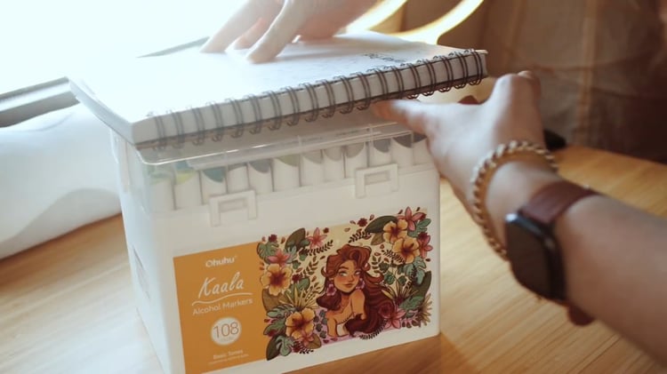
If you’ve been following me for a while, you know my natural medium is digital illustration in Procreate. But lately, I’ve been going back to my roots enjoying the feel of paper and that therapeutic quality that only traditional art can give. For this, Ohuhu sent me a 108-color set from the Kaala series, along with their Fine Line drawing pens and their famous bleedproof sketchbook (I totally adore it ❤️).
Since it’s currently autumn in my Tales of the Shire playthrough (yes, the Lord of the Rings game I’m absolutely obsessed with), I decided to illustrate my character using a purely autumnal palette. Perfect excuse, right?
You can see the full process video here!
First Step: Inking and battling against my impatience
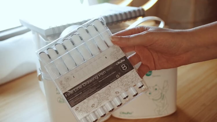
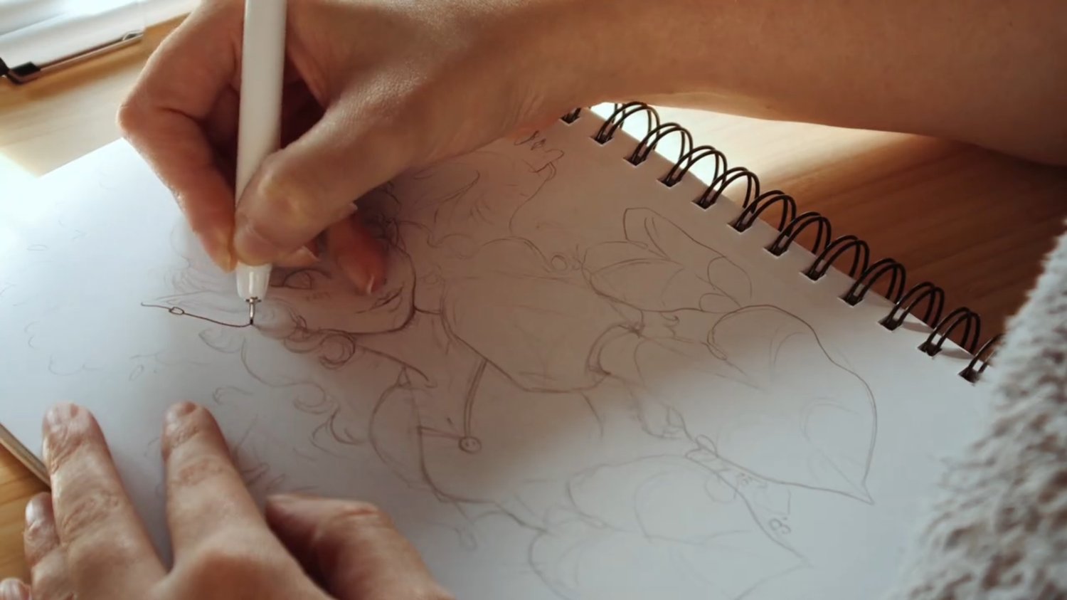
This time I started this drawing differently from I usually do: working on the line art first. Normally in digital I work over a sketch and define things with paint, but I wanted to put the Fine Line drawing pens to the test. They come in a pack of 8 nib sizes, which is a dream because it keeps the line from looking flat and boring.
✨ But here’s my first tip from a self-confessed impatient person: even though they dry fast, if there’s a heavy concentration of black ink, wait. I didn’t wait at all and ended up with a couple of small smudges. Give it 5 to 10 minutes before you start painting on top, and you’ll avoid any drama.
First Impressions
The first thing you notice when you pick up a Kaala is its design. Unlike the Honolulu (round and glossy), the Kaala are:
- Matte and oval-shaped: They have a very ergonomic feel that genuinely comes across as premium in the hand.
- Practical: The color code is printed both on the barrel and on the cap. It sounds like a small thing, but when you’re deep in a drawing, it’s so much easier to just glance at the marker than to keep spinning it to read the cap.
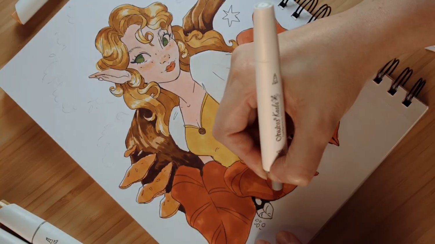
The Tip
The Kaala come with two tips: a fine/hard tip and a slim broad tip. I’ll be completely honest with you here:
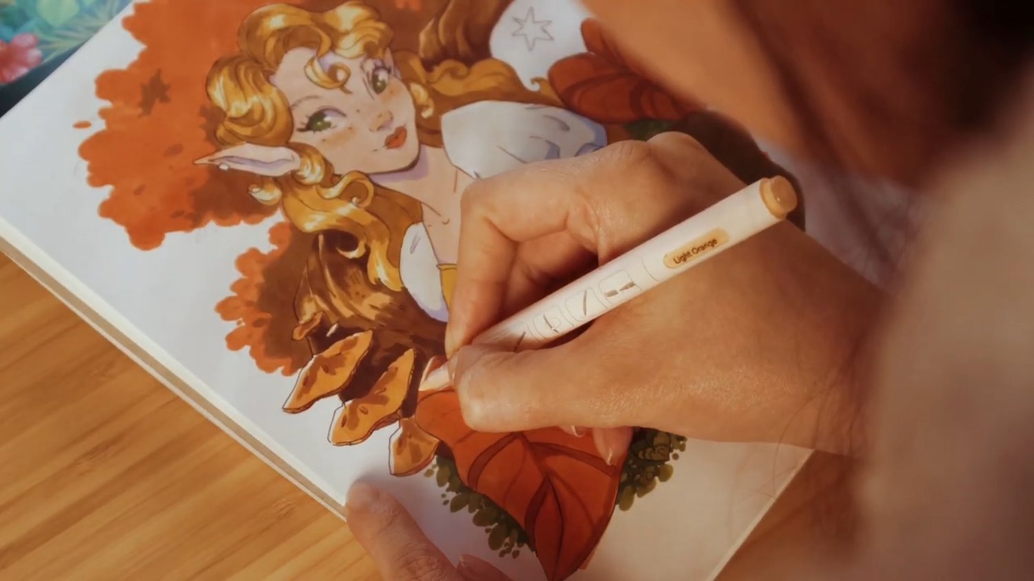
- Total control: The fine tip gives you a lot of precision. I was worried it might leave patches or brushstroke marks, but the result has been really smooth and even.
- The broad tip: I mainly used it for larger areas, though I’ll admit it’s not my favourite. It’s noticeably more chisel-shaped than the broad tip on the Honolulu, which makes it very geometrically precise, but for me, it loses some of that natural, fluid feel. If you want to fill areas cleanly and neatly, it does the job perfectly; if you’re after expressiveness and flow, that’s where it starts to fall short.
✨ My preference: If I had to choose, I’m still on team brush-tip (the Honolulu) for painting large surfaces. But that’s purely personal taste. For detail work and precision, the Kaala fine tip is unbeatable.
Blending
One thing I want to clarify first: I don’t use the colorless blender (which comes included in the set) for gradients. My technique is more direct. I apply the first color and, while the area is still wet, I continue painting with the next color on top. The alcohol ink reactivates with the heat and moisture of the new marker, and the colors blend together very naturally along the transition zone. The Kaala respond really well to this. The ink flows and blends without any resistance.
The colorless blender is equally useful if you prefer more controlled gradients or want to soften edges once a color has dried. Everyone finds their method, so the important thing here is to experiment.
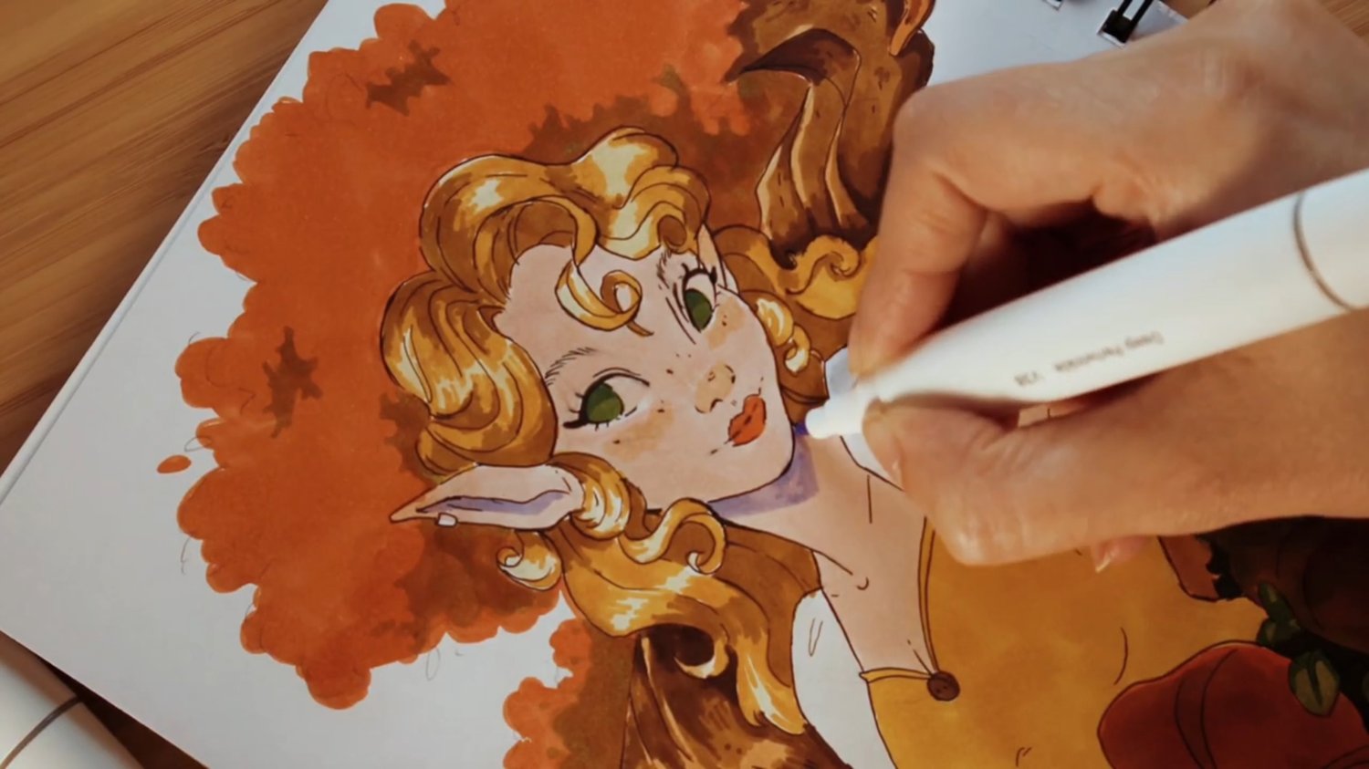
The Paper
I used Ohuhu’s bleedproof sketchbook. I love it because the ink spreads beautifully and doesn’t bleed through, so you can use both sides of the page.
✨ Pro tip: Don’t panic if lighter colors (like skin tones) look slightly grayish when you first apply them. That’s not the marker, it’s the paper’s inner gray layer, which is what prevents bleed-through. Just be patient. Once it dries, the color is vibrant and true to what you see in the cap, so you only need to trust the process (it's hard sometimes, I know lol)
The set also includes a protective plastic sheet to place under your paper while you work, in case you’re working on a not bleedproof paper to protect the next sheet or your desk. A small detail, but a thoughtful one.
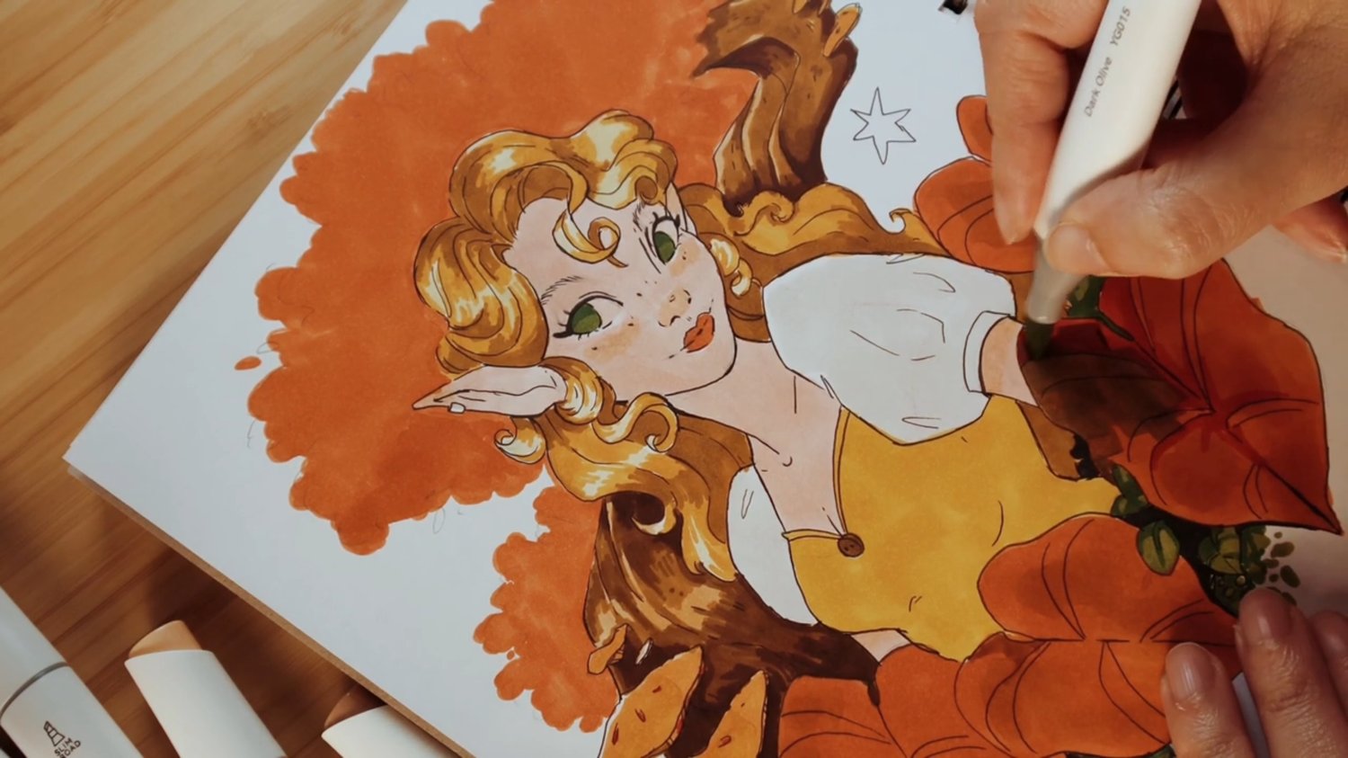
The Improvised Tree Trunk and the Leaf Disaster
In this drawing, I decided to go with the flow. The tree trunk was completely improvised, no references, and I love the texture the Kaala left on it. The leaves, though... let’s talk about those. I have to confess I don’t draw many leaves in my day a day and this time, I over-experimented here. I ended up satturating the orange and the reds way too much, and it ended up looking like a shapeless blob. How did I fix it? (or at least, make it look not that bad?)
- I painted some orange leaves with green, just to break up the monotony.
- The master trick: lilac shadows. I used the same lilac I’d used for the skin shadows on the tree canopy too. Lilac over orange works like magic. It adds a depth that brown just couldn’t achieve. Orange and lilac are part of the same triadic harmony, and so far, the lilac blue component is complementary for the orange.. So, just try it and see!
The Finishing Touch
To get that effect I usually have in my digital work, I like to finish with a little “sparkle”:
- Acrylic markers: The fine tips markers are perfect for highlights in the eyes and light dots on clothing.
- Colored pencils: I use these at the end to soften skin transitions and add small details that sometimes get lost with alcohol markers.
Kaala vs. Honolulu: Which One Is for You?
If I had to sum up the difference between the two lines in one sentence: the Kaala are more technical, the Honolulu are more artistic.
The brush tip on the Honolulu gives you a gestural freedom that’s hard to match. They are ideal for organic gradients and a more expressive painting style. The Kaala, in the other side, with their fine tip, shine in control, detail, and precision. In the end, I can't say that one isn’t better than the other, they just suit different ways of working.
- Choose the Kaala if… you come from technical drawing or detailed linework, you love precision and control, or you’re looking for a wide palette at a reasonable price.
- Choose the Honolulu if… you prefer a more gestural, expressive painting style, or you work a lot with organic gradients, or if you prefer to paint large surfaces smoother.
Are They Worth It?
If you’re looking for control, an elegant design the Ohuhu Kaala are an excellent choice. With 108 colors, 1 colorless blender, and a canvas carry case included, the €81.95 pack is a solid offer for anyone wanting to try alcohol markers for the first time or expand their collection.
For me, it’s been a real pleasure to step out of my digital comfort zone and get a little ink on my hands. At the end of the day, it’s all about enjoying the process and using art as therapy.
Have you ever tried shading oranges with lilac? Or are you more of a brown-shadows person?
Tell me your tricks in the comments!
This post is an honest review based on my real testing experience.
View the product: Ohuhu Kaala 108 Colors
Comments ()