

Typography is more than just picking the right font—spacing plays a crucial role in making text look professional, balanced, and easy to read. Three essential concepts every designer should understand are kerning, leading, and tracking. These elements influence how your typography feels and functions.
In this guide, we'll explain what each term means, how they differ, and when to use them.
🔠 What Is Kerning?
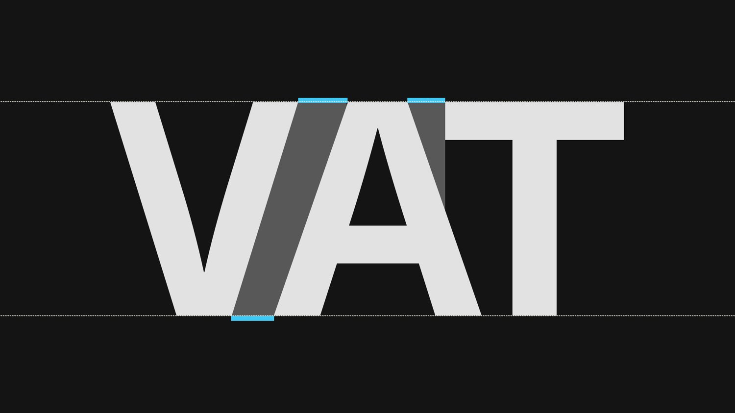
Kerning refers to the adjustment of space between individual characters. It’s often used to make specific letter pairs look more visually balanced.
Example:
- The space between “A” and “V” often appears too wide by default and needs manual adjustment.
Use kerning when:
- Designing logos or large headlines
- Adjusting letter pairs that feel awkward or unbalanced
Tools: Most design software, like Adobe Illustrator and Figma, allows manual kerning.
↕️ What Is Leading?
Leading (pronounced “ledding”) refers to the vertical space between lines of text. It gets its name from the strips of lead used in traditional typesetting.
Good leading improves readability by preventing text from feeling cramped.
Best practices:
- For body text, use 120–150% of the font size (e.g., 16px font = 19–24px leading)
- Avoid lines that are too tight or too far apart
Use leading when:
- Designing paragraphs and articles
- Formatting lists and quotes
↔️ What Is Tracking?
Tracking refers to the overall spacing between characters across a word or block of text—unlike kerning, which focuses on specific pairs.
Adjust tracking to:
- Improve readability
- Create a specific aesthetic (tight for compact designs, wide for luxury or modern looks)
Use tracking when:
- Styling all caps headlines
- Creating branded typographic treatments
✍️ Summary of Differences
Feature Kerning Leading Tracking Affects Space between letter pairs Space between lines of text Space across all characters Used for Logo, headlines, visual balance Paragraph spacing, readability Aesthetic consistency, tone Scope Selective (per character pair)Vertical (line to line)Uniform (entire word or block)
✅ Final Tips
- Always preview your typography on real content, not just sample text.
- Combine all three spacing techniques for a professional-looking design.
- Be subtle—small adjustments often make the biggest difference.
Typography is both a science and an art. Mastering kerning, leading, and tracking gives you more control over your message, making your designs not just beautiful but also readable and effective.