

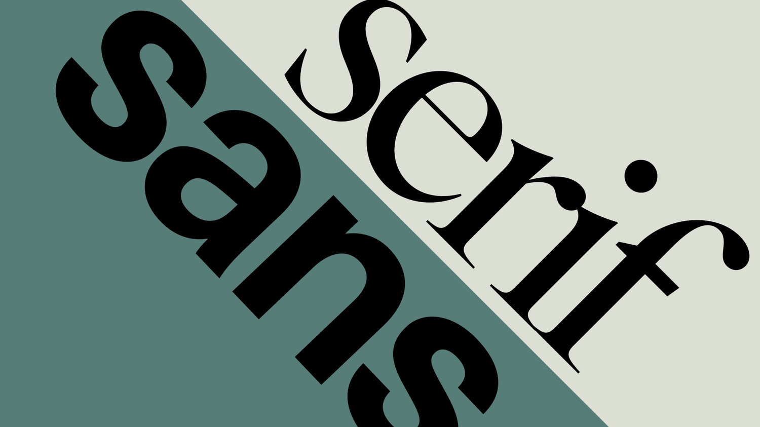
Typography is a cornerstone of visual communication. Whether you’re designing a logo, a website, or social media content, the fonts you choose help define your brand’s voice. Two of the most common and important font categories are serif and sans serif. But what exactly sets them apart—and when should you use each one?
Let’s break down the key differences, use cases, and how to decide which is best for your project.
🔤 What Is a Serif Font?
A serif font features small decorative lines or strokes (called “serifs”) at the ends of the letters. These little flourishes give the text a traditional, formal, and elegant appearance.
Examples: Times New Roman, Garamond, Georgia
Key characteristics:
- Classic and timeless
- Associated with print media
- Enhances readability in long-form printed text
Best used for:
- Editorials and books
- Luxury branding
- Legal or academic documents
🔤 What Is a Sans Serif Font?
A sans serif font is a typeface that does not have serifs—hence the name “sans” (French for “without”). Sans serif fonts look clean, modern, and more minimal.
Examples: Helvetica, Arial, Montserrat, Open Sans
Key characteristics:
- Simple and modern
- Great for screens and digital content
- More readable at small sizes on mobile devices
Best used for:
- Websites and mobile apps
- Startups and tech brands
- Presentations and UI/UX design
🧠 Serif vs Sans Serif: Visual & Emotional Differences
FeatureSerif FontsSans Serif FontsAppearanceElegant, classicClean, modernReadability (print)HighModerateReadability (screen)ModerateHighEmotional toneTrustworthy, professionalFriendly, straightforwardCommon associationsTradition, authorityInnovation, simplicity
🎯 When to Use Serif Fonts
Use serif fonts when you want to convey:
- Authority and credibility
- Sophistication and luxury
- A more traditional or formal tone
Good for: Law firms, financial institutions, premium brands
🎯 When to Use Sans Serif Fonts
Use sans serif fonts when you want to convey:
- Innovation and modernity
- Simplicity and clarity
- Accessibility and friendliness
Good for: Tech companies, lifestyle blogs, creative agencies
💡 Can You Mix Serif and Sans Serif Fonts?
Absolutely! One of the most effective font pairings combines a serif and a sans serif.
Example:
- Serif for headings + sans serif for body text (or vice versa)
- This creates visual contrast and hierarchy
Tips:
- Make sure styles complement each other
- Use consistent spacing and sizing
✅ Final Thoughts
Both serif and sans serif fonts have unique strengths. Your choice should depend on your brand voice, the medium you're designing for, and your target audience.
Use serif fonts for tradition, elegance, and print clarity. Choose sans serif for digital clarity, modern aesthetics, and approachability.
And don’t be afraid to mix both—when done right, they can bring balance and professionalism to your designs.