
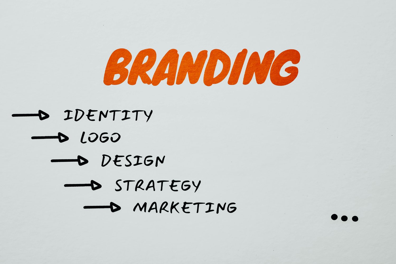
Let’s face it — building a brand isn’t just about having a good product. It’s about how your audience sees you. And one of the most overlooked tools in shaping that perception is… your font.
Many small businesses unknowingly make mistakes that weaken their visual identity — and it often starts with poor typography choices. The good news? You can fix them fast.
Here are 3 common branding mistakes, and how to avoid them:
❌ Mistake #1: Using Default or Overused Fonts
Fonts like Arial, Times New Roman, or Comic Sans might be easy to access, but they don’t give your brand any uniqueness.
Your font should reflect your brand’s personality, not feel like a Word document.
Fix it:
Invest in custom fonts that aren’t seen everywhere. Use fonts with character — ones that feel like you.
❌ Mistake #2: Inconsistent Typography Across Platforms
Your Instagram uses a trendy script. Your website uses a minimalist sans serif. Your packaging uses… something else. The result? A visually scattered brand.
Inconsistent fonts confuse customers and make your brand feel unprofessional.
Fix it:
Choose 1–2 core fonts for your brand. Use one for headlines (display font) and another for body text (legible, clean font). Keep them consistent across all platforms — from logo to social media to tags.
❌ Mistake #3: Choosing Fonts That Don’t Fit Your Audience
A luxury skincare brand using playful comic fonts? Or a streetwear brand using a calligraphy script? That’s a disconnect.
Fonts speak a language. When you use the wrong one, your message gets lost — or worse, ignored.
Fix it:
Think like your target customer.
✨ Final Thoughts:
Fonts aren't decoration — they’re brand signals. They build trust, show professionalism, and tell your story without saying a word.
At Masyafi Studio, I create fonts designed for modern branding — especially for small businesses ready to stand out.
💬 Your font is your brand’s first impression.
Make sure it’s the right one.