
Oct 5, 2026 · @Blend&Reveal
Smooth, glowing colour comes from many light layers, not from pressing harder. Have you ever finished a page and felt it looked flat or patchy, even with good pencils? The fix is almost never more expensive tools. It is how the colour goes down.
Blending is the skill that turns a filled-in shape into something that looks lit from within. It is also the skill we are named for. Every Blend & Reveal video starts with separate colours and ends with one seamless gradient. The same idea works on paper, one soft layer at a time.
In this guide you will learn:
- Which tools actually matter, and which you can skip
- The one principle behind every smooth blend
- Five blending techniques, from simple layering to solvent blending
- How to pick colours that melt into each other
- A step-by-step walkthrough on a real colouring page
- The most common mistakes, and how to rescue a page that went wrong
You do not need art training. If you can hold a pencil lightly, you can blend.
Your blending toolkit
You need two things to start: pencils and decent paper. Everything else is optional. Here is what each tool does, so you can decide what is worth buying.
Tool
What it does
Do you need it?
Wax-based pencils (e.g. Prismacolor Premier)
Soft, creamy cores that blend easily into a smooth, "buttery" finish
Yes, if you want easy blending
Oil-based pencils (e.g. Faber-Castell Polychromos)
Harder cores that hold a sharp point and layer cleanly with no wax bloom
Great for detail; either type works
Textured cardstock
Gives the pencil "tooth" to grip, so you can stack many layers
Yes, this matters more than the pencils
White or very light pencil
Softens edges and blends colours together under pressure
Helpful, and cheap
Colourless blender pencil
A pencil with binder but no pigment; it smooths layers without adding colour
Optional
Odourless mineral spirits (e.g. Gamsol) + small brush
Dissolves the binder so pigment flows like paint
Optional, for advanced pages
Kneaded eraser
Lifts colour gently to create highlights
Nice to have
Wax or oil? Wax-based pencils feel softer and blend more readily, but they can develop wax bloom: a hazy white film that rises to the surface over time. Oil-based pencils skip the bloom and stay sharp longer, but rarely reach the same creamy finish. You can mix both types on one page with no problem (The Virtual Instructor).
Paper is the hidden upgrade. Ordinary printer paper has little tooth and fills up after two or three layers. For printing colouring pages at home, artist Sarah Renae Clark recommends a Bristol vellum cardstock around 67 lb (147 gsm), which has a slight texture made for layering (Sarah Renae Clark). If you plan to use solvents, go heavier: over 300 gsm is advised so the paper does not buckle (Fine Art Tutorials). Check your printer's maximum paper weight before you buy a big pack.
The one principle: light pressure, many layers
Every smooth blend follows the same rule: build colour slowly and save heavy pressure for the very end. Look closely at paper and you will see tiny hills and valleys. That texture is the paper's tooth. Light strokes sit on the hilltops and leave room for more colour. Heavy strokes flatten the hills, and once they are flat, nothing else will stick.
Think of it as a pressure scale from 1 to 5:
- Feather (1): The pencil barely touches the paper. Use this for your first layers and for soft edges.
- Light (2): Most of your blending happens here. Colour builds but the paper grain still shows.
- Medium (3): Deepens shadows and pulls layers together.
- Firm (4): Fills the grain. Use it only in the darkest areas.
- Burnish (5): Full pressure that seals the surface. Always the final step, never the first.
Three habits follow from this rule:
- Work light to dark. It is easy to add a darker layer and almost impossible to lift one out.
- Use small circles or short, overlapping strokes. Long straight lines leave visible stripes.
- Keep a sharp point. A sharp tip reaches into the valleys of the paper and gives smoother coverage.
Five blending techniques, step by step
Start with layering and gradients; they need nothing but pencils and cover most pages. Add the other three as your confidence grows. In a 2022 test of ten blending methods across seven pencil brands, the blender pencils and sticks gave mixed results (two left flaky residue), while plain layering and burnishing needed nothing extra (Jenny's Crayon Collection).
1. Layering
The foundation of everything else. You stack thin, transparent layers so the colours mix optically on the paper.
- Lay down your lightest colour over the whole shape at feather pressure.
- Add a second, slightly darker colour where the shadow falls, overlapping the first.
- Go back over the overlap with the first colour to soften the join.
- Repeat with a third colour if you want more depth.
2. Gradient (light to dark)
A gradient is a smooth change from one colour or value to another. It is the heart of every Blend & Reveal video.
- Colour the darkest end at medium pressure.
- Ease off as you move across the shape, fading to feather pressure.
- Start your second colour at the opposite end and fade it the same way, so the two fades overlap in the middle.
- Smooth the middle with small circles at light pressure.
3. Burnishing
Burnishing means pressing hard with a light colour (or white) over your layers. It crushes the paper's tooth and melts the pigment into a smooth, almost glossy finish.
- Build at least three or four layers first. Burnishing over a single layer just looks waxy.
- Choose the lightest colour in that area, or white for a soft pastel look.
- Press firmly in small circles until the paper grain disappears.
- Treat it as the last step. Very little will stick on top afterwards.
4. Colourless blender pencil
A colourless blender is a pencil made of binder with no pigment. It pushes layers together without adding a new colour, and it works best with wax-based pencils (The Virtual Instructor).
- Layer your colours as usual.
- Run the blender over them at medium pressure, light areas first.
- Wipe the tip on scrap paper before moving to a new colour, so you do not drag dark pigment into light areas.
5. Solvent blending
A solvent such as odourless mineral spirits dissolves the binder, so the pigment spreads like watercolour. It suits oil-based pencils best and gives the smoothest result of all.
- Pour just enough solvent to cover the bottom of a small jar.
- Dip a small brush or cotton swab, then blot off the excess.
- Brush over your layers, light areas first, cleaning the brush between colours.
- Let it dry fully. You can then add more pencil on top.
Even odourless spirits should be used in a well-ventilated room (Art is Fun). Keep the jar closed and away from children, and use heavy paper so it does not wrinkle.
Choosing colours that melt together
The easiest blends use neighbours on the colour wheel. Colours that sit side by side, such as red, red-orange and orange, are called analogous colours (Wikipedia). They share pigment, so the join between them almost disappears. Colours from opposite sides of the wheel, like orange and blue, turn muddy where they overlap.
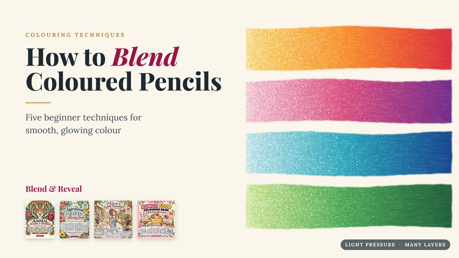
Try these three-pencil families, light to dark:
Family
Light
Middle
Dark
Great for
Sunset
Yellow
Orange
Red
Fruit, flames, warm skies
Berry
Light pink
Magenta
Purple
Frosting, flowers, jam
Ocean
Light blue
Turquoise
Deep blue
Water, sky, glass
Forest
Lime
Grass green
Dark green
Leaves, matcha, hills
Cocoa
Cream
Light brown
Dark brown
Bread, chocolate, wood
Two more tips change everything:
- Shade with a darker neighbour, not black. Black flattens colour. For a pink cupcake, shade with magenta or purple instead.
- Use temperature for light. Warm colours (yellow, orange) seem to come forward, cool colours (blue, violet) seem to recede. A warm highlight with a cool shadow instantly looks rounder.
Want to practise with real palettes? Flags are a great starting point. Many of them are built from just two or three bold colours, and blending one flag colour into the next is exactly what we do in every Blend & Reveal video.
Practice walkthrough: the Cupcake & Milk page
Let's put it all together on one real page: "Cupcake & Milk" from our Kawaii Food Colouring Book. It has a swirled cupcake with a cherry, a bottle of milk, two chocolate chip cookies and a little flower. Big, simple shapes like these are perfect for learning to blend. Before you start, pick a light source. Here, the light comes from the top left, so shadows fall on the bottom right of every shape.
- Frosting (Berry family + gradient). Cover each swirl in light pink at feather pressure. Add magenta along the bottom edge of each swirl, where it tucks under the one above. Blend the join with light pink, then deepen only the deepest creases with a touch of purple.
- Cherry (Sunset family + burnishing). Leave the little highlight marks white. Layer orange, then red, then a dark red on the right side. Burnish with red to make it shine like glass.
- Wrapper (layering). Choose one colour, such as turquoise. Colour every other stripe a shade darker to make the folds look real.
- Milk bottle (Ocean family, very light). Glass is mostly the colours around it. Add light blue at feather pressure down the right edge and leave the left edge white. Colour the milk itself in pale pink for strawberry milk, shaded with light pink where the drip curves.
- Cookies (Cocoa family). Cream all over, light brown around the edges, and dark brown on the right side. Colour the chocolate chips dark brown and burnish them.
- Hearts and flower (your choice). Use them to practise a two-colour gradient, for example yellow fading into orange.
- Final pass. Burnish the brightest highlights with white, and add a soft cast shadow under the cupcake and cookies with light purple. This grounds everything on the table.
Take your time. A page like this can take two or three relaxing sessions, and that is part of the fun.
Common mistakes, and how to fix them
Most blending problems come from pressing too hard, too early. Here is how to spot and rescue the usual ones.
Problem
Why it happens
Fix
Speckled white dots show through
Pressure was too light on the final layers, or the paper is very rough
Add one more layer at medium pressure, or burnish with the lightest colour
Colour will not go on any more
The tooth is full from heavy early layers
Lift some colour with a kneaded eraser, or finish with a burnish; next time start lighter
Visible stripes or scribbles
Long, straight strokes in one direction
Go over the area with small circles in a mid colour
Muddy, greyish blend
Colours from opposite sides of the wheel were overlapped
Blend through a middle colour, or burnish a bright analogous colour on top
Hazy white film appears days later
Wax bloom from wax-based pencils
Wipe very gently with a soft tissue; a light spray of workable fixative helps prevent it
Dark colour smeared into a light area
A blender pencil or brush carried pigment over
Clean the tool between colours and always blend light areas first
Paper buckled or pilled
Too much solvent or too much erasing on thin paper
Use heavier paper and blot the brush before every stroke
Ready to practise? Pick your first page
The best way to learn blending is to try it on a page made for it. Every Blend & Reveal book is an instant printable PDF, so you can print the same page again and again until your gradients feel easy.
- Kawaii Food Colouring Book: 50 cute treats, including the Cupcake & Milk page from this guide. Big shapes, perfect for your first blends.
- Mira's Little Moments: 20 cozy everyday scenes for practising soft skin tones, fabric and warm light.
- Animal Mandala Artbook: 20 detailed animal mandalas for gradient practice on small repeating shapes.
- Inspirational Quotes Colouring Book: 20 uplifting quote pages with bold lettering to fill with colour fades.
You will find them all at payhip.com/BlendandReveal. Print a page, pick a three-pencil family, and remember: light pressure, many layers. When you finish, share it and tag @blendandreveal. We would love to see your blends.
Sources
- Oil-based vs wax-based colored pencils, The Virtual Instructor
- 10 ways to blend colored pencils with 7 different colored pencils, Jenny's Crayon Collection, 2022
- Best paper for coloring pages, Sarah Renae Clark
- Best paper for coloured pencils, Fine Art Tutorials
- Using solvents to blend colored pencils, Art is Fun
- Analogous colors, Wikipedia