
October 15 @Blend&Reveal
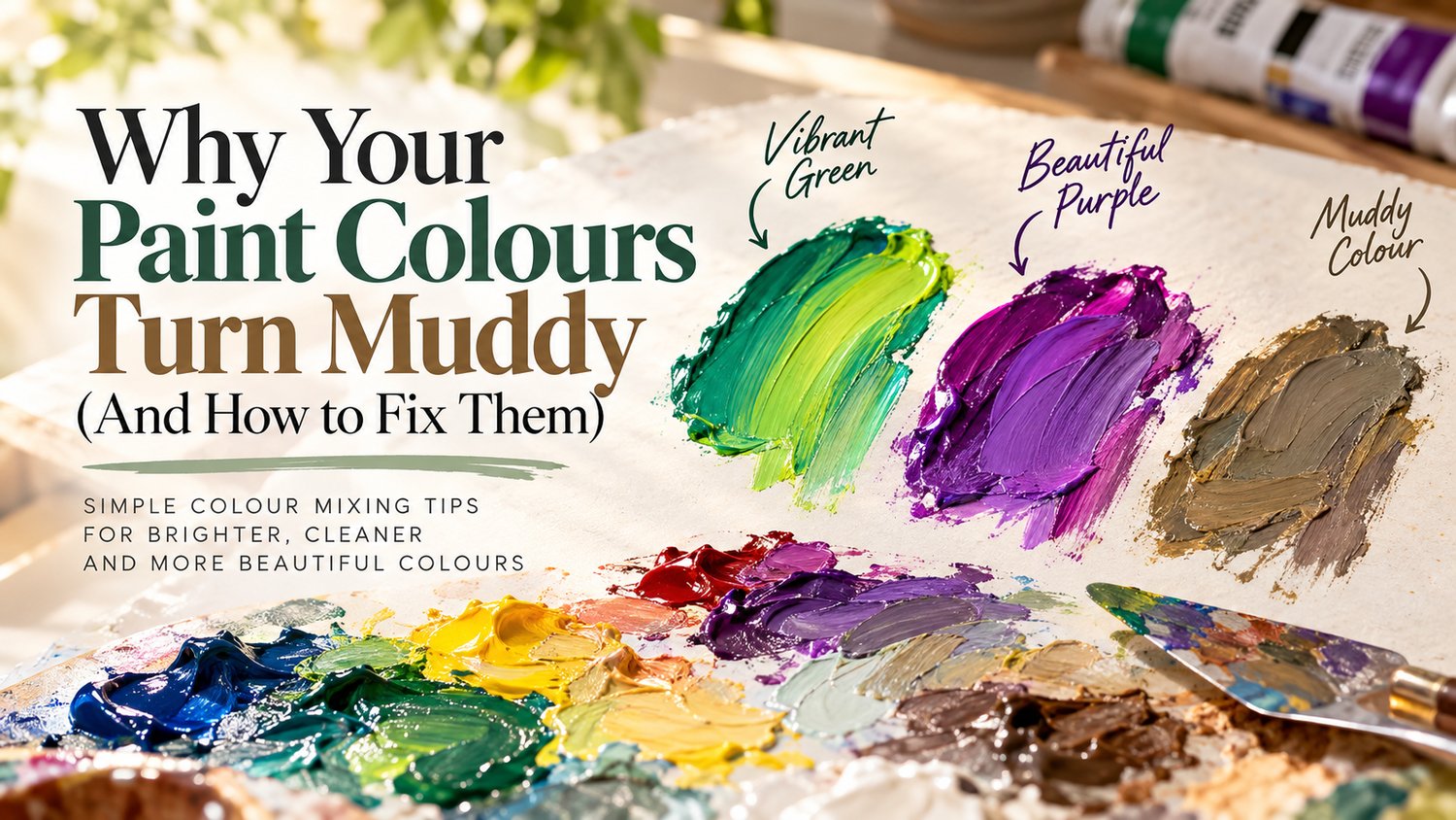
The colour mixing mistakes almost every painter makes —and the simple science that helps you avoid them.
You squeeze a beautiful yellow onto your palette. Add a little blue, expecting a fresh, vibrant green.
But instead of the bright green you imagined, you get something dull, greyish or strangely brown.
So you add more yellow. Then more blue. Perhaps a little white.
Somehow, the colour gets worse.
Sound familiar?
At Blend & Reveal, we love discovering what happens when colours come together. But one of the most useful lessons in painting is that not every mixture produces the colour you expect.
Often, muddy paint is not a sign of poor technique. It is the predictable result of how particular pigments interact. Once you understand those interactions, you can mix with greater confidence—and make better decisions about when to stop adjusting a colour.
In this guide, we'll explore why paint loses vibrancy, how to prevent unwanted muddy mixtures, and how to create beautiful muted colours on purpose.
What does “muddy colour” actually mean?
Artists often call a paint mixture muddy when it appears dull, greyish or less vivid than intended.
A useful colour-theory term here is chroma: how strong or subdued a colour appears. Imagine three greens:
- Emerald green: vivid, striking and relatively high in chroma.
- Sage green: quiet, soft and greyed.
- Olive green: earthy, muted and often yellow-leaning.
All three can be beautiful. What changes is their hue, value and chroma—not whether they count as “good” colours.
A muted colour is not a failed colour. It becomes a problem only when it isn't the colour you wanted.
1. The biggest cause: accidental colour neutralisation
On a traditional artist's colour wheel, complementary colours sit opposite each other. Familiar pairs include red and green, blue and orange, and yellow and violet.
Mixing appropriate complementary paints usually reduces the intensity of the result. Depending on the pigments and proportions, you may get a grey, brown or dark neutral.
That's useful when painting earth, foliage, rocks, skin or shadows. It is much less useful when you're trying to make a brilliant purple or luminous green.
Why red and blue don't always give you a clean purple
Compare two combinations:
- Orange-leaning red + green-leaning blue: may produce a subdued, greyed violet.
- Quinacridone Magenta + Ultramarine Blue: can produce a cleaner, more saturated violet in many paint ranges.
The actual result depends on the pigments, paint brand, medium and mixing proportions. But the principle is important: two tubes labelled “red” or “blue” can behave very differently when combined.
That difference has a name: colour bias.
2. Understanding colour bias changes everything
Colour bias means that a paint leans toward one of its neighbouring hues.
- Some reds lean toward orange, others toward violet.
- Some blues lean toward green, others toward violet.
- Some yellows lean toward orange, others toward green.
If you want a clean secondary colour, begin by testing pigments whose tendencies support that mixture. If you want an earthy neutral, other combinations may be more useful.
Try this two-green comparison
For brighter greens: Try a green-leaning yellow, such as Hansa Yellow Light, with Phthalo Blue (Green Shade). Begin with yellow and add tiny amounts of blue. Depending on the ratio, you can reach everything from vivid yellow-green to strong blue-green.
For earthy greens: Try Yellow Ochre with Ultramarine Blue. This combination often produces natural-looking muted greens suited to foliage, hills and moss.
Neither mix is automatically “better”. One might suit tropical leaves; the other, a misty landscape. Choose pigments for the result you want—not just the colour names on their labels.
3. Seven practical fixes for muddy paint
Fix 1: Start with fewer paints
When a mixture isn't right, it's tempting to keep adding colours: a little red, a touch of yellow, more blue, then black, then white. Eventually, it's difficult to know what any one addition is doing.
Start with just two colours. Mix a small test puddle. Add a third only when you understand what needs changing. Using fewer pigments often makes mixtures easier to predict and repeat.
Fix 2: Diagnose the problem before adding anything
Ask three questions:
- Is the hue wrong? Perhaps the green is too blue and needs to shift toward yellow.
- Is the value wrong? Perhaps it's too dark or too light.
- Is the chroma wrong? Perhaps it's too muted—or not muted enough.
These are different problems. Adding white to a dull green usually makes a lighter dull green, not a vibrant one. Adding black to orange may move the hue and chroma as well as darkening it.
Identify what needs to change before reaching for another tube.
Fix 3: Add powerful pigments slowly
Some paints have high tinting strength. Phthalo Blue is a classic example: even a small amount can overpower a puddle of yellow or white.
When making green, start with yellow and introduce strong blue pigments in tiny increments. Mix completely between additions. You can always add more pigment, but removing it from a mixture is much harder.
Fix 4: Clean your tools and mixing area
Sometimes the culprit is not colour theory at all. A brush carrying traces of red can contaminate green; a palette knife with leftover blue can shift a carefully prepared orange.
Wipe brushes and knives between colours, keep separate mixing areas when possible, and change dirty rinse water. With watercolour, avoid transferring residue into a clean pan.
Fix 5: Use white to lighten—not to “rescue” every colour
White can create lovely tints in acrylic, oil and gouache, but opaque white often reduces apparent colour intensity.
Mixing crimson with white makes a pink tint; it does not simply make a “brighter crimson”. In transparent watercolour, painters usually lighten a wash by adding water so more white paper shows through.
Ask whether your colour actually needs more lightness or more chroma. They're not the same thing.
Fix 6: Know when to start fresh
You cannot reliably reverse every muddy mixture by adding more paint. If several pigments have already neutralised one another, continuing to adjust them may make a larger amount of the wrong colour.
Save the subdued mixture for an earthy passage or a future study, then start a fresh puddle using more suitable pigments. Knowing when to restart is part of learning to paint efficiently.
Fix 7: Check the dried colour
Paint can change appearance as it dries. Many acrylic mixtures dry darker than they appeared when wet. Watercolour washes frequently look lighter after drying. Oil paint behaves differently depending on the materials and surface.
Test a small swatch and allow it to dry before judging a carefully mixed colour—especially if you're preparing a large area.
4. A surprising truth: muted colours make paintings feel real
Not every leaf in a forest is emerald green. You'll find olive, sage, grey-green, yellow-green and nearly brown tones, depending on light and distance.
The same is true of skin, stone, water and clouds. Natural subjects often need mixtures that are more restrained than the colours straight from the tube.
Imagine painting one tree with three greens:
- Sunlit leaves: a brighter yellow-green.
- Middle foliage: a balanced green with slightly lower chroma.
- Deep shadows: a darker, more neutral green, adjusted carefully for the light in your scene.
Even simple shapes can begin to feel three-dimensional when the values and colour relationships are considered.
Vibrant colours often look even more vibrant when surrounded by quieter colours. The aim is not to avoid muted mixtures—it is to control them.
5. A colour wheel is a guide, not an exact paint calculator
A colour wheel explains relationships between hues. But it cannot predict the exact result of every physical paint mixture.
Real paints contain pigments with different transparencies, tinting strengths and spectral characteristics. Two manufacturers may use different pigment formulations even when the paint names sound similar.
That's why experienced painters also look at pigment codes, such as PB29 (commonly Ultramarine Blue), PB15:3 (a green-shade Phthalo Blue) or PV19 (used in many quinacridone paints).
The colour wheel helps you choose a direction. Your own paints tell you what happens next.
6. Try this 15-minute colour mixing experiment
You don't need a big paint collection for this lesson. Grab a brush or palette knife, a practice surface and these four paints—or the closest equivalents you already own:
- A bright yellow, such as Hansa Yellow Light
- Yellow Ochre
- Phthalo Blue (Green Shade)
- Ultramarine Blue
Step 1: Make four green combinations
Mix each yellow with each blue, keeping the mixtures separate. Notice which combinations look more vivid and which lean toward earthy greens.
Step 2: Compare three rough ratios
For each pair, test:
- 3 parts yellow : 1 part blue
- 1 part yellow : 1 part blue
- 1 part yellow : 3 parts blue
These ratios are starting points, not guaranteed formulas. Highly staining or strong-tinting pigments may need much smaller additions.
Step 3: Label and dry your swatches
Write down the paint names, rough ratios and what you observe. Let the swatches dry. Then compare them again.
Which would you choose for tropical foliage? Which suits a distant hillside? Which gives you the cleanest green for your own painting style?
You've just started making a practical colour reference based on your own paints—often more valuable than guessing from a digital swatch.
Frequently asked questions
Why does red and blue sometimes make a dull purple?
Your red and blue may have colour biases that reduce the chroma of the resulting violet. Try a violet-leaning red or magenta with a suitable blue, and test a few pigment combinations.
Can I make muddy paint vibrant again?
Sometimes small corrections help, but heavily neutralised mixtures usually cannot be restored to the saturation of a clean, well-chosen pigment pair. Starting fresh is often the better option.
Why do all my greens look dull?
Your yellow and blue may naturally produce lower-chroma greens. Pigment choice, contamination and too many additions can contribute. Compare several yellows and blues before blaming your technique.
Does black always make colour muddy?
No. Black can create beautiful darks and neutrals. But it can shift hue and chroma as well as value, so use it deliberately and compare with darks mixed from other pigments.
Does colour mixing work the same in acrylic, oil and watercolour?
Many pigment relationships carry across media, but the binder, transparency, application, dilution and drying behaviour affect the result. Test with the exact paint and surface you plan to use.
The real secret is mixing with intention
You don't need to memorise hundreds of colour recipes to mix beautifully. Start by learning to recognise hue, value, chroma, colour bias and neutralisation.
A dull green stops being a mystery. A strong violet becomes a repeatable experiment. And a quiet, earthy brown can become exactly what your painting needs.
At Blend & Reveal, we believe colour education should feel creative, practical and approachable. You don't need every shade in the art shop. You need curiosity, observation and a better understanding of the paints you already own.
Because the best colour reveal isn't always a surprise. Sometimes it's creating exactly the shade you imagined.
Keep exploring with Blend & Reveal
If you want to go deeper, The Colour Companion: The Complete Colour Mixing Handbook explores pigment bias, colour relationships, colour recipes and hands-on practice.
Prefer learning by experimenting? The 6-Paint Colour Mixing Lab includes mixing comparisons and practice worksheets to use with your own paints.
Or explore all our colour guides and creative resources.
Every shade has a story. Keep mixing, keep exploring, and enjoy the reveal.
© Blend & Reveal