
Unleash The Power of Data
Data visualization, the graphical representation of information, is a powerful tool for conveying complex concepts and patterns. As the volume of data generated across industries continues to grow, data visualization has become an indispensable component of data analysis and communication.
Why Data Visualization Matters
"The purpose of visualization is insight, not pictures." - Ben Shneiderman
As visual creatures, we process visual information faster than written or spoken language. Data visualization allows us to identify patterns, trends, and correlations that may not be readily apparent from raw data. It also enables us to simplify complex ideas and communicate them effectively to both technical and non-technical audiences.
Data visualization can benefit various industries such as healthcare, finance, marketing, and education. For example, in healthcare, visualizations are used to track patient outcomes, monitor disease outbreaks, and identify areas for improvement in healthcare delivery. In finance, visualizations are used to track market trends, perform risk analysis, and monitor portfolio performance. In marketing, visualizations are used to track campaign performance, analyze customer behavior, and identify target audiences. In education, visualizations are used to monitor student progress, identify areas for improvement, and help instructors personalize learning for each student.
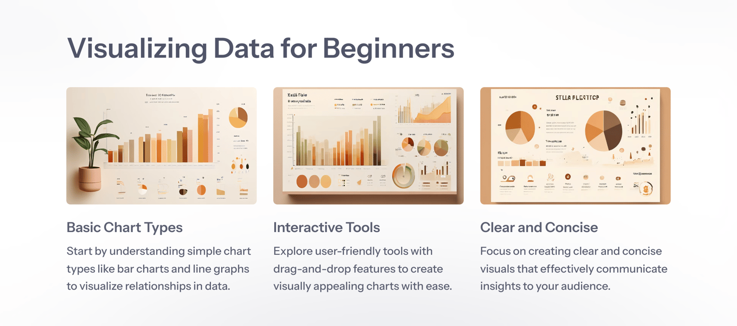
Types of Data Visualizations
There are various types of data visualizations, each with its own purpose and benefits. Some of the most common types include:
1. Bar charts: used to compare data across categories or groups.
2. Line charts: used to track changes over time or show trends in data.
3. Pie charts: used to display proportions of data in relation to the whole.
4. Scatter plots: used to show the relationship between two variables.
5. Heat maps: used to show the intensity of data values in a two-dimensional format.
6. Other types of visualizations include trees, diagrams, maps, and tables. Choosing the right type of visualization depends on the data being presented and the message that needs to be conveyed.
10 Secrets of Good Data Visualizations
It is often said that secrets cannot remain hidden for long. As a data detective, you are tasked with using these secrets that are used as best practices to share meaningful insights with others.
In this section, we will look at 10 secrets of good data visualizations. Read on for more ways to uncover those insights. These are useful for when there upcoming presentations to make (especially when you are working in a team), dashboards to build or reports to write.
Without further ado, here are 10 secrets to data visualisation and management.
READ MORE click here