
Color theory isn’t just for artists- it’s a powerful tool in interior design, too. One of the most visually compelling pairings on the color wheel is blue and orange. As direct opposites, these hues create maximum contrast while maintaining a natural sense of harmony. And when used in home design, especially in kitchens, the result is both bold and timeless.
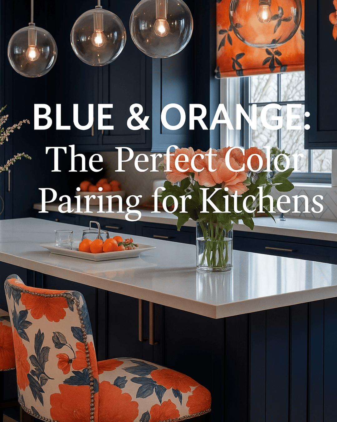
Take this vibrant kitchen, for example. Deep navy cabinets bring a sophisticated depth to space, while bright orange florals, upholstered stools, and accents inject energy and warmth. The floral pattern on the chair ties the whole palette together, and the orange tones feel cheerful, not overwhelming, thanks to the dark grounding base of blue cabinetry.
This design continues the color wheel conversation from our previous post, where we explored how orange can be both daring and elegant. Here, it takes on a new personality- dynamic, balanced, and lively. Even the lighting and countertop choices are intentional. Clear globe pendants add a modern touch without competing for attention, and the white counters serve as a neutral canvas, which keeps the color story clean and elevated.
If you’re looking to make a bold color move in your home, take a cue from this space. Pairing complementary colors, such as blue and orange, gives you the freedom to be expressive while still following a tried-and-true design principle. Whether you’re working with accessories, textiles, or cabinetry, let the color wheel guide you to a more cohesive and confident space.
For more design tips and inspiration, please visit my website here