
Florals have always held a special place in design. They bring warmth, personality, softness, and energy into a space, whether it's through artwork, textiles, prints, or color. But as much as we love floral décor, what truly transforms a room is the color palette behind the florals.
The right color combination can make a space feel luxurious, uplifting, grounded, or romantic. And this season, floral-inspired palettes are taking center stage in interior styling.
Today, I’m sharing four curated floral palettes, each designed with intention, emotion, and modern elegance, as well as my highly requested Floral Harmony in Burgundy & Cream palette, now trending on Pinterest. These color stories are perfect for creating mood boards, designing cohesive décor, planning seasonal updates, or simply refreshing your home’s color direction.
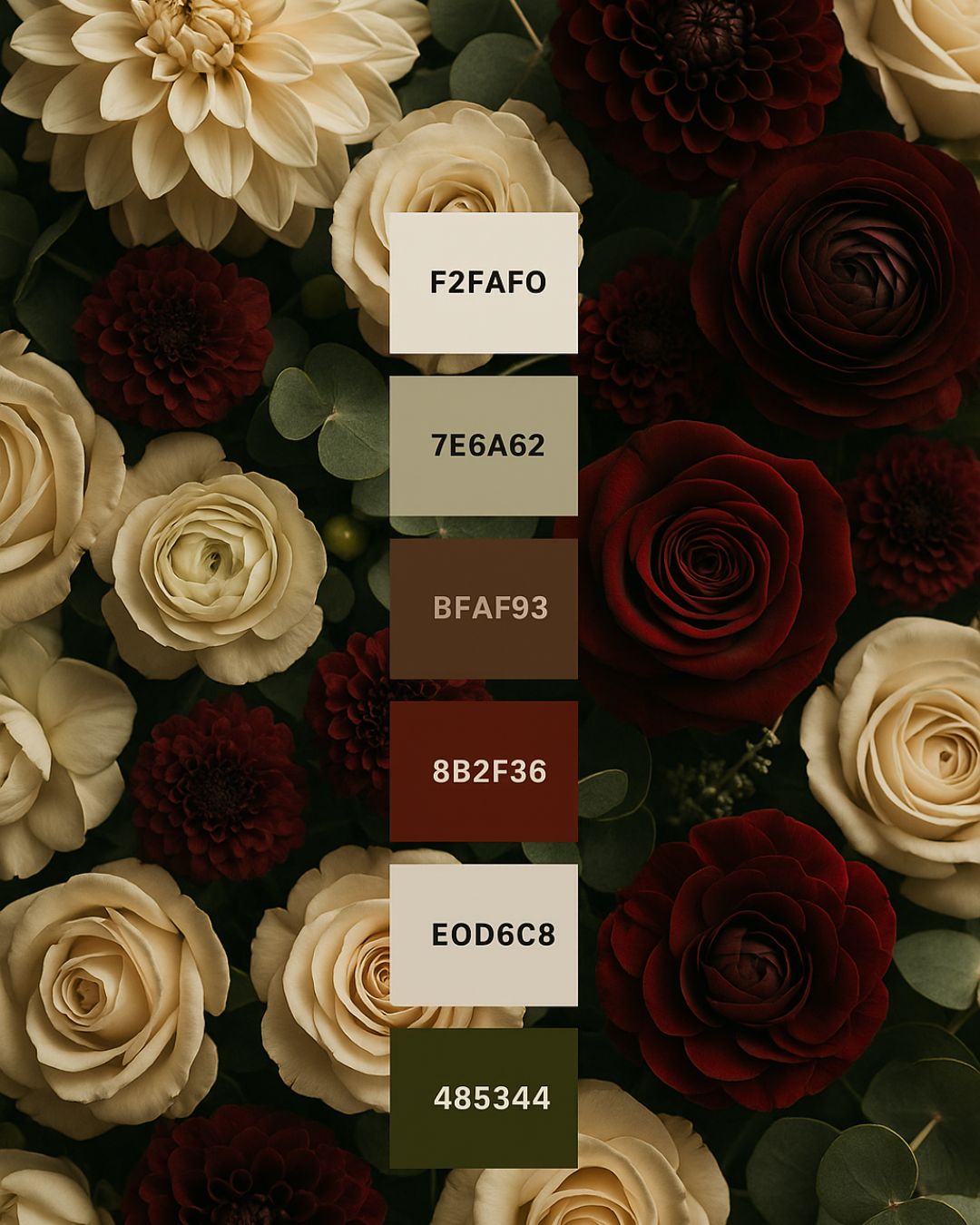
1. Floral Harmony in Burgundy & Cream
A rich, dramatic blend of deep burgundy, soft cream, warm golden tones, and earthy greens. This palette is ideal for:
- Warm, cozy living rooms
- Elegant dining spaces
- Fall and winter décor
- Statement art and florals
- Luxe styling with emotional depth
This palette creates an atmosphere that feels both romantic and grounded. It brings a sense of harmony to any space—especially when paired with gold accents, dark wood, or velvet textures.
2. The Soft Pastel Bloom Palette
Inspired by airy petals and botanical freshness, this palette blends blush, lavender, soft peach, and muted neutrals. Perfect for:
- Bedrooms
- Entryways
- Feminine office spaces
- Spring refreshes
This palette is calming, gentle, and timeless. Use it to create a serene atmosphere that still carries character and charm.
3. The Romantic Garden Palette
A modern mix of rich florals layered with warm pinks, berry tones, neutrals, and subtly moody hues. Great for:
- Cozy yet elevated living rooms
- Accent walls
- Statement art
- Layered textiles
This palette strikes the balance between soft romanticism and contemporary style—ideal for women who love warmth, intimacy, and expressive color.
4. The Mood-Boosting Petal Palette
Bright, joyful, and full of energy, this palette was designed to spark creativity and lift your spirit. Featuring sunny yellows, lively pinks, fresh greens, and complementary florals, it works beautifully in:
- Creative workspaces
- Kitchen decor
- Kids’ rooms
- Spring/Summer updates
If you love spaces that feel vibrant and inspiring, this palette instantly refreshes a room.
5. The Earthy Floral Neutral Palette
For lovers of soft, organic design—this palette blends earthy taupes, warm neutrals, muted florals, and grounding greens. Perfect for:
- Minimalist homes
- Modern cottages
- Nature-inspired styling
- Year-round décor
This palette keeps your space calm and cohesive, with a hint of floral softness for balance.
How to Use These Floral Palettes in Your Home
Whether you’re decorating a new home or refreshing your current space, here are a few simple ways to use these palettes effectively:
✔️ 1. Start with art or florals as your anchor.
Let your floral prints or arrangements determine your core colors.
✔️ 2. Pull your neutrals from the background tones.
Creams, taupes, and warm neutrals keep the palette balanced.
✔️ 3. Layer textures to create dimension.
Think velvet, boucle, linen, ceramic, or wood.
✔️ 4. Use your boldest shade sparingly.
A pop of burgundy, fuchsia, or sunny yellow can transform a room without overwhelming it.
✔️ 5. Create a mini mood board before you buy anything.
This ensures all colors flow harmoniously through your space.
Your home should tell a story—your story. Whether you lean toward bold burgundy, soft pastels, or earthy neutrals, these curated floral color palettes help you design a space that feels intentional, stylish, and uniquely you.
If you’d like help choosing the best palette for your space, I’d love to guide you.
You can explore my interior mood boards, color guides, and personalized styling services in the shop.