
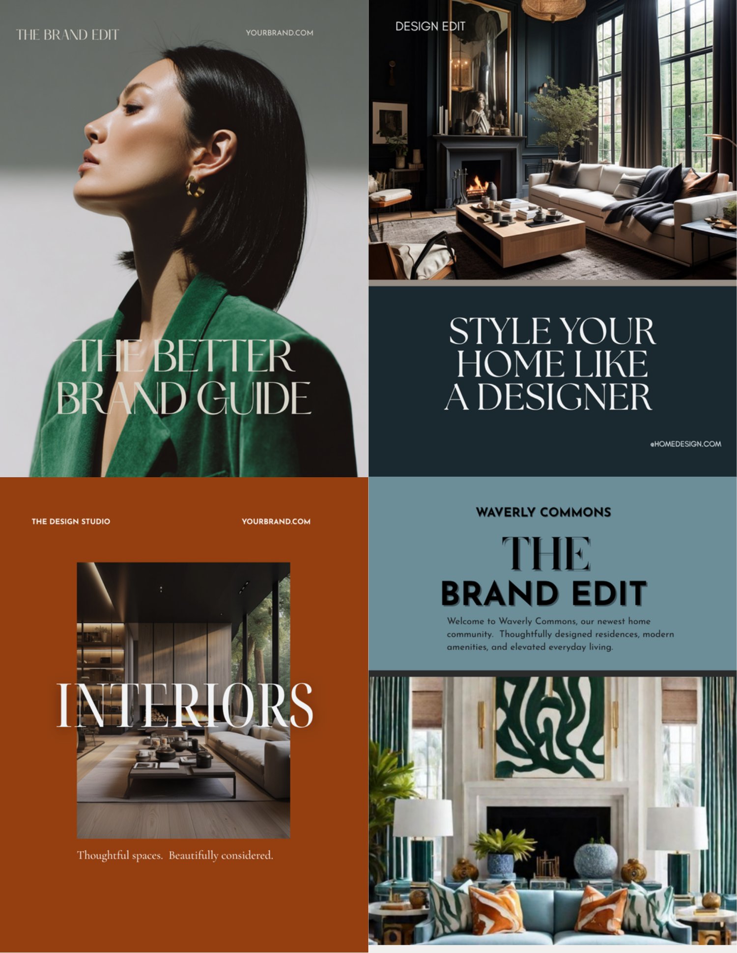
Scroll through some business social media pages, and you’ll notice something, every post looks almost the same. The same layout, the same colors, and the same placement of the logo. Although consistency is important, consistency and sameness are not the same thing.
A cohesive brand should be recognizable without becoming predictable.
Think of your visual identity as a collection and not a uniform. Individual pieces can look different while still clearly belonging together. Your graphics might include photography, educational posts, quotes, promotional content, product features, or lifestyle imagery. What connects them is the visual language behind them.
That visual language can include a consistent color palette, complementary typography, similar image styles, repeated design details, and an overall mood that reflects your brand. Adobe's guidance on brand identity similarly emphasizes coordinating elements such as typography, colors, and imagery across customer touchpoints.
Giving yourself room for variety can also make content creation much more interesting. A service announcement doesn't need the same layout as an inspirational post. A Pinterest graphic doesn't need to look exactly like an Instagram post. Each piece has a different job.
The goal isn't for someone to look at your feed and think, every post looks the same. The goal is for them to think, I know whose brand this is. That's cohesion.
Last year I created several collections of design templates to sell as digital products. The learning curve was steep and intense. I created about 150 template graphics. It all started when I was searching on Pinterest for post and content ideas, and I discovered this amazing brand that designs website and social media graphics. I am not going to mention the brand by name.
Even now, I haven’t found another brand that can touch them in creating high-quality templates. So, I set out to make my graphic templates look as amazing as theirs were. I finally completed my collections, and so over the course of a year I noticed that my templates weren’t selling the way or as fast as I had hoped. So I went back to my inspiration brand to see what they were doing from a marketing and design perspective.
Several things I immediately noticed were that they periodically update their templates; they remove the ones that don’t perform well and replace them with new, fresh ones. The second thing I noticed was that their collections vary across industries and audiences.
However, my collections were all centered on or targeted at one brand idea or niche. Therefore, I think this was the main factor that caused them to underperform. So, with this information and new design approach, I started looking through my collections, removing the underperformers and updating the collections with fresh new ideas across multiple niches and industries.
This new approach turned out to be a great idea. I discovered something valuable, that cohesiveness and everything looking and being exactly alike aren’t the same thing.
Ready to put these ideas into practice? visit my website for more branding resources, creative inspiration, and customizable design tools to help bring your visual brand together.
https://www.adobe.com/creativecloud/business/teams/resources/how-to/brand-identity.html?utm_source=chatgpt.com