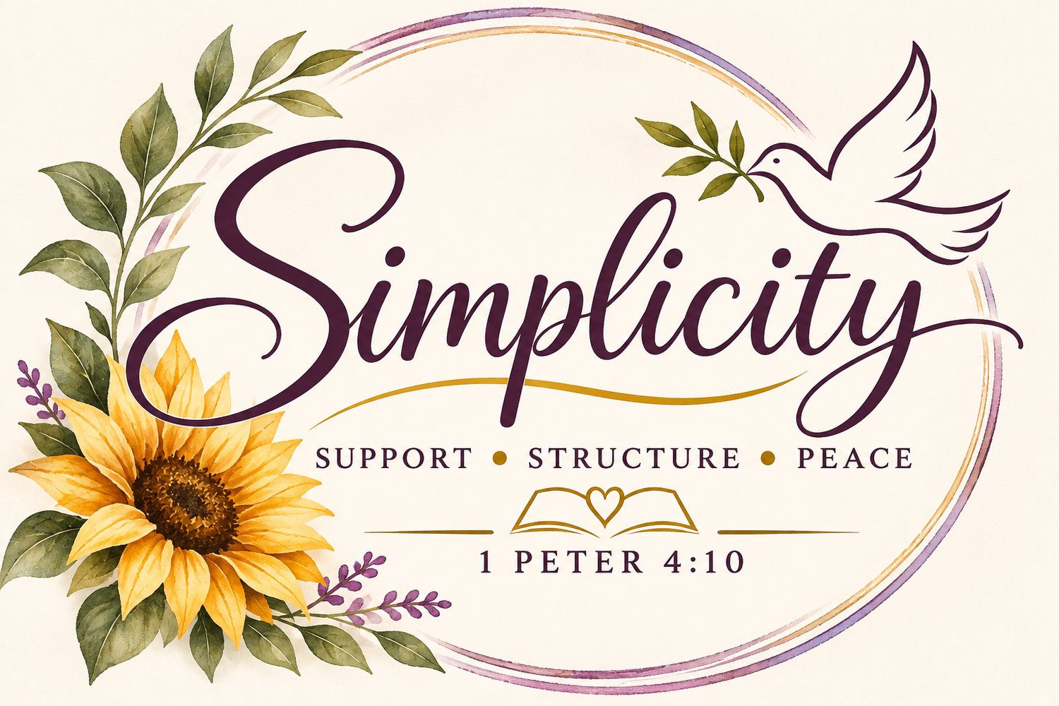

Sometimes, as you grow, the things you’ve created need room to grow with you.
That’s where I am with Simplicity.
This little business holds so many pieces of my heart: my love for helping people, creating something meaningful, bringing order to the overwhelming, and using what God has placed in my hands. As I continue figuring out what that looks like in this season, I wanted Simplicity’s logo to reflect that growth, too.
So, Simplicity is getting a fresh look—and I wanted to share the heart behind it.
Making room for what Simplicity is becoming
When I think about Simplicity today, I see several ways to serve:
- There’s the practical support: helping someone organize their inbox, stay on top of invoicing, or make their business feel a little more manageable.
- There’s the creative side: faith journals, devotionals, and resources that invite someone to pause, reflect, and spend time with God.
- Then there are the ideas I’m still developing, including a growing direction toward HR support and tools for small businesses.
As these pieces take shape, I want them to feel connected. Each one comes back to the same desire: to offer thoughtful support that makes room for people to breathe.
The refreshed logo is a way of bringing that heart into clearer view.
Why 1 Peter 4:10 stays
One thing I knew I wanted to carry into the new design was 1 Peter 4:10. That scripture reminds me to use the gifts God has given me to serve others and to care faithfully for what He has entrusted to me.
It’s the foundation beneath the work.
I may be organizing information, creating a resource, or helping someone work through a task that has been sitting on their list for weeks. Whatever the assignment looks like, I want to approach it with care, integrity, and a willingness to serve. Keeping the scripture reference in the logo gives that purpose a permanent place. It’s a quiet reminder to me every time I see it: Use what you’ve been given well.
What I want Simplicity to communicate
I want everyone to encounter Simplicity and feel welcomed.
I want them to feel comfortable asking for help, even when their files are scattered, their plans have changed, or they don’t know where to begin. That matters to me because I understand how quickly life can become overwhelming. We carry responsibilities, ideas, family needs, and expectations—sometimes all at once.
The heart of Simplicity is to meet people where they are with something useful. A clearer process. A task handled with care. A resource that encourages them. A little room to take the next step.
That’s what I want the refreshed brand to communicate: warmth, thoughtfulness, and support that feels like peace.
GROWING WHILE I AM STILL BECOMING
There’s something personal about this change, too. I’m building Simplicity while navigating changes in my own life. I’m learning, adjusting, praying, and making decisions about what I can realistically carry in this season. I don’t have every future detail mapped out. But I can recognize growth and make room for it.
Refreshing the logo feels like one of those steps: honoring what I’ve already created while giving the next chapter space to unfold. My hope is that as Simplicity continues to grow, you’ll see the same heart throughout it—a desire to serve well, create with purpose, and keep God at the center.
Thank you for being here as that story continues.
With love,
Ana
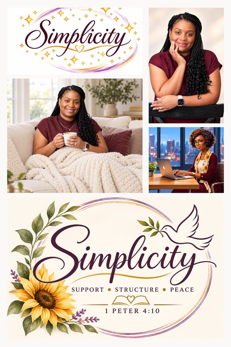
The heart behind Simplicity
Where we grew from, pieces of our Simplicity history....🥂 to the future ❤️
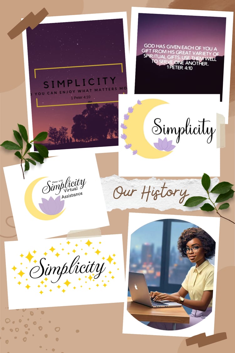 --------------->
Comments ()