
Accessible Color Palettes for Stores: 8 WCAG-Checked Token Sets (Tailwind, CSS Variables, Shopify)
Stop guessing contrast. Start every store from a palette that is already measured.
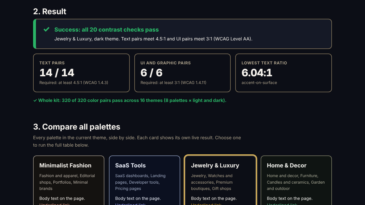
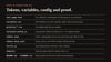
Contrast-Proof Tokens is a set of 8 accessible color palettes, each in light and dark, as design tokens you can paste into any project. Every text and UI color pair is already measured against the WCAG contrast thresholds, and a self-test page lets you (and your client) verify the numbers live in a browser.
No swatch screenshots. No checking pair by pair. Tokens, variables and proof.
What you get
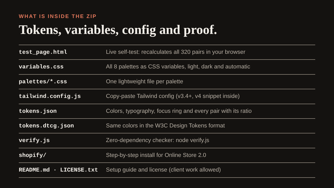
- test_page.html: interactive self-test that recalculates all 320 pairs, compares the 8 palettes side by side, previews keyboard focus and error/success states, and tests your own colors
- variables.css: all 8 palettes as native CSS custom properties, with palette switching, light/dark and automatic system dark mode
- palettes/*.css: one lightweight file per palette
- tailwind.config.js: copy-paste Tailwind config (v3.4+, with a v4 snippet in the comments)
- tokens.json and tokens.dtcg.json: structured tokens, plus the colors in the W3C Design Tokens format
- verify.js: zero-dependency Node script that recomputes every pair, or any two colors you give it
- shopify/: step-by-step install for Online Store 2.0 themes, plus a theme-settings snippet to pick the palette in the editor
- README.md, CHANGELOG.md, LICENSE.txt
The 8 palettes (each in light and dark)
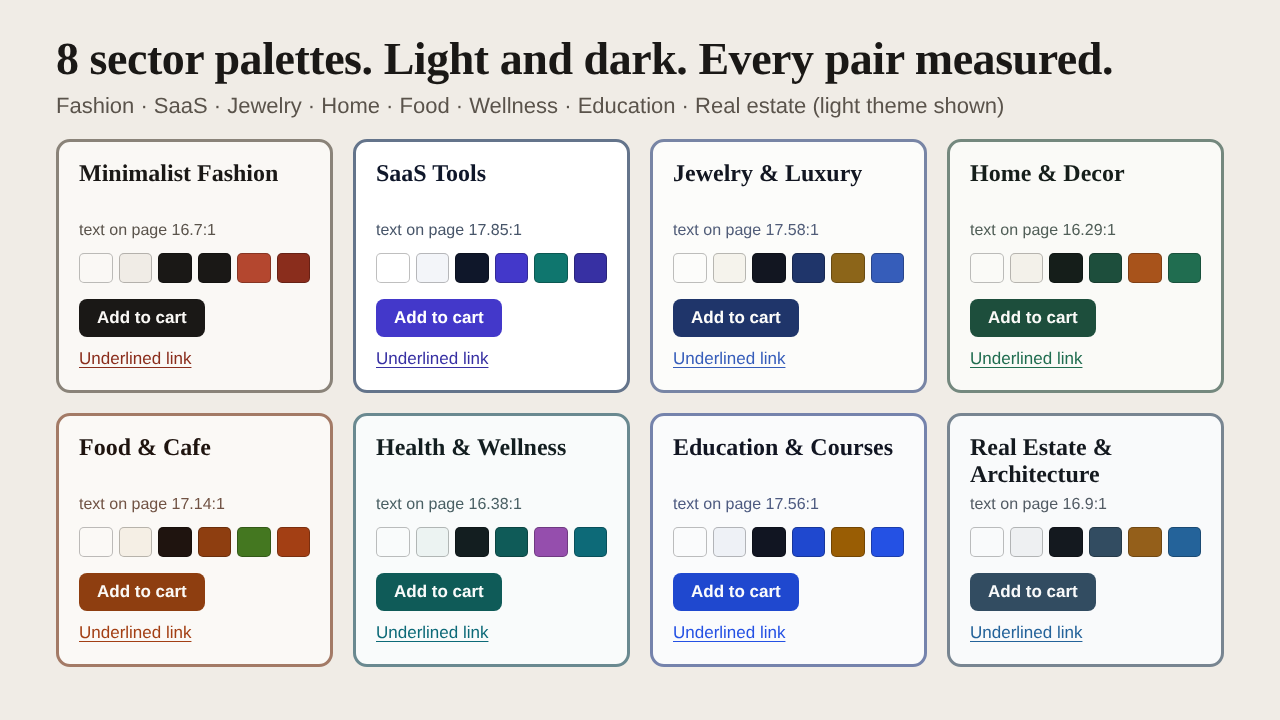
- Minimalist Fashion: warm paper-white and ink with a terracotta accent. Fashion, editorial shops, portfolios.
- SaaS Tools: crisp white and deep slate, indigo primary, teal accent. Dashboards, pricing and landing pages.
- Jewelry & Luxury: ivory with deep navy and an antique-gold accent. Jewelry, watches, premium boutiques.
- Home & Decor: soft linen with forest green and clay. Furniture, candles, ceramics, garden.
- Food & Cafe: warm cream with roasted-brown primary and a basil-green accent. Cafes, bakeries, meal kits.
- Health & Wellness: clean mist with deep teal and a plum accent. Studios, clinics, nutrition, fitness.
- Education & Courses: bright white with a strong blue primary and an amber accent. Courses, schools, tutoring.
- Real Estate & Architecture: cool gray with slate-blue primary and a bronze accent. Agencies, studios, renovation.
What "contrast-proof" means here
- 14 text pairs per theme at 4.5:1 or higher (WCAG 1.4.3)
- 6 UI and graphic pairs per theme at 3:1 or higher (WCAG 1.4.11): input borders, focus ring, primary icons
- Every pair is defined on both the page background and the card (surface) background
- Button labels are checked in default and hover states
- Ratios are rounded down, never up, as WCAG requires
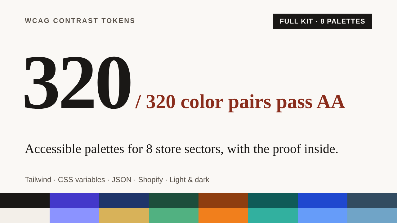
- 8 palettes x 2 themes x 20 pairs = 320 measured pairs, 0 below the threshold
Built for real projects
- Works with any CSS project, with Tailwind, and with Shopify Online Store 2.0 themes (setup steps included)
- Links stay underlined and messages carry an icon and a word, so nothing relies on color alone
- 3px focus ring with offset; 24px minimum and 44px recommended target sizes
- Respects reduced-motion preferences
- No images, no tracking, no build step
Who it is for
- Freelancers and small agencies who ship stores and sites for clients in several sectors
- Developers and store owners who want an accessible color base without a design-system project
- Teams preparing for the European Accessibility Act who want to remove the most common contrast defects at the token level
How it works
- Download the ZIP and open test_page.html to see every ratio recalculated in your browser.
- Copy variables.css (or the Tailwind config) into your project, or follow shopify/INSTALL.md.
- Set data-palette="jewelry" (or any palette id) on your html tag and map your buttons, inputs and links to the tokens.
Try it free first
The free Lite kit has 2 of these palettes (Minimalist Fashion and SaaS Tools), with the same files and the same self-test page: https://payhip.com/b/6FTfQ
Honest limits
Color contrast is only one part of web accessibility. Keyboard access, text alternatives, page structure, form labels, motion and many other requirements matter too. This kit does not guarantee that any website conforms to WCAG, EN 301 549 or the European Accessibility Act, and it is not legal advice. Text over images, gradients or transparency, and third-party widgets, need their own checks. The Shopify guide has not been tested on every theme: try it on a duplicate of your live theme first.
License
Use the files in unlimited personal and client projects. Do not resell or redistribute them as a standalone product. See LICENSE.txt in the ZIP.
Made by Sparkle Web Templates.