

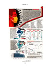
Mapping Covid 19 Pandemic in India in Comparison with Other Countries (Chronology)
Prof. (Dr.) D. M. Bohra's recent publication on COVID-19. This work portrays cartographically COVID-19 pandemic in India in comparison with other countries. Few hundreds of maps, charts and diagram (in color) depict this situation in chronology.
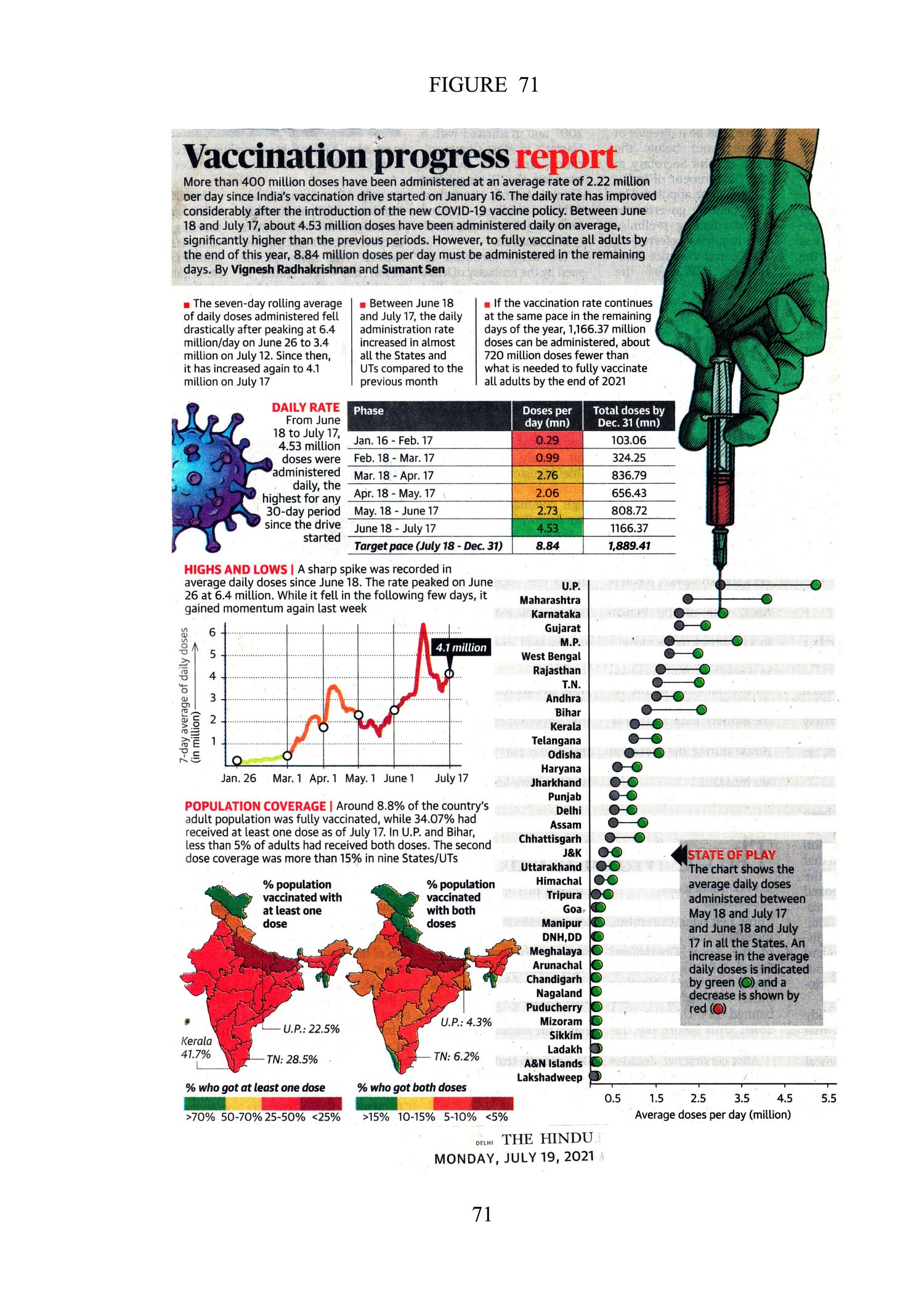
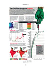
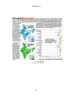
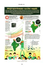
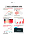
COVID-19 testing capacities, vaccination rate, vaccination category, vaccination-utility rate, COVID-19 fatality peak, national and statewise undercount factor, vaccination effectiveness, disparity in supply, public and labor mobility, nationwide lockdown, Death Count, Case Fatality Rate (CFR), COVID-19 hotspots, vaccination progress report, COVID-19 impact on food prices, etc have been shown cartographically. Maps and figures have been taken from various issues of The Hindu for academic use. Data Sources are, e.g.: Natural Journal, The Lancet, The World Bank, CRISIL Report, Lok Sabha, Reserve Bank of India, United Nations, Hindu Data Team, CMIE, National Family Health Surveys (NFHS), Health Ministry, Google Mobility Index, etc. The author acknowledges them with thanks.