

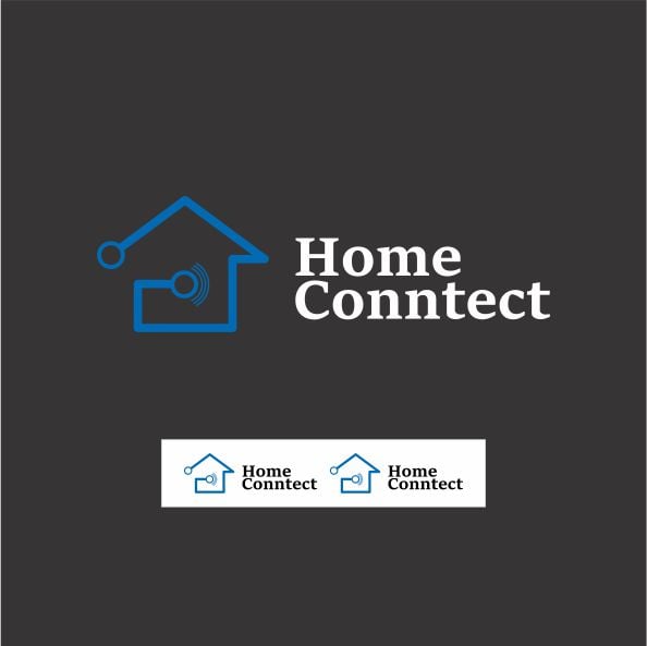
Smart Home connect logo design
On Sale
$100.00
$100.00
That's a neat logo design! Based on the image, here is a product description for the "Home Connnect" logo, focusing on what the visual elements convey.
🏠 Smart Home Connect Logo Design: Product Description
This logo design for "Home Connect" brilliantly captures the essence of modern smart home technology and seamless connectivity.
Design Concept & Imagery
The logo is built around a stylized house outline, which immediately grounds the brand in the concept of "Home." This is paired with abstract, tech-focused elements to emphasize "Connect."
- The House Icon: A clean, modern outline of a house provides a foundational symbol of safety, comfort, and domestic life.
- The Connection Circuit: A thin, continuous blue line forms part of the house's structure. This line, suggestive of a digital circuit path or data flow, enters the house from an external circular node and connects to an internal symbol. This visually represents the integration of external technology (like the internet or a wide-area network) into the home.
- The Signal/Hub Symbol: Positioned centrally within the house outline is a symbol reminiscent of a Wi-Fi or radio signal broadcast (concentric arcs emanating from a central point, which is also a small circuit node). This is the key visual element that communicates the product's function: it is the central hub or source of communication and connectivity within the smart home environment.
Color Palette
- Color: The primary color is a bright, clear Electric Blue (in the full-size version) or a lighter shade (in the smaller versions).
- Meaning: Blue is strongly associated with trust, reliability, intelligence, and technology. This color choice instills confidence and a sense of professionalism, perfectly suited for a tech solution that manages a home.
- Background: The logo is presented against a Charcoal Grey/Dark background, which makes the blue line and white text pop, giving the overall design a premium, sleek, and high-tech feel.
Typography
- The text "Home Connect" uses a clean, modern, sans-serif typeface. The consistent weight and simple letterforms ensure readability and align with the logo's contemporary, minimalist aesthetic.
- The placement (right beside the icon) and the contrast (white text against a dark background) make the brand name instantly visible.
Overall Brand Impression
The Home Connect logo is a powerful, clear, and focused visual identity. It suggests a product that is:
- Smart: Utilizes cutting-edge technology (circuit lines, signal icon).
- Seamless: Provides uninterrupted and central connectivity (the continuous line and central hub).
- Secure: Focused on the home environment.
- Modern: Has a clean, professional, and contemporary look.
It is ideal for a company specializing in smart home systems, Wi-Fi solutions, home automation, IoT devices, or network installation services.