
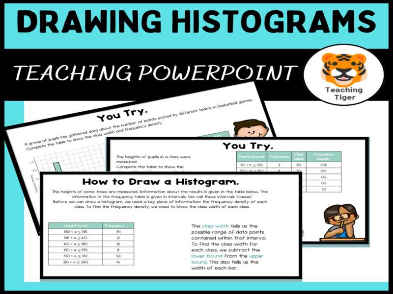


Mastering Histograms: Creating a Histogram from a table of Data
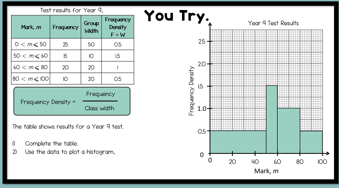
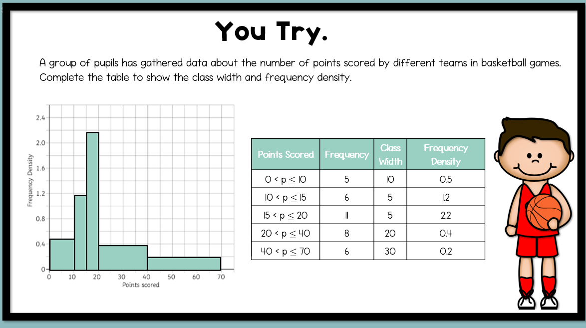
📊Dive into the world of data representation with our engaging lesson on histograms!📊Perfect for introducing students to this vital concept, our lesson clarifies the distinctions between histograms and bar charts. By drawing on their prior knowledge of data representation, students will develop the skills to create precise histograms from both table data while also learning to calculate frequency density.💡
Throughout the lesson, students will hone their abilities to:
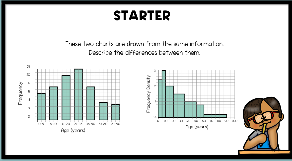
🔍Describe the differences between histograms and bar charts.
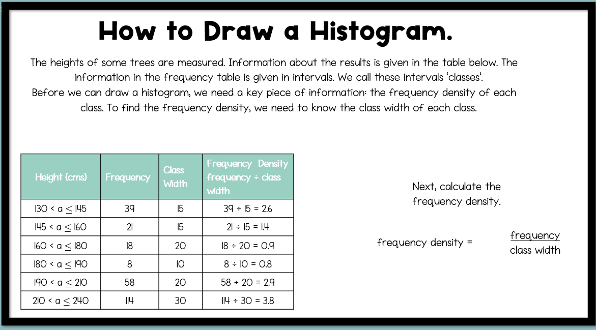
📊Calculate Frequency density
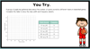
📏Produce accurate histograms from data tables.
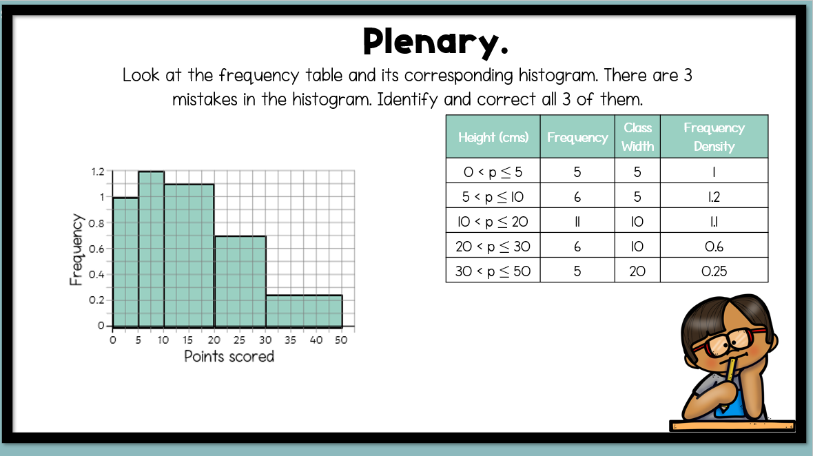
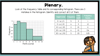
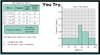
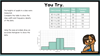
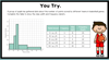
The presentation includes a starter slide, 3 methods slides, 3 question slides with answers and a plenary slide.
Equip your students with the essential skills needed for effective data analysis and interpretation!🎓