
Flexible Layout Section - 25 sites
On Sale
$49.00
$49.00
The Flexible Layout Section block for Gutenberg
Meet the Flexible Layout Section plugin!
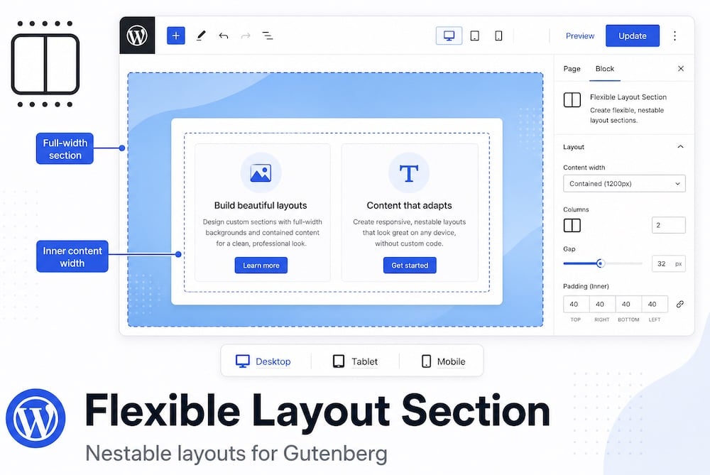
Flexible Layout Section is a nestable container block for page sections — full-width backgrounds with controlled inner content width, responsive layout types, and spacing that stays predictable when blocks are nested.
Layout types
Flow
- Default vertical stack — like a normal document flow. Best for hero sections, text blocks, and simple stacked content.
Flex row
- Horizontal layout: children sit side by side.
- Includes an option that makes nested Flexible Layout Sections equal height in one row.
- Child width controls how wide each nested section is per breakpoint (mobile defaults to full width).
Flex column
- Vertical flex layout with alignment controls. Like the Flow layout type, but with more flex controls.
- Horizontal alignment positions items left, center, right, or full width.
- Vertical alignment controls distribution along the column (Top, Middle, Bottom, Stretch, Space between, and similar). Reverse order flips the visual order of children.
Grid
- CSS grid with a configurable number of columns.
- On smaller viewports you can override columns per breakpoint so content reflows cleanly.
- Mobile order # sets the stacking order on mobile.
Site-wide defaults (Settings tab)
Did you ever get tired or even annoyed because you had to set everything again?
The Flexible Layout Section plugin gives you preferred settings:
- Default custom max width — fallback for custom inner content width.
- Default padding — applied to all sections unless overridden in the block.
- Default margin — applied to all sections unless overridden in the block.
- Tablet and mobile breakpoints — control when responsive overrides and Order mobile take effect.
Those settings apply to every new and existing Flexible Layout Section and are easily overridden by the block settings.
Other Flexible Layout Section plugin features
Gap
- Spacing between direct children inside the inner content area. When a parent uses Gap, nested children automatically have their own block margins cleared so spacing is not doubled. Set vertical and horizontal gap separately; values can differ per device.
Inner content width
- Different content width selections: Theme — follows the theme content width. Wide — theme wide alignment width. Custom — your own max width per breakpoint (defaults come from Settings on this page). Full — inner content spans the full section width.
Child width (flex row only)
- When this block is a direct child of a flex-row parent, you can set its width per device — for example 50% on desktop and 100% on mobile.
Order mobile
- Visible on the Mobile device tab only. Lower numbers appear first when flex items stack on mobile, without changing the desktop or tablet order.
Margin, padding, background, border
- Standard Gutenberg controls on the outer section wrapper. Backgrounds and padding apply to the full aligned width; inner content width constrains the blocks inside.
Overlay link & visibility
- The overlay link makes the whole section clickable (targets to a URL you enter) while inner links and buttons stay usable. Visibility hides the section per device.
- Works also with Dynamic URL; choose Post Meta and enter the Meta field key.
Dynamic background image
- Built into this block — no extra plugin required.
- In the block sidebar under Color, enable “Use custom field / dynamic image” and select a source: URL (with tokens such as {meta:field_key}), attachment ID, or post meta field key. The meta field can return an image URL or a Media Library attachment ID — from ACF, Meta Box, ACPT, Modern Fields, or any plugin that stores the value in post meta.
Free versus Pro
Free
- Flow, flex, grid, gap
- Child width
- Nesting
- Custom width (desktop and inherit)
- Min-height (desktop and inherit)
- Media Library background
Pro
- Tablet/mobile custom width
- Min-height tablet/mobile
- Dynamic background + meta (custom field) picker
- Hide on device (desktop, tablet, mobile)
- Overlay link + meta (custom field) picker
- Sticky
- Automatic updates
- Support
Information about this plugin
- Homepage of the plugin.
Documentation
- Both the plugin itself (Settings / Guide) and the documentation page on our website offer documentation.
More information
- Full Dynamic Accordion documentation
- Flexible Layout Section plugin page
Get your Dynamic Accordion license
- You are allowed to use the plugin on a maximum of websites, according to the purchased license (25).
- Always deactivate a license on an unused website; otherwise the key slot remains occupied.
- It’s a one-time payment; no yearly costs.
- You can check your available slots at: https://server.wpinsight.eu/validate-key/
