


Excel Charts Tutorial
On Sale
$0.90
$0.90
Excel Charts Tutorial
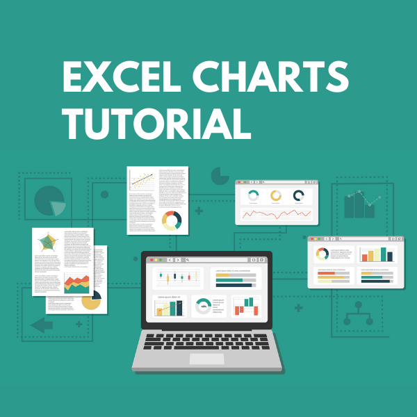
A chart is a tool you can use in Excel to communicate data graphically. Charts allow your audience to see the meaning behind the numbers, and they make showing comparisons and trends much easier. In this tutorial, you will learn how to insert charts and modify them so they communicate information effectively. Each of Excel's 12 chart types has different features that make them better suited for specific tasks. Pairing a chart with its correct data style will make the information easier to understand, enhancing the communication within your small business.Graphs or charts help people understand data quickly. Whether you want to make a comparison, show a relationship or highlight a trend, they help your audience “see” what you are talking about.
Among its many features, Microsoft Excel enables you to incorporate charts, providing a way to add visual appeal to your business reports.
Before you start proceeding with this tutorial, we are assuming that you are already aware of the basics of Microsoft Excel. If you are not well aware of these concepts, then we will suggest you to go through our short tutorials on Excel.
Table of Contents
- Introduction- Creating Charts
- Types
- Column Chart
- Line Chart
- Pie Chart
- Doughnut Chart
- Bar Chart
- Area Chart
- Scatter (X Y) Chart
- Bubble Chart
- Stock Chart
- Surface Chart
- Radar Chart
- Combo Chart
- Chart Elements
- Chart Styles
- Chart Filters
- Fine Tuning
- Design Tools
- Quick Formatting
- Aesthetic Data Labels
- Format Tools
- Sparklines
- PivotCharts