

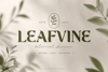
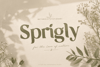

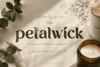
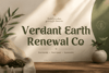
Ekainos Font: Nature-Inspired Botanical Serif for Modern Brands
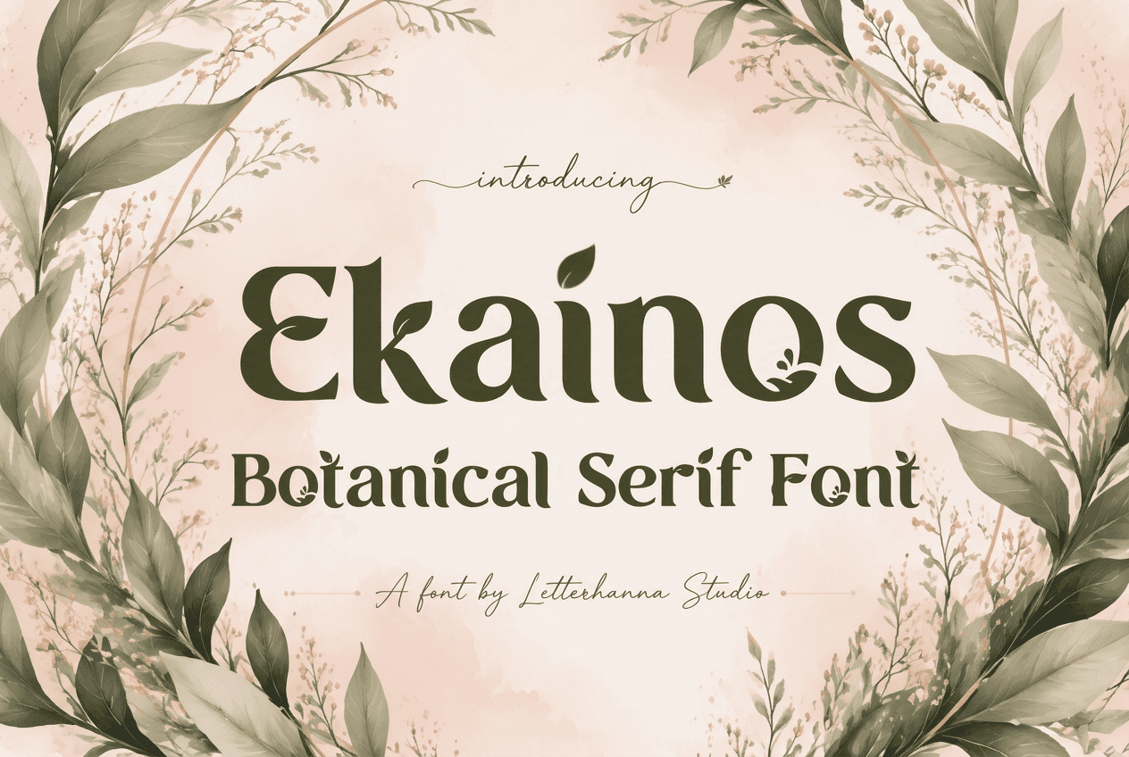
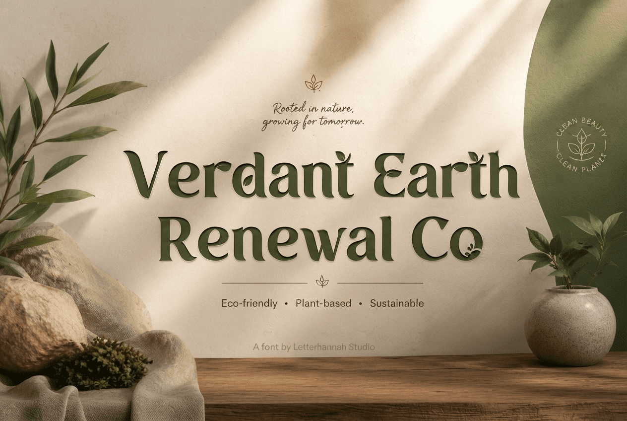
Some fonts are built for spreadsheets. Ekainos was built for gardens, greenhouses, and the quiet corners of a farmers market where hand-lettered signs still mean something. It's a bold, high-contrast serif display typeface finished with delicate leaf and vine details — a genuine botanical font for brands that want to feel grown, not manufactured.
What Makes Ekainos Different
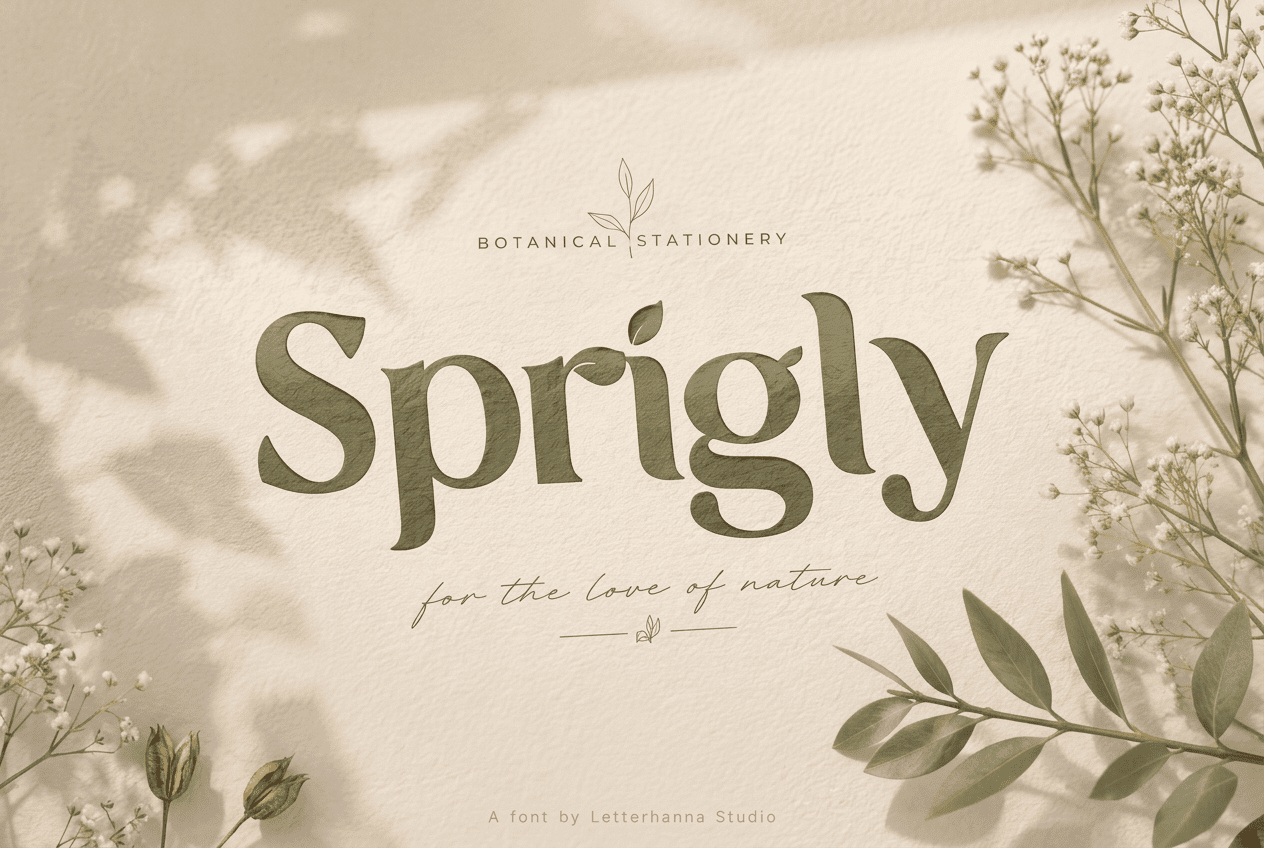
Plenty of typefaces claim to be "nature-inspired," but most just add a leaf icon somewhere in the marketing image. Ekainos takes a different approach. The botanical elements are part of the letterforms themselves — a leaf curling off an ascender, a vine wrapping a bowl, a small sprout finishing a terminal. The result is a nature font where the organic character is structural, not decorative.
The uppercase alphabet is sturdy and classic, the kind of serif you'd expect on a well-made sign. The lowercase is where the personality lives — slightly rounded, a little playful, with looping terminals that feel handwritten rather than engineered. Together, the two cases create a typeface confident enough for a headline yet warm enough for packaging copy.
A Small Story
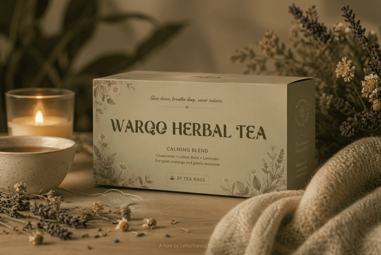
Picture a woman named Hana, who runs a tiny herbal tea shop two streets from a public garden. Every jar on her shelf is labeled by hand, ink slightly uneven, until one day she switches to a typeface that finally looks the way her shop feels — leafy, unhurried, a little imperfect in the most charming way. That's the gap Ekainos was designed to fill: the space between hand-lettering and a font, where warmth doesn't have to be sacrificed for consistency.
Where This Garden Font Belongs
Ekainos was made for brands rooted in something organic:
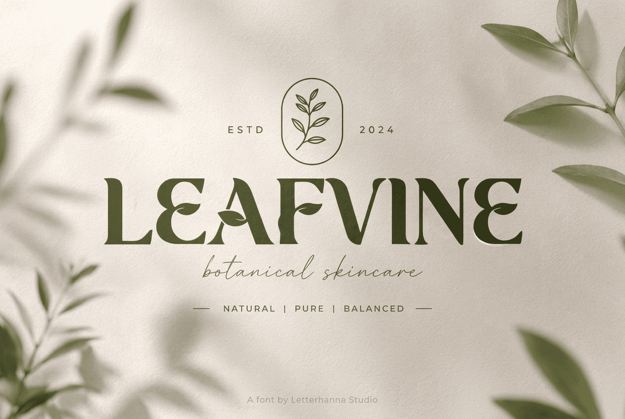
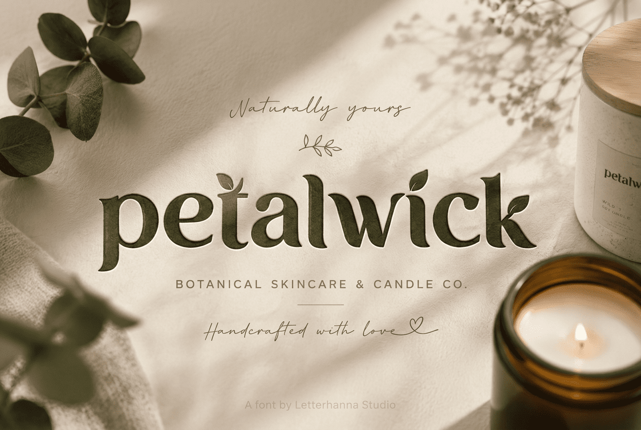
- Botanical skincare and herbal wellness lines
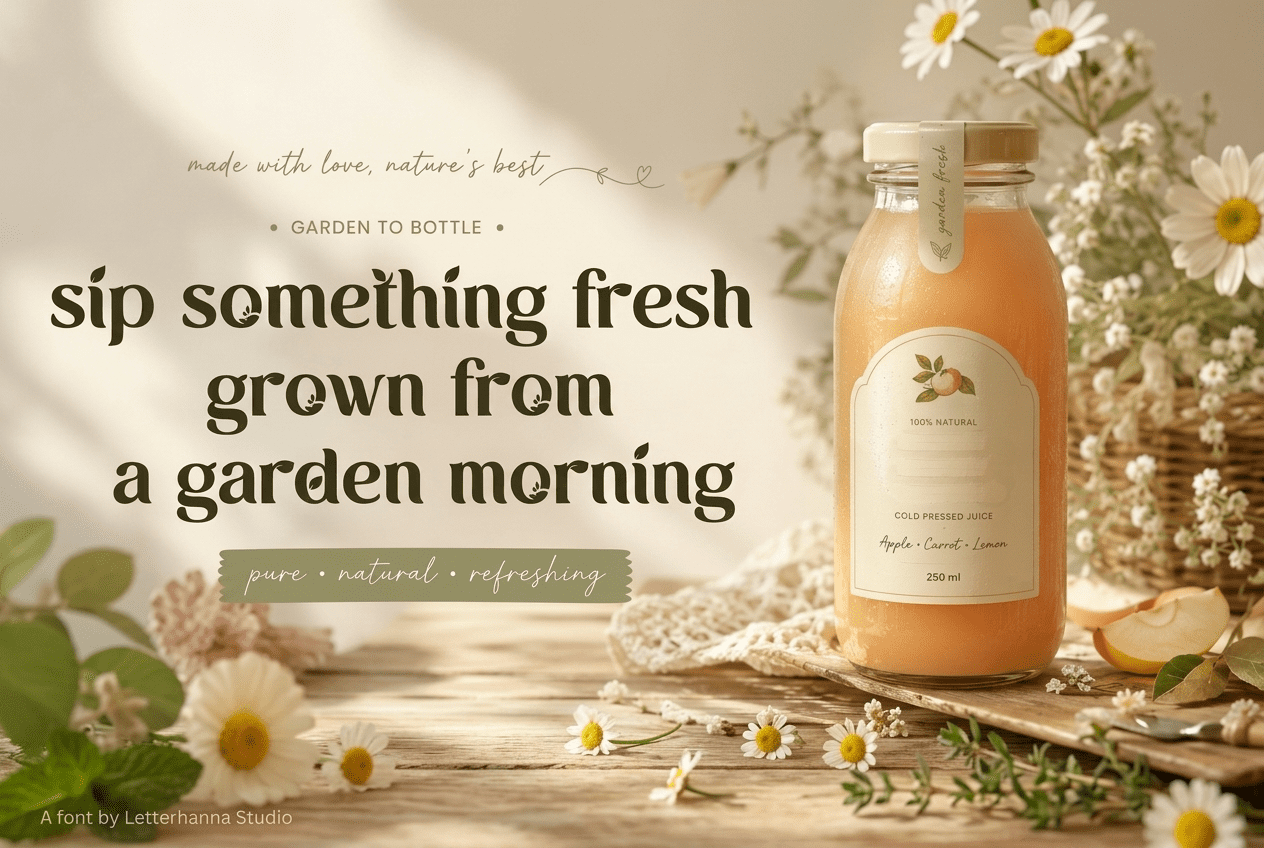
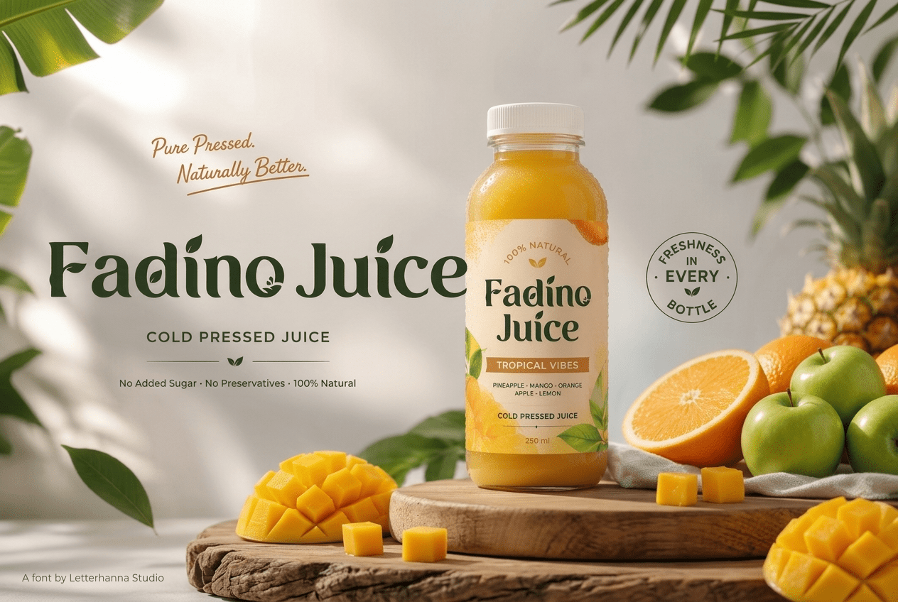
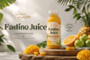
- Cold-pressed juice bottles and smoothie labels
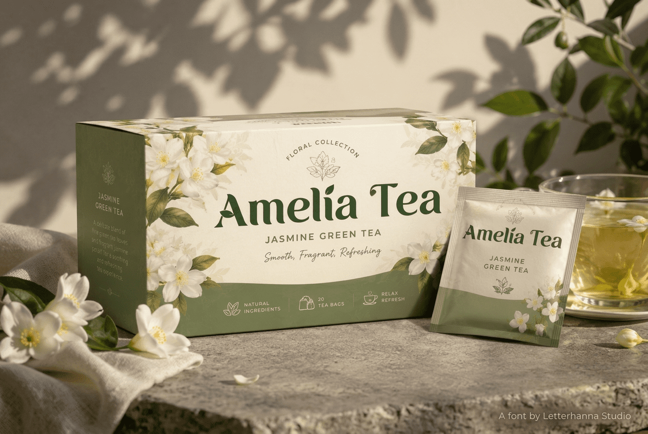
- Tea houses, apothecaries, and plant-based cafés
- Florists, garden centers, and seed packet design
- Sustainability campaigns and "save the earth" messaging
- Cottagecore journals, zines, and hand-lettered prints
As a garden font, it also holds up well in longer-form layouts — think seasonal newsletters, packaging inserts, or farmers market menus — because the lowercase remains readable even as the uppercase carries visual weight for headlines.
Designed to Feel Alive
There's a reason botanical branding has stayed popular for years: people are drawn to things that feel alive, imperfect, and connected to the earth. Typography can either support that feeling or work against it. A typeface that's too rigid undercuts an otherwise beautiful, earthy brand. Ekainos was shaped specifically to avoid that mismatch — every curve and flourish exists to reinforce the same message a botanical brand is already telling.
Use it boldly on a logo where the leaf details become a signature. Use it quietly in body text where the rounded lowercase softens the page. Either way, the typeface does the work of tying a visual identity back to nature without needing extra illustration.
Try Ekainos on Your Next Brand
If you've been holding out for a serif that actually earns the label "botanical," Ekainos is worth a closer look. It's structured enough for professional branding, detailed enough to stand out on a shelf, and warm enough to make a product feel like it was made with care rather than mass-produced.
Download Ekainos today and give your next garden-inspired, nature-rooted brand the typeface it deserves.