


FREEBIE! UI Kit Bundle
On Sale
$0.00
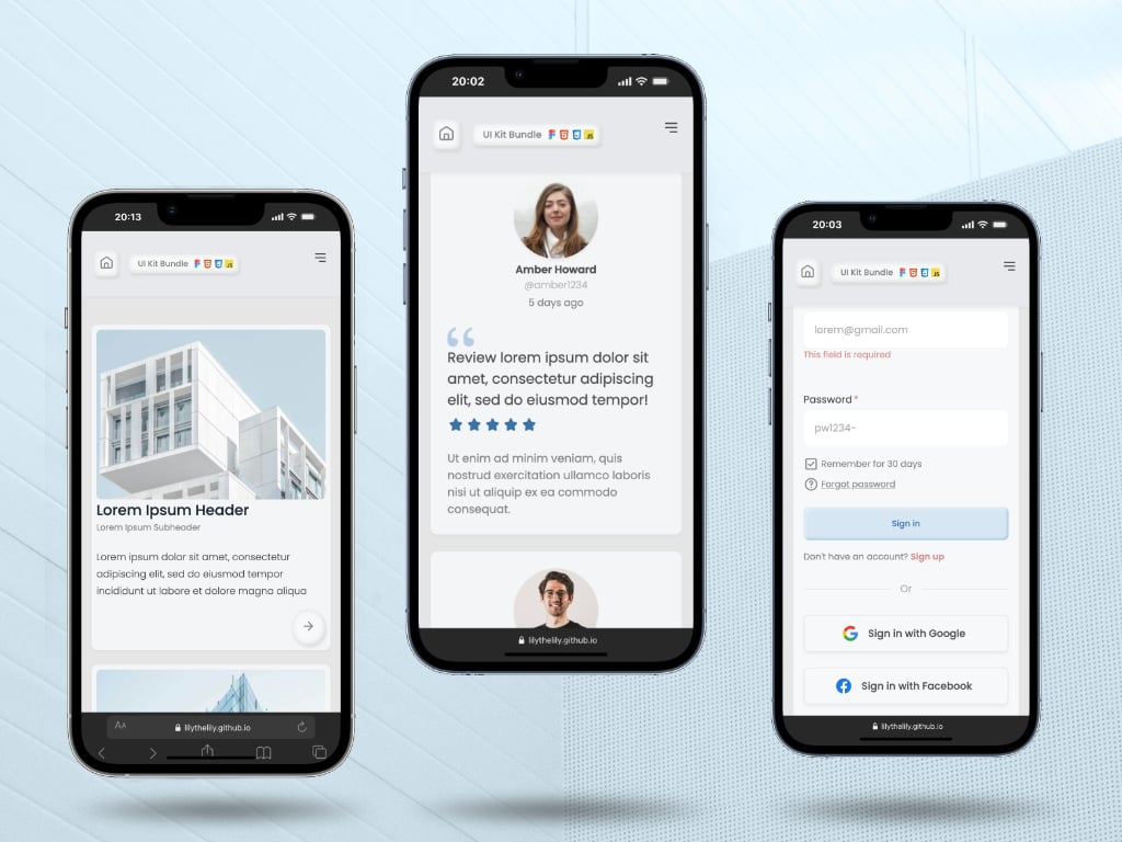
FREE UI Kit Bundle: From Design Straight to Code
Bridge the gap between design and development with this ready-to-use, modular UI Kit. This bundle includes the essential components to kickstart your next Web project, featuring both the Figma design file and clean, hand-coded source files.
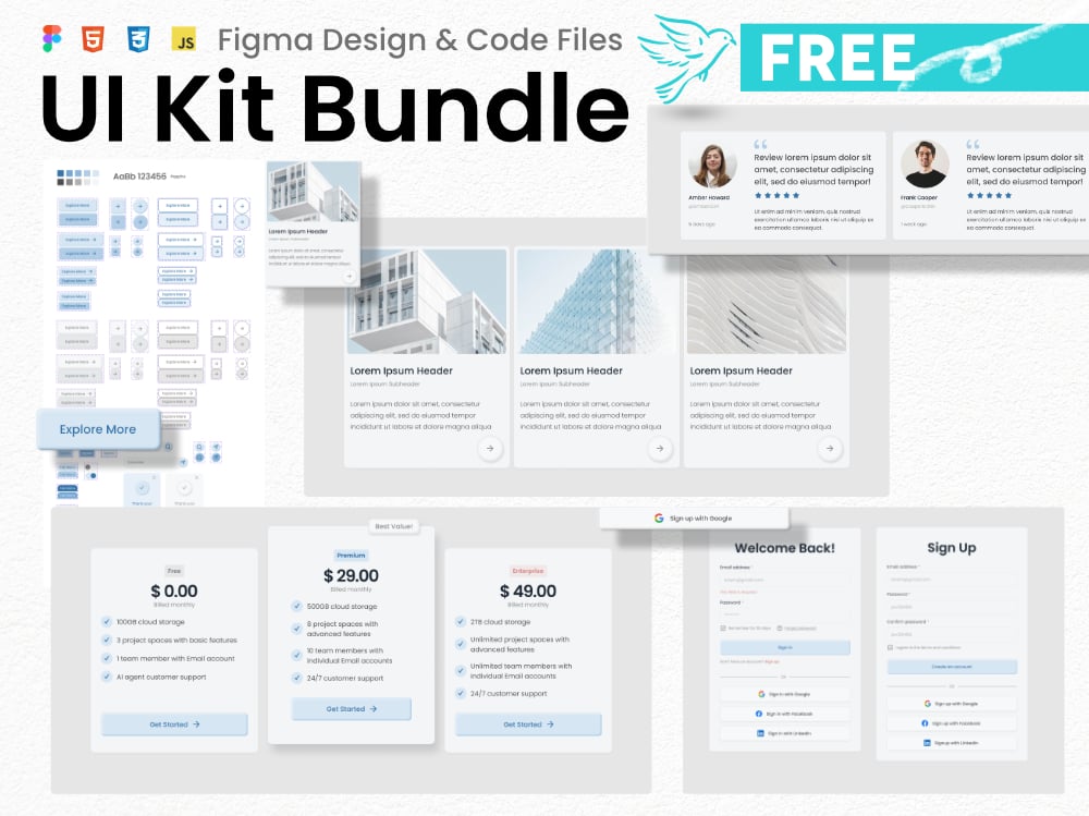
Introducing a comprehensive UI Kit package, available for free, to welcome new visitors to this online shop! Whether you are a designer looking for modular UI components or a developer in need of a light-weight, dependency-free codebase, this bundle is for you. Experience a holistic Design-to-Code workflow with this starter bundle!
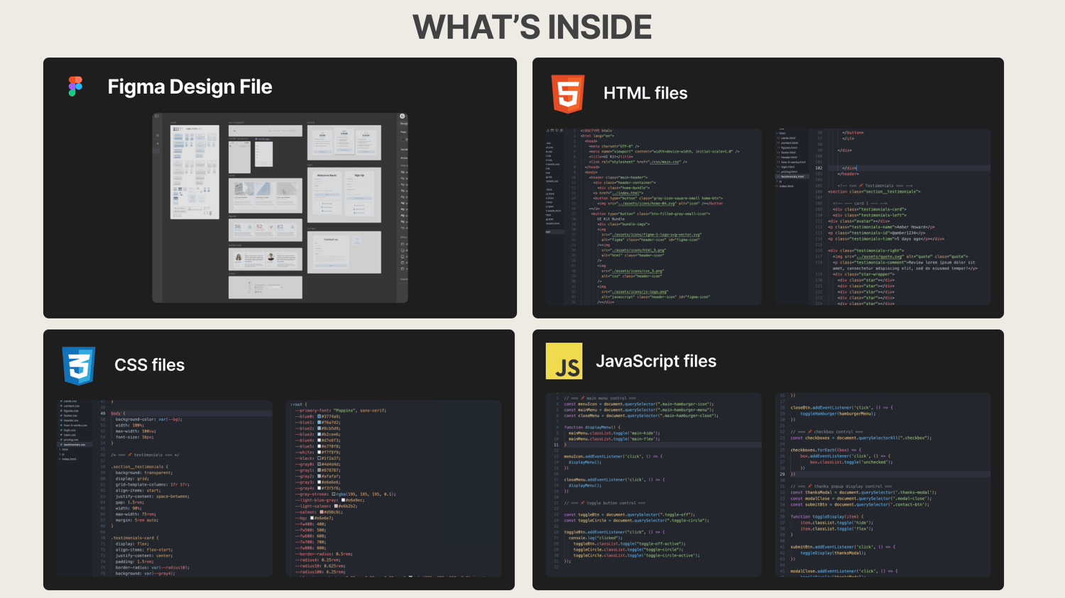
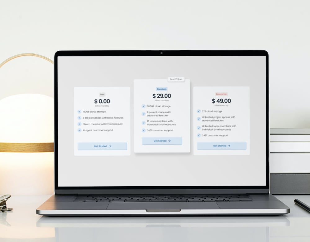
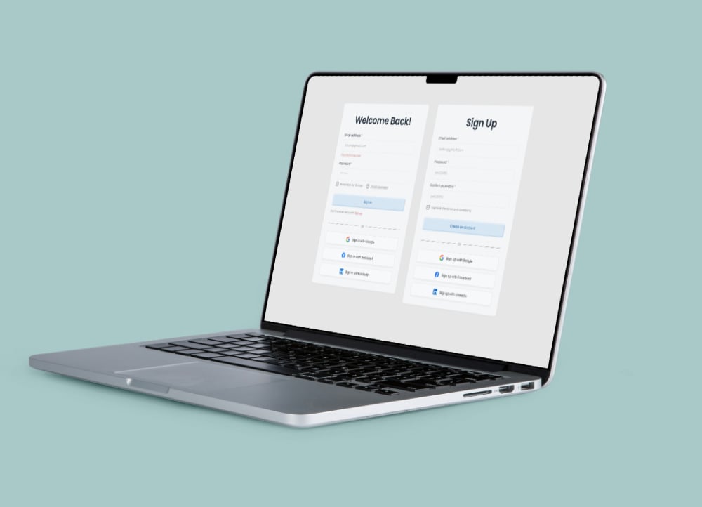
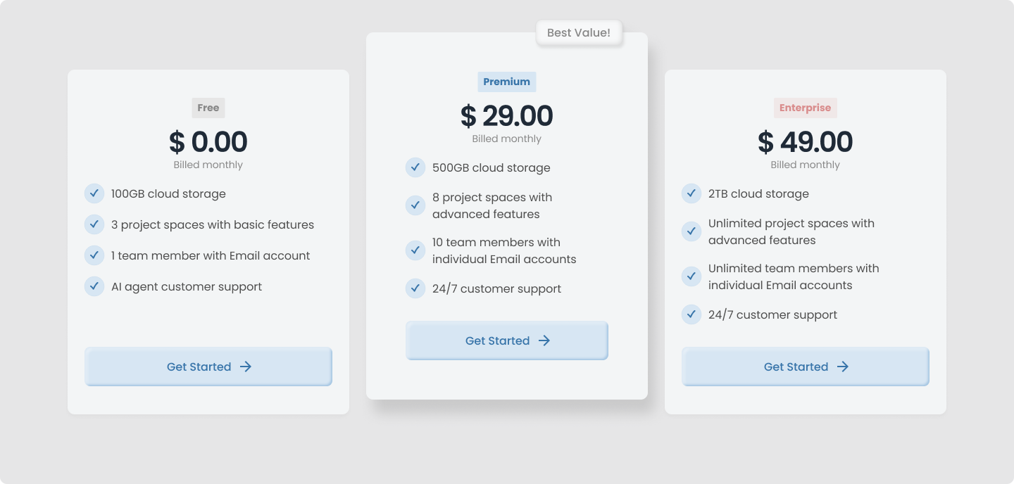
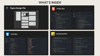
What’s Inside:
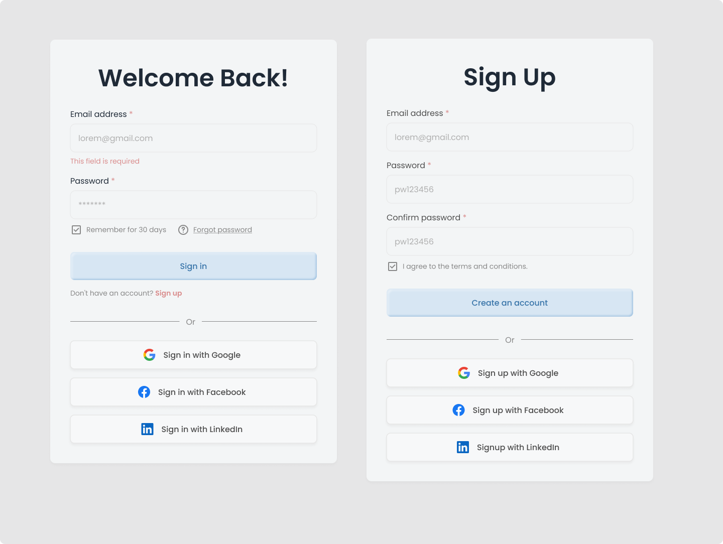
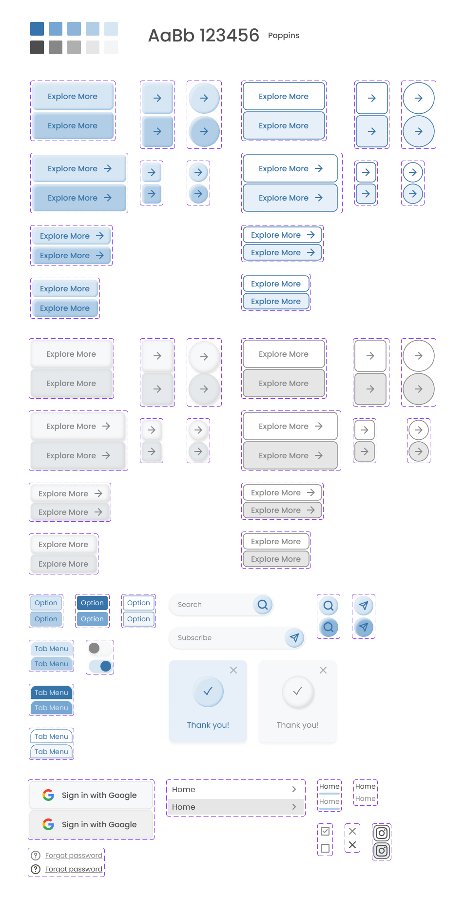
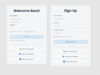
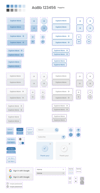
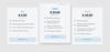
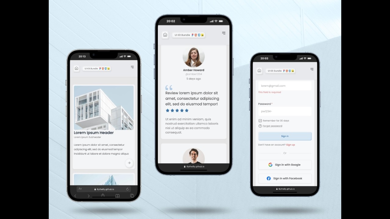
- Figma design file (.fig): Clean, component-based architecture. Hover-state micro animation. Consistent, fully responsive layout with Auto-Layout. Easily customizable with variables.
- Source code files (.html/.css/.js): Hand-coded. No dependency on external libraries. Fully responsive from mobile to desktop.
- Live Preview Site: View the live site here.
- Documentation: Well-commented code and a clear ReadMe file for easy setup.

How to use:
📌 Figma Design File
- Import the figma local file (.fig) into your Figma Workspace.
- Update text, colors, typography, and images to match your brand.
📌 Code files
The project structure is organized as follows:
- assets/ #Images and Icons
- css/ #Component styling
- html/ #Container for UI components
- js/ #Interaction and functional logic
- index.html # Main page with basic UI assets
- readMe.md # Documentation
- Open the code folder in VS Code or other text editor.
- Copy the self-contained component code block into your project.
- Global variables (colors/spacing) can be edited at css:root.
Reference: How It Works
License:
Free to use this kit for your own projects or client work. Redistribution or resale of the files themselves is not permitted.
Credit:
The placeholder images are sourced from Unsplash. Google font (Poppins) is embedded in the CSS file.
✨ Thank you! ✨