
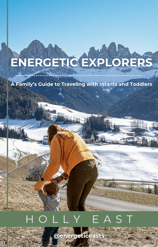


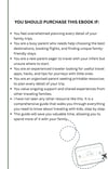
The Ultimate Family Travel Guide with Little Ones
On Sale
$37.00
$37.00
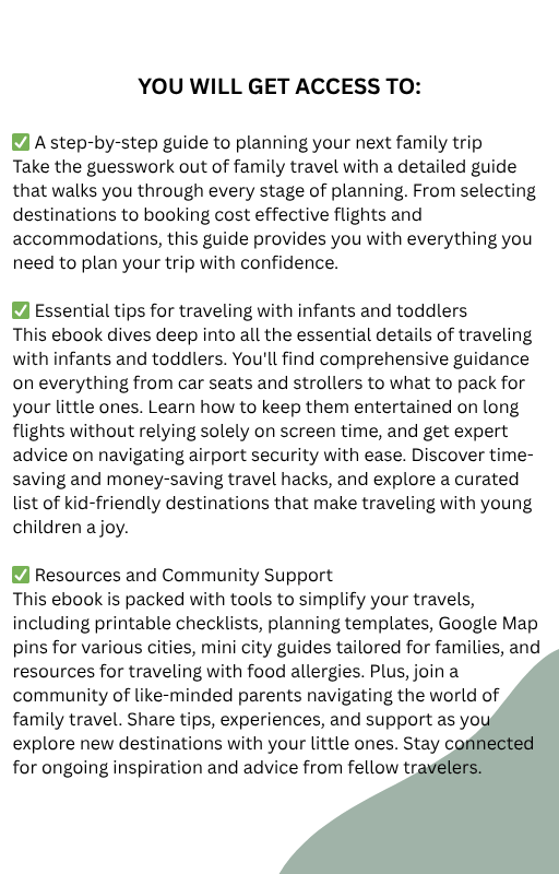
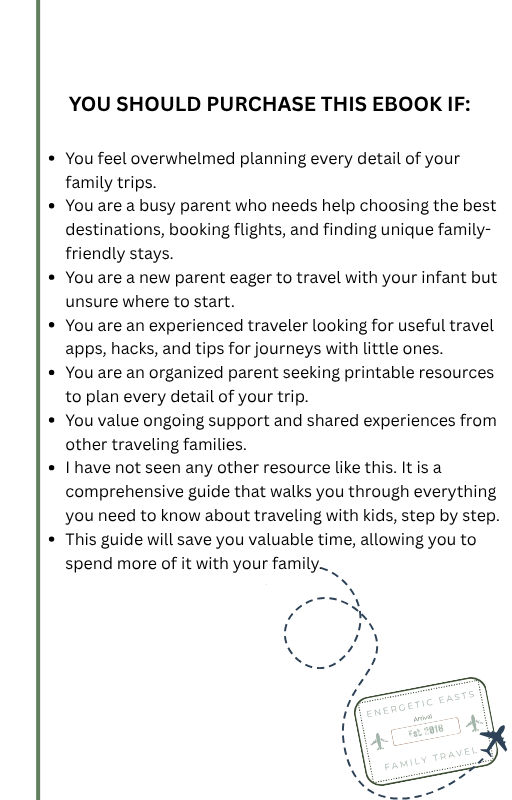
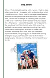
This is THE GUIDE I wish I had the first time we traveled with our first baby at just 6 months old. It has everything you could need to start out traveling with your little one. Our comprehensive ebook is designed to transform your family travel experience from stressful to seamless. Here’s what you can expect:
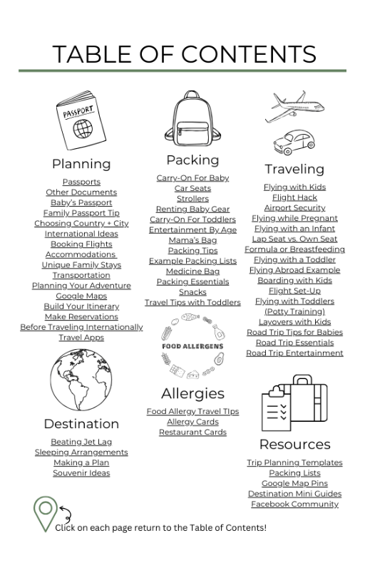
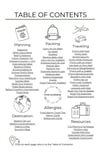
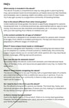
- Detailed Travel Planning
- Booking and Accommodation Guidance
- Packing and Essentials
- In-Flight and On-the-Road Tips
- Health and Safety
- Travel Hacks and Apps
- Planning Tools
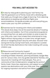
- Community Support
This ebook is packed with practical tools, tips, and resources to ensure you have everything you need to travel confidently and enjoy every moment with your family.