
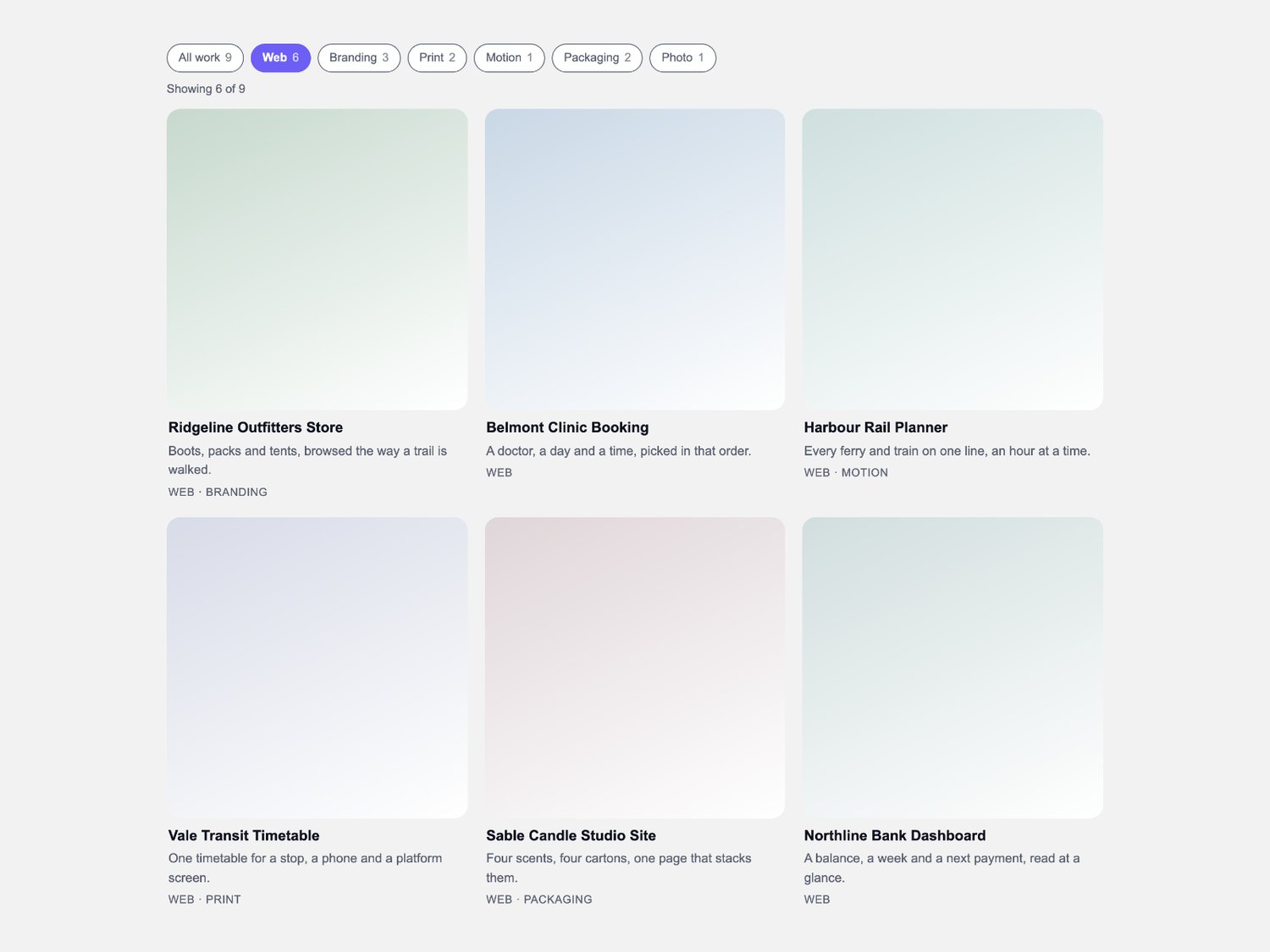
CMS Tag Grid — filterable square gallery for Framer
What it is
The catalogue grid a studio, a shop or a team page puts on its index: one collection, one row of tag chips, and a card that goes straight to the thing it shows.
What you get
• One Framer code component (CMS Tag Grid), delivered as a Component URL.
• Per-item controls: title, caption, a comma list of tags, image with alt text, link, new-tab, and a tint that draws the card face while an image is still on the way.
• A component slot per card, so a CMS collection drives the grid directly.
• The grid set in plain choices: card ratio, column count, gap, radius, text size, alignment and max width.
• Free updates.
How it behaves
• One shape for every card face. A single ratio — square, 4:5 or 16:9 — reserves each built-in card's height before anything paints, so rows line up and the page holds still. A slotted card takes its slot's own height.
• Chips stack. Several tags can be on at once, and one switch decides whether a card needs any of them or all of them.
• One class swap. Pressing a chip swaps a class; filtered cards fade out over the time you set and the survivors close the gap. Nothing is measured and no JavaScript lays the grid out.
• Numbers where they help. Each chip carries the count behind it and a polite line reads out the total showing.
• Self-contained. Everything happens inside the component's own frame: your project's images, your CMS, your styles.
Requirements
Any Framer project. No plugins, no external libraries.