
Executive Dashboard Blueprint: Data Storytelling for the Boardroom — The Complete Power BI Design, DAX and Presentation Guide for BI Managers and Consultants
Your executives have 5 seconds to decide if your dashboard is worth their attention. Most dashboards fail that test. This guide fixes that — permanently.
Walk into any boardroom presentation and you will likely see the same thing — a dashboard packed with 40 charts, 12 different colors, KPI numbers scattered in varying font sizes, and filters that require a data analyst to interpret. The presenter spends five minutes explaining what the dashboard shows. The executives spend those five minutes checking their phones. This is not a data problem. It is a communication problem. And it is completely fixable.
An executive dashboard has one job: enable fast, confident decisions. A CEO glancing at your dashboard for 5 seconds should be able to answer three questions instantly — Is the business performing above or below target? Where is the biggest opportunity or risk? What action should I take? If your dashboard cannot answer those three questions in 5 seconds it has failed — regardless of how technically impressive it is.
Executive Dashboard Blueprint: Data Storytelling for the Boardroom is the complete design, DAX, and presentation guide for BI managers, data storytellers, and consultants who need to present data to non-technical stakeholders — covering visual hierarchy psychology, the 5-Second Rule, Power BI layout templates, color theory, a complete DAX measure library, the 6-phase dashboard build framework, and C-suite presentation strategies.
Every chapter includes specific Power BI configuration settings, working DAX code for every KPI type, and real layout examples. No abstract theory — just the complete toolkit for building dashboards that executives actually use to make decisions.
What's Inside:
✅ Introduction — Why most executive dashboards fail — a five-row failure analysis table mapping each common failure (information overload, no visual hierarchy, wrong color usage, missing context, no narrative) to its symptom and the specific fix this guide teaches, establishing the design philosophy that drives every chapter
✅ Chapter 1 — Executive dashboard design principles — eight numbered principles covering visual dominance for primary KPIs, size as hierarchy signal, the art of omission, visual zone architecture, pixel-perfect grid alignment, visible comparison context, white space as a premium design signal, and designing for the worst screen in the room — with the squint test technique for validating hierarchy before presenting
✅ Chapter 2 — The 5-Second Rule — how executives actually read dashboards including the F-pattern scan, the 3-second gestalt filter, chunked information processing (the 3-5 item rule), and instant context seeking, followed by a four-step 5-Second Test framework for validating your dashboard before the boardroom, and a green/red Good vs Bad comparison box showing exactly which design decisions pass or fail the rule
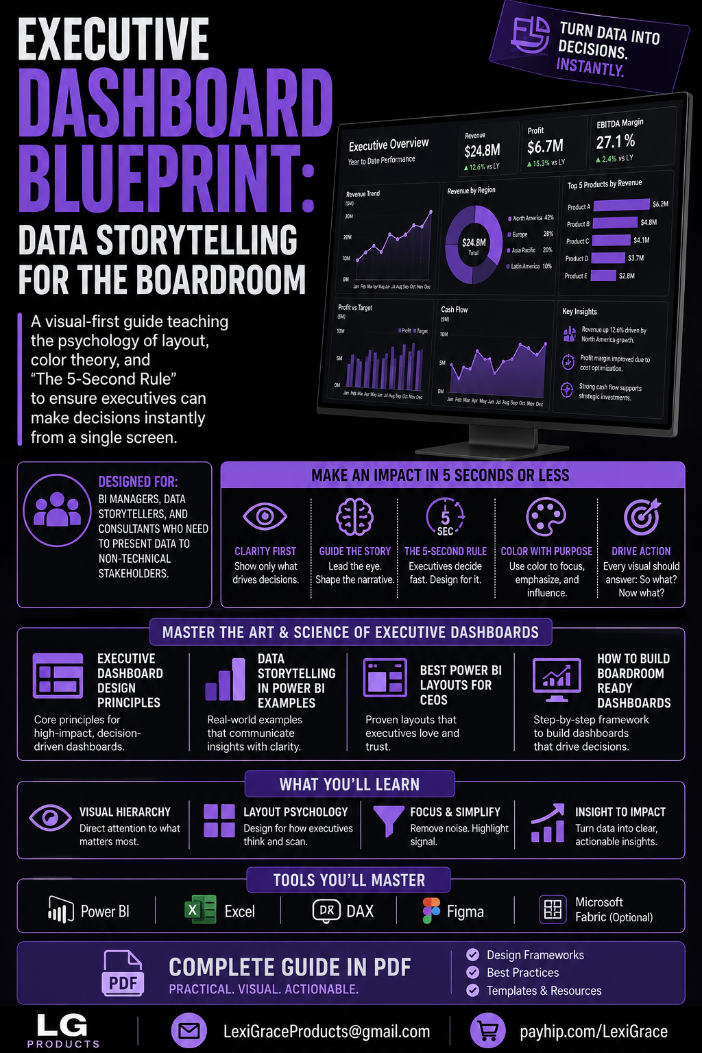
✅ Chapter 3 — Data storytelling in Power BI examples — four complete real-world dashboard layouts: the Executive Revenue Overview (three-zone architecture with KPI cards, trend section, and Key Insights panel), the CEO Weekly Pulse (Monday morning 60-second health check layout), the Operations Supply Chain Dashboard (with On-Time Delivery DAX measures including FILTER, CALCULATE, and DATEADD), and the Financial CFO Dashboard (P&L measures including Gross Profit Margin, EBITDA, Budget Variance, YTD Revenue, and YoY Growth)
✅ Chapter 4 — Color theory for dashboards — a seven-row color role reference table covering primary brand color, neutral base, semantic green/amber/red, grey for de-emphasis, and white text rules, WCAG contrast ratio guidance for every common color combination, and conditional formatting DAX using SWITCH to return hex color codes for background and font color based on performance thresholds
✅ Chapter 5 — Best Power BI layouts for CEOs — complete canvas setup configuration (1600×900 and 1920×1080 recommendations with all Format pane settings), Template 1 Executive Overview with five zones and proportions, Template 2 Single Metric Deep Dive layout for board-focused sessions, and Template 3 Comparative Scorecard with RANKX DAX for multi-business-unit reviews and Bookmarks-based Presentation Mode setup
✅ Chapter 6 — DAX for executive dashboards — the complete measure library including base aggregations, same period last year comparisons, year-over-year percentage, YTD and QTD measures, rolling 3-month and 12-month windows, budget variance amount and percentage, performance status SWITCH measure returning plain-language status text, directional arrow measures, full year forecast from YTD run rate, and dynamic KPI card subtitle measures that update automatically with filter context
✅ Chapter 7 — How to build boardroom-ready dashboards — the complete six-phase build framework covering Discovery (dashboard brief and decision definition), Data Audit (quality validation before building), Sketch (wireframe before opening Power BI), Build (two-pass approach — data first, design second), Review (5-Second Test with stakeholder feedback), and Deploy and Maintain (scheduled refresh, data dictionary, 90-day review), plus a Good vs Bad performance best practices comparison covering Import vs DirectQuery, measures vs calculated columns, and visual count per page
✅ Chapter 8 — From data to decision — the Pyramid Presentation Structure (headline 30 seconds, evidence 2 minutes, implication 1 minute, action 30 seconds), and four complete boardroom tough question response scripts covering data discrepancy challenges, requests for drill-down dimensions not on the dashboard, forward-looking forecast questions, and metric relevance challenges — with exact language for each scenario
✅ Bonus — Complete Resource Kit — a 25-item pre-publication checklist organized into five sections (Visual Hierarchy, Color and Contrast, Data Accuracy, Executive Readiness, Power BI Technical), five recommended executive color palettes with hex values for boardroom, corporate, minimal, high-contrast, and technology contexts, and a complete DAX quick-reference library covering all period comparisons, YTD measures, variance calculations, rolling windows, status indicators, arrow measures, and ranking in copy-paste format
This guide is perfect for:
- BI managers who build technically excellent dashboards that executives do not engage with and want to understand why
- Data storytellers and analysts who present to senior leadership and want every presentation to drive a clear decision
- Consultants who deliver dashboards to client C-suites and need a repeatable framework for boardroom-ready output
- Power BI developers who are strong on DAX and data modeling but want to improve the visual communication and design quality of their reports
- Anyone who has ever had an executive say "can you just tell me the headline number?" after a dashboard presentation
The data is not the problem. The communication is the problem.
Executives make hundreds of decisions per day. They do not have time to interpret complex visualizations, hunt for context, or decode what a number means without a comparison. They need a dashboard that does the analytical thinking for them — that surfaces the insight, signals the status, and points to the action. In 5 seconds or less.
Every principle, template, DAX measure, and presentation strategy in this guide exists to build exactly that.
Turn Data Into Decisions. Instantly.
Instant digital download. Build your first boardroom-ready dashboard today.
Note: Examples use Microsoft Power BI Desktop and DAX. A Power BI Desktop license is free. A Power BI Pro license ($10/user/month) is required for sharing and collaboration features. DAX measures are compatible with Power BI, Excel Power Pivot, and Analysis Services.
© 2026 Lexi Grace Products | LexiGraceProducts@gmail.com | payhip.com/LexiGrace