

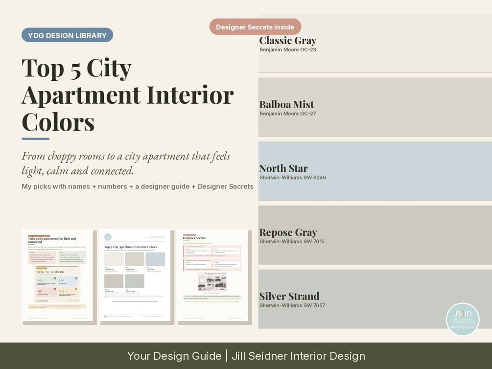


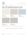
Top 5 City Apartment Interior Colors: Keep a City Apartment Light, Calm and Connected (Printable PDF)
From choppy rooms to a city apartment that feels light, calm and connected.
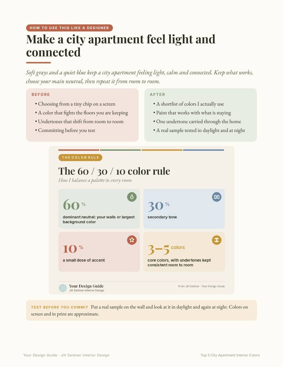
BEFORE: choosing from a tiny chip on a screen, a color that fights the floors you are keeping and undertones that shift from room to room.
AFTER: a shortlist of colors I actually use, paint that works with what is staying, one undertone carried through your home and a sample tested in your own light.
NEW IN THIS EDITION
- How to use this like a designer: my 60 / 30 / 10 color rule as a color guide, plus how I test a color before I commit.
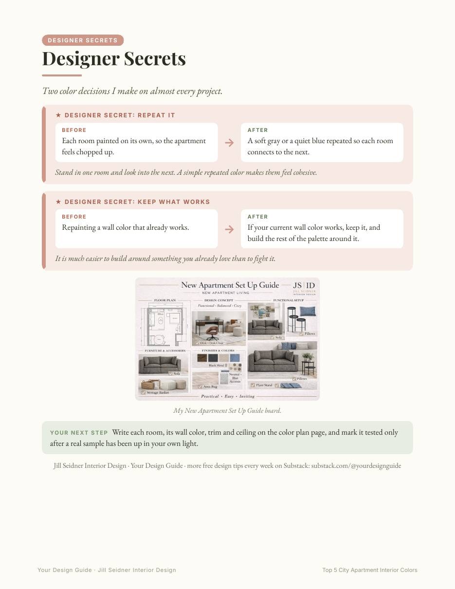
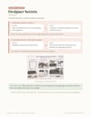
- Designer Secrets: two before → after color decisions: repeating one color from room to room, and keeping what already works.
- Every original printable page is still inside, exactly as before.
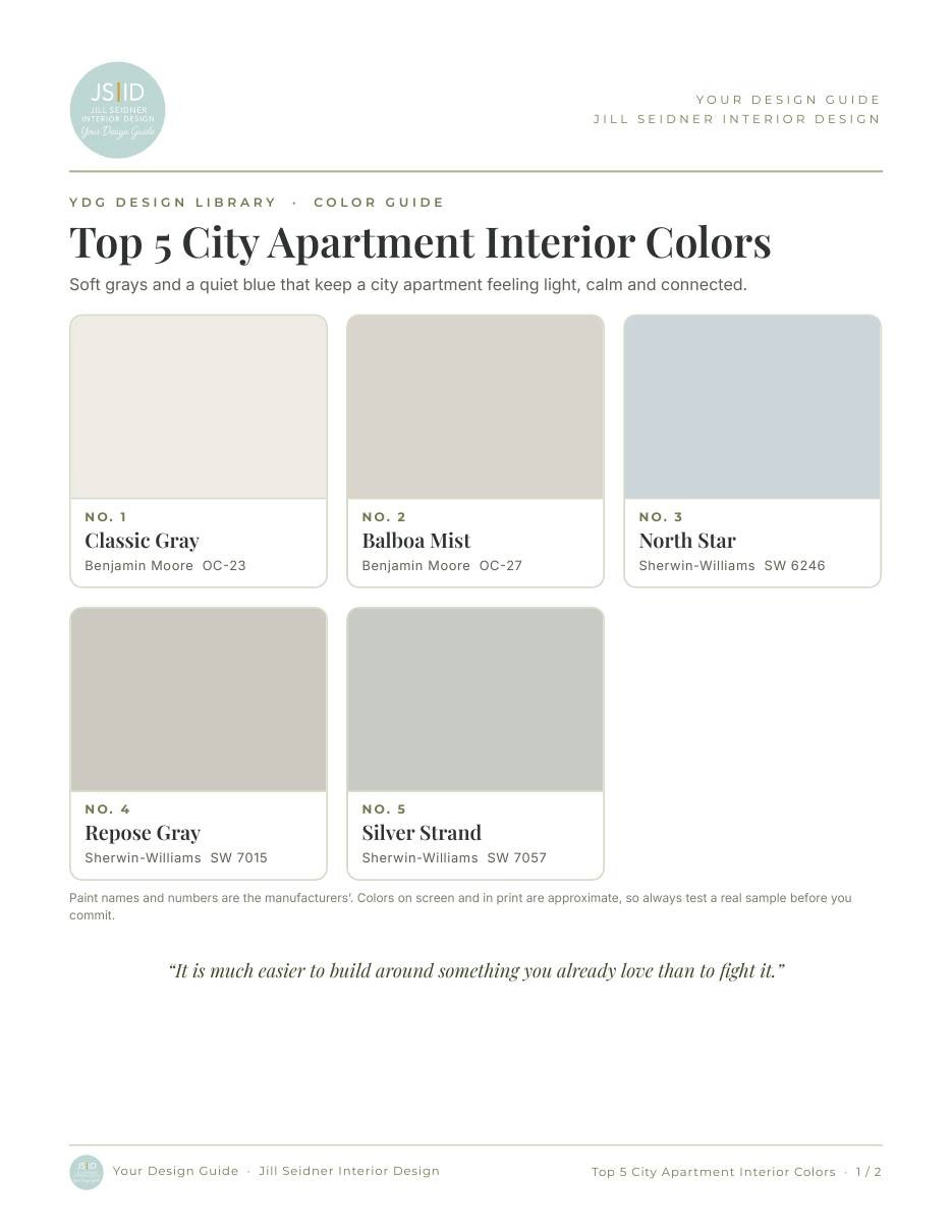
Soft grays and a quiet blue that keep a city apartment feeling light, calm and connected.
WHAT'S INSIDE (4 pages)
- 5 colors: Classic Gray (Benjamin Moore OC-23), Balboa Mist (Benjamin Moore OC-27), North Star (Sherwin-Williams SW 6246), Repose Gray (Sherwin-Williams SW 7015), Silver Strand (Sherwin-Williams SW 7057)
- Large color blocks so you can see each color at a glance
- "Put these colors to work": my checklist for choosing and testing paint, from my color articles
- A fill-in color plan for each room or wall
Paint names and numbers are the manufacturers'. Screen and print colors are approximate, so always test a real sample before you commit.
FORMAT
Printable PDF · US Letter (8.5 x 11 in) · 4 pages · Instant download.
Created by Your Design Guide · Jill Seidner Interior Design