




How to Draw Key Levels on Any Chart
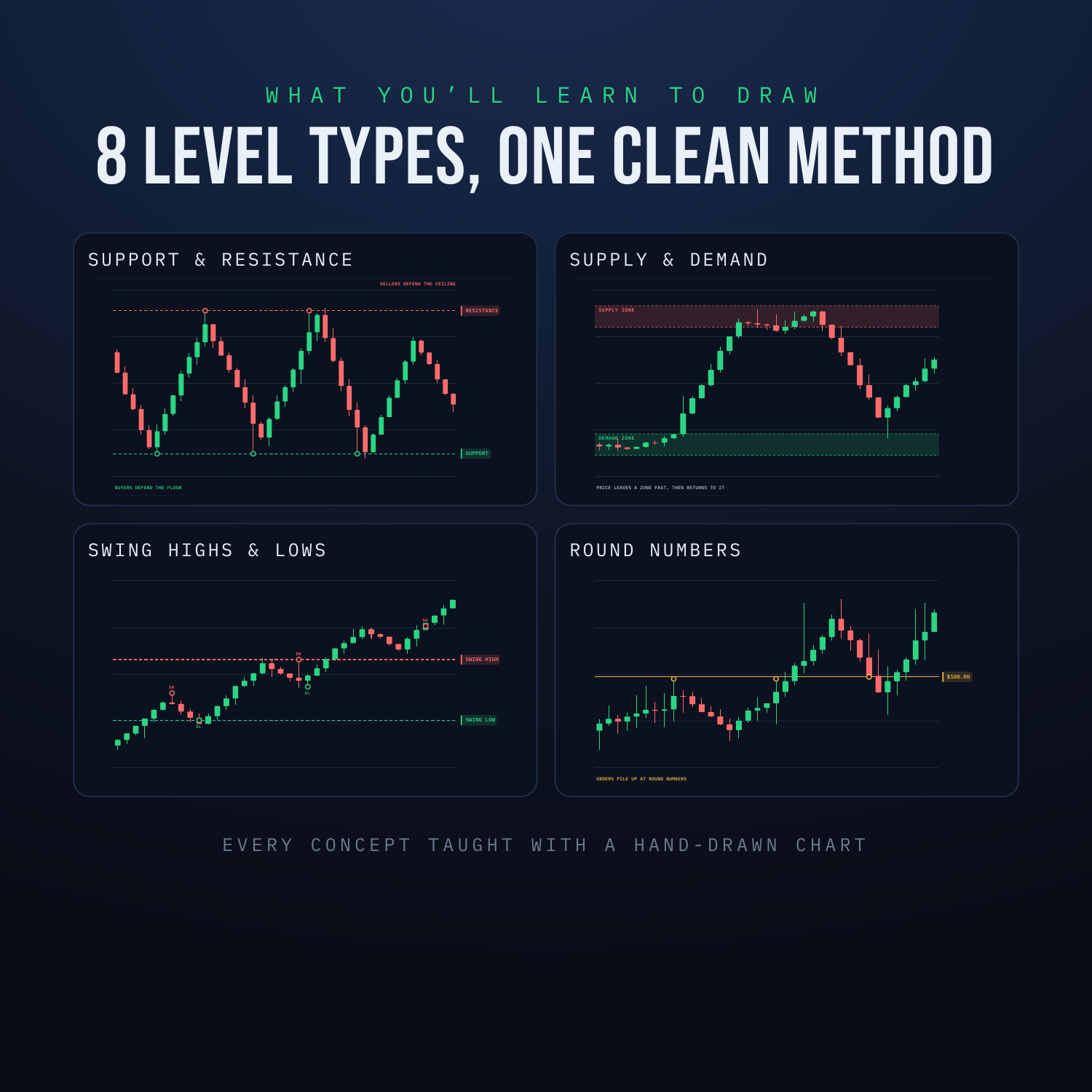
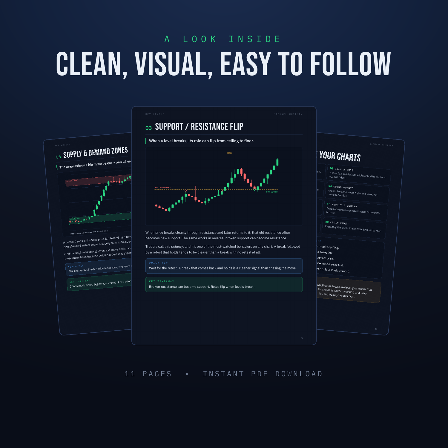
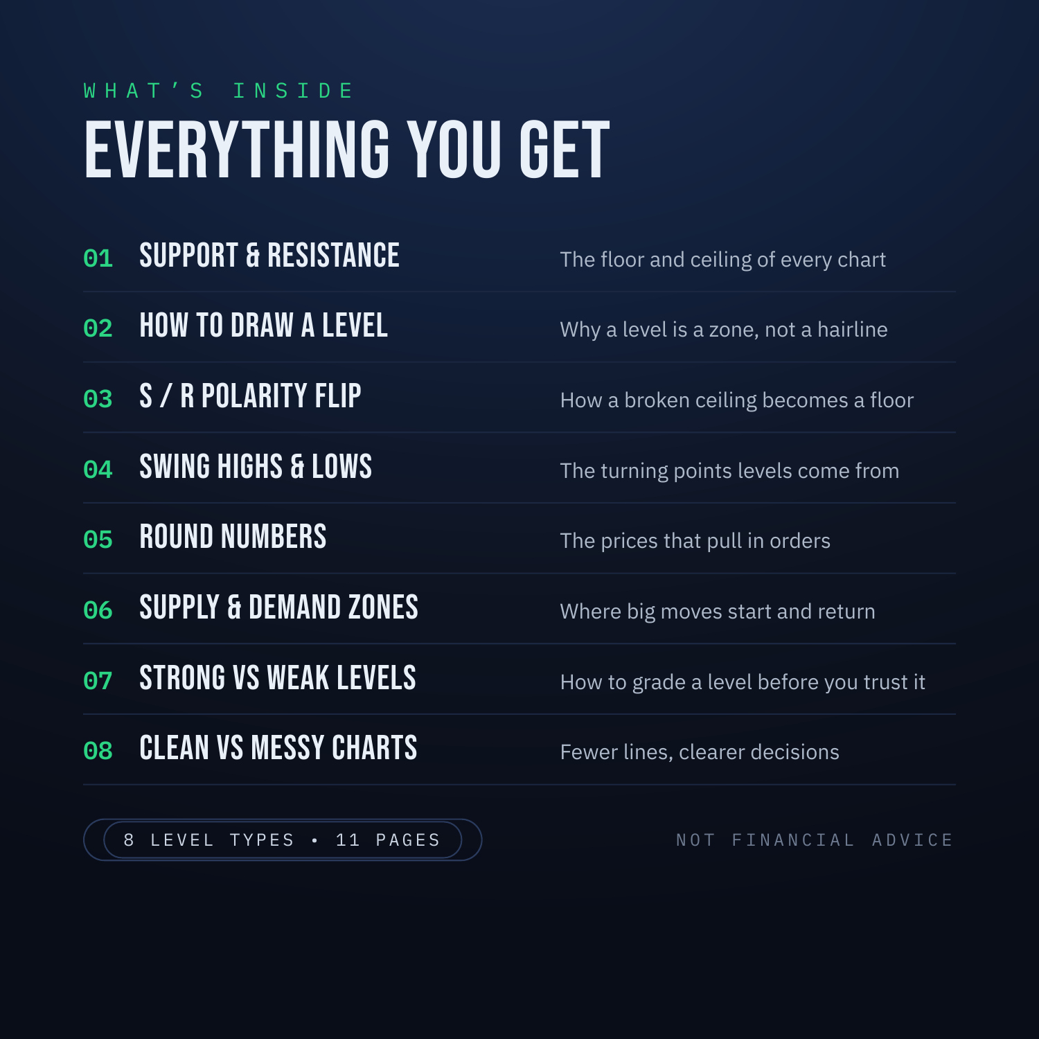
Most charts look like chaos. A wall of random candles with no map. Key levels are the map. They're the price areas where buyers and sellers have fought before — and where they tend to react again. Once you can mark them, every chart gets simpler. This is a visual, no-fluff guide to drawing the levels that matter. No jargon. No 40-minute lectures. Just the 8 level types, how to draw each one, and how to keep your chart clean. WHAT'S INSIDE - Support & Resistance — the floor and ceiling every chart is built on - How to Draw a Level — why a level is a zone, not a hairline - Support/Resistance Flip — how a broken ceiling becomes a floor - Swing Highs & Lows — the turning points your levels come from - Round Numbers — the psychological prices that pull in orders - Supply & Demand Zones — where big moves start, and where price returns - Strong vs Weak Levels — how to grade a level before you trust it - Clean vs Messy Charts — why fewer lines mean clearer decisions WHAT YOU'LL BE ABLE TO DO - Mark any chart in 5 simple steps - Tell a strong level from a weak one at a glance - Stop cluttering your screen with lines that mean nothing - Read price as a series of decision points, not noise Every concept is taught with a clean, hand-drawn chart — so you see exactly what a level looks like in the wild. HONEST NOTE Levels show you where a reaction is more likely — not where it's guaranteed. Every level eventually breaks. This guide is educational only and is not financial advice. Always use a stop and manage your risk. WHAT YOU GET - An instant-download PDF guide (11 pages) - Yours to keep and re-read anytime Pairs perfectly with "How to Read a Crypto Chart" and the "Candlestick Patterns Cheat Sheet" — read the chart, draw the levels, then read the candles at those levels.