
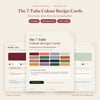
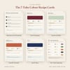

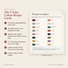

The 7-Tube Colour Recipe Cards | 16 Colour Mixing Recipes for Acrylic, Oil & Gouache (PDF)
MIX MORE. BUY LESS. UNDERSTAND WHAT YOUR PAINT IS DOING.
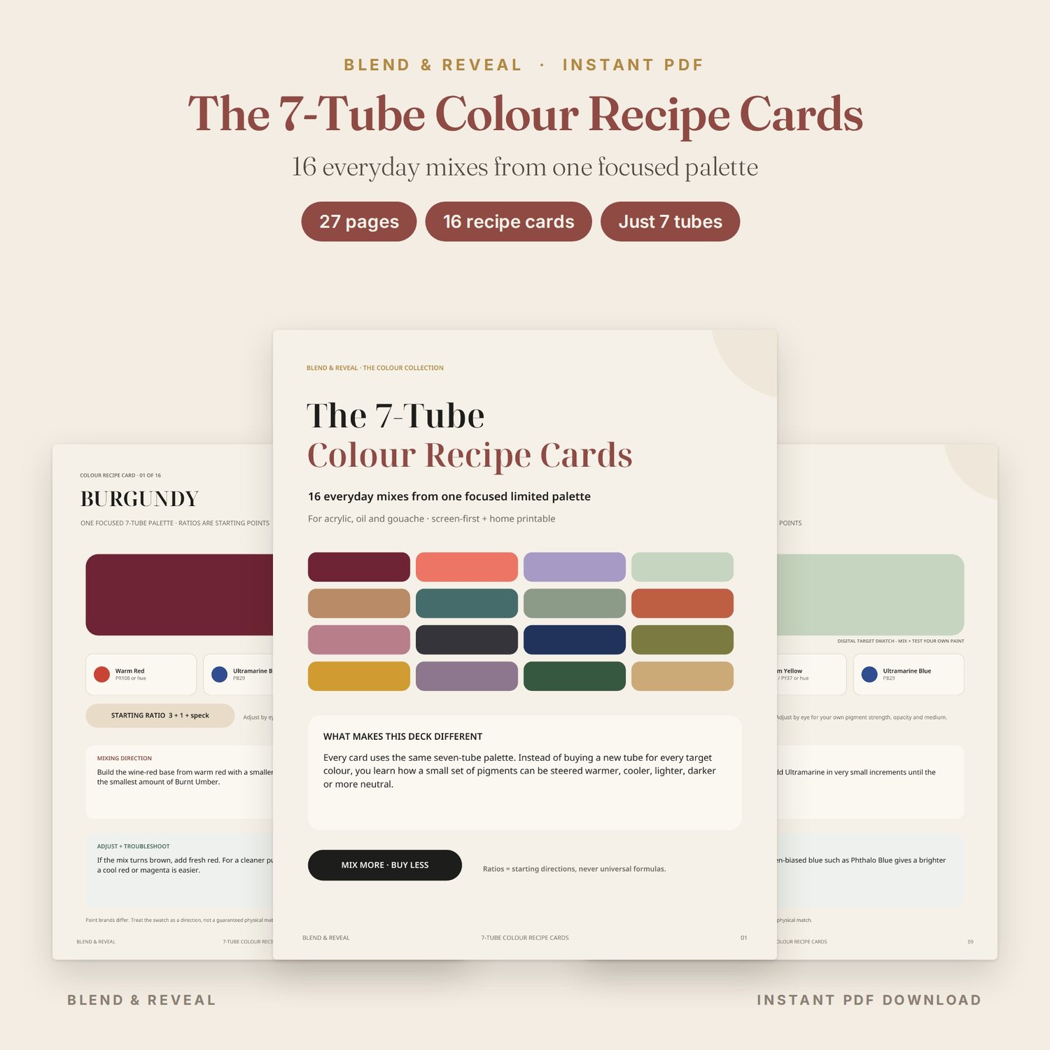
The 7-Tube Colour Recipe Cards by Blend & Reveal is a practical 27-page limited-palette reference deck built around one focused set of seven paints.
Instead of buying a separate tube for every target colour, you learn how the same small palette can be steered warmer, cooler, lighter, darker or more neutral.
The deck is designed for acrylic, oil and gouache painters who want a quick reference beside the palette rather than another long theory book.
WHAT'S INSIDE
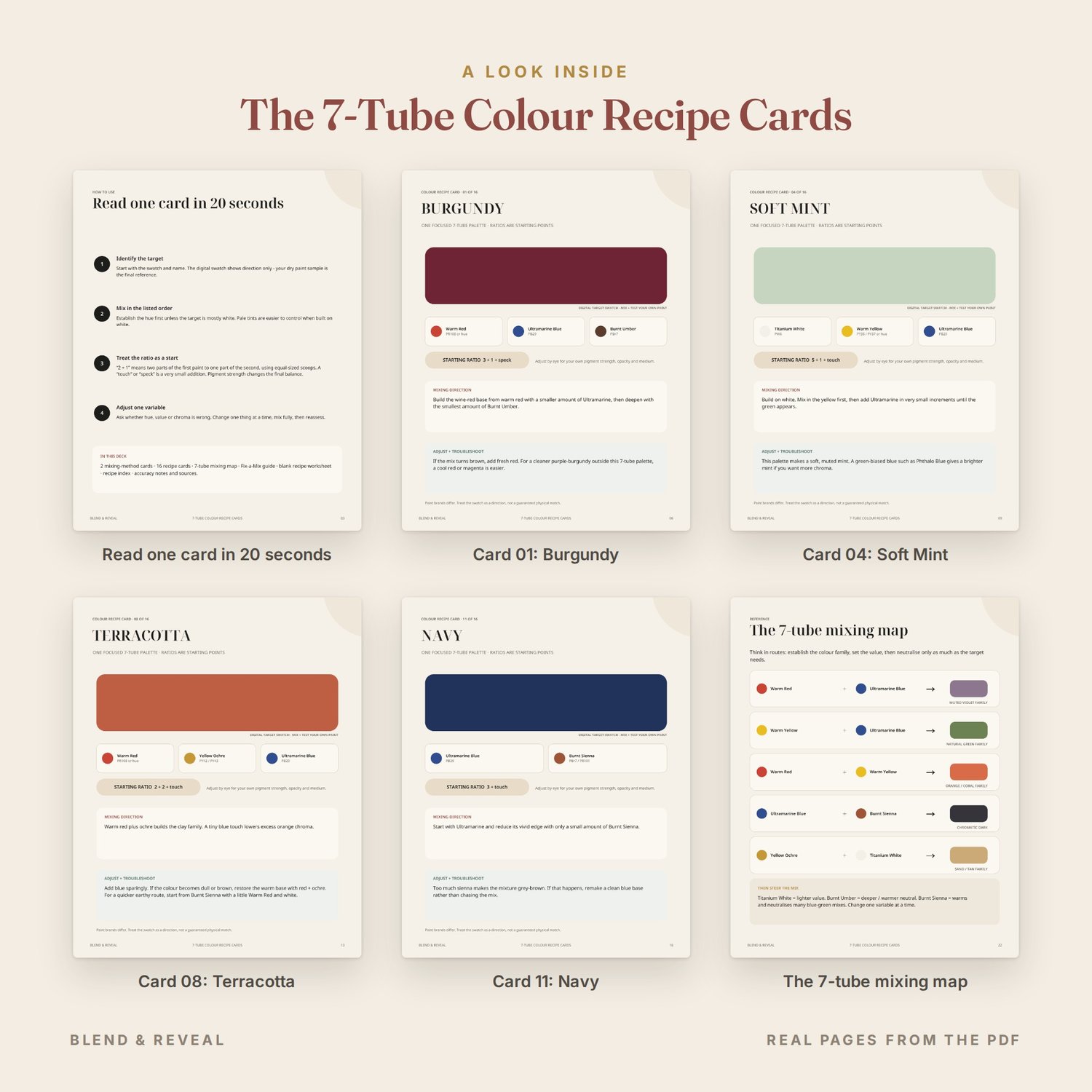
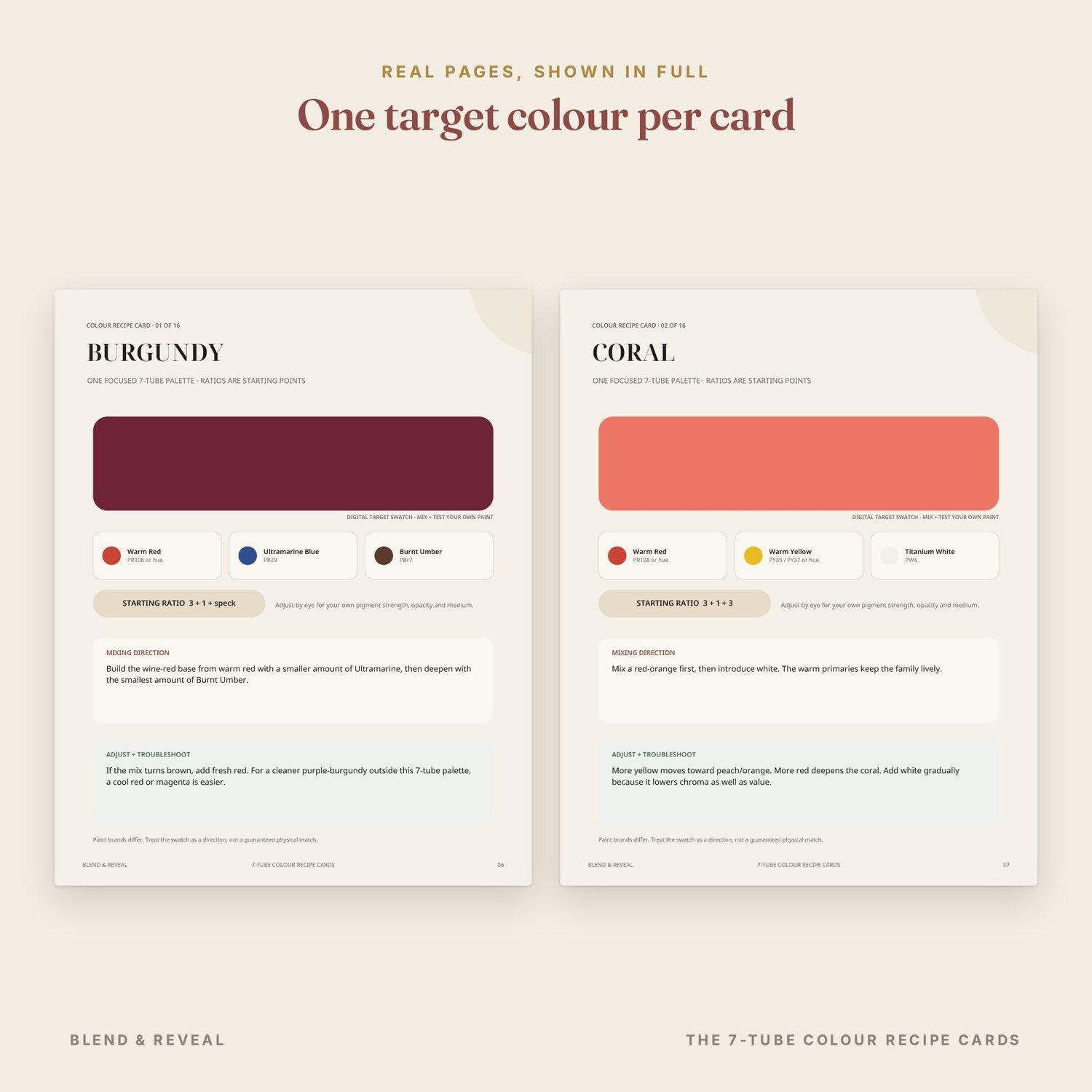
• 16 individual colour recipe cards
• One focused 7-tube palette
• 2 professional mixing-method cards
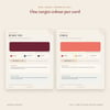
• Starting ratios for every target
• Mixing direction for every recipe
• Adjust + Troubleshoot guidance on every card
• 7-tube mixing map
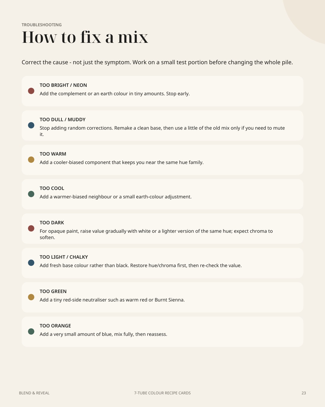
• Fix-a-Mix troubleshooting guide
• Printable colour-recipe worksheet
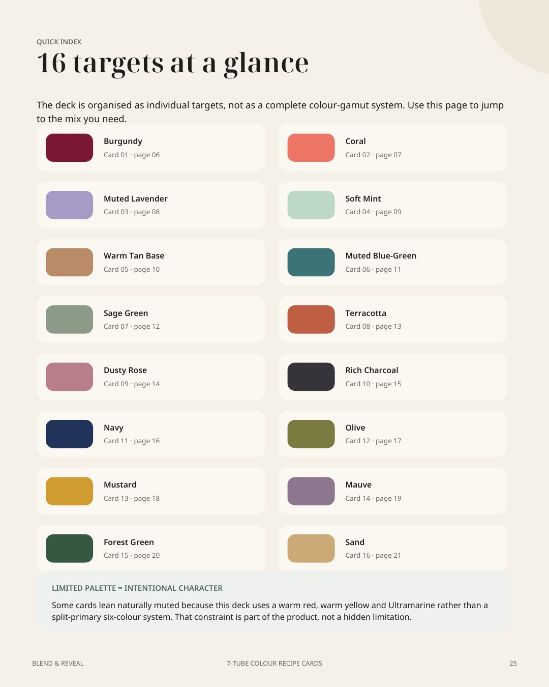
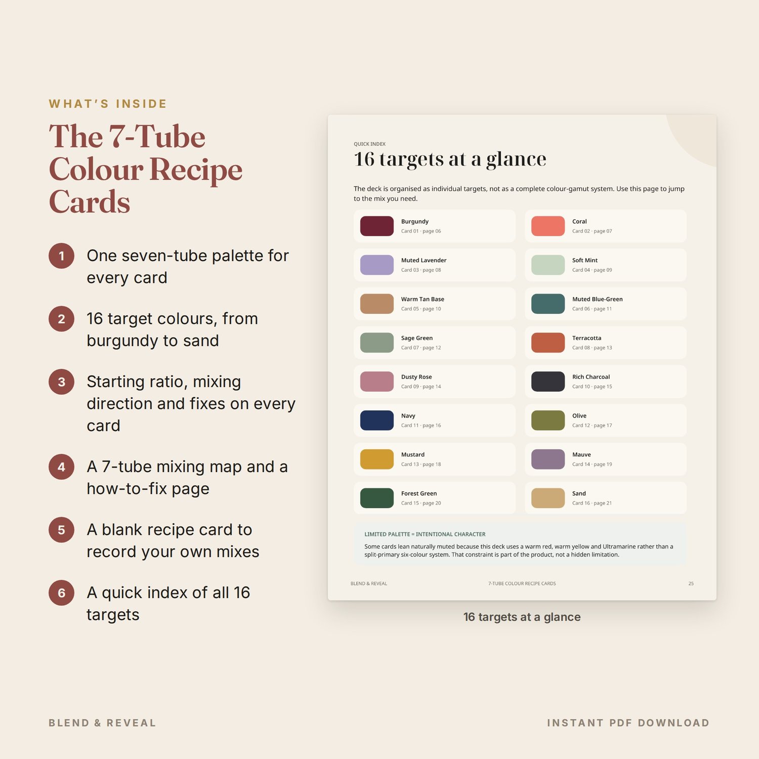
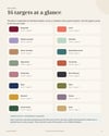
• 16-colour quick index
• Accuracy notes, pigment-bias guidance and technical references
THE 16 TARGET COLOURS
Burgundy, Coral, Muted Lavender, Soft Mint, Warm Tan Base, Muted Blue-Green, Sage Green, Terracotta, Dusty Rose, Rich Charcoal, Navy, Olive, Mustard, Mauve, Forest Green and Sand.
THE 7-TUBE PALETTE
• Ultramarine Blue
• Yellow Ochre
• Warm Red
• Warm Yellow
• Burnt Sienna
• Burnt Umber
• Titanium White
WHY THIS DECK IS DIFFERENT
Every recipe uses the same seven-tube palette.
That limitation is intentional. The goal is not to pretend seven tubes can reproduce every colour at maximum chroma. The goal is to teach you how a useful, compact palette behaves — especially for natural greens, earths, darks, muted violets, coral and warm neutral families.
Where a cleaner violet, teal, mint or rose would benefit from a different pigment bias, the card tells you.
HOW TO USE THE CARDS
Choose a target, mix in the listed order, treat the ratio as a starting direction, then adjust one variable at a time.
Every card reminds you that real paint varies by pigment, brand, opacity, tinting strength and medium. Your own dry swatch is always the final reference.
FORMAT
• 27-page digital PDF
• 4:5 portrait format
• Screen-first and home-printable
• Searchable/selectable text
• Instant digital download
• Designed for acrylic, oil and gouache
IMPORTANT PAINT NOTE
Ratios in this deck are starting directions, not universal formulas. Pigment chemistry, concentration, opacity, tinting strength, brand and medium can all affect the final result.
Digital and printed swatches are visual targets only. Always test a physical dry swatch with your own materials before final work.
This deck is most directly suited to opaque acrylic, oil and gouache. Watercolour behaves differently because dilution, transparency and paper white are central to the result.
LICENCE
You may print the deck for your own practice and use the colour ideas in your personal or commercial creative work.
You may not resell, redistribute, upload, share or reproduce the PDF or its pages as another product.
This is a digital product. No physical item will be shipped.
BUYER FAQ
Q: Are the ratios exact formulas?
A: No. They are controlled starting directions. Paint brands and pigments vary, so adjust by eye and judge a dry test swatch.
Q: Do I need exactly the same brand of paint?
A: No. The guide explains the intended pigment bias and gives representative pigment information where useful. Comparable warm-red and warm-yellow alternatives can be used.
Q: Can I use Cadmium Hue alternatives?
A: Yes. Comparable warm-red and warm-yellow hue formulations can be used. Check your paint label and adjust for tinting strength.
Q: Why are some violets and blue-greens muted?
A: The deck intentionally uses a compact warm-primary palette. A cool red/magenta or a green-biased blue such as Phthalo Blue can expand the gamut, but those extra tubes are not required for the 16 core cards.
Q: Is this the same as The Colour Companion?
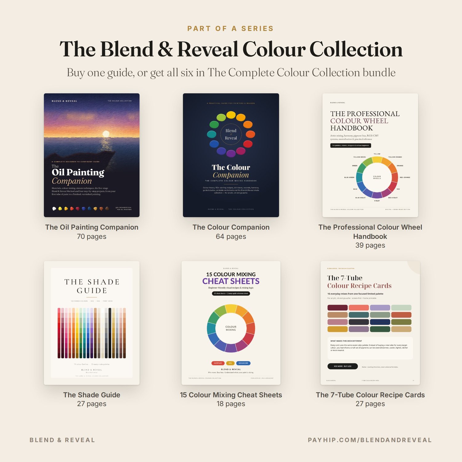
A: No. The Colour Companion is the full colour-mixing handbook. This product is a fast limited-palette recipe deck designed to sit beside your palette while you work.
Q: Can I print it?
A: Yes. The PDF is designed for screen use and home printing. Printed colours can vary by printer, ink and paper.