


Aura UI — Figma + React Design System for AI Products
What is Aura UI?
Aura UI is a production-ready Figma and React component library designed for teams building AI-powered products. It ships with
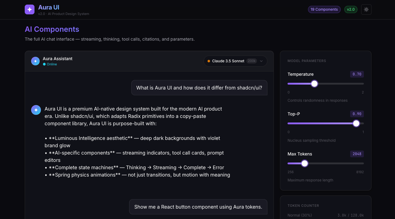
every component a standard design system includes — plus nine AI-specific components that don't exist anywhere else.
Streaming indicators. Tool call cards. Token counters. Prompt editors. Model selectors. The building blocks of modern AI
interfaces, designed with the same rigor you'd apply to a base component library.
---
What's included?
19 production-ready components across two layers:
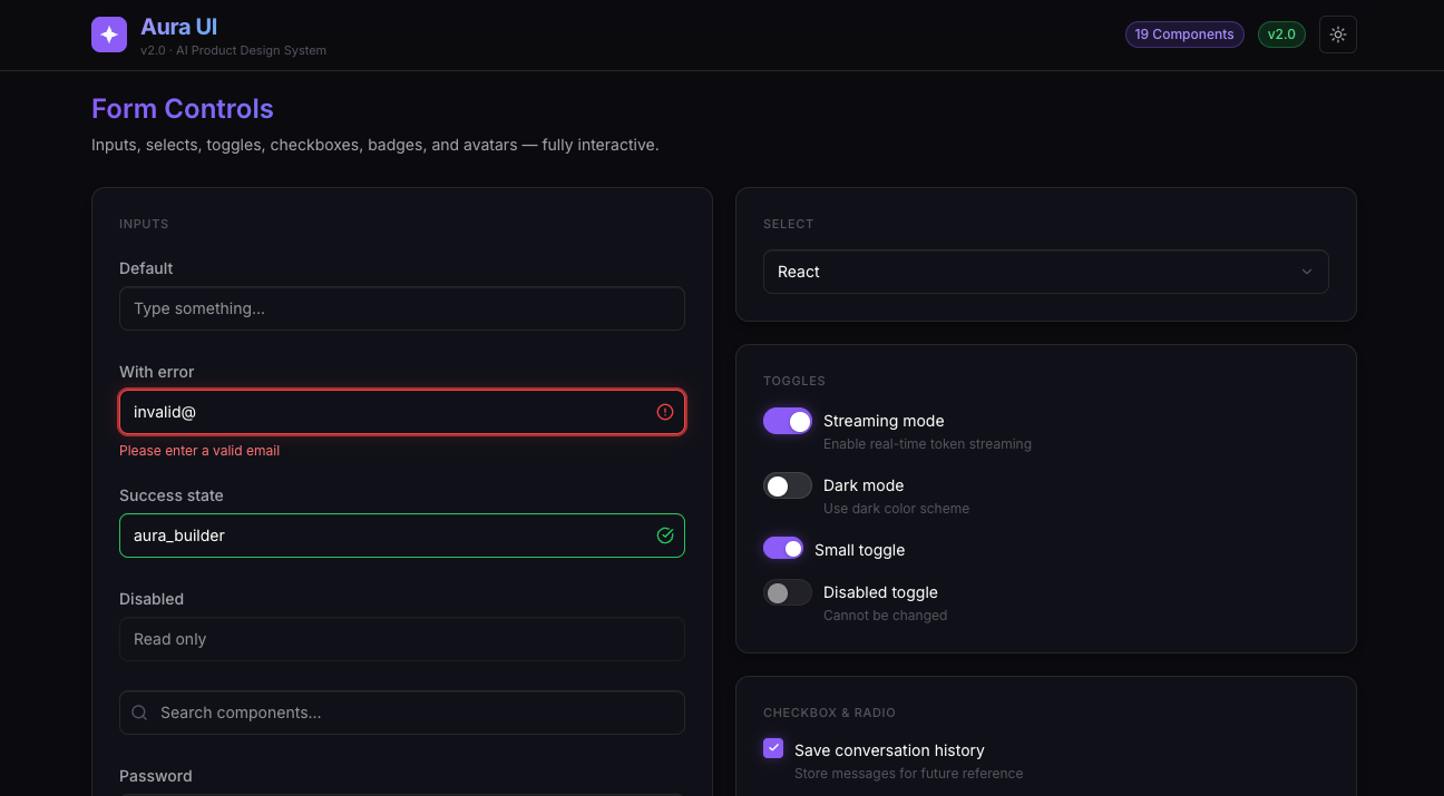
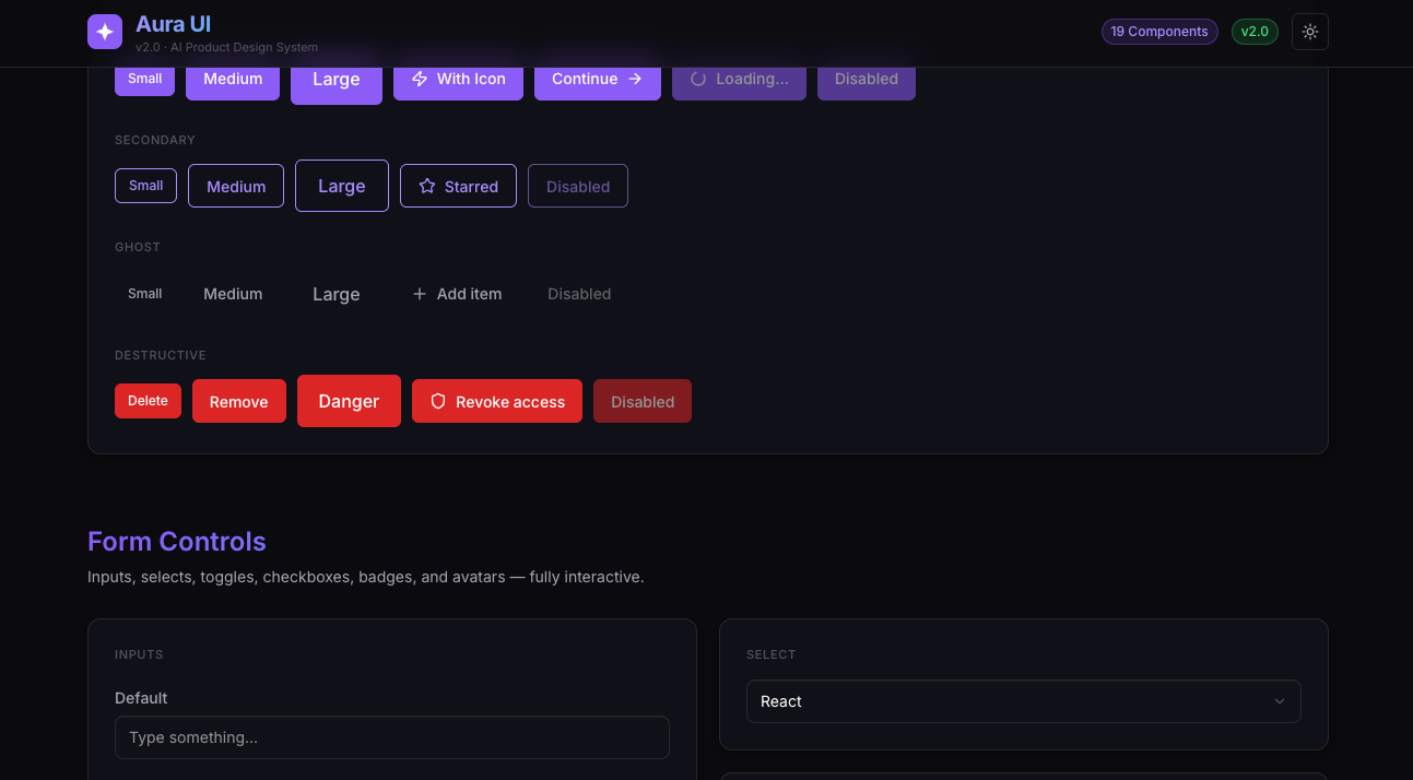
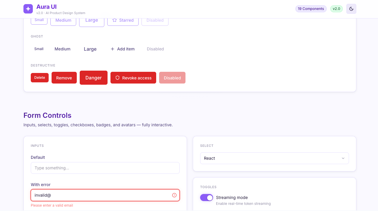
Base Components (10):
Button · Input · Select · Toggle · Checkbox · Badge · Avatar · Modal · Toast · Tabs
AI-Specific Components (9):
MessageBubble · StreamingIndicator · ToolCallCard · ParameterSlider · CitationBlock · TokenCounter · CodeBlock · PromptEditor ·
ModelSelector
Everything ships in:
- Figma file with full component library, auto-layout, and variables
- React + TypeScript + Tailwind CSS — zero build errors out of the box
- Complete AI state machine: Thinking → Streaming → Complete → Error
- Dark mode and Light mode, fully implemented
---
Why Aura UI?
Most design systems were built before LLMs existed. They have buttons and modals. They don't have streaming text states, tool call
visualizations, or model parameter controls.
If you've ever opened a general-purpose UI kit to build an AI chat interface and realized you'd be starting from zero on the parts
that actually matter — this is why Aura UI exists.
---
Pricing
Early access: $49 — first 200 licenses only.
Regular price: $99
One-time purchase. Lifetime access. All future updates included.