

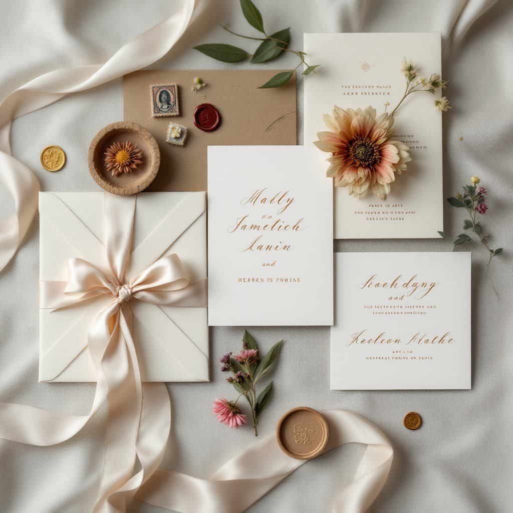
5 Elegant Script Fonts for Wedding Invitations (Top Picks)
The first look at your wedding starts with the invitation, and it should feel like magic. The right typeface sets the mood, hints at the dress code, and whispers the style of the day. Choose well, and your invite reads as elegant, romantic, and timeless before guests even open the envelope.
Script fonts shine here. They flow like handwriting, with graceful curves and natural rhythm, which adds warmth and polish. The best picks balance beauty with clarity, so names feel special and details stay easy to read.
In this guide, you’ll find five elegant script fonts that suit modern, classic, and vintage themes. Each option brings a distinct vibe, from airy and light to rich and ornate, so you can match your font to your venue and style.
You’ll also get simple tips to use them well, like how to pair scripts with clean sans serifs, when to adjust size and spacing for print, and where to add flourishes without clutter. We’ll talk hierarchy for names, dates, and addresses, plus color choices that keep contrast crisp. Ready to set the tone and make every detail feel intentional?
Why Script Fonts Are Ideal for Wedding Invitations
Script fonts feel personal. They mimic handwriting with cursive strokes and connected letters, so they read as warm and romantic. That human touch sets the tone for a celebration, not a board meeting, which is exactly what you want on an invite.
What Script Fonts Are
Script fonts are designed to look like pen on paper. Letters often connect, forms vary, and strokes curve with a natural rhythm. Think elegant calligraphy, loose brush scripts, or refined copperplate styles. They add personality, even before guests read a single detail.
Why They Suit Weddings
Weddings call for emotion and style. Script fonts add romance, elegance, and a slight vintage feel without turning stiff or dated. They make names feel special and elevate key lines like your venue or date. Compared to serif or sans serif, scripts signal celebration and intimacy, not business or editorial tone.
- Modern vibe: Clean, airy scripts for minimalist themes.
- Classic look: Formal scripts for black-tie events.
- Rustic charm: Brush scripts for garden or barn venues.
Strong in Print and Digital
Scripts hold up well across formats when sized and spaced right. On print, curves feel tactile and premium, especially with textured paper or foil. On screens, high-contrast, smooth scripts pop in PNG or SVG. Test at actual size, then adjust weight or tracking as needed.
Readability With Smart Pairing
Use scripts for names and headings, then pair with a simple serif or sans serif for details. This contrast keeps everything clear and guides the eye.
- Example: “Avery & Julian” in script, body text in a clean sans serif.
SEO and Style Trends
Guests and planners search for terms like “romantic script fonts,” “modern calligraphy fonts,” and “wedding script trends.” Choosing styles that align with these phrases helps your inspiration boards, mood boards, or portfolio get found.
Mistakes to Avoid
- Overcrowding text, which makes scripts hard to read.
- Using script for long paragraphs.
- Low contrast colors, like pale gold on ivory.
- Tiny sizes that lose fine strokes.
- Too many flourishes that compete with names.
Top 5 Elegant Script Fonts to Elevate Your Wedding Invites
Here is a curated list of five script fonts that work beautifully for wedding stationery. Each pick reads well in print and on screens, plays nicely with clean supporting fonts, and sets a mood without stealing focus from your details. Use them for names, dates, and headings, then balance with a simple serif or sans serif for body text.
Great Vibes: Timeless Elegance for Romantic Affairs
Great Vibes is a modern calligraphy script with smooth, flowing lines and gentle swashes. Strokes connect with a soft rhythm, so names feel polished and romantic. The letterforms have a natural slant, which adds movement without looking messy.
Why it works for weddings: it signals classic romance, not old-fashioned formality. You get graceful curves and just enough flair for a keepsake look. It suits both formal ballroom events and intimate backyard vows.
- Best uses: Couple names, dates, envelope addressing, ceremony headings.
- Pairing idea: Lato for details and directions. Lato adds crisp contrast and keeps the layout clean.
- Design tips: Keep tracking tight, since the connections are smooth. Print at 16 to 24 pt for headings on invites, a bit larger for letterpress or textured stocks.
Practical perk: it is free on Google Fonts, quick to download, and easy to test in mockups. Great Vibes delivers a classic feel that reads fresh, not dated.
Dancing Script: Playful Flourish for Joyful Celebrations
Dancing Script brings a bouncy, handwritten look with varying stroke widths that feel lively and warm. Letters dip and lift like real pen strokes, so the text feels casual and friendly while still stylish.
This is perfect for fun, outdoor weddings or cocktail-forward receptions where the vibe is upbeat. It shines on invites that include quotes, schedule details, or playful taglines. The rhythm helps short lines pop and keeps long lines from looking stiff.
- Best uses: Quotes, day-of timelines, RSVP headers, wedding website headers.
- Pairing idea: Open Sans for body text. It keeps everything neat and readable next to the script’s energy.
- Design tips: It is legible at smaller sizes, which is rare for scripts. For print, 14 to 18 pt still reads well. For web, use it as a display style, then serve body text in a sans serif for speed and clarity.
Bonus: Dancing Script is available as a web font, so you can match your paper suite with your site. That detail makes your brand feel cohesive, from mailboxes to mobile screens.
Allura: Sophisticated Swirls for Luxe Invites
Allura features elegant, elongated letters with refined swirls and tasteful flourishes. The lines are slim and crisp, so the script reads upscale without heavy ornament. Ligatures knit letters in a graceful way, which gives the font a calm, steady flow.
It looks right at home on high-end suites, black-tie events, or any design with foil, vellum, or deckled edges. Allura also brings a soft, feminine tone that pairs beautifully with bridal motifs and floral monograms.
- Best uses: Save-the-dates, RSVP titles, monogram marks, reception signage.
- Pairing idea: Playfair Display for subheads and body. The contrast between elegant script and classic serif adds a premium feel.
- Design tips: Give flourishes room to breathe. Increase line spacing for multi-line titles, and avoid all caps. Use deep ink colors like charcoal or navy for crisp edges on uncoated stocks.
Allura is royalty-free and works for both digital previews and printed pieces. That makes proofing simple, since what you see on screen translates well to paper.
Edwardian Script: Vintage Charm for Classic Weddings
Edwardian Script carries ornate, 19th-century inspired forms with intricate connections and formal loops. It has a bold presence, even at moderate sizes, and it immediately adds a sense of history. The weight tends to sit slightly heavier than modern calligraphy styles, which gives it gravitas.
This is ideal for traditional ceremonies, cathedral venues, and black-tie affairs. Because the strokes are complex, it is best used for headlines and short lines, not long blocks of text.
- Best uses: Main invitation headline, couple’s names, venue line, program titles.
- Pairing idea: Montserrat for the supporting text. The clean geometry grounds Edwardian Script and keeps the layout current.
- Design tips: Scale with care. Start large to honor the detail, then reduce slowly while proofing at 100 percent print size. Track slightly looser for small caps or long names to avoid overlapping swashes. Use generous margins so flourishes do not crowd the edges.
When you want classic, museum-poster elegance, this font brings that old-world charm in a polished way.
Parisienne: Whimsical Grace for French-Inspired Nuptials
Parisienne is a light, cursive font with a distinct Parisian flair. Letters float with soft curves and airy spacing, and the accents feel delicate rather than showy. It reads breezy and chic, like a handwritten note from a weekend in the Marais.
It suits destination weddings, garden parties, or modern city halls with a stylish twist. Because it is light, it layers nicely over textured papers, soft color fields, or subtle patterns without getting heavy.
- Best uses: Menu inserts, programs, place cards, escort displays, captions on photo cards.
- Pairing idea: Roboto for body and small details. Roboto’s straight lines and even rhythm let Parisienne’s curves stand out.
- Design tips: Use higher contrast colors to protect thin strokes. Consider a slight weight increase in print if your paper is very textured. Keep sizes modest for a refined look, and avoid tight letter spacing.
Parisienne brings personality that enhances the layout without overwhelming it. It adds charm, not clutter, which makes it easy to style across a full suite.
Quick Pairing and Usage Guide
A simple pairing strategy keeps your suite cohesive and readable. Use the script for emphasis, then let a clean font carry the details.
- Scripts for names and headers: Great Vibes, Dancing Script, Allura, Edwardian Script, Parisienne.
- Supporting fonts: Lato, Open Sans, Playfair Display, Montserrat, Roboto.
- Where to use scripts: Invitation headline, couple’s names, dates, venue, short quotes.
- Where to use sans or serif: Timelines, addresses, RSVP info, directions, registry notes.
Example: Set “Ava & Theo” in Great Vibes at 36 pt, then list the venue and date in Lato at 10 to 12 pt with generous spacing. The contrast guides the eye and keeps every line easy to read.
Print and Web Tips to Get a Polished Finish
Scripts shine when you give them room and clarity. Small adjustments go a long way.
- Test at actual size, both on screen and on your chosen paper.
- Increase line spacing for multi-line script headings.
- Keep color contrast strong, especially for thin strokes.
- Avoid all caps in scripts, since forms are designed for cursive flow.
- For web, host the script as a display style, then set body text in a fast-loading sans serif.
These five fonts cover a wide range of moods, from playful to formal. Mix them with the right partner fonts, set the hierarchy with care, and your invitations will feel intentional, romantic, and easy to read.
How to Choose and Use These Fonts in Your Wedding Designs
The right script should match your story, not fight it. Tie your font to the theme, venue, and palette, then test it in real sizes. Small tweaks to spacing, color, and pairing make a big lift. Here is how to pick smart and design with confidence.
Match Font to Theme, Venue, and Palette
Start with mood, place, and color. Your font should echo all three.
- Classic ballroom: Choose refined scripts with steady strokes and clean swashes.
- Garden or barn: Pick lighter, bouncier scripts with a relaxed rhythm.
- City loft or modern venue: Go sleek and minimal with low-contrast scripts.
- Color pairing: Keep contrast strong. Navy on ivory beats pale gold on cream.
Test Readability and Hierarchy
Scripts shine in short lines. Keep them for names and key words.
- Print at final size. Check thin strokes and flourishes.
- Set a clear hierarchy: names in script, details in a simple sans or serif.
- Adjust tracking slightly looser if letters collide.
Layer With Restraint
Scripts pair well with minimal elements.
- Use soft borders, simple monograms, or a light texture.
- Let flourishes breathe. Add white space around swashes and tails.
- Avoid busy backgrounds that reduce legibility.
Tools for Customization
You can build polished invites without guesswork.
- Canva: Quick layouts, easy pairing, fast mockups for script fonts wedding invitations DIY.
- Adobe Illustrator or InDesign: Fine control for kerning, ligatures, and print-ready files.
- Export high-res PDFs with fonts embedded.
Print Production Tips
Your print choice changes how scripts read.
- Foil stamping: Choose thicker lines to avoid flaking. Test on your paper.
- Letterpress: Bump size a bit to protect thin strokes.
- Paper: Uncoated stocks soften hairlines. Gloss or foil reads crisper.
- Ask your printer to proof at 100 percent.
Licensing and File Prep
Check licensing before you sell or print at scale. Some free fonts allow personal use only. Save outlines for printers if required, and keep a live text version for edits.
Try a few fonts with your colors and venue in mind, then mix, proof, and refine until it feels like you.
Conclusion
These five scripts cover the full mood board for weddings. Great Vibes feels romantic and timeless, Dancing Script adds joyful energy, Allura brings luxe polish, Edwardian Script leans formal and historic, and Parisienne delivers light, chic charm. Each one reads beautifully when paired with a clean serif or sans serif and sized with care.
Pick the font that matches your story, your venue, and your palette. Test it at print size, then fine-tune spacing and color for crisp results. Download a couple of options, mock up your names, and compare on your actual paper. If you want a second opinion, ask your stationer or a designer to review legibility and hierarchy.
Set your invitations with intention, and your guests will feel the tone before they read a word. Which font feels like you two? Share your favorite in the comments, or pin this guide for later.
Comments ()