
Color Makes a Comeback
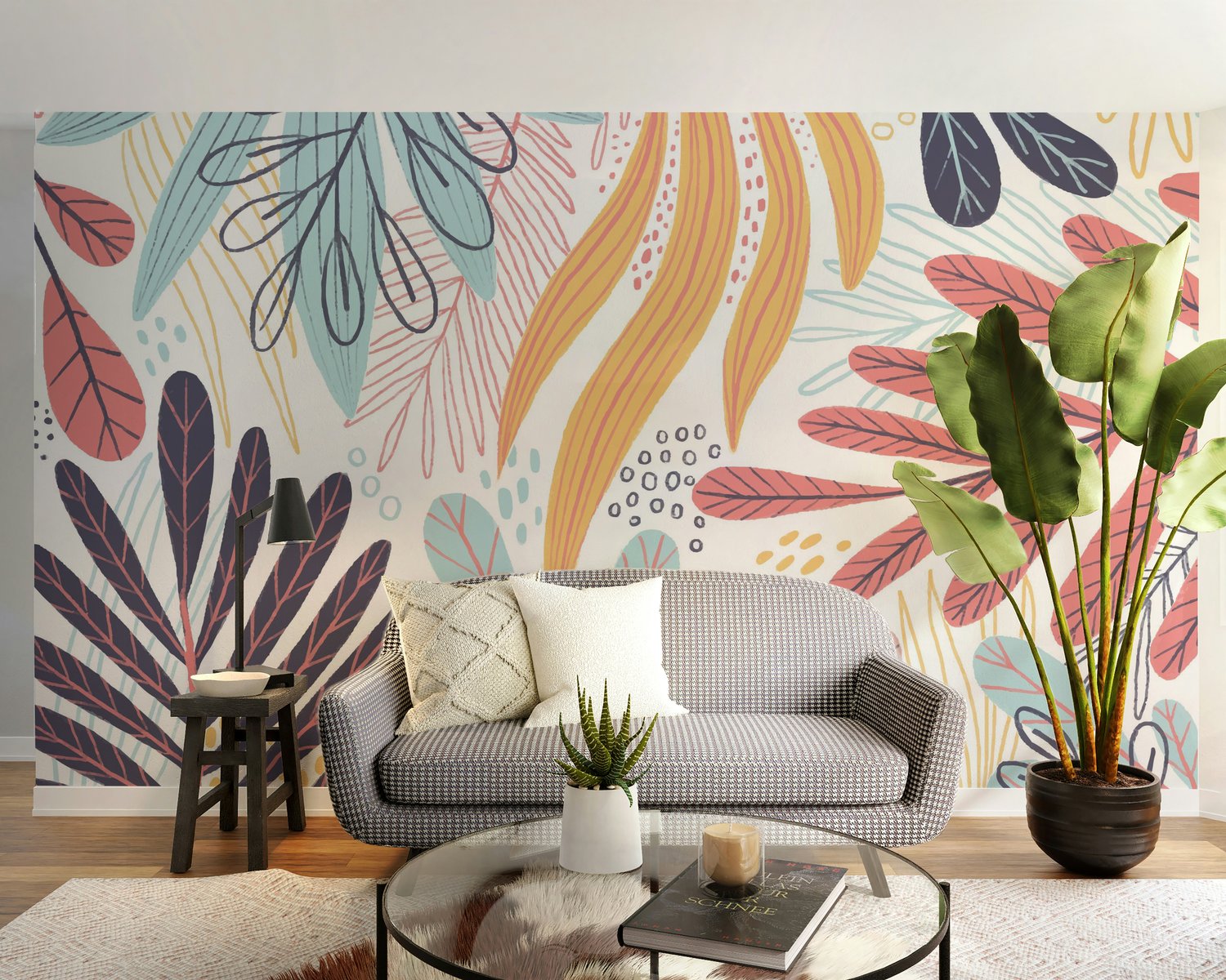
Neutral tones once dominated interior walls for their safe, timeless quality. But current wallpaper trends signal a major shift—designers and homeowners are leaning into color. From warm ochres to deep teals and sunset-inspired blends, bold wallpaper is challenging beige as the default backdrop.
This change is about character. Vibrant wallpapers offer individuality, depth, and mood in a way flat neutrals rarely do.
Understanding the Shift in Style
The move toward colorful wallpapers reflects a broader change in how people view their living spaces. More than ever, there’s a desire for personalization over uniformity. As explored in this article on wallpaper by style, the variety of styles—from retro revival to bold botanicals—shows how color supports a range of design expressions.
Whether it’s a playful pattern in a hallway or a deep-toned mural behind a bed, color adds something neutral walls often lack—presence.
Trendy Ideas That Replace the Plain
Several trendy wallpaper ideas are leading the charge:
- Maximalist florals with oversized blooms in saturated colors.
- Geometric abstracts in bright, clashing hues that spark energy.
- Art deco patterns mixing metallic accents with navy, emerald, and rust.
- Color-washed murals inspired by watercolor art and natural gradients.
These designs offer more than visual interest—they reflect cultural shifts toward color confidence and layered interiors.
Don’t Just Go Bold—Go Smart
Not all colorful wallpapers are created equal. To get long-term value, it's important to pay attention to material quality and finish. This guide to wallpaper features breaks down how washable, fade-resistant, and texture-rich papers can support both aesthetics and practicality.
Choosing the right finish ensures the wallpaper stands up to sunlight, daily wear, and cleaning needs without sacrificing design.
Matching Colorful Wallpaper with Room Purpose
The best wallpaper for walls matches not only your aesthetic but the function of the room:
- For kitchens or dining areas, citrus shades or warm terracotta patterns add vibrance without overwhelming.
- Bedrooms pair well with deeper hues—charcoal with soft greens, or plum with dusty pinks—for restful tones.
- Creative spaces benefit from energizing tones like cobalt blue or marigold, especially in bold geometric prints.
Color selection should always support the atmosphere you’re aiming to create.
Investing in Color That Lasts
Going bold doesn’t mean cutting corners. Many of today’s designs fall into the premium wallpaper category—meaning they’re not just beautiful but built to last. These papers typically use high-grade materials, strong adhesive backing, and long-lasting inks. For those thinking about resale value or durability, this breakdown on premium wallpaper explains how these options contribute to a long-term design payoff.
It’s not just about a trend—it’s about selecting color with purpose and performance in mind.
What to Expect from the Latest Wallpaper Designs
The latest wallpaper releases push beyond aesthetics. Many focus on eco-conscious materials, peel-and-stick options for renters, and even textured surfaces that add depth. Brands are exploring sustainability alongside bold pattern choices, offering designs that are both expressive and responsible.
As more people seek out custom interiors, color-rich wallpapers will likely continue to rise in both popularity and variety.
Final Takeaway: Let the Walls Speak
Neutral has its place, but in 2025, color is carrying the conversation. Whether you prefer expressive murals, moody palettes, or vibrant motifs, the right wallpaper brings more than color—it brings identity.
This isn’t about keeping up with trends. It’s about letting your space reflect who you are—with confidence and color.