

Pastels are typically associated with springtime—light, airy, and soft. But what if you want to bring that same gentle, feminine energy into the warmth of autumn? The secret is deep pastels—muted, dusty, and earthy tones that feel rich yet soft. These colors keep your brand or women’s ministry visuals approachable while embracing a cozy, seasonal aesthetic.
Think of it this way: take any pastel and add a touch of gray or earthy warmth to create a deeper, autumn-ready shade. You get the elegance and softness of pastels, but with a grounded, seasonal vibe perfect for the fall.
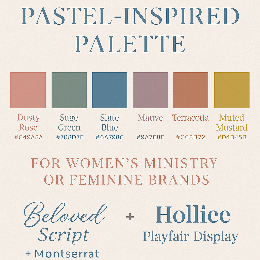
Autumn Pastel-Inspired Palette for Designers:
This palette is ideal for graphics, social media posts, event flyers, or ministry branding—a soft yet sophisticated autumn feel that appeals to women and creative audiences.
Font Pairing Suggestions (Available on CreativeFabrica.com):
- Elegant Script + Sans Serif: “Beloved Script” paired with “Montserrat”
- Playful Handwritten + Modern Serif: “Holliee” paired with “Playfair Display”
These fonts complement the muted pastel palette beautifully, striking a balance between sophistication and approachability.
Whether you’re designing a women’s retreat flyer, ministry social media post, or brand graphics, this dusty, muted palette will give your visuals a warm, inviting, and autumn-inspired vibe.
Comments ()