
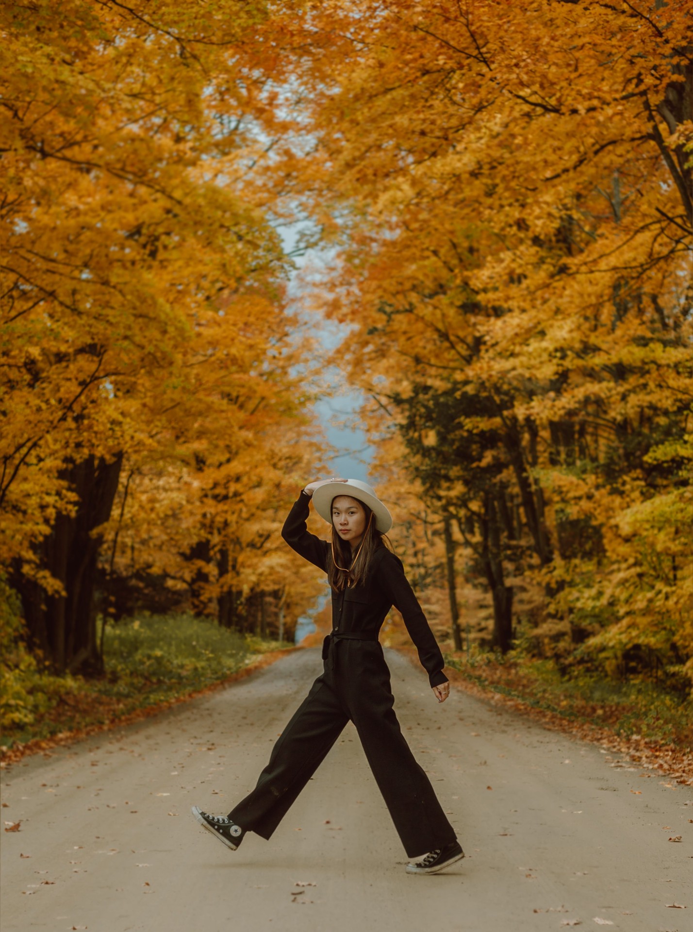
Fall is the easiest season to photograph and the hardest to edit. Your eyes see glowing gold leaves, warm light, crisp air — and your camera gives you back something flat, dull, and slightly green. Sound familiar?
The good news: fall photos don't need a full retouch. They need a few deliberate moves that put back what the camera stole. Here are 7 concrete edits that make October actually look like October.
1. Warm your white balance on purpose
Auto white balance is the #1 fall-photo killer. It sees all that orange and thinks "error" — so it cools everything down to make it look neutral. But neutral is the last thing you want here. Push your temperature warmer (around 5,800–6,500 K) until the light feels like late-afternoon sun again. If skin starts looking sunburned, you've gone too far — back off slightly.
2. Let the warm colors lead in HSL
This is the heart of a fall edit. Open the HSL panel and give Orange and Yellow a gentle saturation boost — that's your foliage. Then do the trick that separates amateurs from everyone else: pull the Greens down. Lawns and evergreens going slightly muted makes every warm leaf in the frame pop harder. You don't need much. Small moves, big payoff.
3. Protect your highlights when you shoot into the light
The best fall photos are backlit — sun flaring through the canopy, leaves glowing from behind. But golden-hour backlight blows out highlights fast. Shoot slightly underexposed (RAW, always) and lift the shadows later instead. A dark file with intact highlights is easy to save; a bright one with white mush where the leaves should glow is not.
4. Lift the shadows — but keep the depth
Under a tree canopy, your subject ends up in the shade while the background blazes. Raise the Shadows slider until you can see their face, then check the whole frame: if it looks flat and milky, ease the Blacks down a touch to bring back the depth. The goal is detail in the dark areas, not a gray fog over everything.
5. Add texture where it belongs
Fall is a detail season — bark, veins in leaves, knit sweaters. A touch of Texture and Clarity (not a hammer, a nudge) makes all of it read richer. Keep these sliders away from faces, though, where they turn skin into sandpaper. Lightroom's masking tools make this a 30-second job: subjects get the soft treatment, everything else gets the crisp one.
6. Don't overdo the saturation — use Vibrance instead
Global Saturation is a blunt instrument: it pushes every color equally, and fall photos go cartoonish fast. Vibrance is smarter — it boosts the quieter colors first and leaves already-strong tones alone. For fall, Vibrance is almost always the right call. Your oranges are already doing the heavy lifting; you just need to wake up the rest.
7. Start from a preset, then make it yours
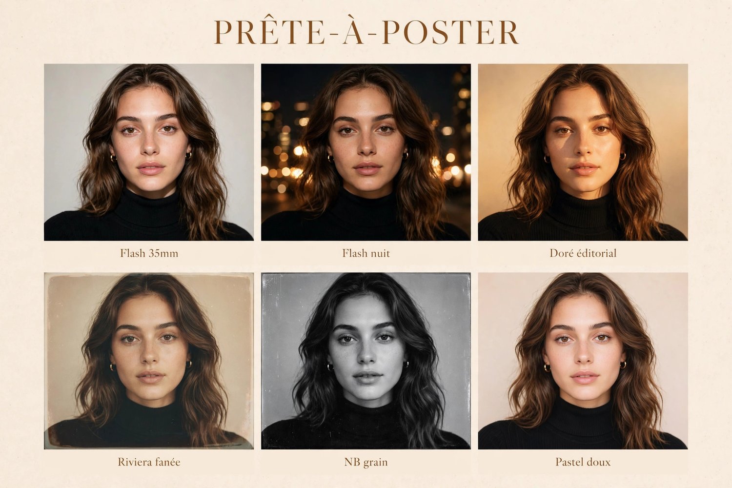
Here's the honest shortcut: don't start from zero. Apply a preset built for golden, warm light as your base, then adjust exposure and white balance to fit your photo. That's how the pros actually work — a strong starting point, then 60 seconds of personal adjustment. A preset like Golden Hour from the Travel Pack gets you the warm glow in one click; you fine-tune from there.
The takeaway
Fall editing isn't about filters — it's about light and color discipline. Warm the balance on purpose, let orange and yellow lead, mute the greens, protect your highlights, and finish with texture. Do those five things and your October photos will feel like the season actually felt — even the ones you shot at noon on your phone.
The Ready-to-Post Travel Pack: 6 Lightroom presets (.xmp) for travel and vacation photos, CA$29.