
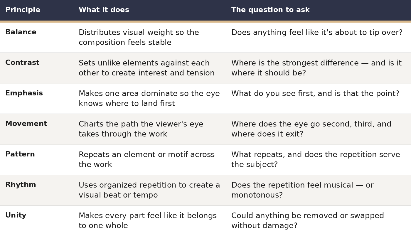
If the elements of art are the vocabulary of visual art — line, shape, color, value, texture, form, and space — then the principles of design are its grammar: the guidelines for organizing those elements so a painting coheres, leads the eye, and communicates the artist's intent. The education materials of the J. Paul Getty Museum present them in precisely these terms, as the compositional decisions behind every arrangement. This guide unpacks the seven central principles — balance, contrast, emphasis, movement, pattern, rhythm, and unity — illustrating each with actual paintings and offering hands-on tests you can apply to your own pictures.
The Seven Principles at a Glance
1. Balance: Visual Weight, Not Symmetry
The Getty's formulation is the most lucid: balance means “the distribution of the visual weight of objects, colors, texture, and space.” Picture the composition as a set of scales. An element's visual weight derives from its size, darkness, color saturation, texture, and placement — a tiny, dark, high-contrast mark near the edge can counterweight a big, pale passage near the middle.
Three varieties exist. Symmetrical — or formal — balance reflects one half onto the other, conveying stillness, ceremony, and grandeur; it is the standard choice for altarpieces, official portraits, and architecture. Asymmetrical — informal — balance sets unlike halves against one another: a broad calm expanse against a small active one. It reads as more lifelike and energetic, and it is the approach most landscape and still-life painters actually favor. Radial balance disposes elements around a center, like spokes on a wheel — rose windows, mandalas, and domes seen from underneath all work this way.
Leonardo da Vinci's The Last Supper (1495–1498) is the classic demonstration of symmetrical balance serving a story. Christ occupies the precise middle, framed by the doorway at his back, while the twelve apostles resolve into four balanced trios, three to each side. The symmetry is functional, not ornamental: it establishes Christ as the calm center while the apostles' excited gestures unfold around him. Imagine the symmetry broken — Christ pushed off-center — and the painting's commanding presence falls apart.
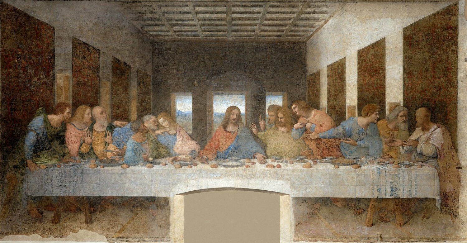 Leonardo da Vinci's The Last Supper, with Christ centered and the apostles arranged in balanced groups on either side
Leonardo da Vinci, The Last Supper, 1495–1498. Source: Wikimedia Commons. License: Public domain.
Try this on your own pictures: squint until the composition dissolves into blurred masses of light and dark. If one side feels markedly heavier, shift a mass, adjust the lightness or darkness of a region, or place a small high-contrast accent on the lighter side. Deliberate imbalance is a legitimate device — the key is that it should be intentional rather than accidental.
2. Contrast: Difference Creates Interest
Contrast measures the degree of difference between elements — light versus dark, large versus small, rough versus smooth, warm versus cool, geometric versus organic. Strip it away and the image flattens, leaving the eye with nothing to settle on; spread it uniformly everywhere and nothing emerges, leaving the eye with nowhere to pause.
Value contrast — the span between the brightest light and the deepest dark — is the most forceful kind. Caravaggio founded a whole manner on it: in The Calling of Saint Matthew (1599–1600), Christ's hand reaches out of profound shadow into brightness, and the shaft of light itself carries the painting's meaning. Color contrast operates likewise: complements set side by side (orange against blue, red against green) seem to vibrate, which is why Van Gogh sets a café interior's orange against deep blues.
In your own work, choose the single location of your strongest contrast and place it on the focal point. Then consciously quiet the contrast elsewhere — subdued values in the background, kindred shapes, calmer edges — so the eye isn't pulled in competing directions.
3. Emphasis: One Focal Point, On Purpose
Emphasis is the region of the design that seizes the viewer's attention before anything else. The Getty observes that artists generally achieve it “by contrasting one area with other areas” — differentiating it through size, color, texture, or shape. All the other principles feed into this one: contrast generates emphasis, balance stops it from capsizing the image, movement conducts the eye toward it.
Contrast is not the only route to emphasis. Isolation — a lone figure set apart from a group — arrests the eye at once. So does placement: on a center, on a thirds intersection, or along converging perspective lines. Detail is another lever: the crispest edges and most refined handling in a painting nearly always coincide with the focal point, while surrounding passages stay broader. Johannes Vermeer's Girl with a Pearl Earring (c. 1665) deploys all three simultaneously: one face against a dark emptiness, the pearl's luminous highlight, and the turban's uncommon hue set against a muted palette otherwise.
When a piece is finished, ask a friend what caught their eye first. If their answer isn't your intended subject, the emphasis is off — and the remedy is usually to intensify contrast or isolation at the focal point rather than to scatter more detail across the whole canvas.
4. Movement: Directing the Eye's Journey
In the Getty's phrasing, movement is “the path the viewer's eye takes through the artwork, often to focal areas,” a route “directed along lines, edges, shape, and color.” Nothing in a painting literally moves; instead the artist stages a sequence of attention, using leading lines, repeated forms that advance the gaze step by step, and edges that aim like arrows.
Vincent van Gogh's The Starry Night (1889) renders movement visible. The cypress flame at the left rises in a sweep, the hills roll the gaze along the lower edge, and the great spiraling sky bears it in a current from the stars down to the village. Trace the brushwork and you trace the route Van Gogh plotted. The eye is never permitted to settle in one spot, which is exactly what makes the painting feel agitated and alive.
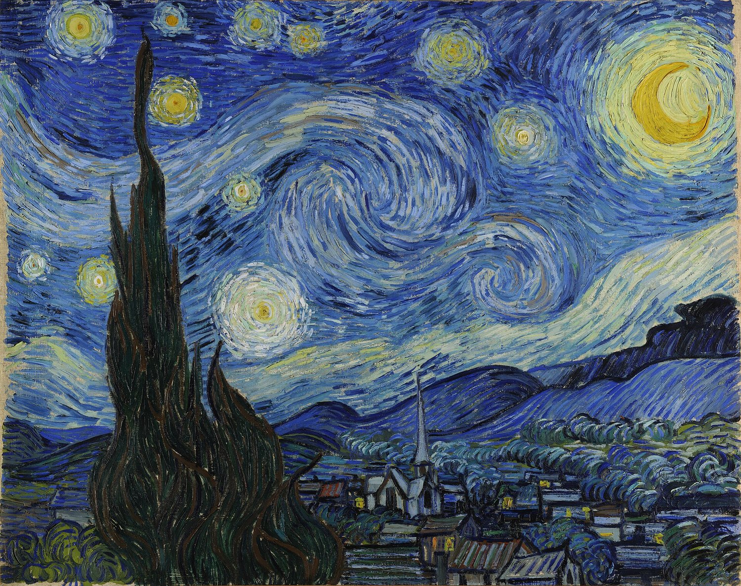
Vincent van Gogh's The Starry Night, with swirling sky currents guiding the eye across the canvas
Vincent van Gogh, The Starry Night, 1889. Source: Wikimedia Commons. License: Public domain.
Test your own composition by following your gaze through it with a fingertip. Does it arrive, call on the focal point, tour the supporting passages, and leave gracefully — or does it snag in a corner or slip straight off an edge? The usual escape routes are a bold diagonal or a figure's gaze aimed out of the frame; a counter-form or a darkened edge can seal them.
5. Pattern: Repetition as Decoration and Meaning
Pattern means the recurrence of an object or motif throughout the work. It may be regular — the same device at measured intervals, like wallpaper — or irregular, the device shifting in scale, rotation, or spacing as it returns. Its first function is ornamental: it occupies space, knits a surface together, and offers the eye a pleasing beat to follow. Its second is symbolic: depending on context, a repeated motif can signify plenty, order, fixation, or endlessness.
Gustav Klimt made pattern his hallmark. In The Kiss (1908–1909), the man's garment bears rectangular devices and the woman's gown circular ones; the gilded patterning compresses the figures into one ornamental plane, and the contrast between the two pattern families is part of what divides — and unites — the lovers. Pattern likewise carries much of the weight in textiles, Islamic geometric art, and Japanese woodblock prints, where a recurring wave or cloud is at once decoration and armature.
With pattern, excess comes easily. A motif stamped identically across an entire surface deadens the image; alter the repeat's scale, spacing, or hue, or interrupt the pattern once, on purpose, at the focal point. That single interruption is often what makes the pattern legible in the first place.
6. Rhythm: Repetition With a Beat
Rhythm is pattern given a tempo. Where pattern repeats a motif, rhythm scores the repetition: regular (steady intervals, like a metronome), flowing (smooth undulating returns), alternating (two motifs taking turns), progressive (a device enlarging or diminishing as it repeats), or random (uneven returns that still feel kin). The musical comparison is the obvious one, and no coincidence — both arts use the term for organized recurrence across time, or in painting's case, across space.
Katsushika Hokusai's The Great Wave off Kanagawa (c. 1831) is a lesson in flowing, progressive rhythm. The wave's claws recur at tightening intervals as they curl over, lesser waves restate the great one at reduced scale, and the foam's tracery repeats along the crest. The eye rides this rhythm as a surfer rides the breaker — which is exactly the sensation the print imparts.
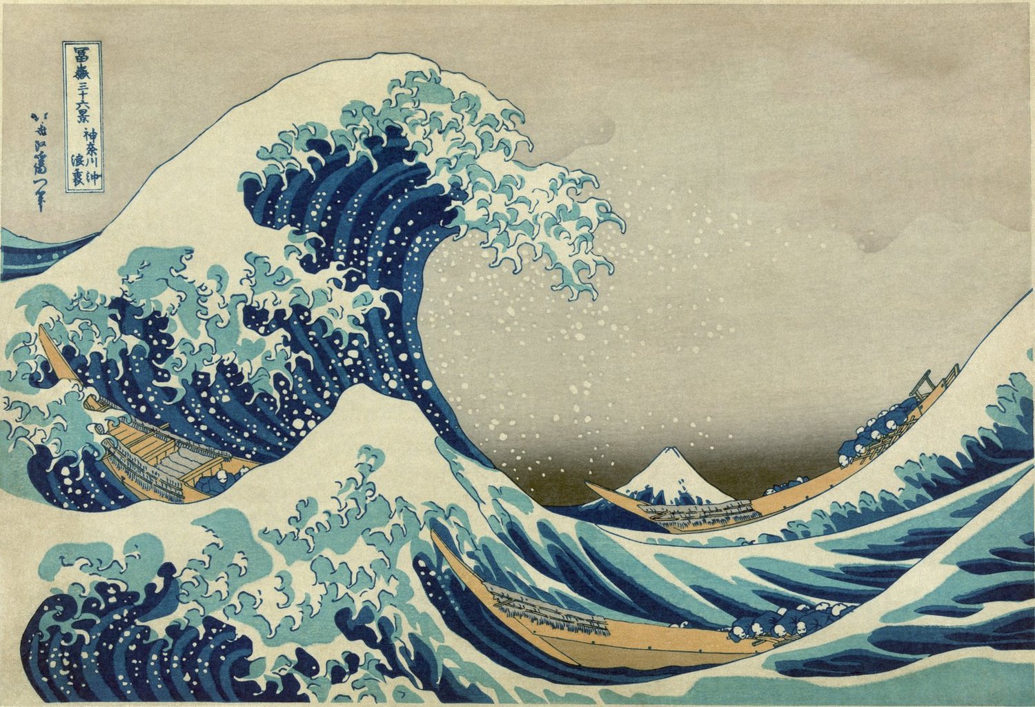 Hokusai's The Great Wave off Kanagawa, with repeating wave forms creating a flowing visual rhythm
Katsushika Hokusai, The Great Wave off Kanagawa, c. 1831. Source: Wikimedia Commons. License: Public domain.
When a repeated device feels dull, alter its beat: trade two motifs off against each other, let the device dwindle as it retreats, or break the rhythm a single time. When it feels disordered, even out the spacing. Rhythm lives on the boundary between tedium and chaos, and modest spacing adjustments shift it a great deal.
7. Unity: When Everything Belongs
Unity is a result, not a method: the property that makes a work feel finished, with every element and principle pulling together and nothing seeming to have strayed in from a different picture. Painters construct it through recurrence (a color or shape echoed), grouping (kindred elements placed together), and consistency (one manner of mark-making, palette, or edge treatment throughout).
Unity's discreet companion is variety — the differences that rescue a unified painting from dullness. Flawless unity without variety is wallpaper; variety without unity is a jumble. Vermeer's interiors cohere through a steady cool light and a disciplined palette, and diversify through the textures of cloth, wood, metal, and flesh operating inside that system.
Failures of unity usually declare themselves as one element that looks pasted on: a hue that occurs nowhere else, a crisp edge in an otherwise soft picture, a tightly rendered passage inside a loose one. Either echo that element elsewhere until it belongs, or take it out.
How the Principles Work Together: A Composition Check
None of the principles works in isolation. Balance lays out the field, contrast establishes the focal point, emphasis identifies it, movement ferries the eye to and from it, pattern and rhythm hold the eye's interest en route, and unity makes the ensemble feel unavoidable. When a composition seems “wrong” in a way you can't articulate, run this five-minute diagnostic:
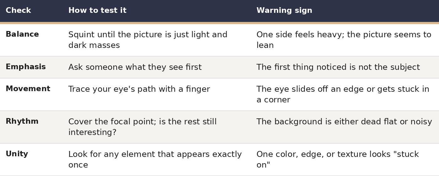 Apply the diagnostic at three moments: in the thumbnail sketch (where corrections cost nothing), at the halfway mark (where they cost little), and at the finish (where they become tuition for the next picture). The thumbnail is where compositions are truly settled — the principles are simplest to assess while the image is small and still pliable.
Principles vs. Elements: Keeping Them Straight
The mix-up is easy to understand, since the two vocabularies overlap — value turns up in both, and color functions as element and principle alike in some textbooks. The tidy distinction: the elements are a picture's raw materials; the principles are the decisions about how those materials are arranged. Line, color, and value are indispensable to painting anything at all; judgments about their balance, contrast, and unity are indispensable to composing. Our companion guide, Elements of Art: Line, Color, Form, Texture, Space, Value, Shape Explained, treats the vocabulary in depth; this one treats the grammar.
One further distinction is worth holding onto: the inventories differ. Certain textbooks list proportion, variety, and harmony as independent principles; others absorb them into the seven used here — proportion into balance, variety into contrast, harmony into unity. If your art class counts ten principles against this guide's seven, neither is mistaken: the underlying judgments coincide, and only the labels diverge.
Frequently Asked Questions
What are the 7 principles of design in art?
Balance, contrast, emphasis, movement, pattern, rhythm, and unity. They describe how artists arrange the elements of art — line, shape, color, value, texture, form, and space — into a unified composition. Some textbooks supplement the list with proportion, variety, and harmony, which this guide folds into balance, contrast, and unity respectively.
What is the difference between the elements of art and the principles of design?
The elements are a picture's materials; the principles are the compositional judgments. Line, color, and value belong to the elements; balance, emphasis, and unity belong to the principles. The Getty Museum's teaching materials adopt the same framework: the principles describe how the elements are disposed and interrelated.
What is the most important principle of design?
Most instructors would name unity, since it is the end the rest serve — but emphasis is the principle beginners most often mishandle in practice. A picture with no distinct focal point leaves viewers uncertain where to look, which makes every other principle's task harder. Begin by settling what matters most in the image, then let the remaining principles support it.
How do you create emphasis in a painting?
Differentiate the focal zone from its surroundings: bolder value contrast, a saturated hue amid muted ones, keener detail and edges, greater scale, separation from neighboring elements, or placement at a naturally commanding spot such as the center or a rule-of-thirds intersection. Two of these devices together are generally sufficient; deploying all of them at once can feel strained.
Can a painting break the principles of design on purpose?
Certainly — and strong paintings frequently do, but the violation succeeds because the principle is first understood. Calculated imbalance breeds tension; an absent focal point breeds mystery; a disrupted rhythm breeds surprise. What separates an error from a statement is whether the artist could have done it the ‘proper’ way and decided otherwise.
How can beginners practice the principles of design?
Keep it small and serial: produce ten thumbnails of one subject, varying a single principle in each — one symmetrical, one asymmetrical, one high contrast, one low. A comparative set teaches the principles more quickly than any one finished painting, because each variable stands isolated.
Sources
J. Paul Getty Museum, Education Department — “Principles of Design” (Landscapes, Classical to Modern: Lessons and Ideas for Discussion Worksheet), getty.edu
Smarthistory — essays on composition and the elements of art
MoMA — collection entry for Van Gogh's The Starry Night (1889)
Österreichische Galerie Belvedere — collection entry for Klimt's The Kiss (1908–1909)
Britannica — entries on Leonardo da Vinci, Caravaggio, and Hokusai
Wikimedia Commons — image files and license metadata for the three artworks reproduced above
Keep Exploring
- Color Theory for Artists: How the Color Wheel Actually Works in a Painting
- Chiaroscuro: The Light-and-Shadow Technique That Changed Painting
Free ebook: The Complete Art Encyclopedia — everything about art: history, mediums, techniques, styles and careers. Download it free here: https://payhip.com/b/IJk7E