
Part of The Complete Art Encyclopedia
- The Complete Art Encyclopedia — hub
- Part 4: Art Techniques & Methods
- Elements of Art: Line, Color, Form, Texture, Space, Value, Shape Explained
- 7 Art Techniques Every Beginner Should Learn First
Vincent van Gogh once wrote about a night scene painted with no black in it at all — "nothing but beautiful blue, violet and green," with the lit square painted "pale sulphur, lemon green." The painting succeeds because the colours were picked on purpose, not copied from life: warm lamplight set against a cold blue night, each side making the other burn brighter. That is the job of the colour wheel. It is not a list of permitted pairings. It is a chart of relationships — which colours face each other, which sit beside each other, and what results from putting them together — so a painter can pick with intent rather than by luck.
This guide covers the traditional painter's colour wheel the way working painters actually put it to use: the twelve hues, the three qualities every colour carries, the small set of harmonies that account for most paintings, and the perceptual quirks that explain why a colour can shift between palette and canvas. It sits alongside Part 4: Art Techniques & Methods, which surveys painting techniques, and Elements of Art, where colour appears as one of the seven elements. Part 4's opening section handles the beginner groundwork; this article digs into the history and perception behind it.
The Wheel in Sixty Seconds
The classic painter's wheel starts with three primaries — red, yellow and blue — placed at equal intervals around the circle. Blending two primaries yields a secondary: red with yellow gives orange, yellow with blue gives green, blue with red gives violet. Blending a primary with the secondary beside it yields six tertiaries — yellow-orange, red-orange, red-violet, blue-violet, blue-green and yellow-green. Three plus three plus six makes the twelve-hue wheel Johannes Itten taught at the Bauhaus.
One honest qualification is needed up front. The red-yellow-blue wheel is a studio teaching tool, not a physical law. Light blends differently (red, green and blue), and printers work with cyan, magenta and yellow. In paint, a "primary" red and blue stirred together often produce a dull violet rather than a vivid one. The wheel still pulls its weight, because its relationships — opposite, neighbouring, triangular — keep working even when one particular mixture lets you down. Use it to plan relationships, then try the real mixture on scrap before putting it on the painting.
Itten, who ran the Bauhaus preliminary course from 1919, centred his teaching on a twelve-hue colour sphere and seven contrasts — hue, light-dark, cold-warm, complementary, simultaneous, saturation and extension. The Getty Research Institute's account of the Bauhaus colour course describes his 1921 colour star as that sphere flattened onto one plane, with twelve pure hues around its equator and tints and shades spreading outward.
Three Properties of Every Colour
The Getty's teaching materials sort colour into three characteristics:
- Hue — the colour's own name: red, blue, yellow-green, and the rest. Hue is the colour's position on the wheel..
- Value — how light or dark the colour runs. White added gives a tint (pink is a tint of red); black added gives a shade (maroon is a shade of red). Value carries more weight in a painting than hue: squint at a picture and the hues fade, but the pattern of lights and darks still reads clearly.
- Intensity (saturation) — how vivid or muted, pure or dulled, the colour is. Colour straight from the tube is high-intensity; stir in its complement, or a grey, and the intensity drops. Muted colours are not failures — they are what allow one bright accent to stand out.
Most muddy paintings are not hue failures at all but value or intensity failures: every colour at full strength, or every value crowded into the middle range, so nothing separates itself. When a painting feels off and you cannot name why, look at value first, then intensity, then hue.
The Harmonies That Cover Most Paintings
A colour scheme is a planned wheel relationship. Six of them cover nearly everything a painter does::
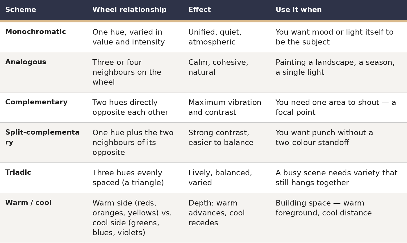 Note what the table leaves out: exact recipes. A scheme names the relationship to aim at, not the tube to squeeze. The relationship is the plan; the particular pigments, values and intensities are the painting.
Complementary Colours: Opposites That Intensify Each Other
Colours facing each other across the wheel — red and green, blue and orange, yellow and violet — are called complements. Placed side by side, each makes the other look brighter; stirred together, they cancel each other toward grey. Painters make use of both directions.
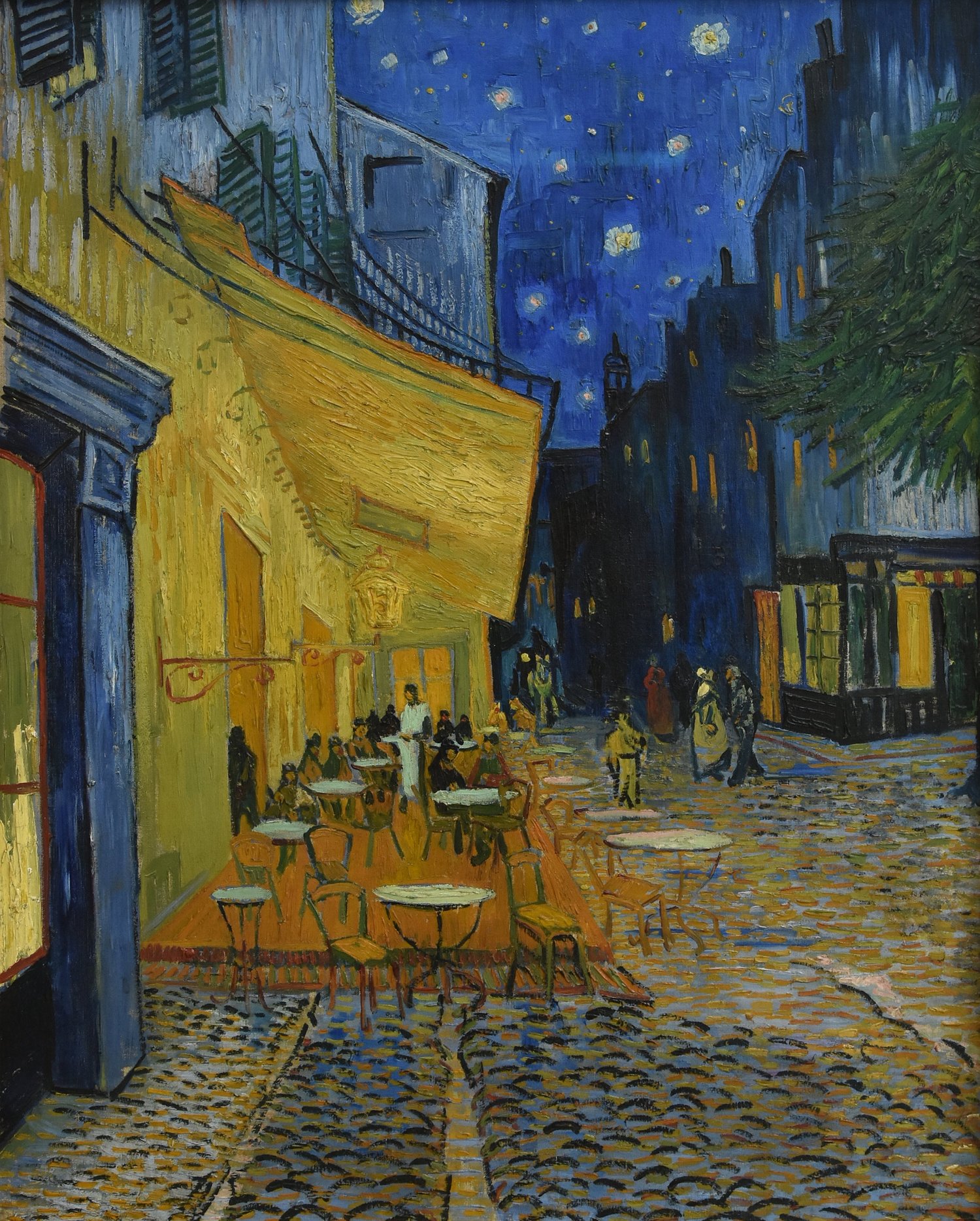
Vincent van Gogh, Café Terrace at Night, 1888, Kröller-Müller Museum. Source: Wikimedia Commons. License: Public domain.

Van Gogh's Café Terrace at Night (September 1888) is the textbook demonstration. Painted outdoors at night in Arles, it is, as he wrote to his sister, a night painting made "without black," built from blue, violet and green, with the lit square in pale sulphur and lemon green. The gaslit terrace glows yellow-orange against the deep blue-violet sky, and that complementary clash does the job black would have done in a conventional night scene, without killing the colour. The yellow shades through green into blue across the buildings, so the eye moves rather than jumps.
That softening is the practical takeaway. Full-strength complements spread over equal areas fight each other and tire the eye. The usual remedies all come down to unequal treatment: let one complement dominate and keep the other as an accent; dull one of them; or separate them with a neutral or a gradation. Van Gogh uses all three — the blue field is far larger than the yellow, and the yellow shades ugh green into blue across the buildings.
Complements are also the quickest way to mute a colour without reaching for black. A touch of green dulls a red far more naturally than black does, because it greys the colour while leaving it a colour.
Analogous and Monochromatic: Calm by Neighbourhood
If complements are argument, analogous colours are agreement. Colours beside each other share a parent hue, so they sit together without friction: blue, blue-green and green; or yellow, yellow-orange and orange. The result reads as one light or one season — which is why analogous schemes dominate landscape painting.
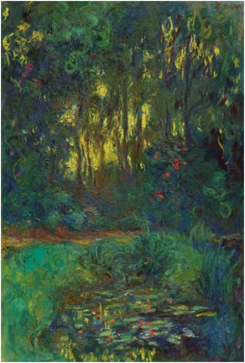
Claude Monet, The Water-Lily Pond (Coin du bassin aux nymphéas), 1918–1919. Source: Wikimedia Commons. License: Public domain.

Monet's late water-lily paintings push analogous colour to its limit: blues, blue-greens and greens, varied chiefly in value and intensity, with only small warm accents where a lily flower breaks the surface. The painting holds together because the hue range is narrow and the value range is wide. That is the rule for any narrow scheme: when hue variety is low, value and intensity variety must be high, or the picture goes flat.
Monochromatic painting is the extreme case of the same rule.
Warm and Cool: How Colour Builds Space
Warm colours — reds, oranges, yellows — tend to advance toward the viewer; cool colours — greens, blues, violets — tend to recede. This is a tendency, not a law, but as a working rule it explains much landscape practice: warm, dark, high-contrast foreground; cool, pale, low-contrast distance.
Temperature is also relative. A blue can be warm (leaning violet) or cool (leaning green); a red can be warm (leaning orange) or cool (leaning violet). Itten's cold-warm contrast is about these leanings within a hue, not just about the two halves of the wheel. A painting that uses only "warm" and "cool" as two buckets will miss the subtler game: a warm red against a cool red can be the most delicate contrast in the picture.
Why Colours Change Next to Each Other: Simultaneous Contrast and Optical Mixing
The most counterintuitive part of colour theory is also the most practical: a colour does not look the same in isolation as it does in company. The French chemist Michel-Eugène Chevreul, director of dyeing at the Gobelins tapestry works, formalised this in 1839 in On the Law of Simultaneous Contrast of Colours. Investigating tapestry dyes that were chemically correct yet looked wrong beside other threads, he found that two colours seen together each shift toward the complement of the other, exaggerating their difference. A grey next to red looks greenish; the same grey next to green looks reddish. The dye had not changed. Its neighbours had.
Josef Albers made this the centre of his teaching at Yale, in Interaction of Color (first published 1963): in visual perception a colour is almost never seen as it really is, which makes colour the most relative medium in art. His exercises asked students to make one colour look like two, or two colours look like one, simply by changing their surroundings.
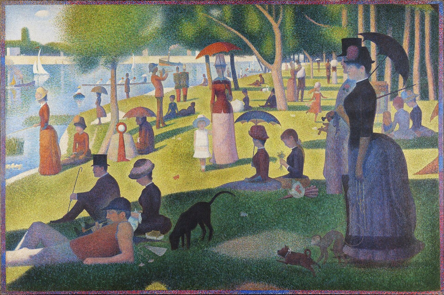
Georges Seurat, A Sunday Afternoon on the Island of La Grande Jatte, 1884–1886, Art Institute of Chicago. Source: Wikimedia Commons. License: Public domain.

Georges Seurat turned Chevreul's law into a painting method. Working from Chevreul and the physicist Ogden Rood, Seurat built A Sunday Afternoon on the Island of La Grande Jatte (1884–1886) from small dots of unmixed colour — divisionism — so mixing would happen in the viewer's eye rather than on the palette. The Guggenheim Museum Bilbao notes that he juxtaposed complementary tones so that chromatic fusion would take place in the viewer's retina. Up close the surface is separate dots; at the right distance they fuse into luminous grass, water and skin.
You do not need to paint in dots to use this. The working takeaways are three: test colours beside their neighbours, not on a white palette; expect a colour to shift when its surroundings change; and remember that small areas of complementary colour, left unmixed, vibrate more than the same colours blended into a flat tone.
A Painter's Colour Checklist
When you sit down with a new painting, run through these five decisions in order. The first two prevent most of the trouble the last three would have to fix.
- Decide the value pattern first. Sketch the lights and darks in grey before choosing hues. If the value pattern does not read, no colour scheme will rescue it.
- Pick one scheme and one dominant. Choose from the table above, then decide which colour owns the largest area. Every other colour is a supporting player or an accent.
- Limit the palette. Three to five pigments, mixed into everything, produce more harmony than twelve tubes used straight.
- Test beside neighbours. Put a test swatch on the painting's ground, next to the colours it will sit beside.
- Save the brightest colour for the focal point.
Colour theory, used this way, stops being a chart to memorise and becomes a set of questions to ask while working: what is the relationship here — opposite, neighbour, or triangle? Which colour dominates, and which one is the accent? What will this colour look like once its neighbours arrive? The wheel answers the first question. Your eyes, tested on the canvas, answer the rest.
Frequently Asked Questions
What is the colour wheel in art?
A circular arrangement of hues showing their relationships: primaries evenly spaced, secondaries made by mixing two primaries, and tertiaries made by mixing a primary with a neighbouring secondary. Painters use it to plan harmonies, not to look up approved combinations.
What are complementary colours?
Pairs directly opposite each other on the wheel: red/green, blue/orange, yellow/violet. Side by side they intensify each other; mixed together they neutralise each other toward grey. Use one as the dominant and the other as an accent, or the contrast can overwhelm the painting.
Why does a colour look different on the canvas than on the palette?
Because of simultaneous contrast, formalised by Chevreul in 1839: a colour shifts toward the complement of its neighbours. Always test a mixture beside its neighbours on the painting's ground.
Should beginners use a limited palette?
Yes. Three to five pigments mixed into everything teach mixing, value and intensity faster than a large set of tubes, and keep the painting harmonious almost automatically.
What is the difference between hue, value and intensity?
Hue is the colour's name and position on the wheel; value is its lightness or darkness; intensity is its brightness or dullness. Most paintings that feel wrong have a value or intensity problem, not a hue problem — check those first.
Do warm colours really advance and cool colours recede?
As a tendency, yes, and landscape painters rely on it: warm foreground, cool distance. But temperature is relative — a blue can lean warm or cool — and value and atmospheric perspective interact with it. Treat it as a strong tendency to use deliberately, not as a rule that overrides what you see.
Sources
- Getty Research Institute, "Color" (Bauhaus exhibition) — Itten's colour star, twelve hues, seven contrasts: https://www.getty.edu/research/exhibitions_events/exhibitions/bauhaus/new_artist/form_color/color/
- Guggenheim Museum Bilbao, "Seurat and His Systematic Study of Light" — divisionism, Chevreul, Rood, retinal fusion: https://www.guggenheim-bilbao.eus/en/did-you-know/seurat-and-his-systematic-study-of-light
- AIGA Eye on Design, "How Color Works, According to 4 Brilliant Old Diagrams" — Chevreul, 1839, simultaneous contrast: https://eyeondesign.aiga.org/how-color-works-according-to-4-brilliant-old-diagrams/
- Getty education materials on the elements of art, summarised via Brenau University libguide — hue, value, intensity: https://libguides.brenau.edu/c.php?g=684071&p=4834544
- Van Gogh's letter to his sister Wil, September 1888, on Café Terrace at Night — night "without black," sulphur and lemon-green light: https://en.wikipedia.org/wiki/Cafe_Terrace_at_Night
- Josef Albers, Interaction of Color (Yale University Press, 1963) — colour as the most relative medium in art: via https://www.sbc.edu/live/news/1777-josef-albers-exhibition-explores-how-colors-are
Keep Exploring
- Part 4: Art Techniques & Methods — the canonical chapter
- Elements of Art: Line, Color, Form, Texture, Space, Value, Shape Explained
- 7 Art Techniques Every Beginner Should Learn First
- The Complete Art Encyclopedia — hub
- Principles of Design: Balance, Contrast, Emphasis, Movement, Pattern, Rhythm, Unity — Explained
- Chiaroscuro: The Light-and-Shadow Technique That Changed Painting
Free ebook: The Complete Art Encyclopedia — everything about art: history, mediums, techniques, styles and careers. Download it free here: https://payhip.com/b/IJk7E