
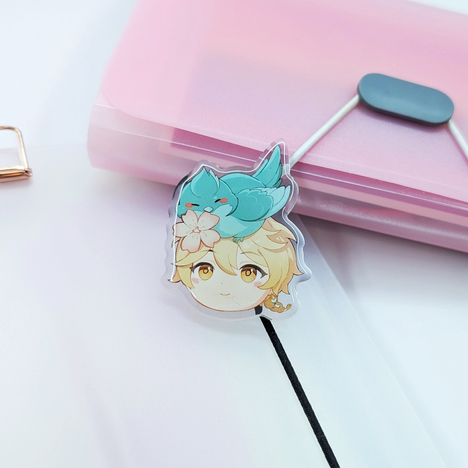
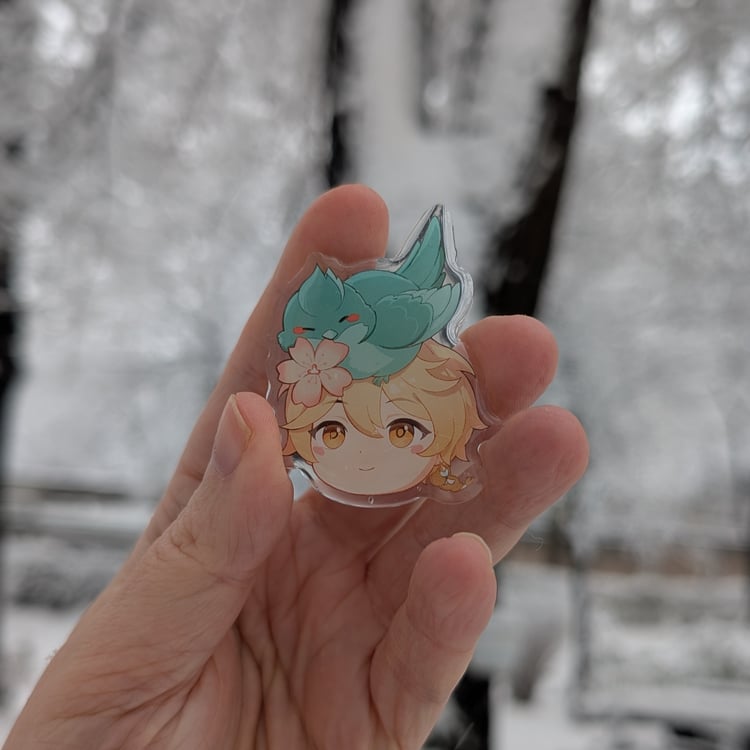
I love my acrylic XiaoAether pins. Look how lively they look in this heavy winter environment.
(new batch of pins)
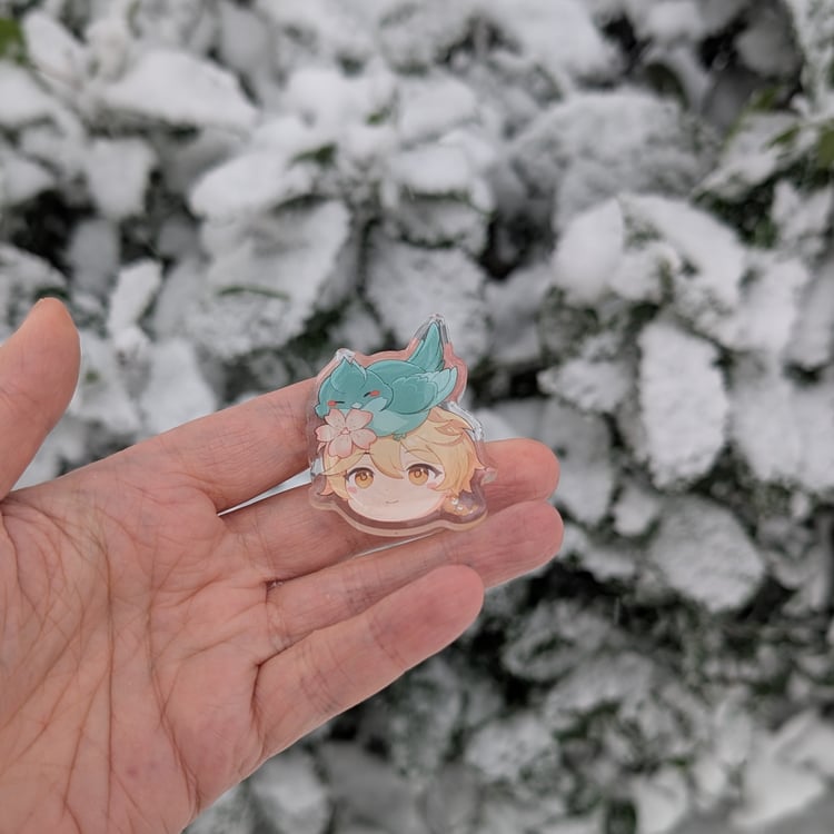
Still I admit in the first test sample - the result wasn’t quite what I hoped for. The colors came out washed out and too light - so much so that from a distance, delicate details like the blush and the fine lines around the face almost disappeared
I knew these pins deserved better. For the real production batch, I adjusted the artwork by increasing saturation and deepening the tones. The difference was incredible: the colors became richer, the details stood out clearly, and the whole design finally matched the vision I had in mind.
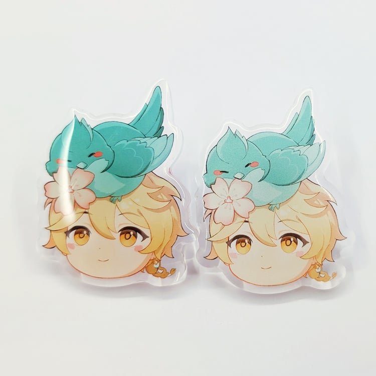
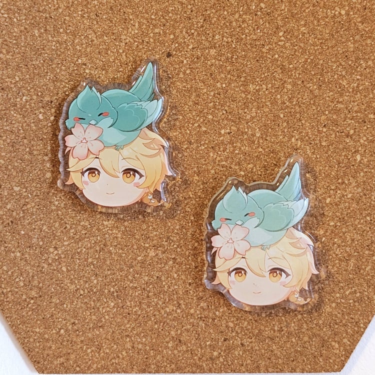
(left: new batch, right: old test sample)
The final pins turned out vibrant but not too much - enough to be clearly readable and at the same time not oversaturated or burned out. It’s always rewarding to see a small adjustment bring the artwork to life in such a big way. You can see the results on the photos.
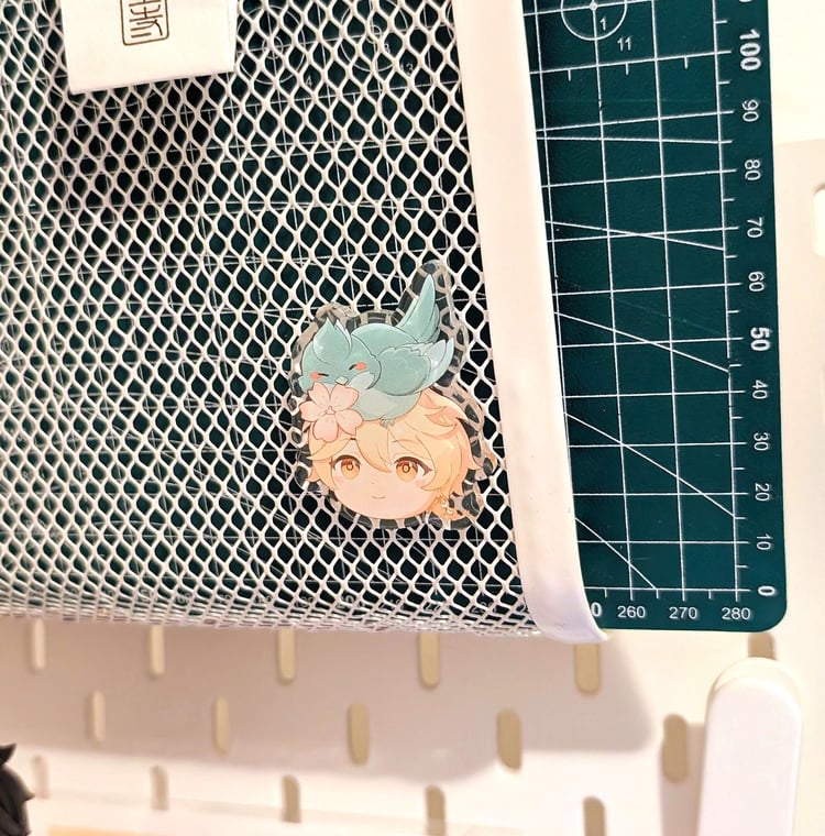
And the test sample is now above my work desk - brightening up my day. ヾ(≧▽≦*)o
Comments ()