

Last time, I ordered Merther keychain samples to see how they looked in real life.
After they arrived, I realized I’d made a few mistakes with the full-bleed version. I had added a thick black outline around the bottle, assuming the cut would follow that line and the outline itself would remain visible on the final product.
That idea, however, had several issues I hadn’t considered:
- The line was just regular thick line art, when it should have been a proper bleed area filled with black - if I wanted the outline to be part of the design. I think I actually forgot about bleed at all ~_~.
- Conceptually, the design actually looked better without the black border, and removing it would also save space.
- Some fragments of the border were left in, and they didn’t look good visually. And by that I mean not only they did look like a defect, but if the full border were left in the design, these black left-overs convinced me - they wouldn't look good.
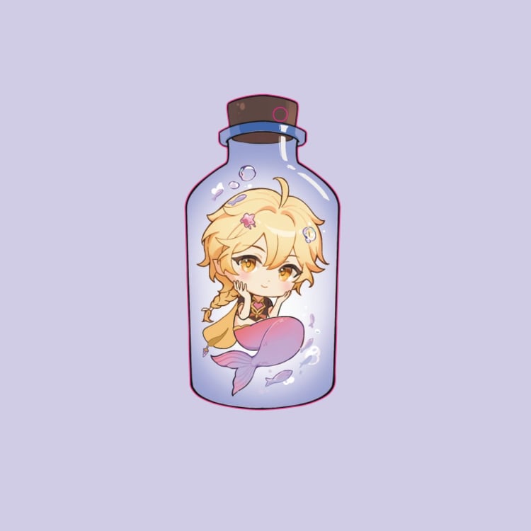
Here is the example of how it looked like in first proof.
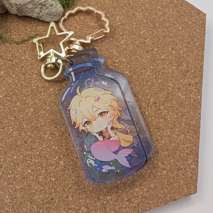
So this time I re-did the design with
- A full-bleed layer of semi-transparent part of the bottle, without any borders. I added much more bleed than specified on the page and provided 'possible' cut-line (old bottle outline border) to make sure, the result wouldn't be overblown fat bottle.
- Increased saturation and slightly darker tones for better contrast
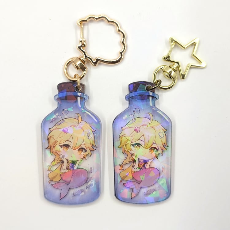
- The previous sample only allowed a star-shaped accessory, but this time I was able to choose a shell-shaped one. I think the color is much nicer and it fits the keychain’s theme better. ˋ( ° ▽、° )
Here you can see comparison of two keychains side to side. Not having a black border really makes it more pleasant in my opinion.
The corrected design is available in my shop.😊
Comments ()