

When I start designing an app, I look at the work someone is trying to do before I decide what the screen should look like. A home baker preparing a custom order and a small business owner reviewing their books may both need clear numbers. They do not need the same working space.
That became especially clear while I was building Whisk & Worth and Ledger & Light. In Ledger & Light, the question is often, “What has been recorded, and what needs checking?” Invoices, bills, cash entries and management reports need room to be read carefully. The design uses ink blue, warm ivory and a little copper, with compact tables and a quiet desk photograph. I wanted the figures to feel orderly without turning the whole app into a wall of boxes.
A different rhythm
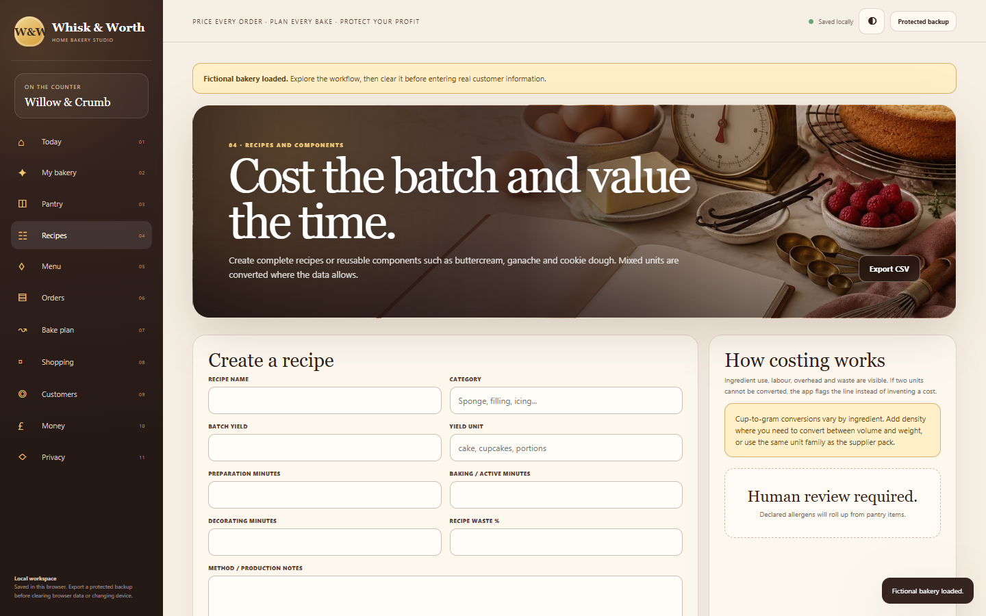
Whisk & Worth starts somewhere else: an ingredient, a recipe, a finished product and a date in the diary. Its cream and cocoa colours, cake and kitchen imagery, and order-book language belong to that world. The journey moves through pantry costs and recipes to an enquiry, a price check, a quote, a bake plan and shopping requirements. It should be possible to feel where you are in the job as well as see the number on the screen.
Imagery with a job to do
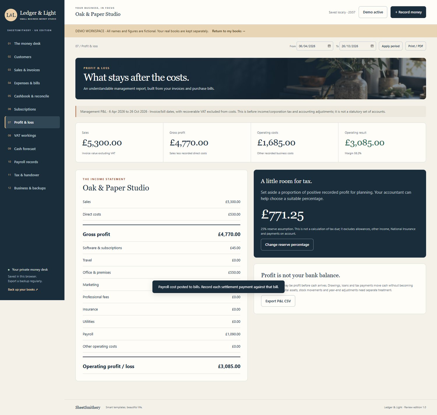
The photographs have a purpose beyond making the page attractive. A recipe section should look and read differently from a list of money received. The images help set that context, while the forms still have to leave enough space for pack sizes, working minutes and notes. If the decoration makes the figures hard to inspect, I have got the balance wrong.
I also want the language to follow the work. In a bakery, “What do I need to make this?” is more useful than an abstract financial label. In a bookkeeping app, a beautiful screen is no substitute for being able to trace an amount back to the record behind it. Both products need clear assumptions and a way to correct a mistake, but the route through those decisions is different.
Clear boundaries
There are limits that design cannot smooth over. Whisk & Worth uses prices the baker enters and asks them to check supplier information; it does not fetch live shop prices. Ledger & Light is a management companion, not filing software or a replacement for an accountant. I would rather put those boundaries plainly into a thoughtful interface than let a polished image imply something the product does not do.
That is the kind of difference I want across the SheetSmithery range: each app should feel at home in the work it supports. If you would like to see the bakery version of that idea, take a look at Whisk & Worth: Whisk & Worth on Payhip
Comments ()