

Title: 📊 Mastering Histograms: A Comprehensive Guide to Teaching Students How to Draw and Interpret Histograms 📊
Introduction:
Histograms are powerful tools for visualizing and interpreting data distributions. Teaching students how to draw histograms equips them with essential skills for analyzing data in various fields, including mathematics, science, economics, and more. In this comprehensive guide, we'll explore effective strategies for teaching students to draw histograms, covering everything from understanding histogram basics to interpreting complex data sets. 🎓
Understanding Histogram Basics:
Before diving into drawing histograms, it's crucial for students to grasp the fundamental concepts behind them. Begin by explaining what histograms are and how they differ from other types of graphs, such as bar charts. Emphasize that histograms display the frequency distribution of continuous data, with bars representing intervals rather than individual categories. 📊
Introducing Frequency Distributions:
Next, introduce students to the concept of frequency distributions and how they relate to histograms. Teach students how to organize raw data into intervals or classes and calculate the frequency of each interval. Emphasize the importance of choosing appropriate intervals to accurately represent the data's distribution without losing essential information. 📈
Drawing Histograms from Data Sets:
Once students understand the basics, it's time to delve into drawing histograms from data sets. Provide step-by-step instructions for constructing histograms, including determining interval width, labeling axes, and plotting frequency bars. Encourage students to pay attention to scale, ensuring that each bar's height accurately represents the frequency of the corresponding interval. 📏 Find an excellent lesson on drawing histograms here
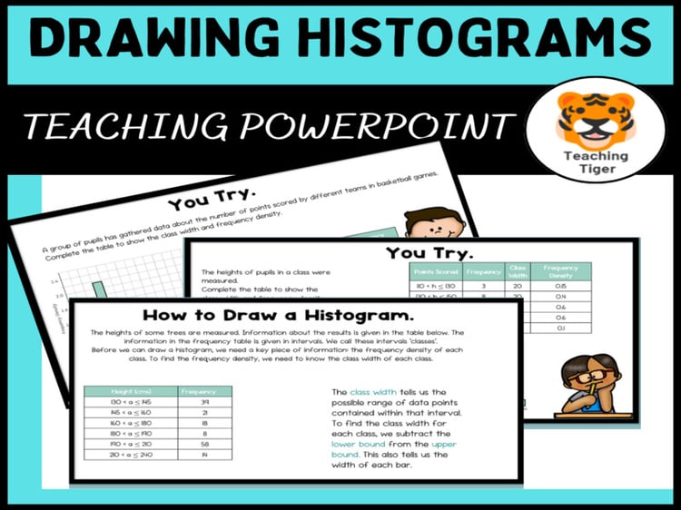
Calculating Frequency Density:
In addition to drawing histograms, teach students how to calculate frequency density—a crucial concept for accurately interpreting histograms. Explain that frequency density represents the frequency of each interval relative to its width and demonstrate how to calculate it using the formula: frequency density = frequency / interval width. Reinforce the importance of interpreting histograms based on frequency density rather than raw frequencies. 🧮
Interpreting Histograms:
Finally, guide students through interpreting histograms to extract meaningful insights from data. Teach them how to identify patterns, trends, and outliers within histograms and draw conclusions based on their observations. Encourage critical thinking by asking probing questions about the data's distribution and its implications in real-world scenarios. 🤔
Practical Exercises and Applications:
To reinforce learning, incorporate practical exercises and real-world applications throughout your teaching. Provide students with data sets from various contexts—such as population demographics, exam scores, or scientific experiments—and challenge them to draw histograms, calculate frequency density, and interpret the results. Encourage collaborative learning by discussing different approaches and interpretations within groups or pairs. 📝
Conclusion:
Teaching students how to draw histograms is a vital skill that empowers them to analyze and interpret data effectively. By guiding students through understanding histogram basics, drawing histograms from data sets, calculating frequency density, and interpreting histogram results, educators can equip students with the tools they need to succeed in data analysis across various disciplines. With practice and application, students will develop proficiency in drawing histograms and gain valuable insights into the world of data visualization and analysis. 🌟
⭐Related Resources
Mastering Histograms: Creating a Histogram from a table of Data - Payhip