

I’m a trend-follower who buys pullbacks and sells rallies on the 4-hour chart.
This time, I’ll explain the Dow Theory and multi-timeframe analysis I use for trend-following.
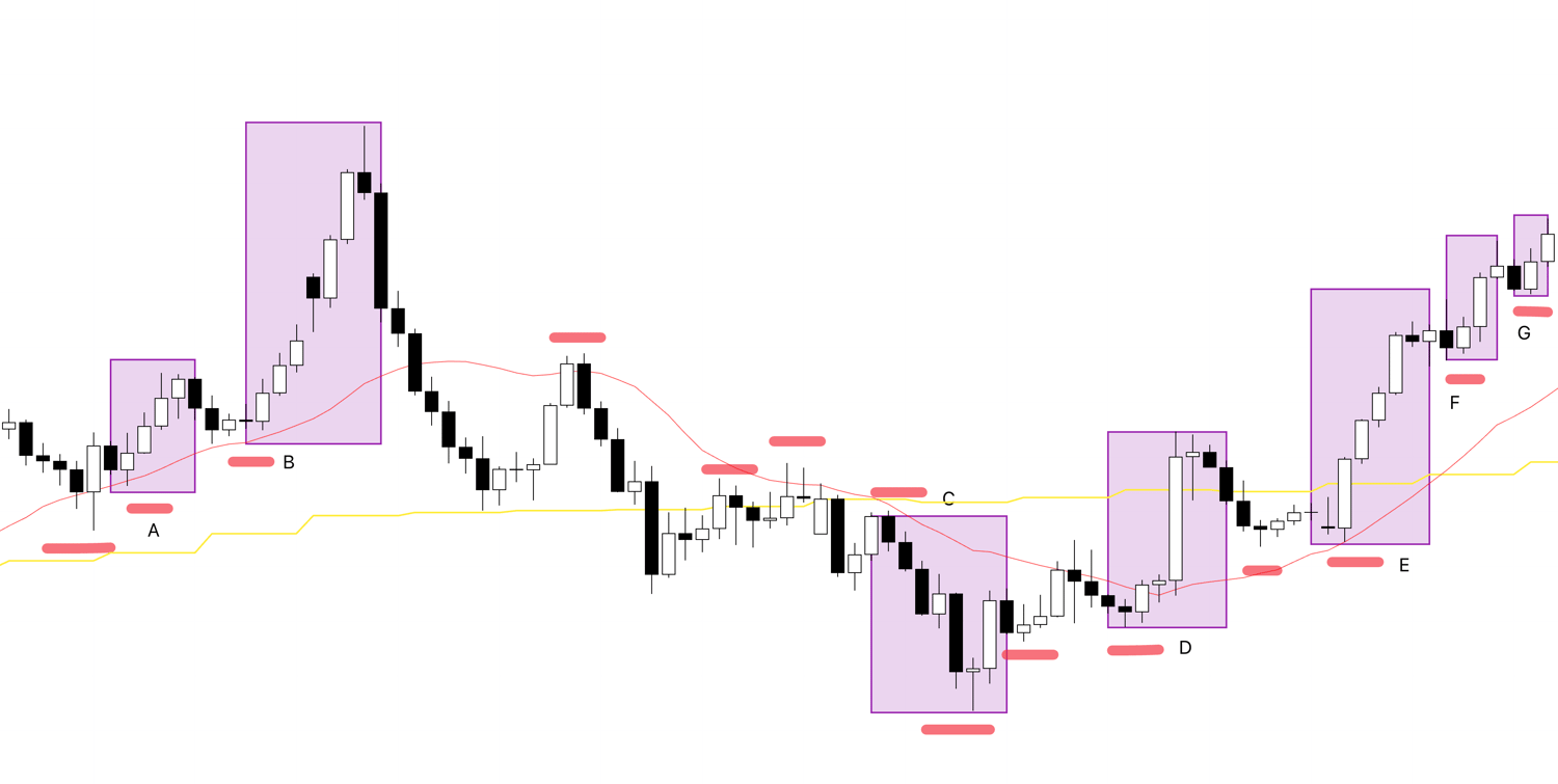
First, take a look at the following chart.

This is the current USDJPY 4-hour chart.
The points where I consider entries are pullback buying or rally selling points on this 4-hour chart.
The criteria for judging trends are based on Dow Theory: “higher lows and higher highs” and “lower highs and lower lows.”
In simple terms, it’s like this:
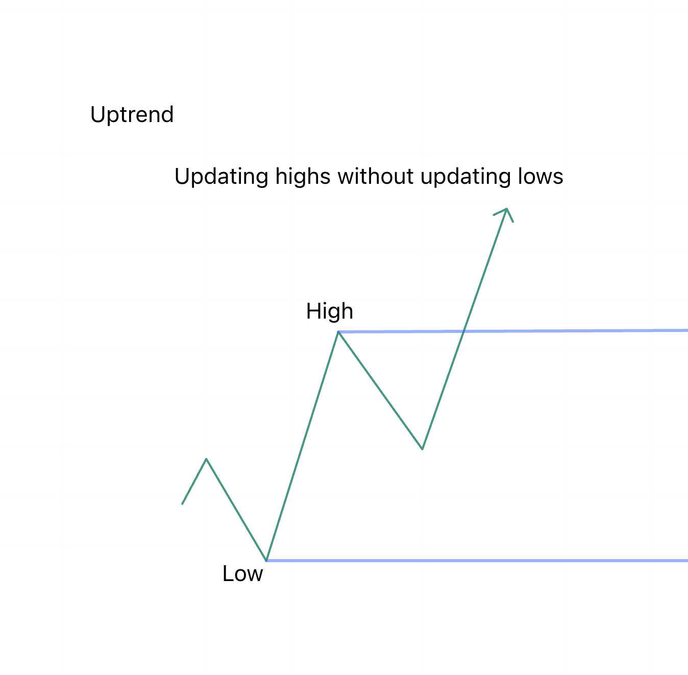
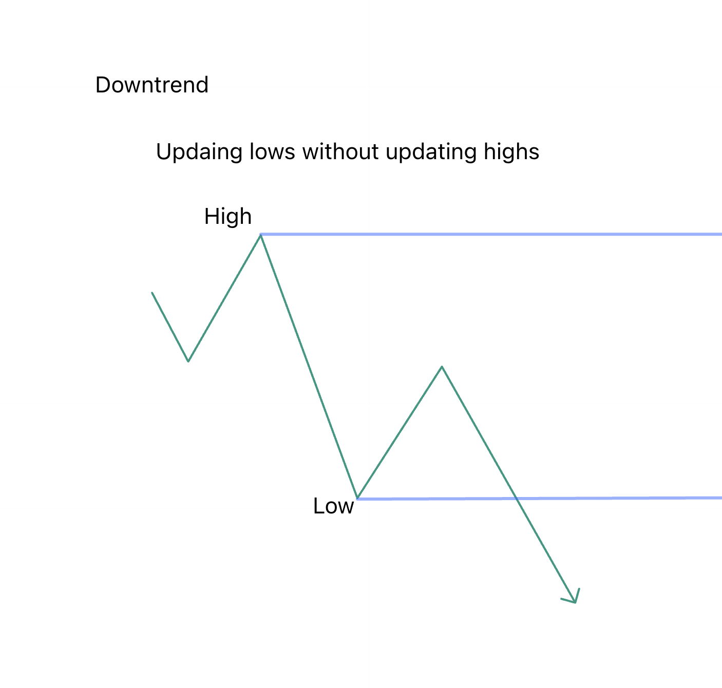
This is a very simple mechanism for judging trends.
By grasping this across multiple timeframes, I identify points where orders are concentrated.
Now, let’s return to the earlier 4-hour chart.

The areas boxed in this chart are the higher low points (buying) and lower high points (selling) on the 4-hour chart.
These indicate points where I “consider entries.”
I don’t trade all of them.
Within these, I further confirm entry points on lower timeframes like the 1-hour or 15-minute charts.
Actual trades are executed on the 1-hour or 15-minute charts.
Let’s look at point A on the 1-hour chart.
As you can see, within the higher low point identified on the 4-hour chart, the 1-hour chart also shows a higher low.
The point that “confirms” this higher low becomes the entry point.
The stop-loss is set just below that low.
The stop-loss point must be a line that many traders are aware of.
This is very important, and I’ll explain it in detail another time.
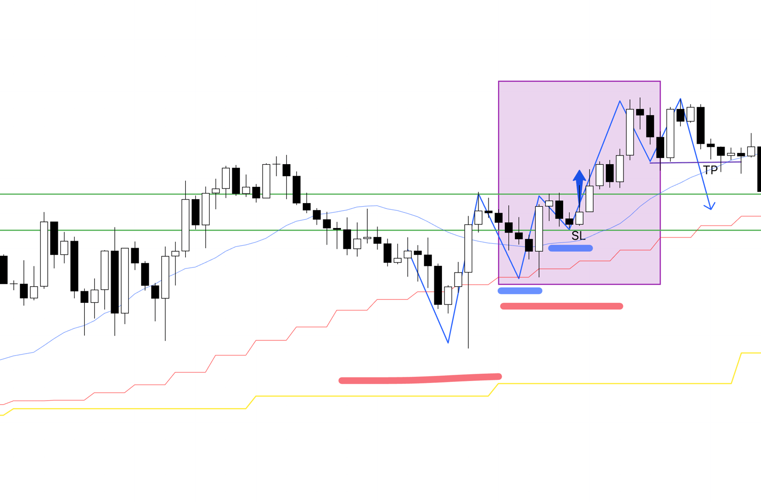
Next, let’s look at point B on the 1-hour chart.
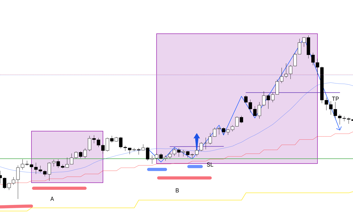
This is the 1-hour chart for point B, and it’s a very clean entry point.
It’s the point within the higher low on the 4-hour chart where the 1-hour chart confirms a higher low.
This stop-loss point functions as a level where buying and selling switch.
It’s a point where buying has a strong edge.
For taking profits, as Dow Theory shows higher highs and higher lows, I trail the stop-loss by raising it to each new low.
In reality, this point was interrupted by a weekend.
Since I don’t hold positions over weekends, I would close the trade midway.
For now, I’ll ignore that and focus purely on explaining Dow Theory and multi-timeframe analysis.
So, assuming no weekends or mid-trade exits, if I traded this chart to the end, the take-profit point would be as shown in the chart.
If the price rises sharply without forming a higher low, I exit at a point where it breaks through a significant high or moving average.
Let’s look at the next point.
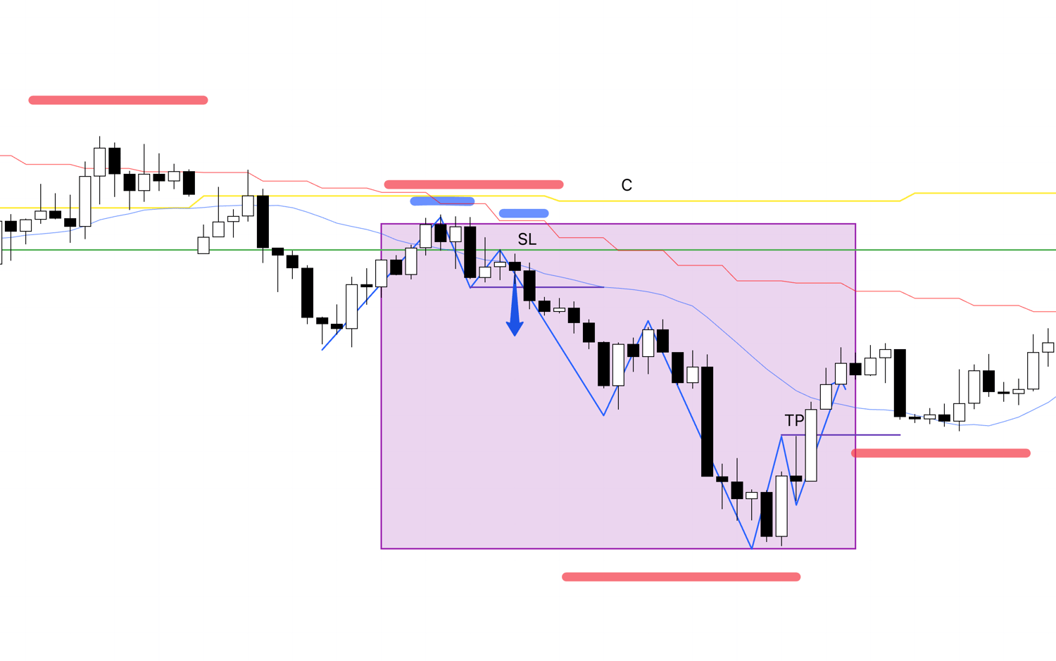
This is the 1-hour chart for point C.
I do the exact same thing: I enter at the point within the lower high on the 4-hour chart where the 1-hour chart confirms a lower high alongside a lower low.
I exit when the trend breaks.
Next, let’s look at point D.
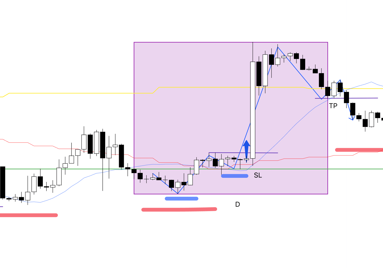
This is the 1-hour chart for point D.
It’s the same process: I enter at the point within the higher low on the 4-hour chart where the 1-hour chart confirms a higher low.
I set the stop-loss just below that low and follow the trend until it breaks.
The trade ends when the trailing stop-loss, raised as the trend progresses, is hit.
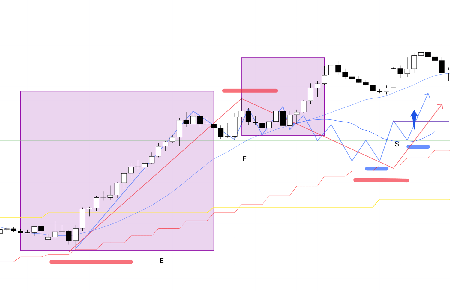
Next, let’s look at point E.
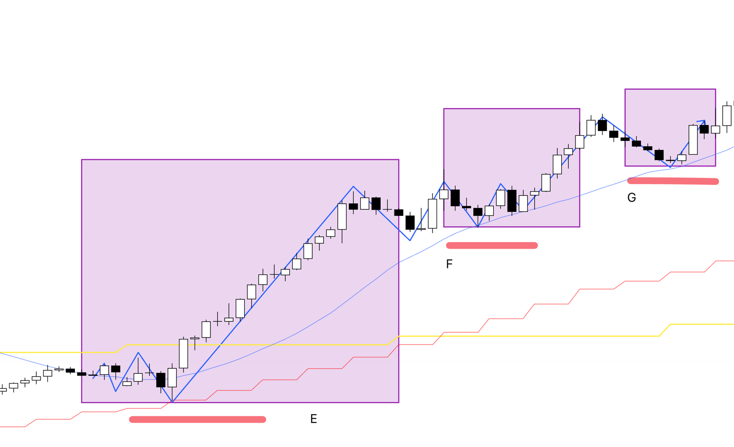
This is the 1-hour chart for point E.
If the price updates a high without forming a higher low, I don’t enter.
This is a point I actually skipped while watching the chart yesterday.
I’ll summarize the details in a weekend report later.
However, this point cleanly broke above the 4-hour high.
Many trend-followers likely traded it.
In that case, since the 1-hour trend hasn’t broken, they would still be holding.
Finally, let’s look at points F and G.
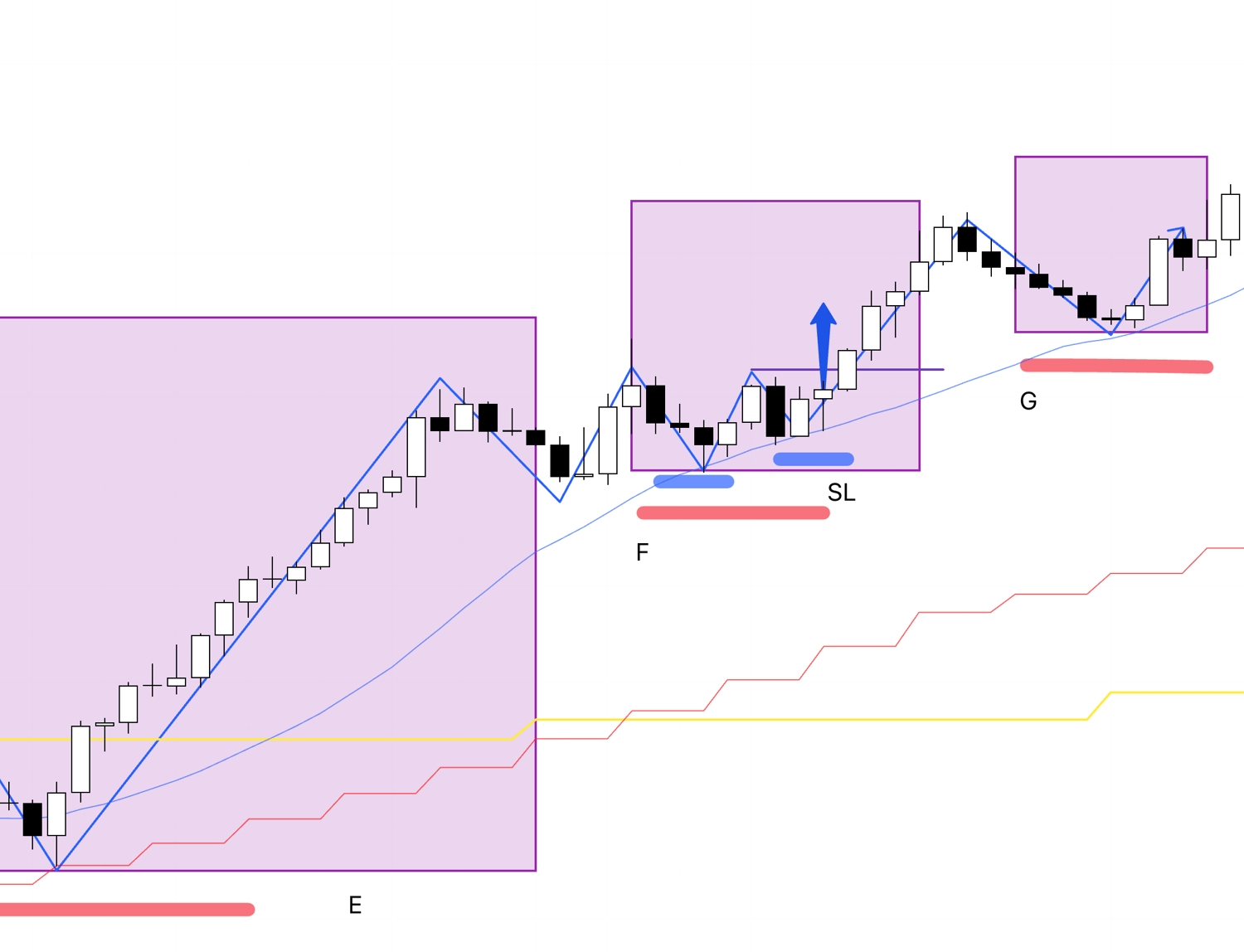
For the pullback point F on the 4-hour chart, I don’t trade the higher low point on this 1-hour chart.
Even if the 4-hour chart forms a pullback, the 1-hour trend that started from the previous point E has stretched significantly without breaking once.
Traders who entered at E are still holding profits without closing.
This increases the risk of profit-taking sell orders, reducing the upside edge.
Ideally, you’d be holding a position from E rather than trading from F after such a stretch.
If I were to consider trading, it would be in a case like this:
When the 1-hour trend breaks once, forms a new pullback on the 4-hour chart, and within that, the 1-hour chart shows a trend reversal, the “first” cheapest point is where I consider buying.
By the way, as a supplement, the following point on the 4-hour chart is also a point where you should prepare a selling scenario and wait.

This is where the 4-hour chart is attempting to form a lower high point.
In hindsight, it didn’t result in a lower low.
But at this stage, you need to prepare a rally selling scenario and wait.
Take a look at this point on the 1-hour chart below.
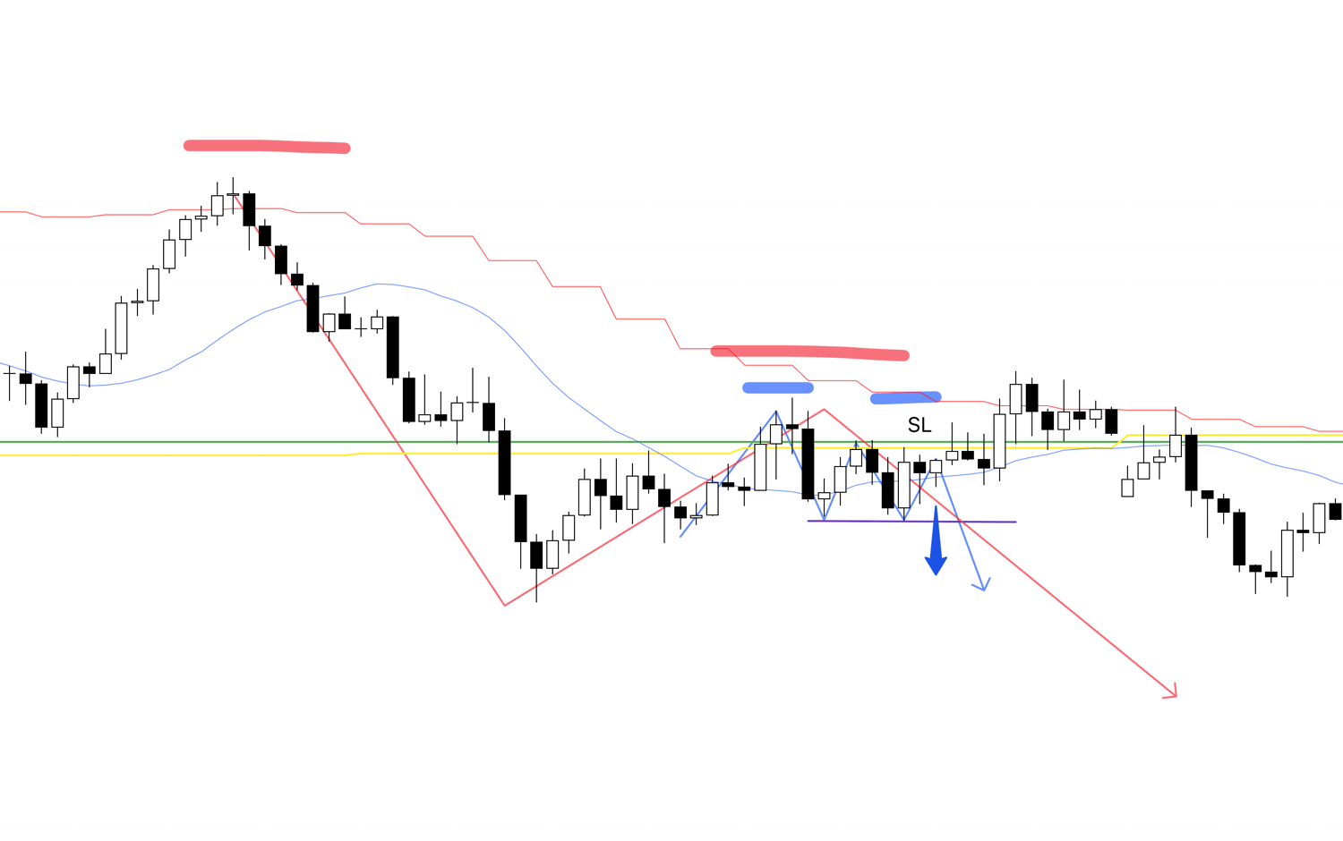
If, at this point, the 1-hour chart updates a lower low and confirms a lower high, it’s a point where you need to enter a sell trade.
You need to build this scenario in advance and wait with the mindset of “if it happens, I’ll act.”
This scenario-building is also very important, so I’ll write about it in detail another time.
That’s all.
This is how I analyze the market using multi-timeframe analysis.
I follow trends using the simple trend identification of Dow Theory.
This explanation focuses on Dow Theory and multi-timeframe analysis, so I’ll stop here.
In reality, “how to assess risk” is also very important.
I’ll write about risk-reward and moving averages in future articles and explain further there.
The points explained here don’t mean “points I actually traded.”
Please don’t misunderstand.
Of course, some of these are points I traded.
But in reality, I have rules like “not taking new positions before economic data releases” or avoiding entries near significant lines, and I filter accordingly.
(I’ll write about these in another article later.)
This is purely an article explaining Dow Theory and multi-timeframe analysis.
Thanks for reading to the end.
I hope you find something helpful.