
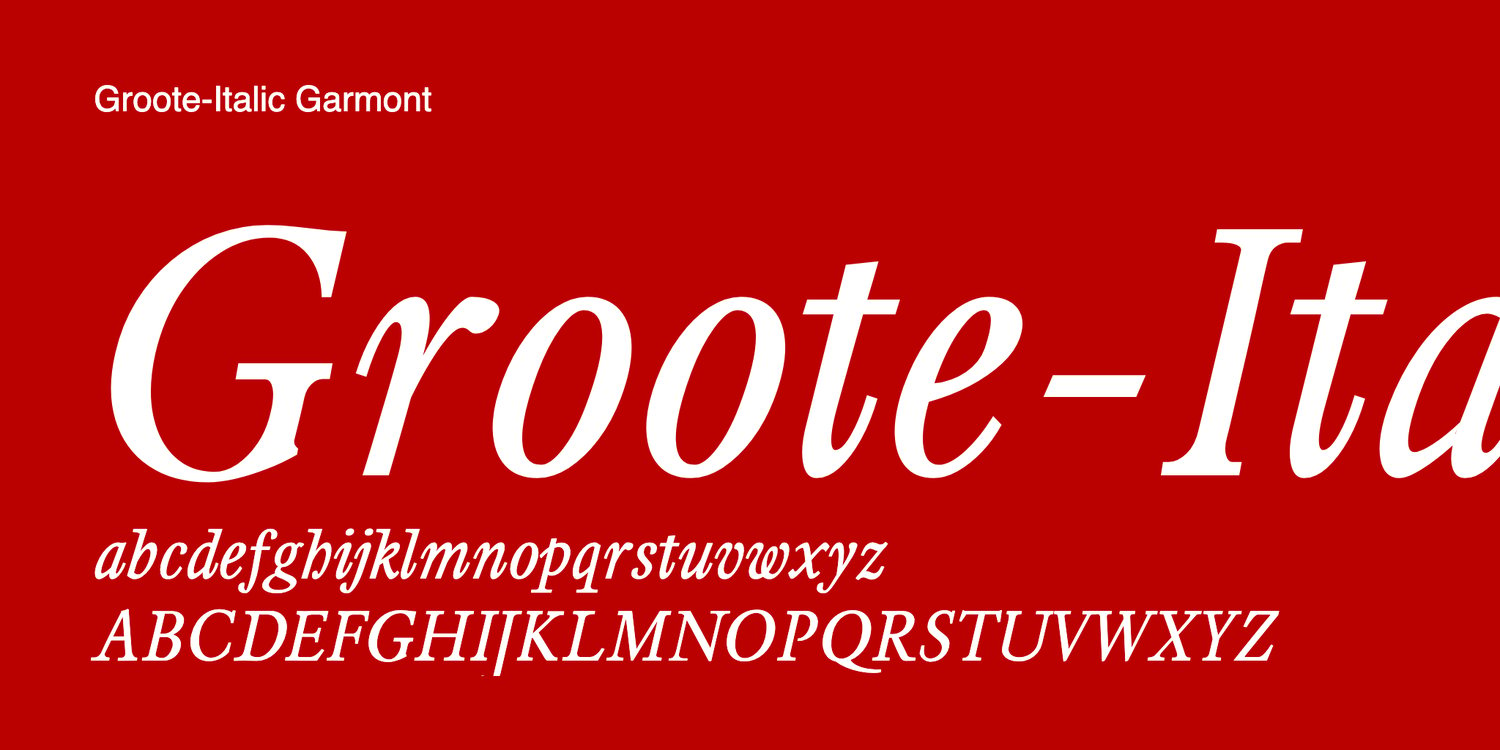
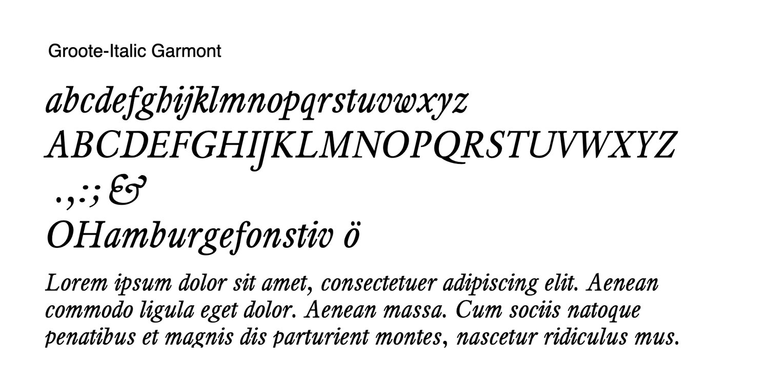

Groote Serif Text Italic
Goote is a mediaeval serif typeface rooted in the 1752 type specimen of Antwerp punchcutter Joannes Baptist van Wolsschaten. Developed from this historical prototype, Goote translates the richness of early Flemish typography into a versatile and carefully structured type family.
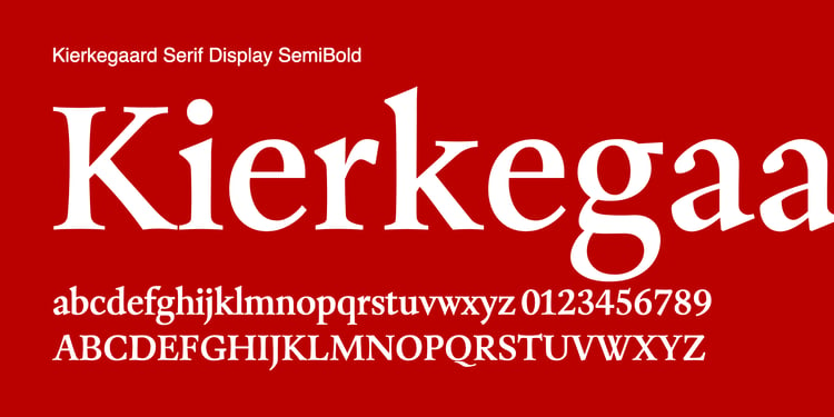
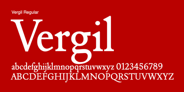
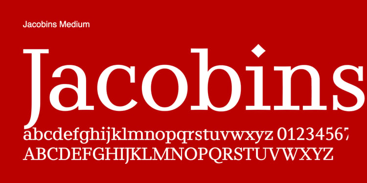
The font includes Italic (Corsyf) styles (but not both Roman (Romeyn)) and is designed across four optical sizes, each tailored to its specific typographic role. From expressive Canon cuts for display, through Paragon for headlines, Garmont for immersive text, to the finely detailed Mignon for captions and small sizes, Goote ensures optimal readability and character at every scale.
With its strong rhythm, sturdy serifs, and subtle calligraphic influence, Goote evokes the material presence of early metal type while meeting the demands of contemporary typography. It is especially suited for editorial design, cultural publications, and projects that seek historical depth paired with functional precision.
Goote is a typeface where typographic heritage and optical refinement come together—honoring Antwerp’s printing tradition while offering a robust tool for modern designers.
Font will be delivered just in Garmont scaling as TTF file.