
SaaS homepages often begin with a list of everything the product can do. Visitors, however, arrive with a much smaller question: Is this for a problem I recognize? Until that question is answered, feature grids, integrations, and pricing tables are only scenery.
The first screen should create a clean line from problem to outcome. Not a slogan that could belong to any startup, and not a paragraph dense with internal terminology. A useful hero names the audience, clarifies the change, and offers one believable next step.
THE FIVE-SECOND READING ORDER
Read the page at five-second intervals. In the first five seconds, a visitor should understand the category and promise. In the next five, they should see evidence: a product view, a concrete workflow, or a recognizable result. In the next, they should know what action is safe to take—watch a demo, explore the product, or begin a trial.
This reading order is more important than the number of sections. A short page with strong sequence can outperform a long page assembled from fashionable components.
Proof also needs progression. Logos provide familiarity, but they rarely explain value. A stronger proof system moves from recognition to specificity: customer names, measurable outcomes, a concise case-study detail, and finally the product mechanism that made the outcome possible.
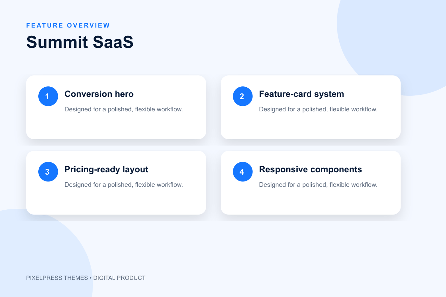
Summit SaaS is structured for this kind of climb. Its visual hierarchy moves from a direct proposition to product evidence, benefits, and conversion points. The design is crisp enough for technical credibility but spacious enough to keep complicated ideas legible.
One final test: cover the navigation and call-to-action buttons, then read only the headlines. Do they form a coherent argument? If they sound like isolated campaign phrases, rewrite them. If they tell a story from tension to solution to proof, the page has a spine.
A homepage may contain ten sections, but it has one job first: earn the next minute of attention.
Explore Summit SaaS:
https://downsstore.com/b/LOfWc