
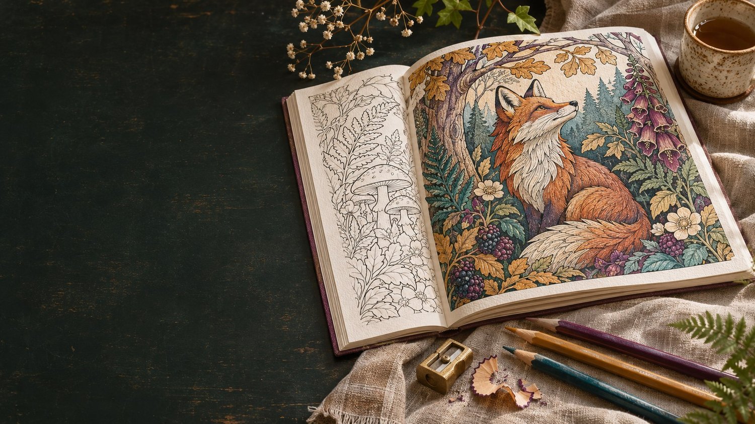
A single colouring page can be lovely. Put twenty of them together and a different question appears: do they feel as though they belong to the same book? That was the starting point for Page & Palette.
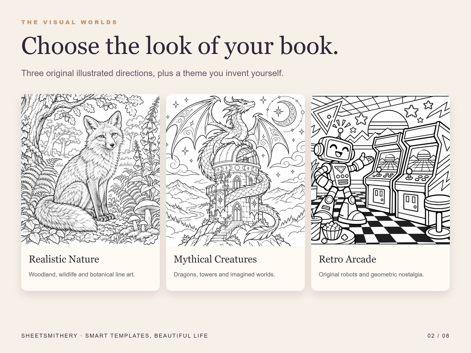
I wanted the app to begin with the reader and the feeling of the book, rather than a long list of images to generate. A fox in a detailed woodland, a dragon around an observatory and a cheerful retro arcade robot are three very different directions. Each can work, but mixing them without a reason would give the reader a collection of pages, not much of a journey.
So the first choice in the studio is a visual world. There are original examples for realistic nature, mythical creatures and retro arcade, as well as an option to make your own theme. The examples show the kind of line, detail and composition you might choose. They are demonstrations, not a finished book to publish.
From there, you set a working title, reader, page size and the mood you want to keep. The Prompt Atelier uses those decisions to build instructions for one page at a time. Change the scene, keep the visual rules. It also gives you a revision request for the moments when an image is nearly right but has a strange hand, a tangled line or some unwanted lettering.
Making the pages belong together
Page & Palette does not generate the artwork. You use an AI image tool of your choice, inspect what it makes and bring the images you approve back into the app. I think that separation matters. It keeps the choice of tool with the maker, and it makes the review a visible step rather than something hidden behind a button.
The Page Wall is where the idea starts to feel like a book. You can import PNG or JPEG pages, change their order and look at them together. The Print Desk then checks their size at the chosen trim and points to possible edge marks or colour. Those are useful signals, but they cannot tell you whether a dragon's wing makes sense or whether a page will look good on paper. That still needs your eye, the publisher's preview and a physical proof.
I have also put a seven-day guided studio alongside the tools. It moves from choosing the reader to checking print and rights, with short exercises and knowledge checks. The aim is to help someone make deliberate decisions as they go, rather than end up with a folder full of unrelated images and no clear next step.
I wanted it to feel like a creative worktable when you open it: paper, ink, colour and finished examples, with the practical controls close at hand. If you would like to see the finished studio, Page & Palette is now on Payhip: View Page & Palette on Payhip
Comments ()