

I grasp the market's trend using Dow Theory, but I also display moving averages to make it easier to visually understand the chart's movements.
In this blog post, I will explain how I use moving averages.
First, the moving average I use is the 20-period Simple Moving Average.
I color-code the moving averages on my charts: yellow for the daily, red for the 4H, blue for the 1H, and green for the 15m.
I display the moving averages of higher timeframes on the chart I am viewing.
For example, on a 1H chart, I also display the moving averages for the daily and 4H timeframes.
In this case, I do not display the moving average of a lower timeframe like the 15m.
Incidentally, to display the 20-period moving average from the 4H chart on a 1H chart, I display an 80-period moving average on the 1H chart.
Similarly, to display the 20-period moving average from the 1H chart on a 15m chart, I display an 80-period moving average on the 15m chart.
My trend-following strategy is to understand the market using multi-timeframe analysis and to enter on a lower timeframe during a pullback on a higher timeframe.
In this process, having moving averages makes it visually easier to understand the movements of the higher timeframe.
Now, please take a look at the following 1H chart.
1H Chart
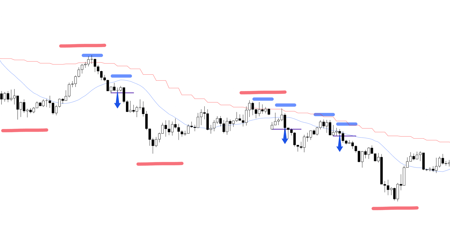
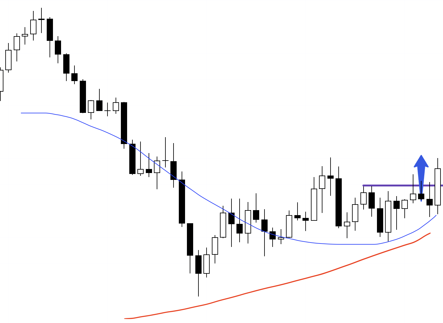
Let's say that after a downtrend, you see the price make a higher low and decide to buy, thinking, "It's making a higher low, so it's time to buy."
What is crucial at this time is the direction of the higher timeframe.
I trade the 4H pullbacks (buys and sells) on lower timeframes like the 1H or 15m, but when trading on the 1H, it is extremely important to determine if it is "truly a buy-the-dip opportunity on the 4H."
Let's display the moving averages on this chart.
1H Chart

As you can see, the 4H moving average (in red) is pressing down from above.
When viewed on a 4H chart, this 1H rise is merely a "pullback for a sell-the-rally setup" and nothing more than a "rise while waiting for the next sell opportunity."
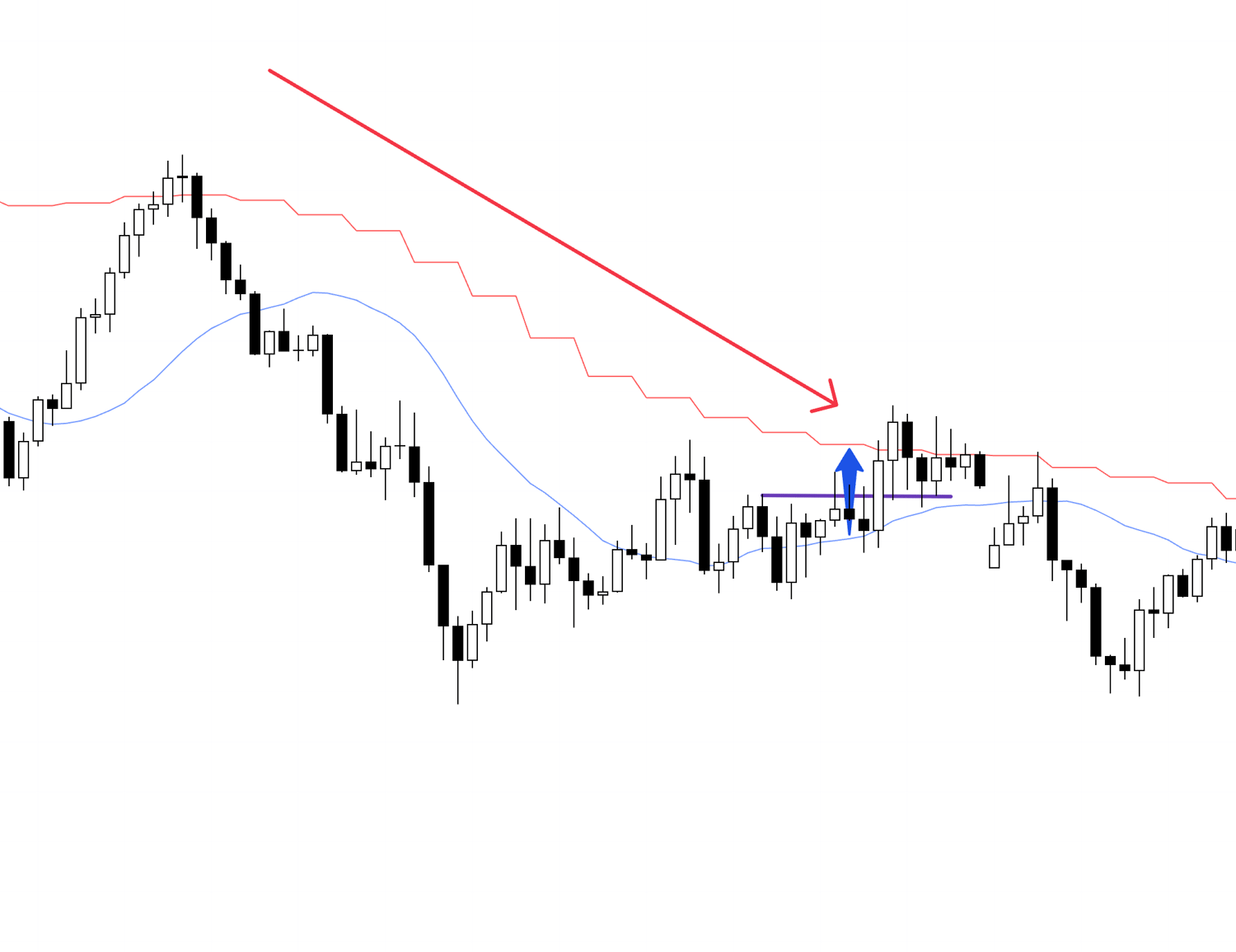
1H Chart
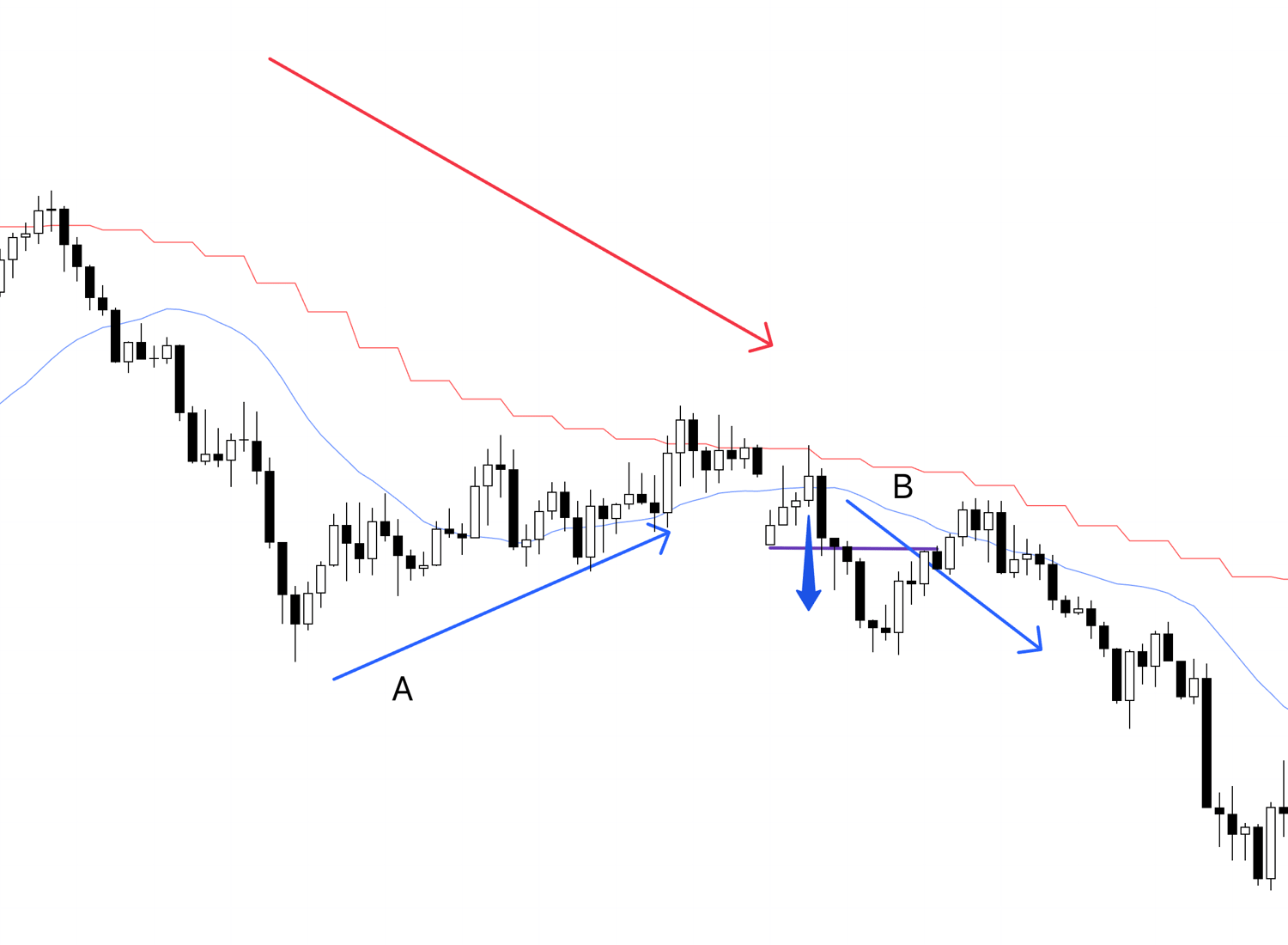
The rise at A is a rise for a 4H sell-the-rally setup, and we trend-followers do not trade during this rise; it is our "time to wait for the first point where the trend switches to a downtrend."
At point B, the 1H uptrend reverses into a downtrend, and "the directions of the 4H and 1H align."
Moving Averages Only
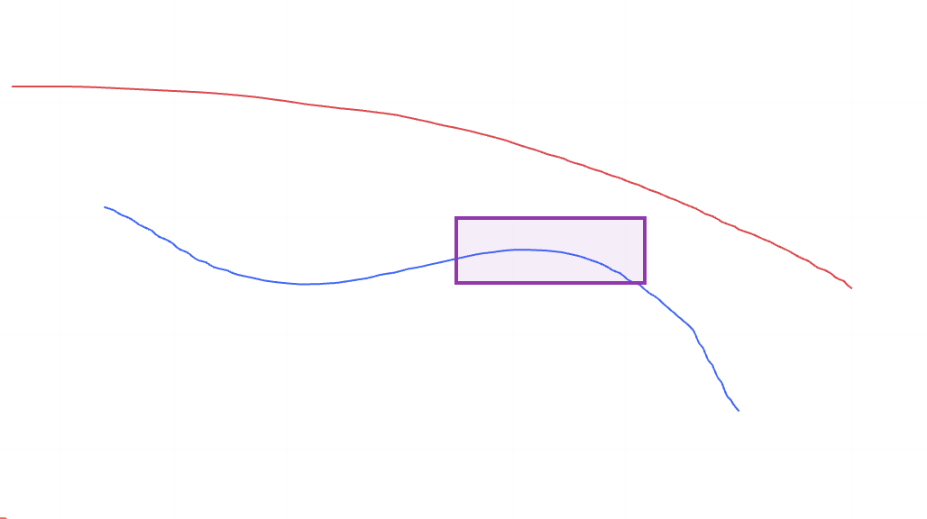
This is a drawing of just the moving averages, but the point where the 1H (blue) converges with and then diverges from the 4H (red) moving average is the point where trend-followers trade.
This is the point where the price first pulls back toward the higher timeframe (rises) and then reverses into a downtrend, "aligning its direction with the higher timeframe."
Just by having the moving averages displayed like this, it becomes easier to recognize at a glance whether you should be taking the current trade.
1H Chart

This becomes the point where I should trade.
It's the point where, relative to the 4H, the 1H rises and then reverses back to a downtrend, and it's where the 1H moving average goes from convergence to divergence.
Please compare it with the chart of only the moving averages shown earlier.
Having the moving averages makes it visually easier to see the point where the short-term movement approaches the long-term downward movement with a brief rise, and then diverges downward again.
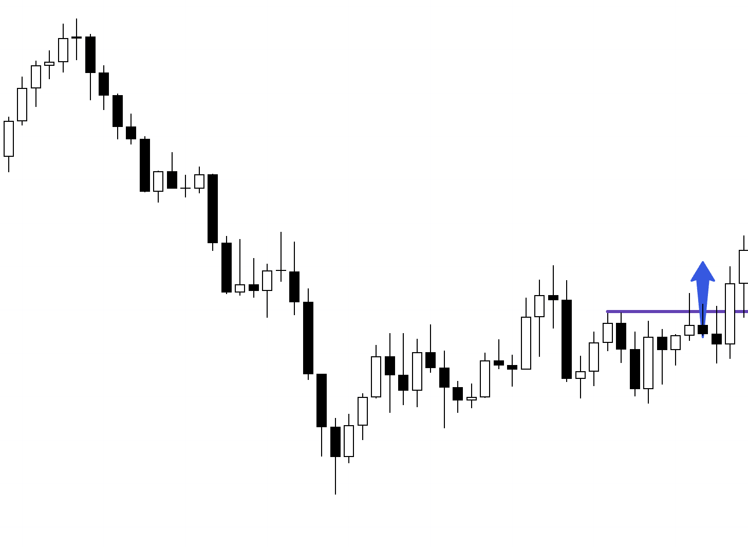
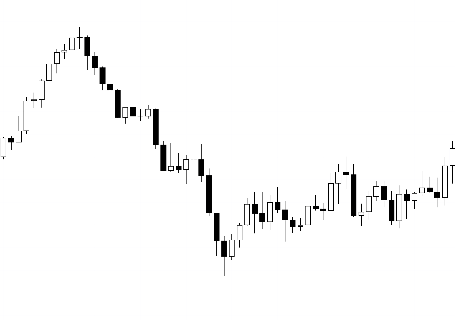
Now, what if on the same chart you first saw, the moving averages looked like the following?
1H Chart
If the moving averages were like this, this would be a perfect opportunity to buy the dip.
This is where the 1H downtrend that formed the 4H pullback has ended, and the 1H is about to reverse into an uptrend.
It is a point where the direction aligns with the 4H, and a point where I must absolutely enter.
By having the 4H moving average displayed like this, you can immediately tell that it is a buy-the-dip opportunity relative to the 4H moving average.
Now let's compare it with the previous chart.
1H Chart
As we saw earlier, in this case, you must not buy.
This is a rise where you "wait for the next sell," not a rise that a trend-follower should be buying.
Thus, even with the exact same chart, the meaning changes completely depending on the context of the higher timeframe environment.
1H Chart
I often see posts on the internet or social media that show only a single timeframe chart like this and ask, "Will it go up or down from here?", but such a thing cannot be determined from a single timeframe chart alone.
As I just showed, if the higher timeframe environment changes, the meaning changes completely.
Therefore, for the effectiveness of chart patterns, the "higher timeframe environment in which they occur" is extremely important.
Moving averages are useful for making it easier to visually confirm how the price is moving relative to the higher timeframe environment.
Furthermore, by looking at the chart as shown below, it also becomes easier to roughly grasp the waves of the higher timeframe.
1H Chart
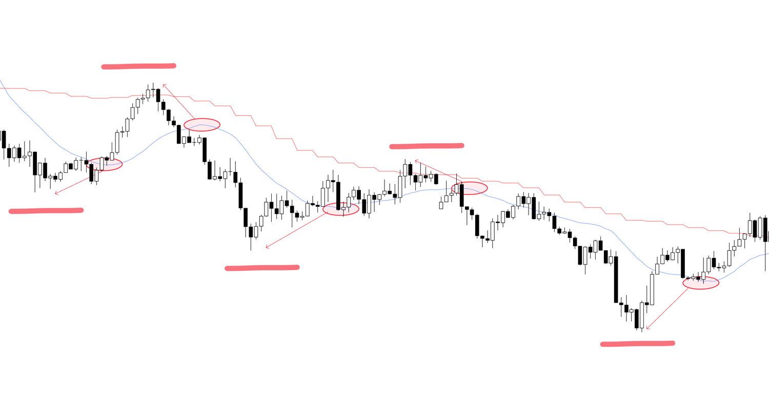
This shows the movement of the 4H overlaid with a red line on the 1H chart.
By looking at the price highs or lows "slightly before" the peak of the blue 1H moving average's bulge (circled in the oval), it becomes easier to capture the waves of the higher timeframe.
Why "slightly before"? Because moving averages, by their calculation, are expressed with a delay compared to the price, so we look at the highs or lows from "slightly before."
However, this is just for a rough judgment, and to confirm in more detail, you need to actually look at the 4H chart.
This is purely to increase convenience.
Based on all of this, I repeatedly trade at the buy/sell points of "Granville's Law."
Granville's Law indicates buy/sell points based on how the price behaves relative to the moving average.
The buy/sell points in Granville's Law are as follows.
Buy/Sell Points of Granville's Law
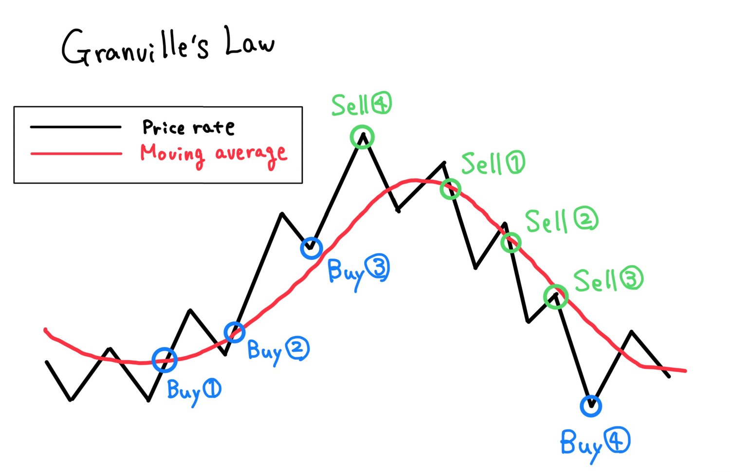
The point Buy ① shown in the diagram is where the price breaks above the moving average as it turns horizontal or slightly upward after having been downward-sloping.
The selling point with the same conditions is Sell ①.
Next is point Buy ②, which is where the price temporarily dips below the moving average and then breaks above it again.
At this time, the moving average must be pointing upward.
The selling point with the same conditions is Sell ②.
Next is point Buy ③, which is where the price returns to the upward-sloping moving average and reverses as if supported by it.
The selling point with the same conditions is Sell ③.
Next is point Buy ④, which is the point where the price, after diverging significantly from the moving average, tries to return to it.
The selling point with the same conditions is Sell ④.
Among these, the special one is point ④.
This point is a counter-trend trade against the moving average, so I only apply it on the daily chart, and I trade when the lower timeframe movement at this point corresponds to ①, ②, or ③.
I do not aim for point ④ on timeframes lower than the 4-hour chart because the potential price movement cannot be expected.
For example, if the daily chart is at position Sell ④, and the 4-hour chart is at Sell ①, ②, or ③, and furthermore the 1-hour chart is also at any of Sell ①, ②, or ③, then I will trade.
At this time, since it is a counter-trend trade against the daily movement, if the distance to the daily moving average or a daily support line is short, I will not trade.
I will trade if the price is far enough from the daily moving average or support line to expect a risk/reward of 2 or more.
I have illustrated this in a diagram, so please see below.
Applying ④ on the Daily Chart Only
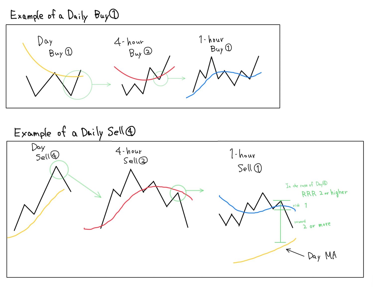
As shown, I only apply ④ on the daily chart, but within that, the lower timeframes must be at one of the points ①, ②, or ③.
This means I am repeatedly trading only at these points.
This is all for this time.
Based on these principles, I am able to understand the higher timeframe environment from actual charts using Dow Theory and multi-timeframe analysis, and repeatedly trade only at points with a high edge.
In the weekend "Trade Scenario" and "Weekly Trade Report," I will touch on how I actually utilize these concepts, so I would appreciate it if you could understand this blog post as a foundation.
I hope this blog post serves as a reference for your own strategy building.