
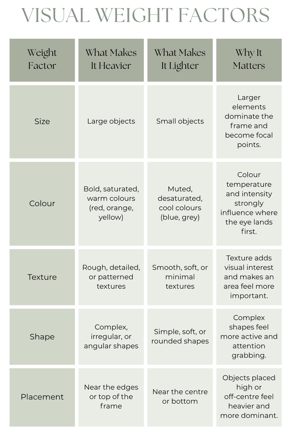
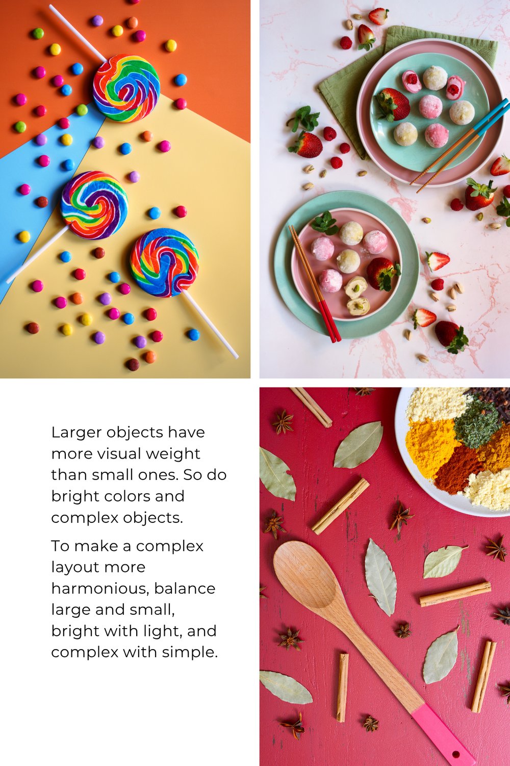
Understanding visual weight begins with recognizing that not all elements in an image attract attention equally. Some objects feel heavier, louder, or more dominant, even if they are physically small. Others feel light, subtle, or secondary. This “weight” isn’t about mass, it is about how strongly something pulls the viewer’s eye.
Visual weight is shaped by factors like size, color, contrast, texture, brightness, placement, and even the direction of light. When you understand what makes something visually heavy or light, you can start to control how a viewer experiences your image from the very first glance.
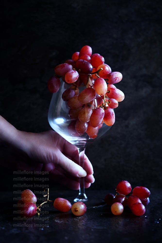
In food and tabletop photography, visual weight becomes a powerful storytelling tool. A bright garnish, a dark shadow, a textured cloth, or a bold prop can shift the balance of the frame and change what the viewer notices first.
By adjusting weight, such as adding, reducing, or redistributing it, you guide the eye through the scene with intention. This is what turns a collection of objects into a designed composition. Instead of hoping the viewer sees what you want them to see, you can use visual weight to lead them there naturally.
Balancing Visual Weight
Balancing visual weight in complex food and tabletop layouts starts with understanding that your viewer’s eye will always be pulled toward whatever feels “heaviest” in the frame.
In a busy scene, that might be a bright garnish, a bold prop, a strong highlight, or even a dark shadow sitting near the edge of the composition. Your job is to guide that pull rather than fight it.
Begin by identifying the natural focal point, which is usually the hero food or key object, and make sure it carries the strongest weight through size, contrast, brightness, or texture. Then look at everything surrounding it.
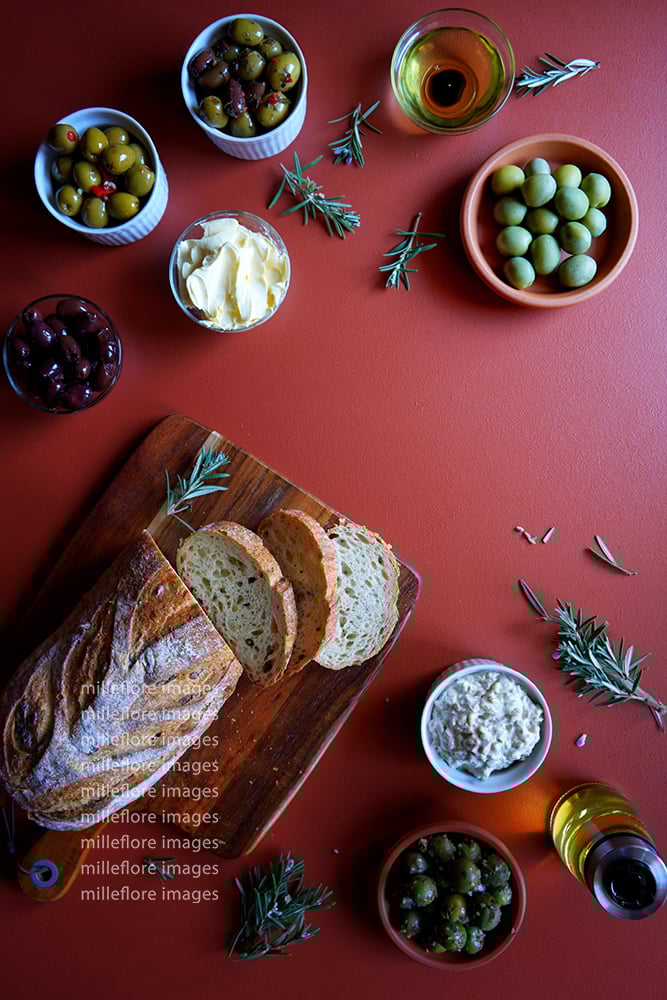
If something else is unintentionally louder, either soften it (reduce contrast, desaturate, dim the light, simplify the shape) or redistribute weight by adding a counterbalance on the opposite side of the frame.
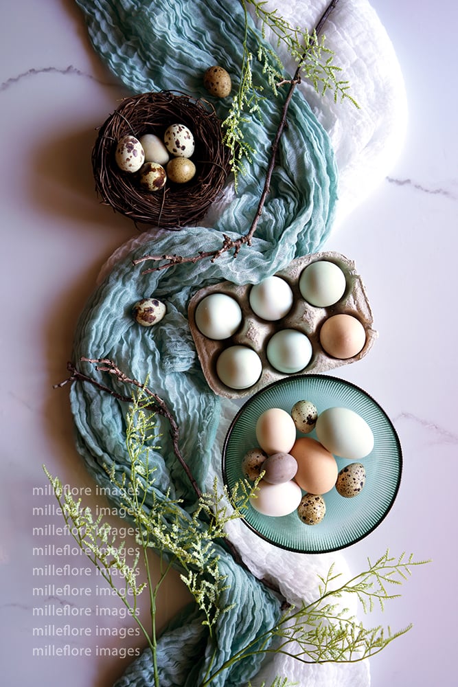
In more layered scenes, harmony comes from creating a rhythm of heavy and light elements. Place visually heavy items, like dark ceramics, textured linens, or saturated ingredients, strategically so they support the hero rather than compete with it. Use lighter elements such as negative space, soft colors, or smooth surfaces to give the eye places to rest.
Think of the layout as a conversation. Some objects speak loudly, others whisper, and your composition works when those voices feel intentional. When you balance visual weight, even a complex setup can feel calm, clear, and beautifully guided.
Feel free to add your comments below. I would love to hear from you,
Cheers,
Annie,
Milleflore Images
To learn more:
Delicious Photography: The Ultimate Handbook - Payhip
Delicious Styling: The Ultimate Playbook - Payhip
The Delicious Photography Ultimate Styling Collection - Essential 2‑eBook Starter Pack - Payhip

Comments ()