

Hello.
I’ll lay out my trading scenarios for the coming week.
I publish this “Trade Scenarios” blog every Sunday.
And every Saturday I post a “Weekly Trade Report” where I explain how I actually thought about the market and executed my trades during the week.
By reading this trading-scenario blog together with the Weekly Trade Report, I think you’ll be able to use my process as a practical reference for how to think ahead of time, what to wait for, and how to execute in a consistent way.
For the underlying strategy, please refer to my blog posts on Dow Theory and multi-timeframe analysis.
A “scenario” is not a forecast.
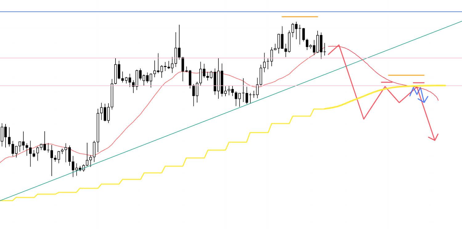
It is not a prediction, but my personal plan that says, “If the market does this, I will do that.”
I don’t try to predict the market, and this is not intended as such, so please keep that in mind.
Nor is this a set of instructions telling you what to buy or sell, or a service providing trading signals.
It does not guarantee any future profits; it is provided purely for educational purposes, using my own consistent process as the example.
I cannot take responsibility for any outcomes of the trades you place, so please trade at your own risk.
With that, let’s start with USDJPY.
(On my charts, the colors of the lines I draw represent each timeframe: orange for the daily, red for 4h, blue for 1h, and green for 15m.)
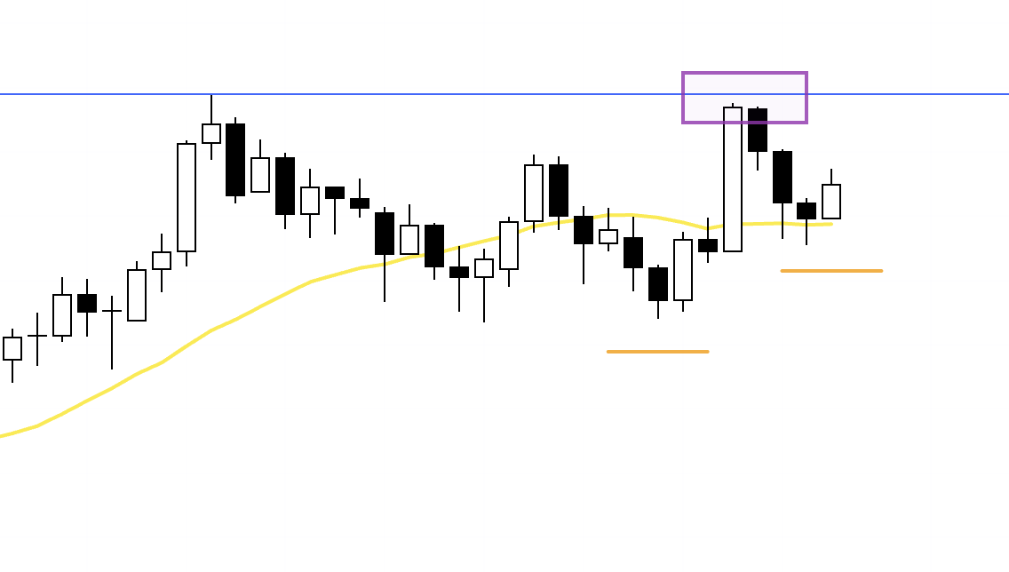
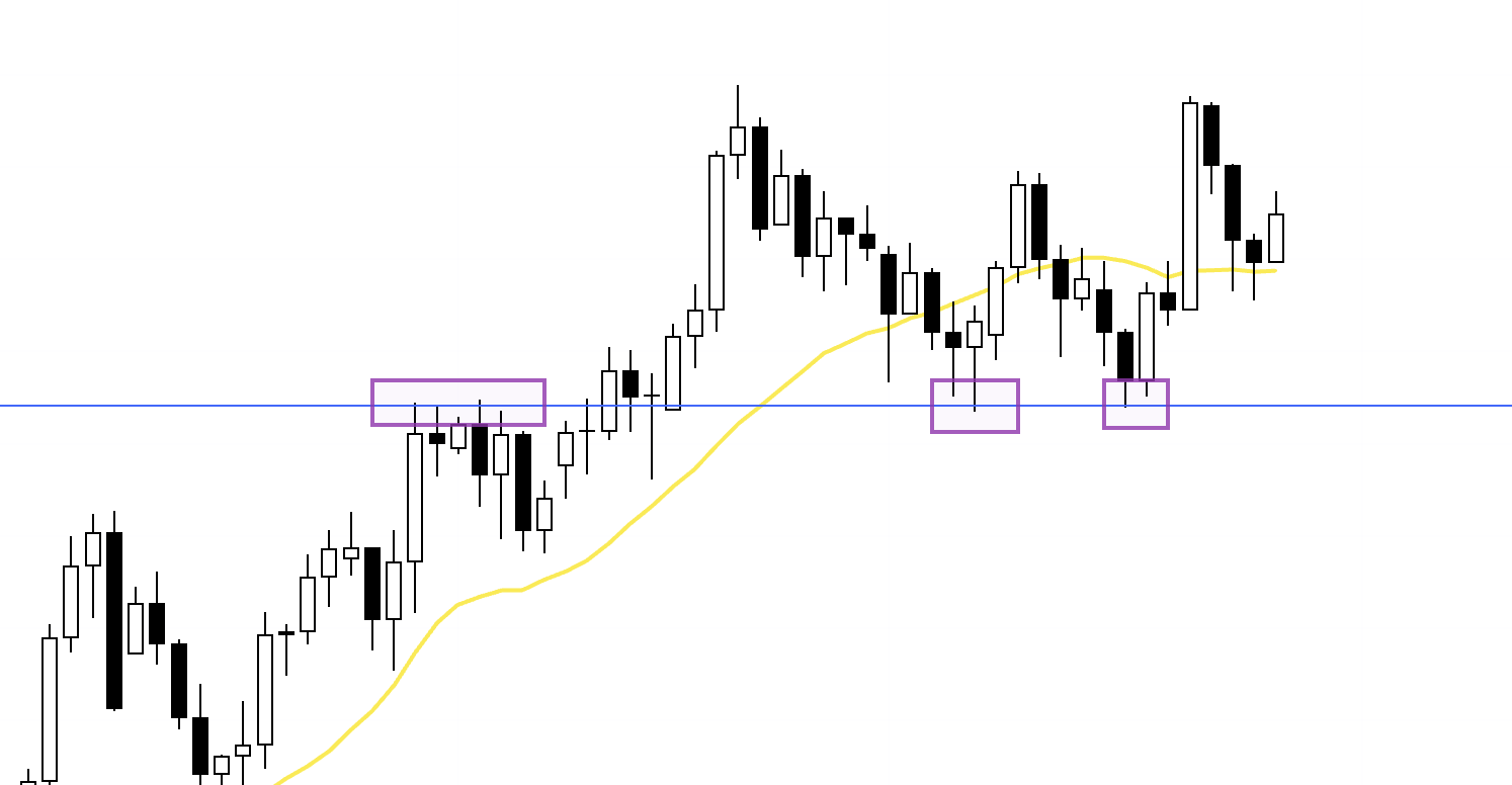
USDJPY
Daily

The daily chart remains in an uptrend, printing higher lows while continuing to set new highs.
However, most recently, selling has come in from the prior high (the blue line) (the area boxed), and price has been unable to break to a fresh high.
So, my base case is to look for buy-the-dip opportunities.
That said, if the daily chart starts printing lower highs in a way that sets up a double top on the weekly chart, this is also a phase where we need to consider shorts.
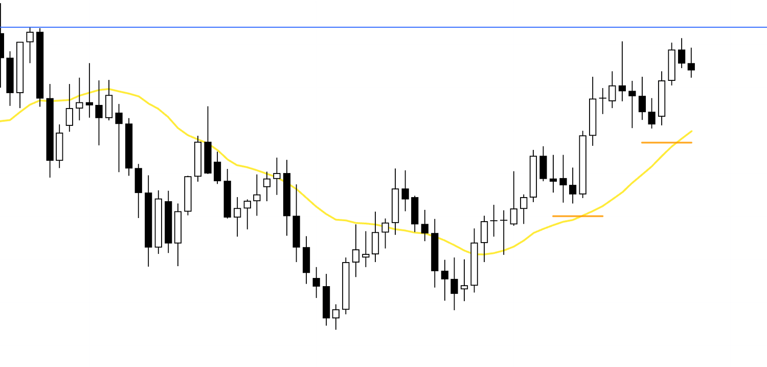
Daily
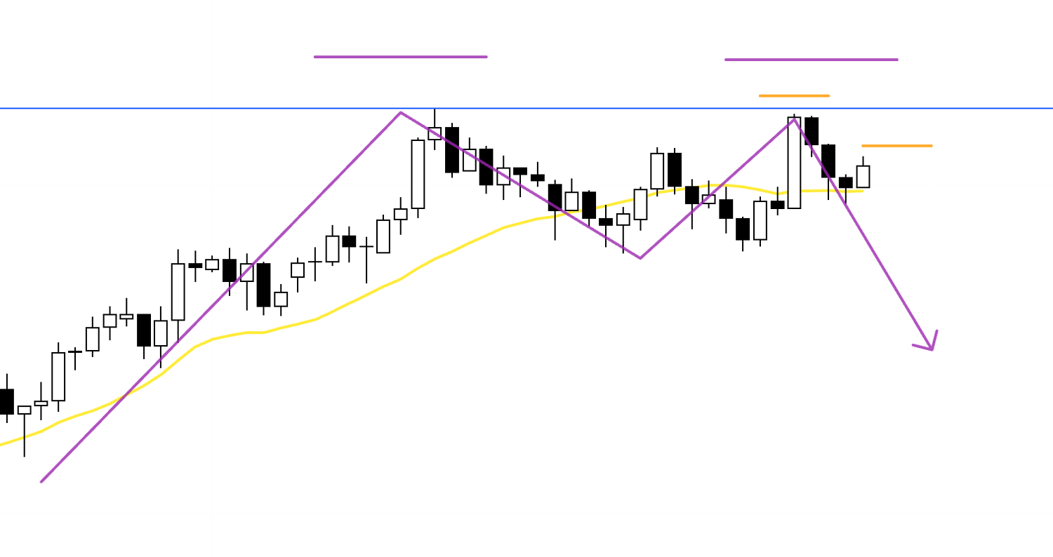
As you can see, the weekly can be read as a potential double top.
And if the daily—being the lower timeframe—starts making lower highs and then breaks to new lows, shifting into a downtrend, we’ll need to actively consider selling.
With that in mind, let’s also look at the 4h.
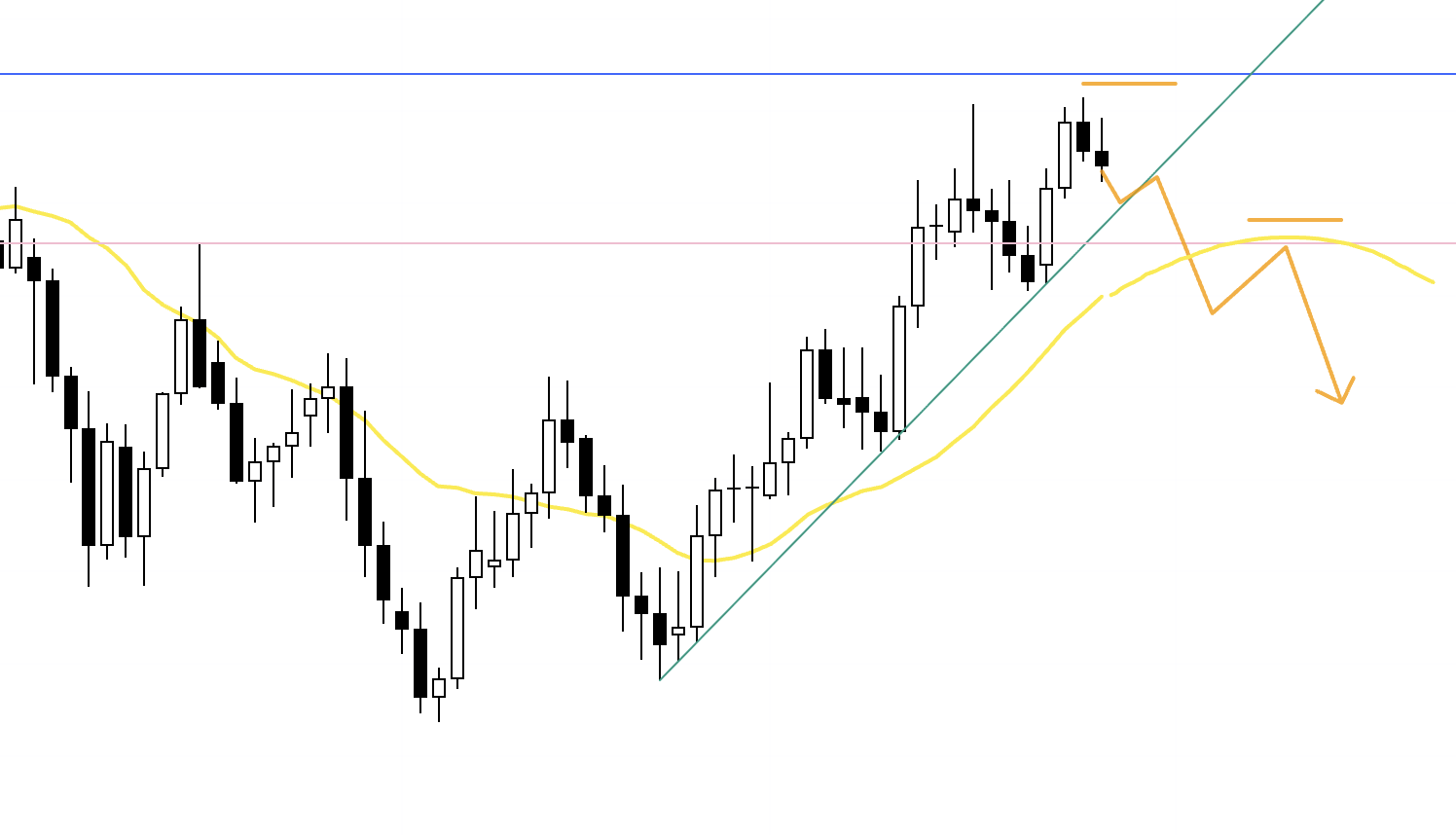
4h
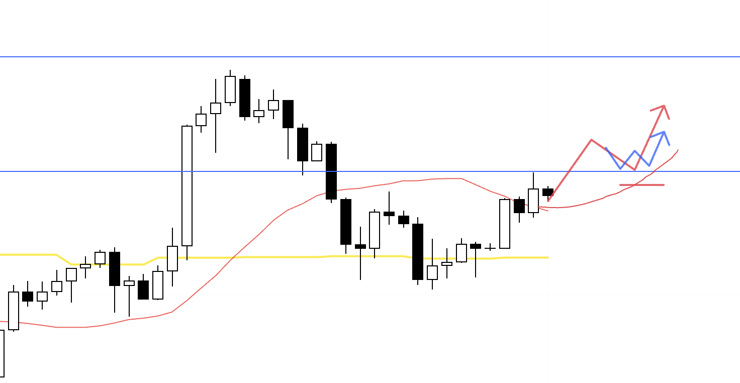
Since the daily is still in an uptrend, I want to consider buying at 4h higher-low points.
At that time, the blue line overhead is the prior high that’s also visible on the weekly—and it’s the high the daily failed to break—so when entering, I want to judge whether the risk-reward up to that line makes sense.
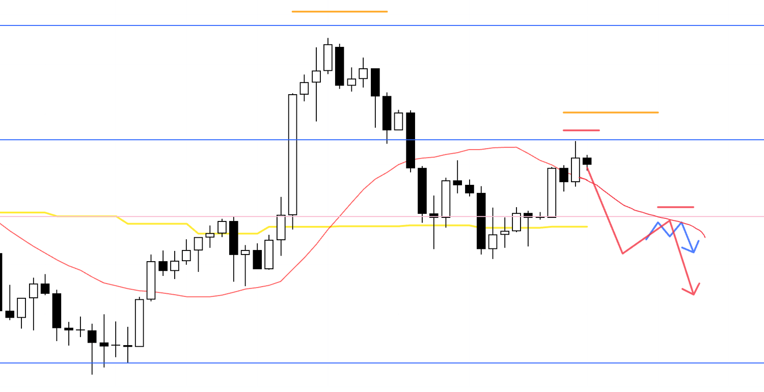
4h

If price rallies but still fails to take out the prior high—then prints lower highs on the 4h and breaks down through moving averages, for example—I’ll look for short setups on the lower timeframe.
However, the daily remains in an uptrend, and even though it couldn’t break the high, the “buy-the-dip” dynamic doesn’t suddenly disappear—meaning it’s still a market that tends to attract bids when it gets cheaper.
So, when entering, I’ll be looking for a setup where the risk-reward to the lower blue line is acceptable, and if I do take a position, I’ll manage it by, for example, locking in half the profits as price approaches that line.
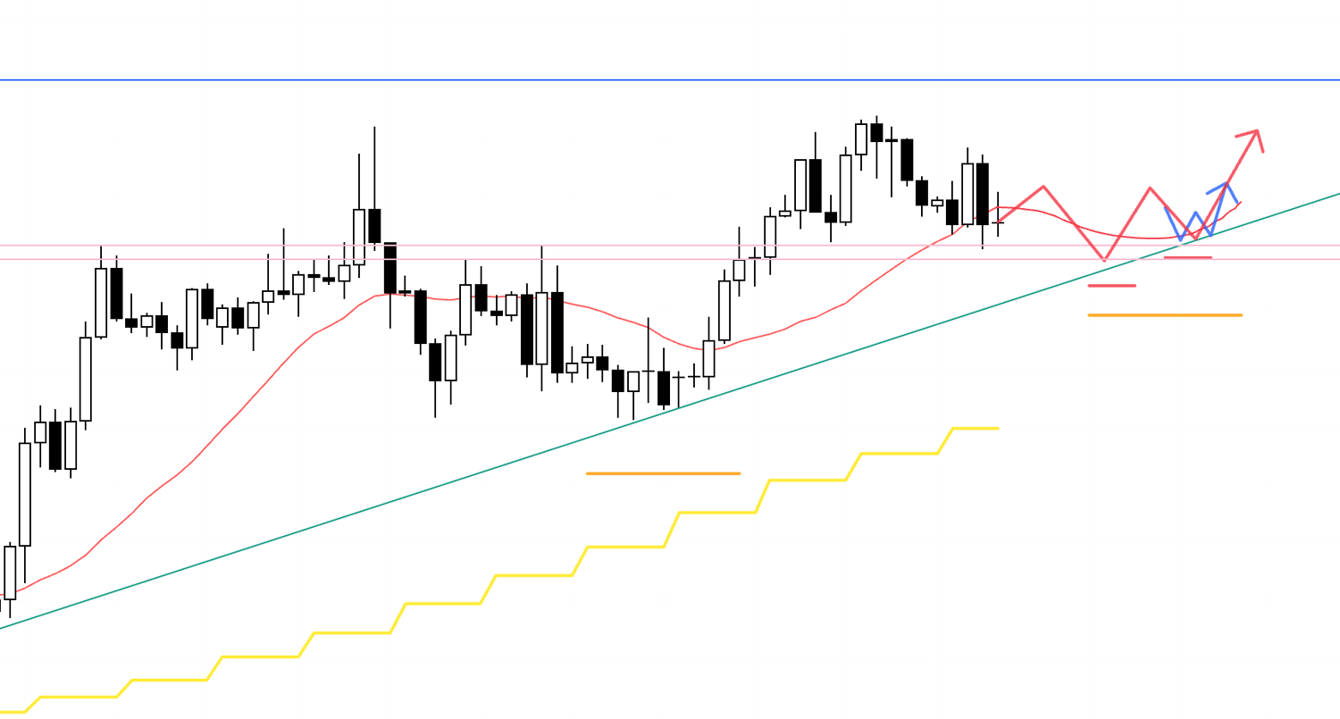
4h
On the other hand, as we saw on the daily chart earlier, if the 4h starts forming a lower-high structure that ultimately contributes to a daily lower high, I’ll look to sell on the lower timeframe.
There’s also a strong support line below that’s visible even on the daily, so you need to assess whether the risk-reward at entry is actually viable.
To make it clear where this lower blue line is drawn from, please refer to the daily chart below.
Daily
As you can see, in the past, prior highs were capped as resistance, and later, two lows were supported—forming something like a double bottom.
Lines like this tend to be widely watched by many traders.
So when price sells off, traders sitting on profits from shorts often set this as a take-profit target (which increases buy orders).
At the same time, it’s also common for fresh buy orders to come in from this support line as dip-buying entries.
As a result, buy orders driven by a range of motives tend to cluster around this level.
In other words, when I hold a position myself, I need to factor these dynamics in.
Next, let’s take a look at EURUSD.
EURUSD
Daily
The daily is in an uptrend, making higher lows while continuing to set new highs.
That said, we’re approaching a resistance area, so if you’re buying here, you need to be careful.
Even so, selling isn’t straightforward either—because the daily trend is still up—so we need to wait for an environment where shorts become easier to execute.
Daily
Right now, price is also being supported by things like a trendline.
If we break below it once, and then start forming a lower-high point while getting capped by moving averages, it becomes much easier to consider shorts.
With that in mind, let’s also look at the 4h.
4h
If price forms a fresh higher-low on the 4h while continuing to respect the trendline we saw on the daily, I’ll consider buying—essentially following the daily dip-buying structure higher.
The blue line above stands out to me, so I plan to watch whether an entry point appears with a risk-reward profile that makes sense.
4h
On the other hand, if price ultimately gets capped by the blue line overhead, breaks below the green trendline, and sells off—then goes on to form a new daily lower-high point—at the corresponding 4h lower-high point within that structure, I’ll look for short opportunities on the even lower timeframe.
That’s all.
These are simply scenarios as of this moment, and as the week begins, I want to keep updating and rebuilding the scenarios in real time while watching how price actually moves.
Midway through this post, I briefly explained how I think about lines.
To judge whether a line is truly “strong,” I look at how price reacted to it in the past.
If it repeatedly capped highs and supported lows, that means many traders are paying attention to it.
In other words, it’s a level where orders—take-profits, stop-losses, and new entries—are more likely to be placed, and more likely to concentrate.
And the more clearly that line can be confirmed on a higher timeframe, the more it will also be respected on lower timeframes in the same way—meaning more traders will incorporate it into their decision-making.
When traders with different styles across different time horizons all focus on the same level and orders concentrate there, it becomes a level you simply can’t ignore.
Of course, none of this is for “prediction.”
Believing that “it has to bounce here” at a line or trendline and entering the moment price touches it is a prediction.
Instead, you wait to see the outcome—price stops making new lows as if forming a double bottom, and then starts making new highs—and only after that do you think, “That means buy orders outweighed sell orders at this line,” and then you enter.
My entries are always like this: price is supported by a level, and at that same time it’s clearly printing higher lows while breaking to new highs—those are the points where I enter.
The lines and trendlines in this scenario aren’t drawn because I want to claim, “This will keep working in the future and price will bounce here.”
And even if they break, I don’t conclude, “Trendlines don’t work.”
They have a different purpose—I’m simply using them to read that meaning.
And that meaning is "how supply and demand shifted (or didn’t shift)."
I use them to build plans of “if this happens, then I do this.”
It may sound difficult, but line work is deep—and the act of drawing lines itself is a skill.
I’m hoping to summarize it in a blog post someday.
This trade scenario is purely my own plan, so if you’re still working on defining your approach, I hope you can use it as a reference when building your own strategy.
But if you already have a solid process, don’t let my plan distract you—stick to your rules, relentlessly.
Thanks for reading all the way to the end.