

In this report I will review the key points of my trading this week, focusing on the actual trades I took.
This Weekly Trade Report is published every Saturday.
When you read it together with Trade Scenarios, which I post every Sunday, I believe it will give you a useful reference for how I think in advance and how I actually execute trades based on those scenarios.
This is not advice saying “you should trade like this,” nor am I claiming that this is the correct answer.
It is not about showcasing individual winning or losing trades, nor is it about recommending a specific strategy based on those results.
My purpose is to show, at a practical level, how I repeatedly follow a consistent process based on pre-defined scenarios, and to offer that as a reference for your own strategy building and for achieving consistency in your process.
The outcomes I show are nothing more than my personal results, and they do not guarantee your future profits.
Please keep that firmly in mind, and when it comes to your own trading, make sure you carry out your own testing and preparation, and trade entirely under your own responsibility.
My trading is based on buying pullbacks and selling rallies on the 4h timeframe.
If you are interested in my pullback and rally strategy, please read my past blog posts on Dow Theory and multi-timeframe analysis.
Now, please take a look at the following charts.
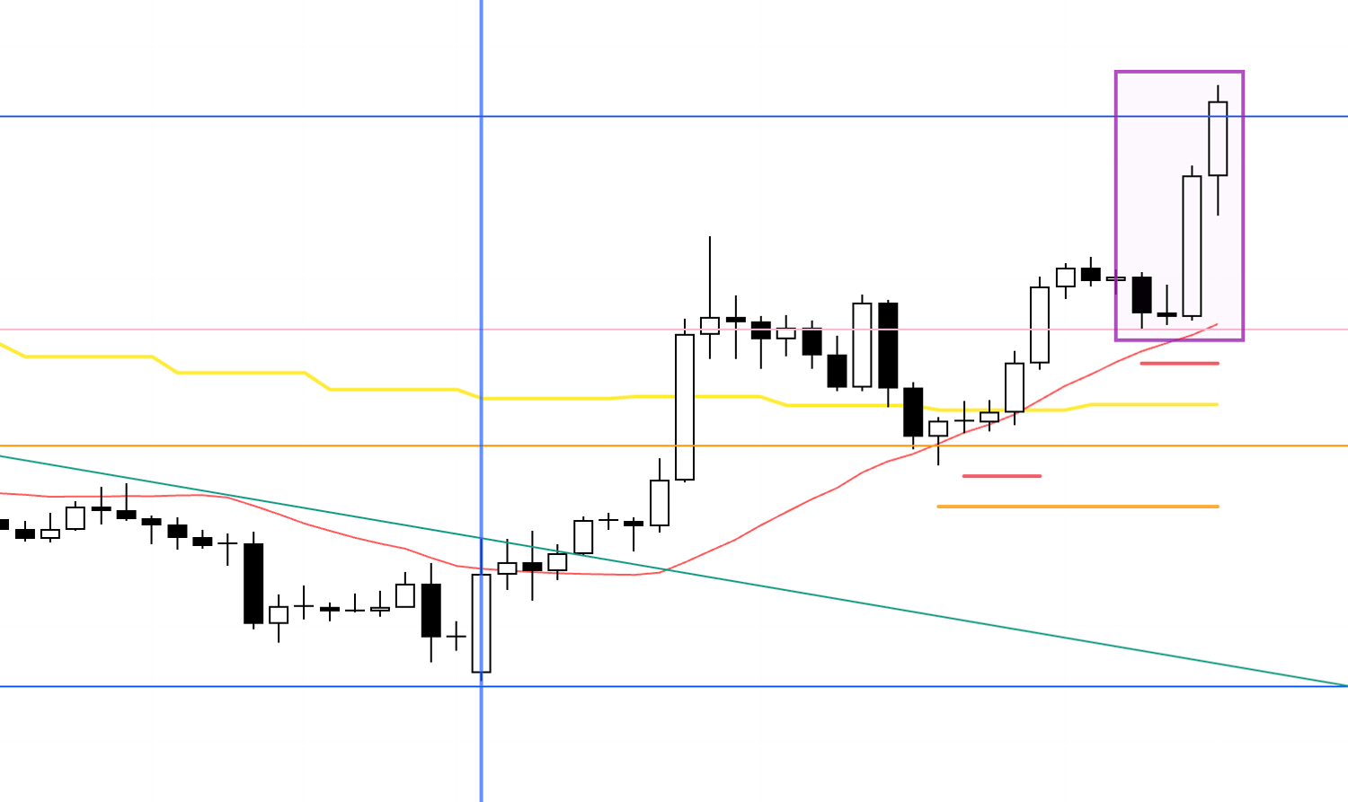
USDJPY 4h
This is the USDJPY 4h chart.
This week’s price action is everything after the blue vertical line marked on the chart.
USDJPY did not develop into a tradable structure, so I haven’t taken a single trade this week.
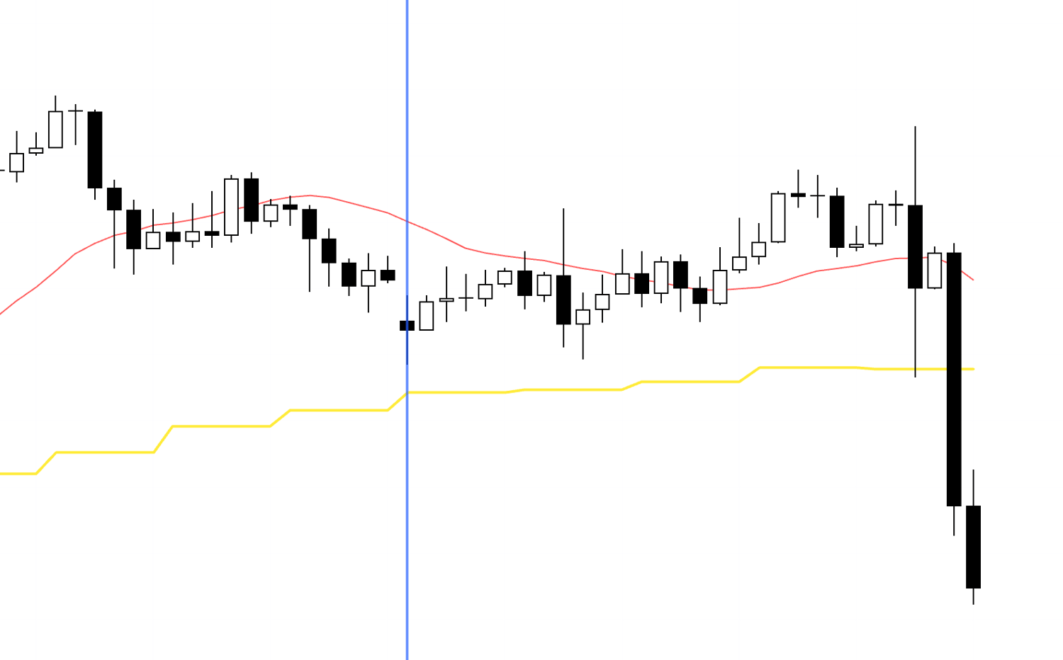
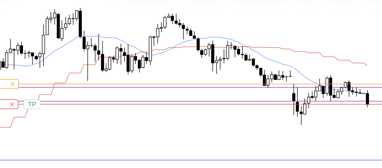
Next, take a look at the EURUSD chart below.
EURUSD 4h

This is the EURUSD 4h chart.
I haven’t taken a single trade on EURUSD this week either.
That said, the area boxed in is a very clean pullback-buy point in terms of chart structure, so I’ll break it down.
The reason I did not trade it is that multiple news events overlapped around this window.
So please don’t read this as meaning "you should have traded here that day" and instead use it purely as a chart reference.
Let’s look at it on 1h.
1h
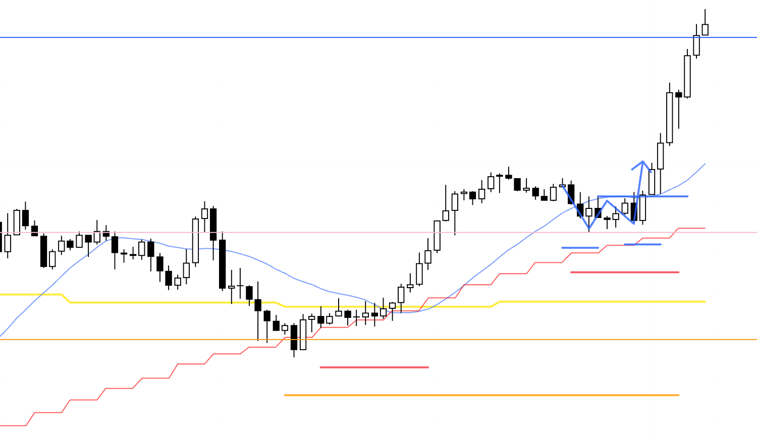
On 1h, it looks like this, and the entry is at the point where 1h forms a higher low and then breaks to a new high (blue), inside the daily pullback-buy zone (orange), inside the 4h higher-low zone (red).
This is a textbook entry pattern that I repeat over and over.
Because the daily, 4h, and 1h are all aligned in the same direction, orders overlap and cascade, and the edge on the long side increases materially.
If there hadn’t been overlapping news events, this would be a must-trade chart for me.
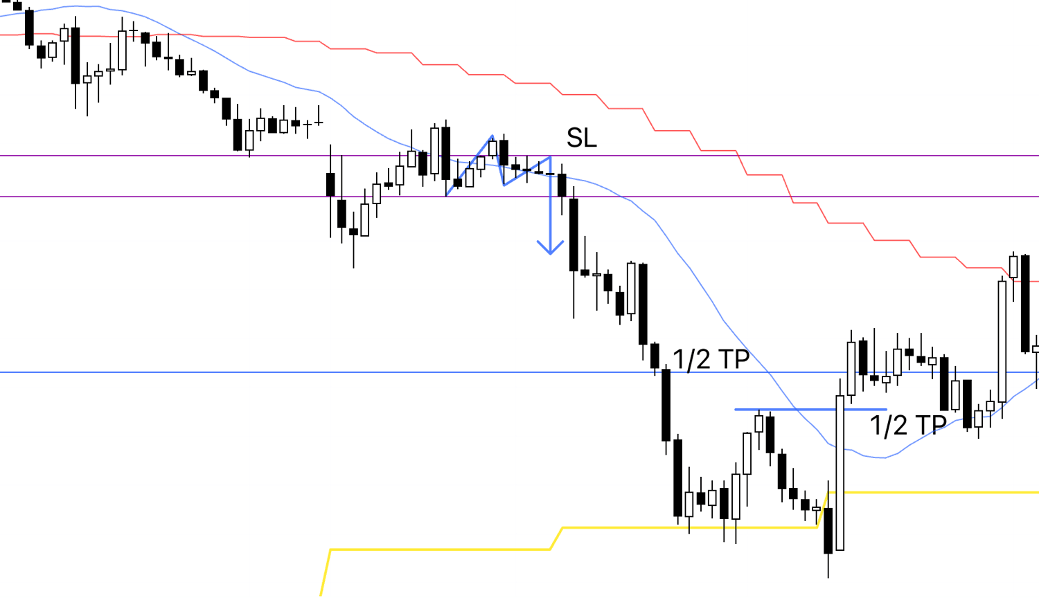
This time I didn’t trade USDJPY or EURUSD, but I did trade JP225 on Tuesday, so I’ll explain it.
I wasn’t planning to write this up on the blog, so I only have a screenshot taken immediately after entry, but take a look below.
4h
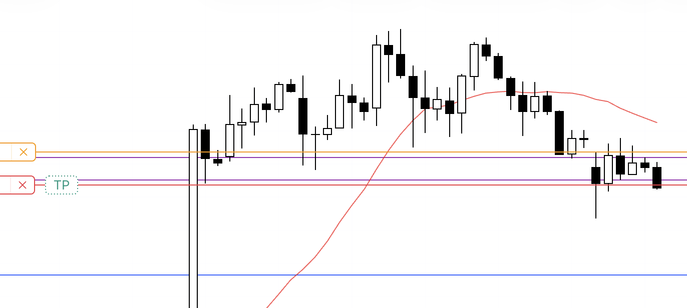
As a long-standing habit, I always take a screenshot immediately after entry, and this screenshot was taken right after I entered.
Because I wasn’t planning to explain it on the blog, I didn’t draw any lines for commentary, but this is a short taken at a 4h lower-high point.
The red line is the entry point, and the orange line is the SL.
I don’t set TP, so it’s displayed overlapping the entry price, which simply means I’m not using that function.
On 4h, this is the point where the preceding uptrend flips into a downtrend, which increases the edge for shorts.
It’s also a very clean short from a chart-structure perspective.
1h
On 1h, it looks like this, and within the 4h lower-high context, 1h also prints a lower high and breaks to a new low.
The entry is at that break-to-a-new-low point.
1h
Because I don’t have any screenshots after that, this is something I annotated later on the completed chart for the purpose of this blog explanation.
This trade carried the risk of daily pullback buying stepping in, so I secured profit on half at the blue line drawn from the prior daily high.
After that, when the 1h structure broke, the remaining half was closed, and the trade was finished.
That is all.
Regarding the JP225 trade I took this time, I did not employ any special techniques; I simply used multi-timeframe analysis to identify where order flow was likely to concentrate, and consistently executed the same trade setup.
I featured this trade because there were absolutely no entries on USDJPY or EURUSD this time, and I believed the JP225 example would serve as a useful reference, but going forward, this blog will continue to focus primarily on USDJPY and EURUSD analysis.
I may occasionally introduce other pairs if they appear to offer valuable insights, but attempting to cover everything—including full scenario building—would result in an unmanageable workload given my time constraints, so I would appreciate your understanding.
Thank you for reading to the end.
I hope this blog serves as a source of insight for those currently building their strategies, as well as for those struggling to achieve consistency in their trading.